Can a single color really lift your mood and change how big your space feels? I ask that because I’ve seen it happen time and again.
I guide homeowners to use optimistic hues that warm cool corners and enhance daylight. Soft tones can act like a neutral backdrop, letting art and texture take center stage without overwhelming the room.
Start small with cushions, throws, and a statement chair. Those accents let you test the vibe before you commit to paint or big furniture.
We’ll explore shades—from lemon to mustard—and pairings like navy, gray, and olive. I also cover materials such as light oak and brass that make the palette feel elevated, not childish.
By the end, you’ll know when to go bold, when to stay subtle, and how to shape light so your home feels intentional and inviting.
Key Takeaways
- Soft yellow tones can act as a neutral backdrop to highlight art and texture.
- Begin with accents before scaling to paint or large pieces.
- Shade choice—lemon, mustard, ochre—sets the mood for the space.
- Pair with navy, gray, or olive for a balanced palette.
- Materials like light oak and brass elevate the overall design.
Why Yellow Works: Light, Warmth, and Instant Mood-Lift
A sunny hue can act like a gentle spotlight, lifting corners and softening shadows. I’ve seen it transform otherwise flat spaces into upbeat places where people want to linger.
The psychology is simple: warm tones read as cheerful and optimistic, so they cue hospitality and energy the moment you walk in.
I use subtle shades as a neutral base and bolder options as focal points. A soft buttercream can feel like a warm neutral, while a vivid accent creates instant character.
The practical magic is in how this paint interacts with natural light. It bounces sunlight deeper into a north-facing living room and helps small rooms feel airier.
For tall walls, I often add a white trim band to break vertical scale without losing impact. And always test: move a poster-size paint swatch around the space at different times of day.
- I’ll help you pick tones that energize or calm, based on daylight and finishes.
- Small tests prevent big mistakes and ensure the color supports daily life.
Choosing Your Shade: From Lemon to Mustard to Golden
The shade you pick decides how light moves, how furniture reads, and how calm the space feels. I start by matching tone to daylight and to how you live—entertaining, snuggling, or quiet mornings.
Lemon and light yellow feel crisp and modern. They open edges and work beautifully with teal or gray. Use them on walls when you want a fresh, airy vibe with pale floors and soft upholstery.
Mustard brings depth and a retro, sophisticated energy. I pair it with navy or charcoal and midcentury furniture for a collected look. It reads as grown-up, not gimmicky.
Buttercup and warm golden tones add traditional richness. Layering related golden tones—walls, woodwork, and accents—creates subtle dimension without shouting.
- I’ll help you pick a shade that suits light and lifestyle: lemon for crisp modernity, mustard for cozy sophistication, golden for heritage warmth.
- Test two neighboring shades on adjacent walls to see how undertones shift with sunlight.
- Choose matte for broad walls and satin for trim to keep finishes intentional.
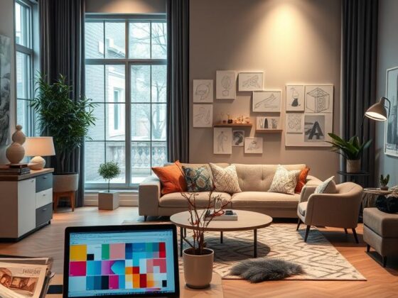
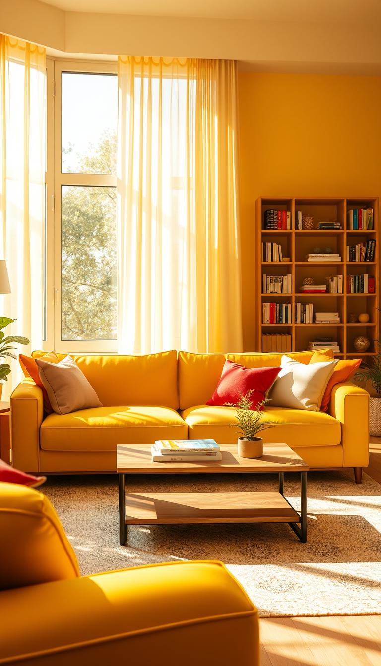
Yellow Living Room
I treat color like a dimmer: four simple controls let you dial mood and momentum.
Core elements: walls, accents, furniture, and textiles
I break a yellow living into four levers—walls, accents, furniture, and textiles—so you can raise or soften color with control.
Designers often pair painted walls with a neutral sofa and patterned textiles. Small pieces—curtains, a chair, lampshades, or art—carry big visual weight. Structured sofas calm bold hues; looser silhouettes suit softer golds.

Balancing saturation, contrast, and neutrals
Start with a baseline: neutral walls with yellow accents, or the reverse. Textiles are your safety net—gingham, stripes, and subtle checks keep color grounded.
- Anchor the space with one neutral hero: a rug, sofa, or wall.
- Use wood, white, or gray to give the eye places to rest.
- Painted trim or a beam gives high impact with minimal commitment.
“A single painted beam can change how a room reads from awkward to intentional.”
Painted to Perfection: Yellow Walls, Accent Walls, and Woodwork
A single painted wall can read like a stage set—focused, intentional, and full of character. Choosing between a feature wall and a full-room wash starts with how much visual impact you want and how the space functions.

Feature wall impact vs. full-room immersion
I often suggest a single painted wall for clients who want punchy impact but low risk. It frames seating, art, or a fireplace without locking you into a long-term commitment.
Painting trim, beams, and cabinetry in vibrant yellow
Painted trim, beams, or cabinets inject energy while keeping most surfaces calm. Bright cabinetry can become a joyful focal zone in a kitchen or seating nook.
Using white bands and pale neutrals to break up tall walls
A white band across a tall wall humanizes scale. Pairing pale neutrals and tactile textiles keeps the scheme balanced so your eye can rest.
- I’ll help you choose matte for broad walls and satin for trim so edges stay crisp.
- Try an accent shelf or painted stair riser before repainting everything.
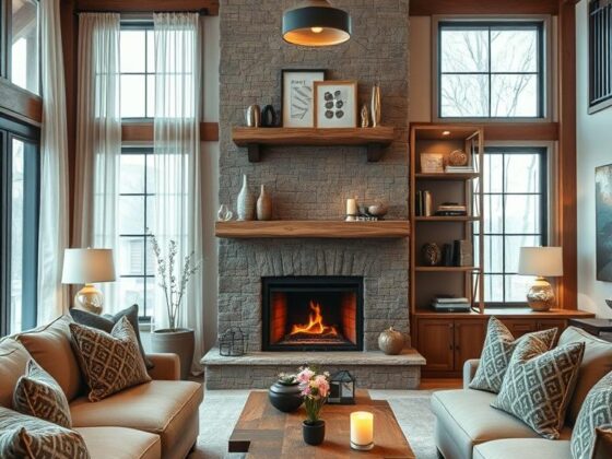
Mustard Magic: A Cozy, Midcentury-Modern Take
Bring in mustard and the rest of the scheme seems to fall into place—olive, navy, and warm wood feel natural partners.
I reach for mustard when a client wants cozy-meets-cool. Its depth flatters vintage lines and midcentury silhouettes.
Pairing tips: anchor mustard with deep navy or olive, then add mid-to-dark woods to ground the palette. Burnt orange and deep blues work well too.
Statement pieces change everything. Mustard curtains that frame the light, an accent chair that sets the tone, or a sofa that quietly steals the show all work wonders.
Texture matters—nubby weaves and velvet amplify richness. Brass accents add warmth without feeling loud.
“A single mustard chair can transform a neutral wall into an intentional vignette.”
- I use neutral walls so dusky upholstery can sing—layered, not loud.
- Echo mustard in small touches: lampshades, artwork mats, and cushions.
- Choose mid-to-dark walnut or teak to give weight and midcentury authenticity.
| Element | Why it works | Suggested finish |
|---|---|---|
| Curtains | Frame windows and add depth | Velvet or heavy linen in mustard |
| Accent chair | Sets focal tone without full commitment | Textured velvet with walnut legs |
| Sofa | Main statement or secondary anchor | Low-profile midcentury sofa in dusky mustard |
| Wood tones | Grounds palette and adds warmth | Mid-to-dark walnut, teak |

Soft and Subtle: Buttercream and Pastel Yellows as Neutrals
A soft buttercream wash can quietly reset a space, turning bright windows into a gentle, steady glow. It reads like a warm neutral and keeps the room calm while letting other elements sing.
I treat this palette as a canvas. Bold artwork becomes clearer. Patterned textiles gain crisp edges. The result feels curated, not contrived.
Layering is key: pair a light yellow wall with whites and pale grays for contrast. Add light oak furniture to anchor the scheme and bring natural texture.
Sheer curtains filter sun into a soft veil. Linen throws and woven rugs add depth. Small shifts—tuning undertones so cream doesn’t edge peach—make a big difference.
Creating a calm backdrop that lets art and patterns shine
- Use buttercream as your neutral to provide gentle warmth without distraction.
- Let large artworks and patterned cushions be focal points against pale walls.
- Keep trims crisp in off-white to prevent the wash from feeling muddy.
Layering pale yellows with whites, grays, and light oak
Start with a pale wall color, then add pale-gray upholstery and a light-oak coffee table. Repeat tones in soft textiles to unify the space.
The payoff: a luminous, soothing living room that adapts as your tastes evolve. It’s perfect for reading corners and quiet mornings.

| Element | Why it works | Practical tip |
|---|---|---|
| Wall wash | Creates a neutral backdrop with subtle warmth | Choose a sample and view at morning and evening light |
| Light oak | Adds natural grain and soft contrast | Use for tables, shelves, or frames to anchor the palette |
| Textiles | Introduce pattern and tactile depth | Mix linen, wool, and woven rugs for layered interest |
| Sheer curtains | Soften harsh sun and spread light evenly | Opt for natural fibers to maintain breathability |
High-Impact Pairings: Color Schemes that Elevate Yellow
Pairing a warm golden hue with a cool neutral is a fast way to make a space feel curated. Below are five ready-made palettes I use with clients. Each one includes a quick materials tip so you can shop with confidence.

Golden + soft gray — modern sophistication
Why it works: gray grounds, golden glows. Use a pale gray wall as a calm backdrop and add golden accents in cushions and art for warmth.
Materials tip: matte paint on walls, satin on trim for crisp edges.
Mustard + deep navy — bold contrast
This pairing reads dramatic and grown-up. Add brass lamps and walnut tables to lift the scheme.
Place mustard accents evenly—throw pillows, a single chair, and a rug—to avoid hotspots.
Buttercup + charcoal — graphic chic
Use black-and-white patterns to sharpen shapes. Buttercup pops against charcoal without feeling fussy.
Materials tip: mix velvet cushions with a woven rug for texture contrast.
Golden + olive — earthy elegance
Bring in plants, woven baskets, and aged wood. Olive tones soften glow and make the palette feel organic.
Lemon + teal — fresh, energetic
Keep big pieces light—white or pale wood—so the lemon and teal feel lively, not heavy.
- I’ll give you five foolproof living room ideas you can plug into your space.
- I’ll show where to place yellow accents so color radiates evenly—no hotspots.
- Each scheme includes a quick materials tip so you can shop with confidence.
“Balance is about spreading color so the eye moves around the room, not stops at one corner.”
For more guidance on tones and test-swatching, see my favorite resource on decorating with yellow.
Furniture Focus: Yellow Sofas, Chairs, and Tables with Personality
A boldly upholstered sofa can transform a neutral backdrop into a personal statement. I often nudge clients to keep walls and floors calm so one piece can carry mood and intent.
When to make the sofa the star
If you want impact with low risk: choose a mustard or golden sofa and keep the envelope neutral. The effect reads grown-up when paired with pale walls and simple floors.
Striped and patterned upholstery for balanced color
Stripes, checks, or florals stabilize strong color. A sofa with navy piping or a patterned accent chair spreads visual weight and stops the hue from feeling static.

- I recommend performance fabrics for heavy-use seats so the look stays fresh.
- Repeat the hue lightly in accessories—lampshades, vases, cushions—for cohesion.
- Side tables in light oak or brass-edged glass keep the composition refined.
- Scale matters: low, slim arms suit compact rooms; deeper seats suit open plans.
“A single well-scaled sofa can make a room feel tailored and welcoming.”
Result: a tailored look that reads spirited and approachable. I’ll show you how to co-star patterned chairs and simple accessories so the furniture feels intentional, not accidental.
Textiles that Tie It Together: Rugs, Curtains, and Cushions
A well-chosen floor covering can turn scattered accents into a composed vignette. I use textiles to guide the eye and set the room’s rhythm.
Three rug tactics: match the walls for a seamless field under furniture, blend with a related tone to soften transitions, or contrast to frame the seating area and add definition. A single yellow rug can anchor a neutral sofa—or flip that relationship so the sofa reads as the anchor.

Gingham, stripes, and checks for classic charm
Gingham and stripes echo a buttercream scheme without feeling childish. Checks add structure and keep patterns feeling timeless. Edit carefully—too many patterns makes the eye tired.
Mixing textures for depth
I layer velvet cushions with linen curtains and a woven rug to give tactile depth that photographs beautifully. Light-filtering panels soften color and spread daylight evenly, which helps textiles sit calmly in the space.
- A few black accents—frames or a slim-legged table—add snap. Use them sparingly to avoid a bumblebee effect.
- Edit patterns so the eye has places to rest; calm is an important part of great decor.
- Care tips: choose washable cushions, rotate rugs seasonally, and match sizes to the seating plan so pieces wear well and fit the room’s proportions.
“Textiles are the finishing touch that make a house feel lived-in and intentional.”
Style by the Square Foot: Small Yellow Living Rooms Done Right
In small footprints, restraint wins: I let accents carry the color so the space breathes.
Accent-first approach to avoid visual clutter
Start with an accent-first idea—pillows, a petite lamp, a rug. These choices add cheer without crowding a small room.
Keep main surfaces neutral so the eye reads openness. Repeat tiny hits of color—book spines or artwork—to build calm rhythm.
Smart storage: ottomans, coffee tables, and compact pieces
Use multi-functional furniture. A storage ottoman hides clutter and adds a soft hue. A slim coffee table with a lower shelf stores baskets and keeps the table tidy.
Light palettes with punchy highlights
Reflective touches—glass lamps, a small mirror—bounce light and make the space feel bigger. Keep window treatments simple to welcome more sun.
- Size rugs and tables to scale; small pieces create instant calm.
- Choose compact chairs and narrow consoles for flow.
- Repeat color sparingly for harmony across rooms.
“A few well-placed accents give a small space big personality.”

Open-Plan Harmony: Carrying Yellow from Living to Dining
An open plan clicks when small details repeat. A cushion on the sofa that matches a dining-seat pad creates a visual thread. I use this trick with clients so the whole area feels calm and curated.
Repeat tones through art, lighting, and textiles. Hang a framed print that both zones can see. Place a pendant above the table that reflects a pillow hue in the seating area. These echoes make the room read as one thoughtful space.
Coordinating chairs, rugs, and pendants without overload
Coordinate, don’t copy. Choose chairs, rugs, and a pendant that share a family of tones. That keeps the design balanced and avoids a matchy look. Warm LEDs help the color glow without glare.
Using muted shades to bridge bolder zones
When one zone is bolder, introduce a softer bridge tone between them. Muted shades act like visual diplomacy—softening contrast while keeping each chapter distinct.
“Treat an open plan as one story: repeat textiles, artwork, and finishes so the eye can travel.”
- I’ll help you treat the open plan as one story—repeat tones via art, lighting, and textiles for a smooth flow.
- Chairs, rugs, and pendants coordinate, not match, for a curated effect.
- Pick accessories that echo finishes—brass and oak—to tie the area together.

| Element | Purpose | Placement tip |
|---|---|---|
| Textiles | Unify color across zones | Repeat cushion fabric on dining seats |
| Lighting | Create shared warmth | Use warm LEDs; pendant near table echoes sofa accent |
| Artwork | Tie sightlines | Place where both seating and dining can view it |
Materials and Finishes: Woods, Metals, and Glass that Love Yellow
The materials you pick decide whether a space reads airy, cozy, or crisp. I start by choosing a primary wood tone, then layer metals and textiles so the palette feels deliberate.
Light oak vs. dark walnut
Light oak complements soft tones and lifts a small living room. It keeps the room airy and pairs well with pale fabrics.
Dark walnut deepens mustard and golden schemes. Use it for legs, shelving, or a statement table to add contrast and weight.
Brass, chrome, and glass
Brass brings warmth and vintage charm. Chrome and glass offer modern clarity and keep sightlines open.
A simple glass-top table makes furniture read lighter and lets color play without blocking the view.
Botanical accents, textures, and lighting
Plants calm saturation—green completes warm palettes naturally. Woven baskets, boucle throws, and linen curtains add tactile depth without noise.
Lighting matters: choose warm-white bulbs so the tone glows at night instead of glaring.
“Aim for three repeating materials across the space for cohesion.”
| Finish | Use | Practical tip |
|---|---|---|
| Light oak | Tables, shelves, frames | Use for airy balance in pale schemes |
| Dark walnut | Legs, cabinets, accent table | Add for contrast with deeper tones |
| Brass & chrome | Hardware, lamps, trims | Mix warmth (brass) with crisp (chrome) |
| Glass | Tabletops, pendant shades | Keep sightlines open; show color clearly |
Conclusion
The trick isn’t bravado—it’s choosing a hue that responds to your light and lifestyle. I recommend testing small accents first, then scaling to walls or a statement sofa when you feel confident.
Remember: shades span lemon, buttercup, golden, and mustard—each pairs well with soft gray, navy, olive, or teal. Use a feature wall, painted trim, or a white band on tall walls to get high impact with low risk.
Layer textiles—gingham, stripes, checks—and mix brass or glass accents to add depth. In tight spaces, an accent-first approach and multifunctional furniture keep the area calm.
If you want more palettes and practical tips, see this guide on yellow colour combinations. However you proceed, aim for balance—test, repeat, and let the space feel like home.