Can a splash of color truly change how your room feels—and how you live in it? I ask that because I’ve seen small choices lift moods and speed cleanup in homes across the U.S.
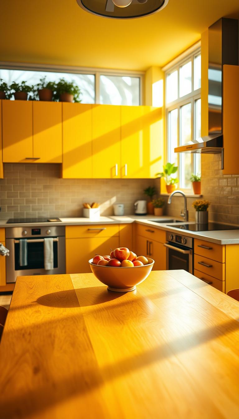
I’ll show you how a yellow kitchen can boost warmth when natural light is limited, or add pep to a sunny space. Think butter-yellow walls with scullery-style white cabinets for cozy, early 20th-century charm, or high-gloss canary cabinets for modern edge.
I lean on color psychology and practical tips—primer, semigloss enamel, and smart accents—to make bright finishes durable and easy to maintain. I’ll also point out where to use contrast, from black brick floors to gray slab counters, and when to test the waters with small pops like window trim or a SMEG fridge.
Ready to map a plan that fits your home, budget, and daily life? Let’s walk through ideas that feel like sunshine, not a costume.
Key Takeaways
- Yellow lifts mood: It adds warmth and optimism to your most-used room.
- Choose the right finish—oil-based primer + semigloss latex enamel improves durability.
- Mix styles: butter tones suit cottage looks; high-gloss canary works for modern design.
- Balance bold color with neutrals, wood, stainless steel, and black accents.
- Start small: test accents or appliances before committing to full cabinetry.
- See practical examples and detailed tips at design content.
Why Yellow Works in the Kitchen Today
A warm tint can change how a room feels, making it read brighter and livelier even on cloudy mornings. I’ve seen tones from amber to muted cream lift mood and usefulness in compact spaces.
Light, warmth, and mood: the case for color
Yellow lifts perceived brightness. Our eyes read it as “sunny,” which boosts energy for cooking and cleanup. In places short on natural light, yellow walls add warmth without upping the thermostat.
Pale yellow reads almost neutral. It calms busy zones and pairs beautifully with copper pendants in Scandinavian layouts. Bright yellow becomes a focal point when daylight is strong or finishes are balanced.
Choosing pale yellow vs. bright yellow based on natural light
- North-facing rooms do better with warmer hues like curry or butter to counter gray light.
- South-facing spaces can handle cleaner, paler tones that feel fresh all day.
- Pair walls with gray or taupe kitchen cabinets to steady the palette and avoid visual noise.
Yellow Kitchen Ideas
Small color moves can reshape how your cooking space feels and functions—without a full remodel. I often guide clients to start with soft fields and micro-accents before committing to full cabinetry.

From butter walls to bold mustard cabinets
Start soft: butter-toned walls with crisp white trim and open shelving create early 20th‑century charm without heavy lifting.
Prefer modern? Try high-gloss canary fronts with white marble and matte black pulls for a clean, confident look.
Small pops, big impact: stools, trim, and art
- Paint window trim or an island base for a punch that’s easy to reverse.
- Swap in bar stools, pendants, or a colorful appliance to test a look.
- Repeat small notes across an open plan—art, planters, or tea towels—to keep flow without overwhelm.
Balancing color with neutrals, wood, and stainless steel
Ground bright tones with black granite, soapstone, or a brick floor so the space reads composed. Stainless steel teams well with warm hues; add wood for softness.
| Style | Key Move | Materials to Pair | Why it Works |
|---|---|---|---|
| Cottage | Distressed cabinets | Beaded board, warm wood stools | Feels lived-in and welcoming |
| Modern | Glossy fronts | White marble, matte black hardware | Sharp contrast and clean lines |
| Budget test | Micro-accents | Stools, trim, pendants | Low cost, high visual return |
Paint-first Upgrades: Walls, Cabinets, and Ceiling Accents
Paint-first upgrades let you test a vibe fast—no demo, no stress, just color and light. I often start clients here because it’s fast, affordable, and reversible.
Butter-yellow walls paired with white, scullery-style cabinets and open shelving create that cozy, early 20th‑century charm many people want. Pale tones warm the room without overpowering details like beadboard paneling or crown molding.

Painting cabinets: primer, enamel finishes, and durability
For kitchen cabinets that last, I follow a strict recipe: sand, oil-based primer, then two coats of semigloss latex enamel.
This gives adhesion, scrub-resistance, and a light-reflective finish that holds up. Label hardware and doors as you remove them—it saves hours on reassembly.
Unexpected accents: beams, interiors of cabinets, and islands
Painted cabinet interiors turn each open door into a small surprise. Yellow-painted ceiling beams add lift and visual rhythm without repainting all walls.
An island painted as a single bold accent reads intentional and is easy to repaint if tastes change.
“A pale glaze over beadboard shows texture instead of hiding it—tiny moves, big personality.”
- Respect paneling—glaze to highlight grain.
- Use a fan deck to match undertones with countertops and backsplash.
- Test sheen under task lights—gloss changes how color reads near work zones.
| Project | Key Steps | Why it Works |
|---|---|---|
| Walls | Prep, test swatch, one to two coats | Instant mood shift; pairs with dark wood countertops |
| Cabinets | Sand, oil primer, 2 coats semigloss | Durable, easy to clean, bright finish |
| Accents | Beams, interiors, island base | Surprise, lift, focal point without full repaint |
Yellow Cabinets That Steal the Show
I love how cabinet choices change a room’s voice. They can tighten a modern profile or soften a cottage feel.

High-gloss canary reads crisp in a modern kitchen. Pair reflective fronts with white marble and stainless accents. Matte black pulls add editorial contrast. A two-tone island—canary on the base, white around the perimeter—keeps the layout dynamic and useful.
Distressed butter yellow for a cozy look
Prefer lived-in charm? Distressed butter-yellow cabinets with beadboard, open shelves, and a farmhouse sink feel like a postcard. Black slab countertops and dark hardware frame the cabinetry so the lines read intentional.
“On one client job, a fresh coat and new hinges turned dated stock into a headline piece—without a full remodel.”
- Paint prep matters: sand, oil-based primer, then semigloss enamel for durable kitchen cabinets.
- Add soft-close hinges; small upgrades make everyday life feel luxe.
- Mind undertones—greenish versus red-leaning will shift how your countertops read.
| Style | Key Pairing | Why it Works |
|---|---|---|
| Modern gloss | White marble + stainless | Reflective, crisp lines, editorial feel |
| Cottage distress | Subway tile + black slab countertops | Warm, lived-in, strong definition |
| Budget refresh | Primer + semigloss on stock | High impact, low cost |
Backsplashes and Tiles: Subtle to Statement
Backsplashes set a room’s rhythm—quietly warming or boldly announcing the palette. I like to start with the scale: do you want a whisper or a headline? That choice guides material, grout, and where to stop the tile—countertop to crown, or just a practical splash zone.

Beveled “buttery-brick” tiles to the crown molding
For subtle warmth, run beveled butter yellow brick tiles from the countertop to crown molding. The bevel catches light and makes gray Shaker cabinets feel gentler.
Yellow harlequin patterns and stacked subway tile
Harlequin patterns add movement—try them behind the range for a playful focal point. Vertically stacked mustard subway creates a modern accent wall that reads intentional, not busy.
Mosaic mixes: yellow with gray, blue, and green
Gray-and-yellow mosaic backsplashes knit glossy cabinets and gray countertops into one look. Pair with black granite when you want contrast that feels sharp, not stark. Edge profiles and clean caulk lines make the install look custom.
“Always mock up a few square feet on-site—small samples can mislead in big, bright rooms.”
- Keep it low-maintenance: choose a wipeable grout sealer so backsplash care is quick.
- If cabinets are the showstopper, opt for tone-on-tone tile with tight grout lines.
- Let countertops dictate undertone—creamy marble wants creamy tile; cool quartz wants cleaner hues.
| Approach | Where to Use | Why it Works |
|---|---|---|
| Beveled butter-brick | Countertop to crown | Adds warmth; reads custom with crown molding |
| Harlequin pattern | Behind range | Playful focal point; easy to limit to one wall |
| Mosaic blend | Full backsplash or accent band | Unifies mixed finishes and ties in countertops |
Pairing Yellow with Grays, Blacks, and Whites
Introduce dark accents to anchor bright cabinetry and the whole scheme settles into place. I like this approach because it keeps the mood fresh but controlled.

Gray-and-yellow modular schemes for a contemporary feel
Modular gray-and-yellow cabinetry gives a crisp, modern rhythm. Glossy yellow lowers pair with gray slab countertops to keep lines clean. A gray-and-yellow mosaic backsplash ties the surfaces together without competing for attention.
Black accents: countertops, brick floors, and hardware for contrast
Black defines form. Use a black countertop, matte hardware, or a thin liner tile to outline shapes. I often recommend a black brick floor when clients want drama that’s practical and low-maintenance.
- White uppers plus colored lowers keep the room buoyant.
- Match metals—matte black or aged brass—so accents feel curated.
- One black element, then repeat it twice more to make the look intentional.
“If counters are busy, soften the walls; if counters are quiet, you can amp the color.” — design note
Farmhouse and English Cottage Takes on Yellow
Nothing feels cozier than an apron sink, beadboard panels, and a soft, sunlit hue—it’s a frame for everyday life.

Think practical charm: an apron-front sink under a sunny window, butter tones on the walls, and white subway tile make a hardworking, timeless setting.
Apron sinks, beadboard, and butter warmth
Pair soft yellow walls with sage or pastel green cabinets for that English cottage hush. Tone-on-tone beige mosaic backsplashes meld with granite and keep the look authentically vintage.
Soft tones, vintage details, and open shelving
Open shelving displays white ironstone and green-and-white dishes so the palette sings without shouting.
Add wood barstools, an oil-rubbed bronze faucet, and a small vintage island for texture you can touch.
“Swap in unlacquered brass knobs for instant charm—let them patina over time.”
- Keep backsplashes quiet; reserve a mustard tile panel behind the range as a single, lively accent.
- Mind sightlines: cottage style benefits from breathing room around treasured pieces.
Scandinavian and Minimalist Yellow Palettes
A minimal palette makes a saturated hue feel purposeful and modern. I often steer clients to simple forms so color breathes instead of shouting.

Marigold matte fronts with light wood and concrete
Matte marigold fronts read calm next to light oak floors and pale concrete countertops. Flat fronts and minimal hardware keep the eye moving and the room airy.
White counters or a full-height concrete splash amplify natural light and make the scheme feel deliberate. Hide small appliances to preserve visual calm—your space will feel bigger instantly.
Pale yellow in clean-lined spaces with copper warmth
Pale yellow cabinetry nudges modern when lines are edited and surfaces are quiet. Add a single copper pendant or two for soft, flattering glow after dark.
- Keep fronts flat and hardware minimal—matte finishes are quietly bold.
- Limit materials to two or three; restraint is the secret to good minimal design.
- Add one black note—a faucet or frame—to define edges and keep the palette graphic.
Want inspiration? For more curated ideas that use restraint and warmth together, see a short collection of practical looks at yellow kitchen ideas you will love. A calm plan, edited elements, and good light make a modern kitchen sing.
Mediterranean, Tuscan, and Coastal Warmth
I often steer clients toward Mediterranean tones when they want a warm, relaxed home that reads like vacation.
Tuscan-leaning spaces favor golden walls paired with terracotta underfoot and wrought-iron accents for a sunbaked, soulful look.
Dark wood cabinets steady the palette and hammered hardware adds artisanal texture. A terracotta floor grounds the scheme and feels durable under daily use.

Golden walls, terracotta floors, and wrought iron
Layer cobalt pottery on open shelving to lift the palette. Use hand-painted tiles sparingly—one feature panel behind the range keeps the tile backsplash intentional.
A slim island painted in a muted yellow carries the theme without overwhelming the room. Choose white stone or honed marble counters to reflect light across the space.
Lemon-cream coastal mix with blue-and-white tile
For coastal vibes, go lemon-cream with white cabinets, blue-and-white tiles, jute rugs, and woven baskets.
- Keep window treatments minimal—linen cafe curtains or none at all.
- Repeat sandy neutrals like wicker and jute to bridge vivid blues and warm accents.
- Echo the palette in the adjoining dining area for a cohesive home flow.
“Natural light loves these schemes—let it do the heavy lifting.”
Industrial and Urban Loft Interpretations
In loft settings, a warm honey tone plays nicely against raw materials and industrial bones. I’ve applied this combo on tight city projects where every surface must earn its keep.

Honey-yellow with exposed brick and steel
Honey fronts against original brick add instant character. Exposed brick feels honest, and a single saturated face reads like a curated choice, not a trend.
Lean into metals—stainless steel, blackened frames, and brushed hardware frame that note with edge. Open metal shelving keeps essentials visible and edited.
Concrete, charcoal, and canary gloss in city kitchens
Canary-gloss cabinetry pairs well with concrete countertops and charcoal trims. The glossy finish reflects light; the concrete grounds the look.
One tidy backsplash—stacked tile or a metal sheet—prevents textures from competing and keeps maintenance easy in traffic-heavy lofts.
- Expose storage strategically—neat essentials on metal shelves.
- Use industrial pendants with warm lamps so the tone stays soft.
- Consider an enamel finish for high-traffic zones so surfaces wipe clean.
“A single yellow island or range can act like sculpture—practical and unmistakable.”
| Element | Material | Why it Works |
|---|---|---|
| Cabinet fronts | Canary gloss / honey finish | Bright focal point that reads modern yet warm |
| Work surfaces | Concrete countertops | Durable, city-smart base that resists wear |
| Accents | Charcoal trims & stainless steel | Anchors color and adds industrial clarity |
| Backsplash | Stacked tile or metal sheet | Single tidy plane keeps textures balanced |
Vintage, Retro, and Mid-Century Yellow Moments
A single period-accurate color choice can make a restored home read like history, not a set. I lean on small, honest details to keep a room feeling lived-in and believable.
Chrome yellow often returns in historic renovations because it reads true to the era. Pair it with a checkerboard floor and beaded-board ceiling for instant retro charm that’s also practical underfoot.
Chrome paints and checkerboard floors
Checkerboard gives the floor a theatrical yet durable base. Use slightly worn black-and-white tiles for an authentic patina.
Starburst clocks, walnut, and graphic backsplashes
Warm walnut furniture and a starburst clock anchor mid-century design. A geometric backsplash adds rhythm—think hex or chevron in muted tones so it complements, not competes.
“Distressed birch cabinets with black slab counters read like an honest restoration—bold, but true to character.”
- Doors: slab or simple shaker keep lines era-correct.
- Countertops: laminate with a modern edge or honed stone balances style and wear.
- Island: a compact unit on tapered legs adds function and period silhouette.
| Element | Period Move | Why it Works |
|---|---|---|
| Paint | Chrome yellow | Authentic, era-correct pop that reads historic |
| Cabinets | Distressed birch / pale yellow options | Warm wood grain with bold contrast against black counters |
| Accents | Chrome canisters & starburst clock | Collected detail that finishes the story |
Tip: pick one strong yellow move, then let walnut and white carry the rest. That keeps the room feeling curated, not costumed.
Accents that Pop: Appliances, Seating, and Open Shelving
One bold appliance or a string of matching pendants can anchor an entire scheme. I’ve seen a single piece change how a room feels—instantly and affordably.
Yellow SMEG fridges and vintage ovens as focal points
A yellow SMEG or a vintage pastel oven works like sculpture. It gives the room a focal point and starts the palette conversation.
They’re practical and photo-ready. Place one against calm walls so it reads intentional, not busy.
Bar stools, banquettes, and pendant lights in warm yellow
Swap stools or pendants for a quick, budget-smart lift. A buttercup banquette makes mornings feel cozy and deliberate.
Open shelving: display whites, greens, and copper against yellow
Open shelving is where small touches pay off. Style white dishes, potted herbs, and copper mugs for lively contrast.
Window trim and wallpaper for quick impact
Paint window trim a bright tone to boost perceived light. Try wallpaper on an island base or a single wall for pattern without commitment.
- Renting? Use yellow appliances, textiles, or a removable paper—no paint required.
- Keep sightlines tidy; one repeated accent ties a space together.
“Edit twice, accessorize once—small touches feel bigger in a clean cooking space.”
Material Mix: Counters, Floors, and Metals that Complement Yellow
A measured mix of stone, wood, and metal keeps bright finishes grounded and durable. I advise picking one standout surface, then letting the rest support it so the room reads cohesive and calm.
Marble, butcher block, and a special baking center
Marble brings elegance to a prep-heavy counter. A yellow marble baking center reads like jewelry—use it sparingly so it truly shines.
Butcher block warms prep zones and is forgiving under knives. Mixing marble and wood gives texture and real-world function.
Black stone, soapstone, and stainless steel edge
Black granite or soapstone anchor bright palettes and offer durability for a busy cooking space. They hide wear and frame color with confident contrast.
Stainless steel adds a professional feel—great for range hoods or prep islands where function meets style.
Floors, rugs, brick, and paneling to ground the plan
Wide-plank wood floors and a low-pile rug calm high-chroma schemes and add warmth underfoot. A well-worn brick wall or hearth gives texture and history.
Keep the backsplash simple when counters are the showpiece—quiet tile and tight grout let surfaces do the talking. Paneling details, like shiplap or beadboard, painted in a neutral, add rhythm without stealing the scene.
- Match the mood: marble for elegance, butcher block for warmth.
- Use one statement top and supporting surfaces—kitchen combines that avoid overload.
- Pay attention to color temperature—warm stones suit warm tones; cool quartz suits cooler colors.
“Pick durable, easy-to-clean countertops where you work most—then enjoy the shine without the worry.”
Conclusion
,Good design asks one question: how will this color support daily life, from coffee to cleanup? I’ve found that a thoughtful palette makes routines feel easier and your home more welcoming.
For testing, start with yellow walls or a backsplash and watch how light and mood change. When you’re ready, paint cabinets with the right prep—oil-based primer and semigloss—for lasting wear.
Pale yellow soothes; bright yellow energizes. Balance with grounded counters, repeats of an accent, and tactile hardware so the look lasts beyond a trend.
Ready to begin? Pull samples, watch them across the day, and trust instinct—design is part science, part soul. Your space will thank you.