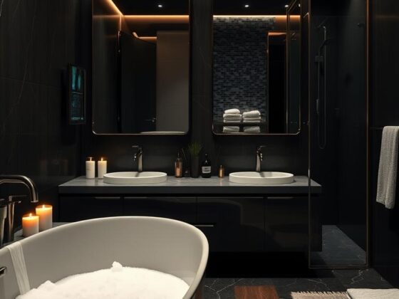
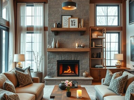
Ever wondered why some kitchens feel like sunlight and soil at once? I ask that because I’ve designed dozens of rooms where white cabinets and wood floors act like a team—light meets warmth—and the result is calm, bright, and very livable.
White surfaces bounce daylight deeper into corners, opening small rooms and giving large spaces a crisp backdrop. The wood adds texture underfoot and a cozy counterpoint so the space never feels sterile.
I guide homeowners through simple choices—paint, hardware, and a runner—that refresh a room without a full remodel. This pairing fits many styles from modern farmhouse to clean Scandinavian, and it helps resale value while supporting daily comfort.
Key Takeaways
- Light + texture: white surfaces expand space; wood brings grounding warmth.
- You can refresh the look with small updates—no full replace needed.
- This aesthetic adapts across styles and room sizes.
- Choosing the right wood tone depends on natural light and flow.
- It’s a practical, timeless design that appeals to homeowners and buyers.
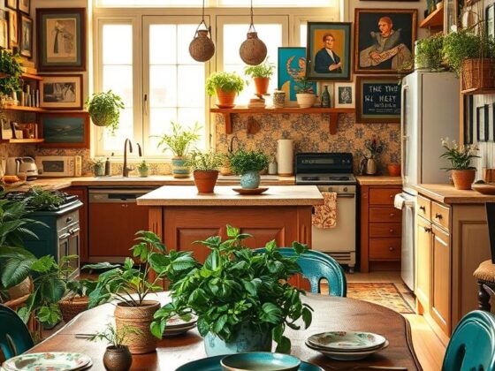
Why White Cabinets and Wood Floors Work Together
Clean cabinet faces bounce daylight while a natural wood base keeps the space welcoming and grounded. I’ve seen tiny galley rooms feel larger and family kitchens soften simply by pairing bright cabinetry with honest planks underfoot.
Light meets warmth: a timeless pairing
White cabinets reflect available light, which opens corners and brightens tasks. Meanwhile, wood floors bring a tactile warmth that stops the room from feeling clinical.
The contrast between crisp cabinet planes and organic grain keeps the eye moving. That balance lets you try a bold backsplash or veined quartz without the space feeling busy.
How wood texture prevents a sterile look
Grain and subtle knots add texture and shadow. Even in minimal designs, that tactile layer makes a kitchen feel lived-in.
“Natural materials help people relax—wood nudges us toward comfort.”
Pro tip: match cabinet undertone to your wood undertone. When in doubt, lay sample boards side by side and let the light decide.
White Kitchen Wooden Floor: Key Benefits Homeowners Love
Pairing crisp cabinets with warm planks creates a base that both looks fresh and grows with your taste. I’ve seen this combo rescue small layouts and steady large open plans. It’s simple and dependable.

Feels open and airy in any size kitchen
In tight kitchens, bright uppers visually expand the space while wood adds contrast to define edges. That prevents a flat, lifeless look.
In larger rooms, consistent floors tie zones together. The white uppers bounce light so the cooking area reads airy and organized.
Versatile foundation for evolving styles
This pairing buys you flexibility. Change wall paint, swap hardware, or add rugs and the whole look shifts without a remodel.
- Floors can be refinished and cabinets repainted—easy long-term upkeep.
- The balance of brightness and warmth supports daily family life and resale appeal.
- It adapts from Scandinavian to farmhouse or coastal with small decor swaps.
“A calm, bright base makes decorating easier and keeps your investment current.”
Choosing Light, Medium, or Dark Wood Floors for a White Kitchen
Floor color sets the stage—soft and airy or bold and dramatic—so pick with the light in mind.

Light wood options like maple or white oak brighten and visually enlarge small spaces. They suit Scandinavian and modern styles and keep sightlines clean.
Medium tones: balanced comfort
Natural oak and hickory give a relaxed, lived-in feel without dimming the room. They hide wear well and pair easily with many cabinet colors.
Dark choices for drama
Dark wood and dark wood floors—think walnut or deep coffee tones—create striking contrast with pale cabinets. They read elegant but need ample natural or layered lighting.
| Tone | Species | Best for | Notes |
|---|---|---|---|
| Light | Maple, White Oak | Small, Scandinavian | Brightens; subtle grain; modern look |
| Medium | Natural Oak, Hickory | Everyday comfort | Balanced; versatile; hides wear |
| Dark | Walnut, Coffee tones | Bold contrast | Elegant; needs good light; dramatic |
- Match plank direction to room length to elongate the space.
- Grain and sheen change the mood—subtle grain reads modern; visible grain feels rustic.
- Always test samples in daylight and under LEDs before choosing a final stain.
“If you want airy, go light; if you want drama, choose dark—just let your light guide you.”
Selecting the Right White for Your Kitchen Cabinets
A picking plan makes choosing paint less scary. I start by looking at light and undertones in the room.
Warm, cool, and pure whites behave differently next to planks and countertops. Warm whites pair with golden and red-toned wood. Cool whites suit gray or cool-toned pieces. Pure whites read modern and crisp.
Warm, cool, and pure whites: pairing with wood undertones
I begin with undertones. Warm whites love honeyed oak and brass accents. Cooler whites harmonize with gray-washed materials and stainless steel. Pure whites give a gallery-like, sleek look.

Test with samples under natural and artificial light
Bring home swatches and sample doors. View them beside your chosen floors in morning, afternoon, and evening. LEDs matter—2700K feels warm; 3000–3500K is neutral.
- Match swatches to planks and counters before you commit.
- Note how metals and stone shift perceived tone.
- Record paint codes, sheen, and the date for future touch-ups.
| White Type | Best Pairing | Effect |
|---|---|---|
| Warm White | Golden oak, brass | Cozy, inviting |
| Cool White | Gray-washed wood, steel | Clean, modern |
| Pure White | Minimal counters, bold backsplashes | Sleek, gallery-like |
“Always test paint with your planks under the room’s actual light—samples save big regrets.”
In short: start with undertones, test in real light, and keep notes. That’s the best way to be confident in choosing right.
Wall Colors That Complement White Cabinets and Wood Floors
Walls set the mood—choose a hue that complements cabinets and the grain underfoot. The right paint ties cabinets, floors, and light into a calm, cohesive space.

Soft gray, pale blue, warm beige, and muted green
I reach for soft grays when I want a modern edge. They feel clean without competing with countertops.
Pale blue gives an airy freshness—great for coastal or airy schemes. Pale green brings a nature-driven calm. Warm beige warms the room and pairs beautifully with golden planks.
- I reach for soft grays to modernize, pale blues to freshen, warm beiges to cozy, and muted greens to bring the outdoors in.
- These colors respect your cabinets while echoing tones in the floor—pull the quietest color from your wood grain as a guide.
- If your kitchen is compact or under-lit, keep walls lighter to protect that open, airy space you love.
- Darker walls work in large, sun-filled kitchens—but layer lighting and reflective surfaces to keep brightness balanced.
When to avoid dark wall colors
Dark paint can be dramatic. But in small or dim rooms it shrinks the space and hides detail.
“Test swatches vertically near counters and corners—colors deepen where light is low.”
Countertops and Backsplashes That Tie It All Together
The right counter and backsplash make cabinets and planks feel intentional. I focus on surfaces that support daily life and lift the room’s mood.

Strong surface options I recommend
White quartz is my go-to for a clean, low-maintenance canvas that pairs with wood and pale cabinetry.
Light granite adds gentle movement—pick a quiet pattern so the grain underfoot remains the star.
Butcher block brings warmth; seal it near sinks and dishwashers to protect it.
Marble reads timeless and elegant. If you cook a lot, consider honed finishes or a durable quartz match.
Reflective, understated backsplash ideas
Lean reflective and refined. Subway tile, zellige, or a full-slab splash in the same stone as your counter will boost brightness and simplify the look.
| Option | Advantage | Care tip |
|---|---|---|
| White quartz | Low maintenance; cohesive | Wipe spills; avoid harsh pads |
| Light granite | Subtle pattern; hides wear | Seal annually; test full slabs |
| Butcher block | Warm, tactile | Oil & seal; protect near water |
| Marble / slab splash | Elegant; reflective | Use honed finish or durable quartz |
- Continue counter material up the wall in small kitchens to bounce light.
- Use neutral grout a step lighter than tile to keep the eye moving.
- Bring full-size samples—scale matters next to wide-plank floors.
“Function and finish should work together—choose surfaces that serve your life and lift the design.”
Hardware, Lighting, and Decor That Add Depth and Warmth
Swapping hardware and updating lighting are cheap, high-impact moves that change how a space feels.
I use these tweaks to add depth and cozy warmth without changing layout or counters. They let natural light do more work and help your surfaces read intentional.

Contrasts and metal choices
Matte black hardware sharpens lines on pale cabinets. It creates a clear contrast and keeps the eye moving across the room.
Brass—aged or brushed—adds instant warmth and pairs beautifully with medium oak tones. I aim to repeat one finish three times: pulls, a light, and the faucet.
Lighting, runners, and greenery
Layer your light: ambient ceiling fixtures, under-cabinet task strips, and pendants over the island. Choose warm bulbs (2700–3000K) so evenings feel inviting.
- A washable runner softens hard surfaces and hides crumbs.
- Houseplants and window herbs bring life and soften straight cabinet lines.
- Use dimmers to shift mood from bright prep to candlelit dinner.
“Small finishes and thoughtful light make a kitchen feel curated, not crowded.”
| Element | Benefit | Practical Tip | When to Use |
|---|---|---|---|
| Matte black pulls | Modern contrast | Pair with black pendants | Pale cabinets with light floors |
| Brass finishes | Added warmth | Repeat 3x for cohesion | Medium oak or warm tones |
| Layered lighting | Flexible brightness | Mix ambient, task, accent | Any kitchen lacking natural light |
Scandinavian Simplicity: White Cabinets with Pale Oak Floors
Minimal lines and pale oak underfoot make small spaces feel open and quietly joyful. I aim for a calm, functional design that supports daily life and still looks composed when guests arrive.

Clean lines, uncluttered surfaces, and light layering
Flat-panel doors and pale oak keep sightlines uninterrupted. That makes the room read larger and lets simple accents sing.
I layer lightly—a linen shade, a wool runner, a ceramic vase—for human texture without clutter. Hardware either hides or whispers to keep rhythm steady.
Eco-friendly materials and natural textures
Choose low-VOC paints, FSC-certified oak, and energy-wise LEDs to honor Scandinavian values. Integrated appliances and panel-ready fronts preserve continuity across runs of cabinets.
- I keep palettes tight: soft whites, sand, stone, and a hint of sage.
- Blonde wood amplifies available light so cloudy mornings feel bright.
- Open shelving works when curated—white, wood, and glass only.
| Element | Benefit | When to use |
|---|---|---|
| Pale oak planks | Brightens the space; subtle grain | Small or north-facing rooms |
| Flat-panel cabinets | Uncluttered sightlines; modern calm | Minimal or Scandinavian schemes |
| Low-VOC finishes | Healthier air; sustainable choice | Any remodel prioritizing wellness |
When you want a peaceful, usable kitchen, this approach delivers. It balances light, material honesty, and just enough warmth to feel inviting.
Scandinavian kitchen ideas offer more inspiration if you want to dig deeper.
Modern Farmhouse with White Shaker Cabinets and Wood Tones
A modern farmhouse look pairs clean Shaker profiles with warm planks for a timeless, lived-in feel. I favor simple lines so the room reads calm and useful—perfect for mornings and slow dinners.

Classic profiles and inviting medium floors
Shaker cabinets give structure without fuss. Medium boards—think oak or hickory—add balanced tones that hide wear and keep the space family-friendly.
Rustic accents that feel authentic
Small, honest details make the style sing. Black or oil-rubbed bronze hardware lends history. A farmhouse sink plus open wood shelving shows off pottery and everyday tools.
- I like drawers on the island—practical for a working kitchen.
- Natural wood shelves and woven baskets add texture and comfort.
- One or two vintage finds go further than a full theme—balance is key.
“Aim for a kitchen that feels like Sunday—relaxed, functional, and made for gathering.”
Coastal Calm: Breezy Whites and Natural Wood Finishes
A coastal scheme should feel like a breath of sea air—light, relaxed, and quietly layered. I aim for materials that age well and read comfortable, not contrived.

Soft hues, linen textures, rattan details
I stick to breezy whites with pale wood and hints of sky—linen drapes, rattan stools, and soft blue accents set the mood. These choices add tactile warmth while keeping the space open.
White oak floors give a sun-kissed look that pairs well with polished nickel or soft brass. Choose easy-clean fabrics and slipcovers so sand and spills don’t stress you out.
Nautical-inspired accents without visual clutter
Keep maritime touches subtle: rope-wrapped pendants, driftwood art, or striped tea towels—never a theme park. Natural light is the star; trim treatments and reflective backsplashes keep the room buoyant.
- Use shiplap ceilings or a beadboard island for character without crowding sightlines.
- Mix woven textures—seagrass runners, wicker baskets—for depth and rhythm.
- Restrained palette: white, sand, sea glass, and a touch of navy for punctuation.
“The feel you’re after? A deep breath—relaxed, open, and effortlessly inviting.”
Statement Moves: Two-Toned Cabinets and a Wood Island
Two-tone cabinetry is a smart visual trick that makes a room feel both airy and layered.
I like to lift the eye with white kitchen cabinets above and warm lowers below. That combo adds instant depth without heaviness. Match the lowers to the floors family for cohesion, but vary the stain slightly so it reads natural.
White uppers with light wood lowers for depth
White uppers keep sightlines open. Wood lowers ground the space and add texture.
Repeat the island tone in a stool or shelf to create a soft echo. Matte black or warm brass hardware sharpens edges and creates crisp contrast.
Designing a standout island with coordinated finishes
A statement island in walnut or white oak anchors daily life. Build in drawers, trash pullouts, and seating—this is the kitchen’s engine.
Keep counters calm if the island grain is strong. Consider a waterfall edge to balance warmth with a sleek gesture. Pendants should highlight form without crowding sightlines.
| Element | Benefit | Tip |
|---|---|---|
| Two-toned cabinets | Adds visual depth | Match to floors family; vary stain |
| Statement island | Anchors social flow | Include storage and seating |
| Hardware & lighting | Define contrast and focus | Use matte black or warm brass; layer pendants |
“A well-chosen island reads custom—layered, personal, and still bright.”
Small Kitchens and Open-Plan Spaces: Make Light Work for You
Compact kitchens can feel roomy if you let light and simple lines lead the plan. I rely on a few steady moves that boost feel and flow without ripping anything out.
Space-enhancing tips for compact layouts
Space-enhancing tips for compact kitchens
Keep floors and counters light and clutter-free. Reflective backsplashes help bounce daylight into corners and make the room read larger.
Swap a pair of uppers for open shelving to widen sightlines. Keep displays tight—only items you use or love stay out.
- Under-cabinet lighting removes shadows and brightens prep zones.
- Streamlined hardware reduces visual noise and makes the whole space calmer.
- Use glass or light-filtering shades to borrow natural light from adjacent rooms.
Open-plan flow: wide-plank oak and multifunctional islands
In open plans, choose wide-plank oak to calm joints and create a unified path between zones. Wide planks read generous and keep visual seams to a minimum.
A multifunctional island — storage, seating, and prep — becomes the room’s anchor and traffic controller. Align the flooring with the longest sightline to elongate the view.
| Challenge | Quick fix | Why it works |
|---|---|---|
| Tight work triangle | Declutter counters; add under-cabinet lights | Clears sightlines and improves task visibility |
| Choppy flooring | Choose wide-plank light wood floors | Unifies open spaces and reads larger |
| Visual clutter | Limit metal finishes; edit often | Reduces eye travel and keeps the room calm |
“Small kitchens shine when every object earns its place.”
Care, Durability, and Long-Term Flexibility
Short, smart habits protect your investment and keep surfaces working hard for your family. I coach clients to keep upkeep simple so the room ages well and stays useful.
Easy cabinet upkeep and floor-friendly habits
Clean spills promptly with warm water and mild dish soap. Avoid bleach, harsh cleaners, or abrasive pads.
Dry surfaces after cleaning to stop water spots. Wipe handles and corners weekly—oils collect there fast.
For hardwood floors, use felt pads under chairs, rugs at entries, and regular sweeping to protect finish and grain.
Updating looks with paint, hardware, and decor over time
Your core pair—bright cabinets and honest wood—lasts for years. When you want a change, start small: paint, new pulls, updated pendants, and textiles give a big lift.
- Dark vs light floors clean the same; they just show debris differently—match choices to pets and traffic.
- Refinish hardwood when needed and touch up or repaint cabinets rather than replace them.
- Pick durable, low-VOC finishes and consider matte or satin sheens to hide scuffs.
“A simple maintenance calendar keeps small habits from turning into big projects.”
If you want practical tips on hardwood floors care, I recommend starting there—choosing right today saves headaches tomorrow and keeps your home flexible for future design shifts.
Conclusion
Start small: pair a cabinet door and a plank sample in your own light and trust what you see. That one simple test makes the rest of your choices clear.
strong, this classic pairing gives a flexible backbone for any home. Pick light, medium, or dark wood based on natural light and the mood you want to live with.
Keep the palette edited, layer lighting, and favor honest textures—linen, stone, and a touch of greenery. Swap hardware, pendants, paint, or runners before you touch big investments.
I’ve watched this look raise spirits and resale. Live in it. Let small scuffs tell your story. When you’re ready, start with a sample and a door under your own lights.