Homiscape.com
  • Homepage
  • Ideas by Room
    • Bathroom
    • Bedroom
    • Home Office
    • Kitchen
    • Living Room
    • Outdoor
Categories
  • Bedroom
  • General
0
0
Homiscape.com
Subscribe
Homiscape.com
  • Homepage
  • Ideas by Room
    • Bathroom
    • Bedroom
    • Home Office
    • Kitchen
    • Living Room
    • Outdoor
Two Tone Walls
  • General

How to Use Two Tone Walls to Elevate Your Space

  • January 6, 2026
  • Jade Hunt

Total
0
Shares
0
0
0

Want a simple trick that adds instant architecture to any room? I ask that question because a clean split of color can change how you see a space—making ceilings feel taller or a nook feel cozy with almost no fuss.

I’ve watched the humble two-tone wall go from a may-be to a must-try in clients’ homes. With just two swaths of paint and a crisp line, you get instant contrast and a more intentional look.

My approach blends color psychology and practical tips. Place the lighter shade on top to lift a ceiling or pick a darker lower half to hide radiators and wear. Use doors, mantels, or picture molding as anchors so the result feels bespoke, not DIY.

By the end of this guide, you’ll have clear, actionable tips and ideas to map a two-tone wall in your home that fits your style and budget.

Key Takeaways

  • Two-color paint creates instant architectural interest and guides the eye.
  • Placing the lighter color on top can make a ceiling feel higher.
  • Align the paint line with existing features for a polished result.
  • Keep one existing wall color to save time and money when possible.
  • Mix complementary or monochromatic shades depending on the mood you want.

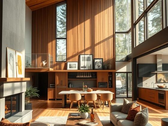
What Two-Tone Walls Are and Why They Work in Modern Rooms

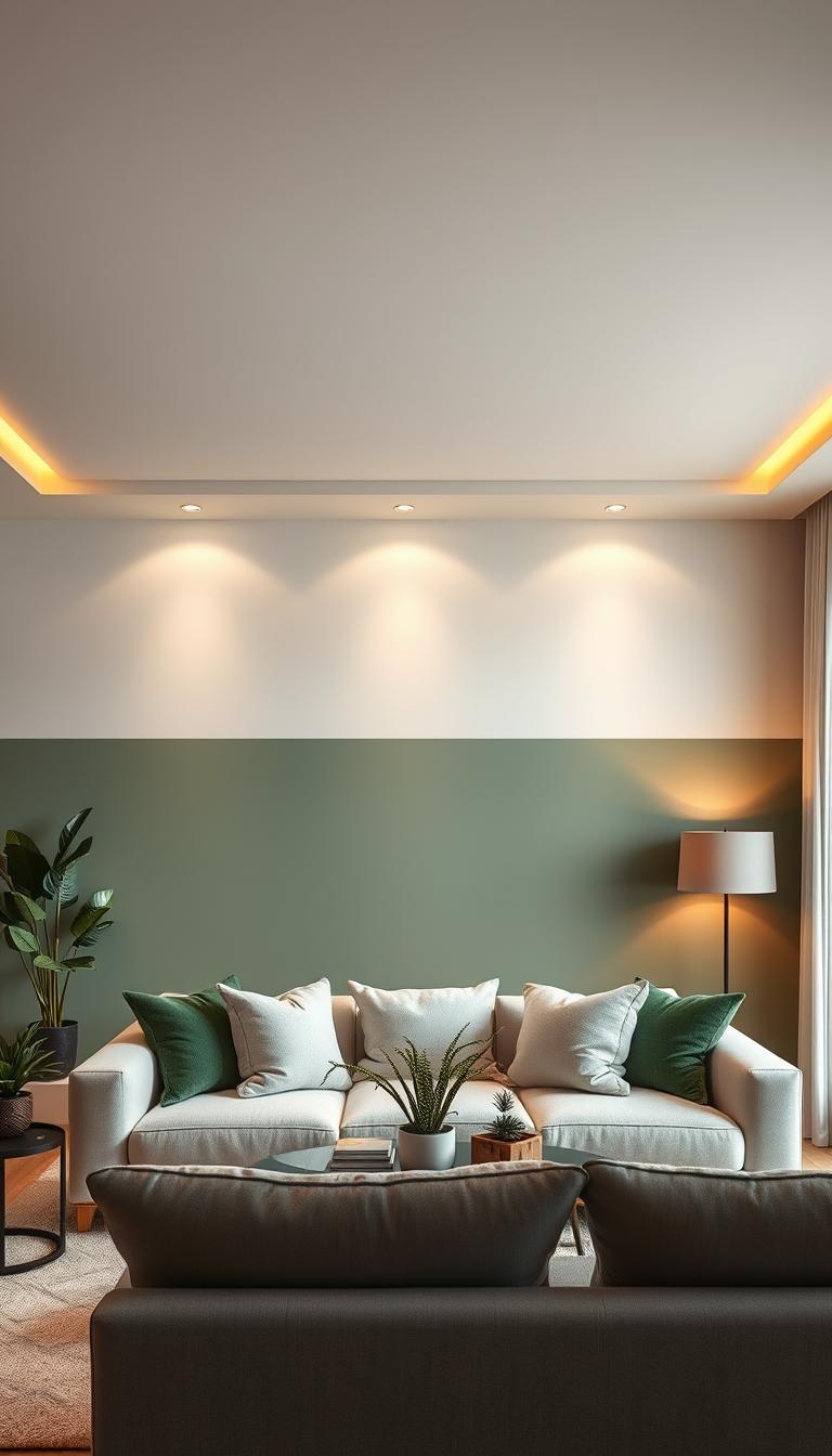
With one crisp line, color can redefine a room’s proportions and mood. Painting two colors on a single wall creates instant contrast and architectural interest with almost no fuss.

I use this trick to add depth and the illusion of a higher ceiling. Placing a lighter color on the top half draws the eye up and makes small areas feel larger.

Benefits that matter

  • Immediate contrast: A clear split anchors furniture and gives the space a focal point.
  • Added dimension: The painted line sculpts depth without trim or carpentry.
  • Illusion of height: Light shades on top lift the ceiling and make an area feel airier.

Where this works best

Use it in living rooms, bedrooms, dining areas, entryways, and anywhere you want to define an area without adding furniture.

Vary the height of the paint line—lower third, mid, or near the top—to change mood. Measure from the ceiling, use a level and painter’s tape for crisp lines, and align the break with door frames, mantels, or picture molding for a custom look.

Planning Your Two Tone Walls

Map the views between rooms before you touch a brush—those sightlines decide a lot. I start by walking the home in morning and evening light to see how color and shadow shift. This tells me where a two-tone wall will actually help the space instead of fighting it.

Think as a whole: consider how a painted line reads from the kitchen into the living room, or down a hall. A consistent set of colors ties rooms together and avoids a patchwork feel.

A modern interior space featuring two-tone walls, with the lower half painted a warm, muted beige and the upper half in a refreshing light blue. In the foreground, a stylish, contemporary sofa and a coffee table adorned with houseplants and books, creating a cozy yet sophisticated atmosphere. The middle ground includes a window allowing natural sunlight to flood the room, casting gentle shadows. The background showcases an accent wall with framed artwork that complements the color scheme, adding interest without being overwhelming. The shot is taken from a slightly elevated angle, enhancing the room’s depth and inviting feel. The lighting is soft and warm, evoking a tranquil, uplifting mood perfect for an engaging design article.

Use architectural lines

Doors, windows, mantels, chair rails, and picture molding make excellent guides. Aligning the paint break with these features keeps proportions natural.

Horizontal vs vertical breaks

Horizontal cuts can lift a ceiling or elongate a room—place the lighter shade on top to open the volume. Vertical breaks work when you want to define zones in an open plan or create a cozy corner.

  • Test heights with painter’s tape and view from several sightlines.
  • Follow time-tested proportions: picture rails 30–50 cm from the ceiling; panel heights around one-fifth of the wall.
  • If a door or window interrupts the plan, nudge the line slightly above or below for a considered look.

Choosing the Right Two Colors for a Beautiful, Functional Room

The colors you choose set the mood — calm, dramatic, or cozy — before you even add furniture. Start by naming the feeling you want and let that guide the palette.

A beautifully styled room featuring two-tone walls, with the lower half painted a soothing pale blue and the upper half a warm, soft beige. In the foreground, a minimalist wooden coffee table is adorned with fresh green plants, adding a touch of vibrancy. The middle section showcases a comfortable, modern sofa in neutral tones, accented with elegant cushions that reflect the wall colors. The background reveals a large window allowing natural light to flood the space, creating a warm and inviting atmosphere. The scene is captured from a slightly elevated angle, emphasizing the contrasting colors of the walls and the overall harmony of the room. The mood is serene and stylish, perfect for inspiring readers on creating beautiful, functional spaces.

Neutral pairs for subtle harmony

Gray with beige, white with soft pink, or taupe with charcoal make an elegant wall color combo. Neutrals work with natural textures and layered lighting to keep a room feeling restful.

Monochromatic “ton sur ton”

Stay in one family — a misty blue up top with a dark blue below reads polished. I often vary sheen (matte above, satin below) to add texture without adding another color.

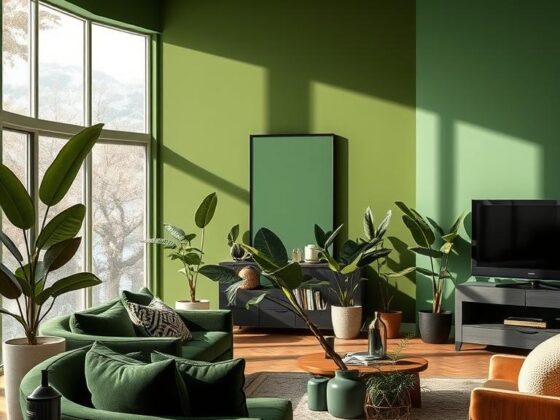
Bold and complementary combinations

Want energy? Pair a saturated lower part with a light neutral on the top half. Cactus green with terracotta or pale gray with deep charcoal creates a fresh color-on-color look.

“Repeat a hue elsewhere — pillows, art, a rug — so the paint feels intentional, not accidental.”

For curated examples and styled color pairings, see styled color pairings.

Deciding the Paint Line Height and Direction for Maximum Impact

Set the paint break with intent — the wrong height can confuse a room’s proportions. I start by picturing furniture and where the eye rests. That helps pick a height that feels natural in the home.

A beautifully designed interior space featuring two-tone walls, showcasing a clear paint line height at mid-wall. In the foreground, a well-painted wall displays a soft, warm beige on the upper portion, transitioning to a rich, deep charcoal below the cleanly defined paint line. The middle scene captures elegant furniture, such as a modern sofa and a stylish coffee table, positioned thoughtfully to highlight the contrasting wall colors. In the background, large windows let in natural light, illuminating the room with a gentle glow. The angle is from a slightly elevated perspective, enhancing the visual impact of the height difference in the paint. The overall mood is sophisticated and inviting, ideal for a contemporary living space. The image should be photorealistic and high definition.

Guidelines and illusions

Rule of thumb: about 120 cm / 47 inches from the floor works in many American interiors. It lands between baseboards and typical artwork heights.

Picture rails often sit 12–20 inches below the ceiling. Paneling runs about 61 cm or one-fifth of the wall. Use these features to anchor the line.

  • The lower third reads classic and grounded; true halves feel bold and modern.
  • For tall ceilings, a darker top part pulls the ceiling down; for standard heights, lighter on top lifts the space.
  • Avoid aligning the line with a window or door head — shift at least 12 inches above or below.

“Mark, measure, and then measure again; a level and crisp tape line make or break the illusion.”

Situation Suggested Height Effect
Standard room 47 inches / 120 cm Balanced, works with furniture and art
Tall ceiling Higher than 47 inches; darker top Makes space feel cozier
Narrow hall Lower half or horizontal low third Wider visual feel
Reading nook / vertical split Vertical line aligned with door or shelf Defines a cozy zone

Step-by-Step: How to Paint a Two-Tone Wall with Crisp Lines

Start by measuring from the ceiling down so your painted split looks intentional from every doorway. I mark small pencil ticks at even intervals, then use a level to link them. Measure in inches or centimeters—consistency matters more than the exact height.

Prep and measure

  1. Make pencil marks from the ceiling at set intervals and snap a chalk line between them.
  2. Apply the lighter paint first. Extend it a hair past the chalk line to seal the edge.
  3. Burnish painter’s tape along the chalk line; on textured walls press the tape firmly to prevent bleed.
  4. Cut in along the tape with an angled brush, then roll the second color for an even finish.
  5. Remove tape while the paint is still wet. That one move gives you a razor-sharp edge.

A bright, airy room showcasing a beautifully painted two-tone wall, with sharp, crisp lines separating the colors. In the foreground, a professional wearing a paint apron and modest casual attire stands with a paint roller in one hand, examining the newly painted surface. The middle ground features a clear view of the wall, where one side is a soft pastel blue and the other a warm creamy beige, harmoniously blending together at a perfectly straight line. The background is a tastefully decorated living space with modern furniture, bathed in natural sunlight streaming through large windows, casting gentle shadows. The lighting is soft yet vibrant, enhancing the colors on the wall, while the overall mood is uplifting and inviting, perfect for illustrating the process of creating a two-tone wall.

Pro finishes and final tips

I pick matte or eggshell up top to soften glare and satin below for durability. If the floor slopes, measure from the ceiling so the line reads level. Step back in natural and artificial light to spot tiny touch-ups.

Step Tool Effect
Measure & chalk Tape measure, level, chalk True, level line across the wall
Paint lighter first Brush, roller Seals base and prevents gaps
Tape & cut in Painter’s tape, angled brush Sharp edge with no bleed
Remove tape wet Hands Clean, razor edge

For a step-by-step photo guide and extra tips, see my recommended tutorial at how to paint straight lines.

Room-by-Room Ideas to Make Spaces Feel Larger or More Intimate

A smart color split can make a small area breathe or a tall room feel cozy.

I use simple paint moves to define areas, guide the eye, and change scale. Below are quick, practical ideas you can test with tape and a sample can.

A stylish contemporary interior showcasing two-tone walls that create an illusion of space. In the foreground, a living room featuring soft beige on the lower half and a calming sky blue on the upper half of the walls. A sleek, modern sofa in muted gray, decorated with vibrant throw pillows, adds comfort. In the middle ground, a polished wooden coffee table and a plush area rug enhance the cozy atmosphere. The background should include large windows that let in warm, natural light, casting gentle shadows and illuminating the textures of the walls. The room is tastefully adorned with indoor plants and minimalist artwork. Capture this scene with a wide-angle lens for a spacious feel, emphasizing a bright and inviting mood. The image should be photorealistic and high definition, with no text or watermarks.

Living and dining

Vertically split a wall to carve a reading nook or anchor a media area. Echo the lower color on furniture to pull the area together.

In tall dining rooms, a deeper top and lighter bottom makes nights feel intimate. Try deep green above and a soft neutral below for that candlelit mood.

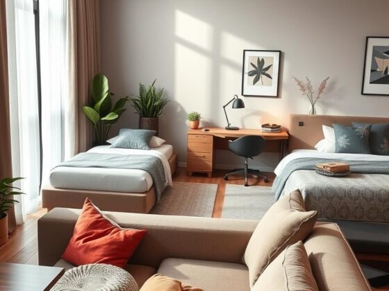
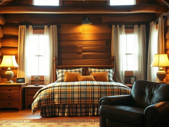
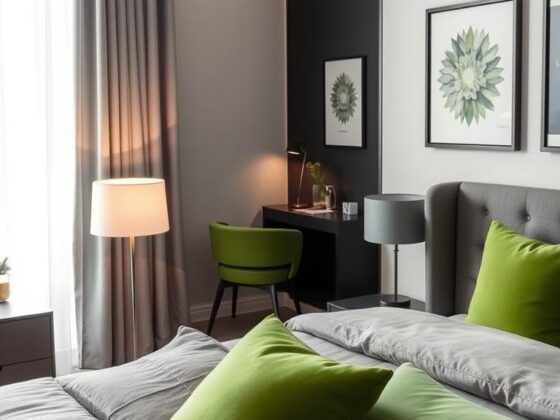
Bedrooms and kids’ rooms

Set the line at or just above headboard height for a built-in halo effect. Calm neutrals up top soothe the eye; richer shades below ground the bed.

For kids, use a scuff-friendly dark blue or green on the bottom and a lighter shade above to keep the room bright and durable.

Halls and entryways

Horizontal divides widen narrow passages; lighter paint on top helps the ceiling feel higher and the corridor feel larger. Align the break with shelves or trim so the look reads intentional.

Area Suggested height Effect
Living / open plan Vertical split or 47 in lower half Defines zones without walls
Bedroom Headboard height or 47 in Creates a cozy bed focus
Hall / entry Lower third Wider, taller illusion
Dining Higher darker top Intimate, candlelit feel

Want more ways to make a space feel larger? See practical tips to make your room feel bigger.

Conclusion

A well-placed paint line turns a plain wall into purposeful design in minutes, adding depth and clear focus to any room.

Start with intention: decide where you want the eye to rest and choose a color scheme that helps that happen. Use a level and tape like precision tools—clean prep is everything for a crisp finish.

Keep it budget-friendly by reusing an existing shade where it works and adding one new paint to change the mood. I often ask clients to test a strip, watch how it reads through the day, then tweak until it feels right.

Small moves can make a big difference in your home. Try a measured approach, and you’ll be rewarded with balance, dimension, and a design that feels truly yours. strong,

FAQ

What exactly is a two-tone wall and why does it work in modern rooms?

A two-color wall uses a horizontal or vertical break to combine a lighter and a darker paint. It creates instant contrast and visual depth, helping a room feel taller or more intimate depending on placement. I often use a lighter shade on top to bounce light and a richer hue below to anchor furniture—simple, effective, and surprisingly transformative.

Where in the home should I try this technique?

Try it in living rooms, bedrooms, dining rooms, entryways, and tight corridors. It’s great for defining open-plan zones, making hallways feel wider, or creating a cozy nook in a large room. I’ve recommended this to clients who want big impact with minimal furniture changes.

How do I plan the line height so it flatters my room?

Think about sightlines, ceiling height, and furniture. Halves feel bold; a lower third (around 36–48 inches) anchors seating and wainscoting, while a top-heavy approach lifts the ceiling. I like using about 47 inches as a starting point in average rooms, then adjust for visual balance.

Which color combinations are safest for a lasting look?

Neutral pairs—gray, beige, soft white, taupe, or charcoal—are timeless. Monochromatic schemes (lighter and darker blues, for example) offer cohesion with subtle contrast. If you want energy, pick complementary bolds but keep one dominant to avoid visual fatigue.

Should I paint the lighter color or the darker color first?

Paint the lighter color first and extend it slightly past the taped line. That way, when you apply the darker shade and remove tape while paint is wet, you get a cleaner edge. This trick reduces bleed-through and gives a crisp finish every time.

What’s the best way to get a razor-sharp line?

Measure and level your guide line, snap a chalk line, and use quality painter’s tape. Paint the first color over the tape edge (seals gaps), then roll the second color against the taped line. Remove tape while the paint is still tacky for the cleanest result.

How do I choose finishes and sheen for each color?

Use a lower sheen (eggshell or matte) where you want to hide imperfections and a higher sheen (satin) for areas needing durability. I usually pick a subtly higher sheen on the lower portion to resist scuffs and a softer finish above to diffuse light.

Can two-color walls make a small room feel larger?

Yes—lighter color on top reflects light and visually raises the ceiling, while a darker base grounds the room without crowding it. Horizontal breaks near eye level can widen narrow spaces; vertical breaks can elongate them. It’s all about how we trick the eye.

Any tips for aligning the paint line with doors, windows, or trim?

Use architectural features as guides—align your break with chair rails, picture molding, window sills, or door heads when possible. If those don’t match your ideal height, choose the most visible plane in the room and make small trim touch-ups to keep the look intentional.

Is this approach kid- and pet-friendly?

Absolutely. Pick washable, low-VOC paints and place the darker, more durable finish where scuffs are likely—on the lower portion. This gives you a practical surface while keeping the room cheerful and healthy.

How do I pick colors that match my floor and furnishings?

Start with tones already in the room—wood floor undertones, fabric hues, or art. Pull a lighter and darker value from that palette for harmony. I suggest testing large swatches on different walls at various times of day to see how natural and artificial light shift the shades.

Can I use this technique on textured walls or paneling?

Yes. Smooth surfaces give the crispest lines, but with careful prep—sanding, priming, and using a high-quality tape—you can achieve a clean result on light texture or classic paneling. For heavy texture, consider a softer break or use molding to disguise uneven edges.

What tools and materials should I have on hand before starting?

Measure and level, chalk line, painter’s tape, angled brush for cutting in, rollers, drop cloths, and a good-quality primer. I always recommend test pots and a long-handled roller to speed the job and keep edges uniform.

How do I avoid repeating the same keyword too often when researching ideas?

Use a variety of related search terms—phrases about color, line height, room function, and finishes. That keeps results fresh and prevents overuse of any single phrase. In practice, I rotate descriptors like contrast, depth, and line height to stay precise.
Total
0
Shares
Share 0
Tweet 0
Pin it 0
Related Topics
  • Home Decor
  • Interior Design
  • Two Tone Walls
  • Wall Painting
Jade Hunt
Jade Hunt

Hi, I’m Jade Hunt — your friendly guide to creating a beautiful, comfortable, and functional home. At Homiscape.com, I share practical home organization tips, budget-friendly decor ideas, and minimalist lifestyle hacks to help you design a space you’ll truly love. With over 7 years of experience exploring home improvement trends and DIY projects, I believe every home has the potential to be warm, inviting, and uniquely yours. Whether you live in a small apartment or a spacious house, my goal is to inspire you to make the most of every corner. Let’s turn your living space into your dream home — one idea at a time!

Previous Article
Bed in Living Room
  • General

Bed in Living Room: Design Ideas for a Cozy Space

  • January 6, 2026
  • Jade Hunt
View Post
Next Article
Easter Wreath
  • General

Welcome Spring with a Stunning Easter Wreath Display

  • January 7, 2026
  • Jade Hunt
View Post
You May Also Like
Hayden Christensen House
View Post
  • General

Inside Hayden Christensen House: A Design Inspiration

  • Jade Hunt
  • January 26, 2026
Living Room Bedroom Combo
View Post
  • General

Creating a Harmonious Living Room Bedroom Combo

  • Jade Hunt
  • January 26, 2026
Color of the Year
View Post
  • General

Color of the Year 2026: What’s Trending in Home Design

  • Jade Hunt
  • January 25, 2026
Japanese Bedroom Decor
View Post
  • General

Japanese Bedroom Decor: Bringing Calm into Your Space

  • Jade Hunt
  • January 25, 2026
Western Style Bedroom
View Post
  • General

Western Style Bedroom Ideas for a Serene Retreat

  • Jade Hunt
  • January 24, 2026
Grey and Green Bedroom
View Post
  • General

Discover the Perfect Grey and Green Bedroom Color Scheme

  • Jade Hunt
  • January 24, 2026
Man Cave Couch
View Post
  • General

My Man Cave Couch: How to Pick the Coziest Spot

  • Jade Hunt
  • January 23, 2026
Palm Leaves Decor
View Post
  • General

Palm Leaves Decor: Bring the Tropics into Your Home Decor

  • Jade Hunt
  • January 23, 2026
Homiscape.com Homiscape.com

Input your search keywords and press Enter.