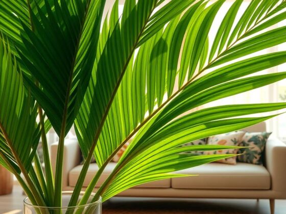
Ever wondered how a single board could flip your room’s mood in an afternoon? I ask that because I’ve watched a tiny framed sign change a kitchen from bland to inviting in under an hour.
A chalkboard is the easiest, low-effort refresh you can try at home. No repainting. No pricey decor swaps. Just simple chalk art, a few sunny accents, and you’ve got fresh vibes for your nook, porch, or office.
I’ll show short, feel-good sayings and playful doodles that give a big visual payoff in small spaces. Think entry tables, mantel corners, and kitchen shelves that suddenly feel curated—not cluttered.
Later, I’ll walk you through styling options: tall porch signs for curb appeal, medium boards for meal notes, and mini frames for shelf charm. I’ll also share quick tips on mixing fonts, adding borders, and rotating designs week by week so your boards stay lively all season.
Key Takeaways
- Chalkboards deliver a fast, budget-friendly decor refresh.
- Short quotes and simple doodles lift small spaces instantly.
- I’ll provide scaling tips for porches, kitchens, and shelves.
- Use bright accents and sun-forward imagery for energizing vibes.
- Mix fonts, borders, and rotations to keep displays fresh.
Why Summer Chalkboards Brighten Your Home and How to Use Them This Season
Short phrases paired with tiny drawings make an outsized impact on how a space feels. I use one-line sayings with a single icon to keep the look fresh and readable. This design approach feels fast, friendly, and very low-effort.
Place a board by your entry or over the kitchen counter to set a welcoming tone. Sunshine cues—rays, a small sun, or a citrus slice—create an optical glow in rooms with little natural light. That lift can bring real smiles to guests and family.
Here’s a simple system I recommend: stick to 1–2 lines of text, add one little icon, and finish with a clean border. Sketch spacing lightly in pencil first. Wipe the surface completely before you start so the art reads crisp on the first pass.
| Use | Best spot | Quick tip | Result |
|---|---|---|---|
| Welcome message | Entry table | Bold block header + tiny sun | Warm, open feel |
| Menu or party sign | Above bar cart | Short lines, one icon | Organized and festive |
| Patio note | Patio wall | Wave doodle, light border | Indoor-outdoor flow |
- Scale quotes so they read at a glance.
- Pair script with block letters for contrast.
- Make cleanup part of the routine for crisp results.
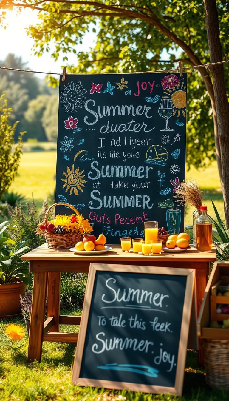
Summer Chalkboard Ideas
Start with a bold greeting in white block letters, then frame it with a cheerful sun and gentle swirls. I like this because it reads from across the room and sets a clear focal point.
Hello Summer with sun rays, leafy swirls, and playful wavy lines
Sketch a “Hello Summer” headline in the top third of the board. Add a beaming sun above with soft rays and a few wavy lines to suggest a breeze.
Bold SUMMER scripts surrounded by doodles: watermelon, flowers, and twigs
Layer leafy swirls and tiny twigs to guide the eye. Use two diagonal watermelon slices for balance and tuck petal doodles into the corners.
- Outline block letters, fill with a light chalk haze, then add a thin drop shadow for depth.
- Keep white space so the art and drawings feel intentional, not crowded.
- Finish with tiny dot clusters to unify scattered motifs for a fun chalkboard style.

Welcome Signs and Party-Ready Chalkboard Designs
A bold board can welcome guests and double as your event program. I like a clear headline that reads from the curb, plus small accents that reward a closer look.
“Welcome Summer Party” pops with hand-drawn sunflowers at the corners, big caps for WELCOME, and a flowing script for the second line. Scale sunflower heads so they read as festive, not fussy, even from the street.
Outdoor Movie Night marquee
Create decorative lettering across the top, add tiny stars and leafy borders, and leave blank lines in the lower third for showtimes or titles. Tiny dots around stars add sparkle while keeping the center clean.
“HELLO Summer” over waves
Pair a glowing setting sun with gentle blue waves and fresh green leaves. Use open margins and consistent spacing between text lines so the board reads fast and gives relaxed patio vibes.
- I’ll walk you through spacing tricks to avoid cramped info.
- Use leafy borders to frame content and keep the center readable.
- Bonus: seal the surface for high-touch events to prevent smudges and keep smiles all night.

Fruity Puns, Citrus Colors, and Mason Jar Moments
A few citrusy lines and a mason jar sketch turn a blank board into a sunny focal point. I love working in short puns because they read fast and feel friendly.
Squeeze the day works beautifully with a small mason jar of lemonade at center. Tuck two lemon wedges at opposite corners to balance the layout and keep the vibe glowing.
Squeeze the day with lemon wedges and a mason jar of lemonade
Sketch the jar in soft white, then add pale yellow highlights with chalk markers for a watery look. Keep the jar motif compact so it fits on small shelves or a narrow entry space.
Orange you glad it’s summer? framed by bright citrus slices
Create a ring of slices around your headline. Vary angles so the border feels lively—no symmetry police here.
Sweet like strawberries with cute berry doodles and playful fonts
Cluster tiny berries near the baseline and dot in leaves for texture. Use a red or pink marker for contrast against white text.
Stay zesty with lime-green outlines and bold highlight text
Two passes with markers and a dry wipe between layers keeps outlines crisp. Pair the board with a real bowl of fruit or a gingham runner for cohesive decor and cheerful vibes.

Beach and Coastal Vibes for Instant Summer Feel
I love using simple wave rhythms and clustered shells to make a room feel like a quick coastal escape. These layouts lean on gentle movement and small accents so the board stays calm and readable.
Start with a flowing band of beach waves across the midline. Add tiny seashells and a lone starfish near the base to anchor the scene. Feather the wave edges with light, horizontal strokes so the foam reads soft and natural.

Beach waves with seashells and a starfish for a serene shoreline look
Cluster shells and a starfish in a small group for depth. Use pale highlights to suggest wet sand and keep the sun minimal—a soft glow in the corner only.
Life’s a beach with sandy lines, flip-flops, and shell borders
Stack the phrase and add sandy strokes under it. Frame the text with a simple shell border so the headline feels grounded.
Surfboard patterns, palms, zigzags, and wave motifs
Sketch three surfboards at varying heights. Mix palms, zigzags, and wave motifs for a playful mini gallery.
- “Beach, please” stacks well with towel outlines and small sunglasses.
- Sprinkle tiny doodles—dots, shells, starfish—to fill corners without crowding.
- Place coastal boards near patios or windows so natural light brings the waves to life.
Sunshine, Sunglasses, and Good Vibes Only
A simple sun sketch gives a board personality in under a minute—no fuss, just glow. I swear by this when I need a fast refresh. A bold sunburst frames short sayings and keeps the message friendly and clear.
Here comes the sun with a cheerful sunburst and flowing rays.
One-minute sunburst
Draw a circle, add alternating long and short rays, then step back. That graphic backdrop makes short letters pop and creates room for tiny doodles.
Sun + shades combo
Float a beaming sun above simple sunglasses. It’s playful and reads from across the room—great for porches or an entry chalkboard.
Sunshine on my mind
Use mixed fonts: clean caps for SUNSHINE, loose script for the rest, and surround with radiating lines. Add spark dots and curl rays so the motif stays lively but not busy.

- One-minute sunburst: circle + long/short rays.
- Sun + sunglasses: bold, readable, fun.
- Color cue: high-contrast fills for sunny days glare.
I keep these layouts optimistic and unfussy so you can swap phrases often and keep the good vibes alive.
Picnics, Camping Trips, and Practical Checklist Boards
Turn your board into a tiny planning hub that doubles as decor for picnic days and camp nights. I like designs that blend charm and function so you actually use the sign, not just stare at it.
Summer Picnic Checklist
Sketch a basket at the top, tuck a watermelon slice and apples beside it, and scatter a few flowers and leaves for flair. Draw short fill-in lines under each item so family members can add menu choices or a guest name.

Camping Essentials
Use a tent icon, a row of pines, and tiny marshmallows near a flame as visual bullets. Keep the center lane clear so your text reads fast when you pack at the last minute.
- I’ll map a simple grid so your handwriting stays straight without a ruler.
- Small-space tip: keep icons tight at margins and let the center hold your list.
- Quick erase method: damp cloth for urgent changes, full wipe for new themes.
Florals and Country Charm: Sunflowers, Lemons, and Mason Jars
Start with one cheerful bloom and let your lettering sit naturally inside its petals.
I like a single sunflower as the anchor. Draw it large enough so the center sits behind a short hand-lettered word. That creates a cozy farmhouse focal point without fuss.
Hand-lettering tip: use slightly irregular caps with a soft shadow to keep the text warm and handcrafted. Place “SUMMER” snugly in the bloom so the flower seems to cradle the word.
Sunny sunflower with “SUMMER” hand-lettered for farmhouse flair
Add lemon sprigs at opposite corners to balance the board. Tuck a small mason jar near the base, then scatter tiny floral doodles to fill gaps and guide the eye.
Lemon sprigs and a mason jar to channel breezy, sunny days
Scale the sunflower for narrow frames by compressing petals slightly; for wide mantels, spread petals and add extra leaves. Finish the vignette with wicker, check linens, and a real bouquet for cohesive home decor.
| Element | Placement | Quick styling tip | Effect |
|---|---|---|---|
| Sunflower | Off-center focal point | Large center, petals cradle lettering | Farmhouse warmth |
| Lemon sprigs | Opposite corners | Bright pop, tuck leaves for lift | Fresh balance |
| Mason jar | Base or shelf edge | Small sketch, pale highlights | Breezy porch vibe |
| Small doodles | Gaps and margins | Tiny florals or dots | Flow and cohesion |
- I recommend sketching with a pencil first to check spacing and lettering alignment.
- Style this fun chalkboard beside wicker baskets and gingham for a lived-in look.
- For more patterns and step-by-step examples see my summer chalkboard art suggestions in this handy guide: summer chalkboard art suggestions.
Lettering, Borders, and Layout Tips for Polished Chalk Art
A few smart layout moves will take your chalk art from cute to confident. I keep things simple so your board reads fast and looks intentional.
Mix block letters with script, add shadows, and vary baselines
Use block letters for power words and a loose script for connectors. Add a slim shadow to lift letterforms and give depth.
Vary baselines slightly to add personality—just enough to feel handcrafted, not messy.
Frame quotes with borders: dots, stars, zigzags, rays, or wave lines
Border choices set the tone. Try dots or stars for whimsy, zigzags for energy, rays to radiate focus, and wave lines for calm.
Keep borders thin so they frame, not fence, your message.
Keep phrases short; sketch with pencil first for symmetry
Work in one-to-two-line phrases to preserve space and clarity. Sketch a light pencil grid to center headlines and keep lines straight.
Clean the surface well before you start. Tight spacing, careful tracking, and a final wipe make every new layout look crisp.

- I’ll teach you one foolproof pairing: bold block + flowing script + slim shadow.
- Choose emphasis colors sparingly so the border supports the design, not competes.
- Quick cleanup habits keep your chalkboards ready for the next fresh layout.
Tools, Chalk Markers, and Getting a Clean Slate
Choosing the right pens and prepping your surface changes how colors sing. I always start with a tiny toolkit so the process feels fun, not fussy.
Core toolkit: classic chalk for soft fills, plus bold chalk markers in orange, yellow, and lime for high-contrast accents. Add a fine-tip marker for outlines and a small caddy with cloths, cotton swabs, and a spare eraser for quick edits.

When to use markers vs. chalk
Use markers for headers, outlines, and any text that must pop. Reach for chalk when you want soft shading or a hazy fill. Let each layer dry a few minutes—this short time prevents smudges and ghosting.
Prep and clean for a crisp finish
Wipe the board completely before you draw. I test colors on a small margin first so the palette reads true on that specific surface.
- Quick prep tip: damp cloth, dry wipe, then a final buff for polish.
- Timing tip: allow brief drying between passes to avoid smears.
- Kit option: consider a patented, family-invented magnetic chalkboard kit — it swaps accents easily, includes a 60-day “Love it” guarantee, and supports the National Breast Cancer Foundation.
For ongoing care and more cleaning tricks, check the brand’s Tips & Tricks page so each new design truly begins on a clean slate.
Plan Your Summer Board Rotation for the Weeks Ahead
Plan a monthly refresh so your board tells a small, steady story across the season. I like a simple plan — it saves time and makes each update feel intentional.
Start with June: use “Here comes the sun” and draw a clean sunburst, soft rays, and a couple of clouds. That motif reads fast on busy mornings and sets sunny days on a friendly note.
June: “Here comes the sun” with simple rays and clouds
Keep the headline short. Add a tiny sunglasses cue for heatwave weeks so the sign reads summer without extra words.
July: “Sweet like strawberries” and picnic accents
Early July: swap in “Sweet like strawberries” with small berries at the baseline. Add a watermelon accent for picnic weekends—easy and playful.
Late July into August: “Life’s a beach” and rolling motifs
Close the run with “Life’s a beach.” Add rolling waves, a shell, and a hint of beach waves to suggest motion and calm.
- I’ll map updates by day and days of the week so swapping icons takes seconds.
- Keep color palette, borders, and spacing consistent for cohesive vibes across the rotation.
- Pick an easy-to-reach home for your chalkboard so refreshing becomes part of your routine.

Conclusion
Pick a single design today—finish it fast and let it set the mood for the week. I do this when time is tight: a bold headline, one small icon, and a clean border turn a blank chalkboard into instant sunshine.
Lean on markers for bright highlights and soften with chalk for gentle shading. Rotate anchors—watermelon slices, seashells, starfish, or tiny waves—so your vibe shifts without a full redo.
If life gets busy, make tiny swaps: an icon, a shadow, or one word. Five minutes can reboot the whole day and keep your space feeling playful and alive.
Have fun—this is simple art with purpose. Over a few days you’ll gain confidence, steadier hands, and a lovelier home vibe.