Can a wall color actually make your day feel calmer? I ask that because I’ve watched a subtle hue change how clients breathe, work, and sleep.
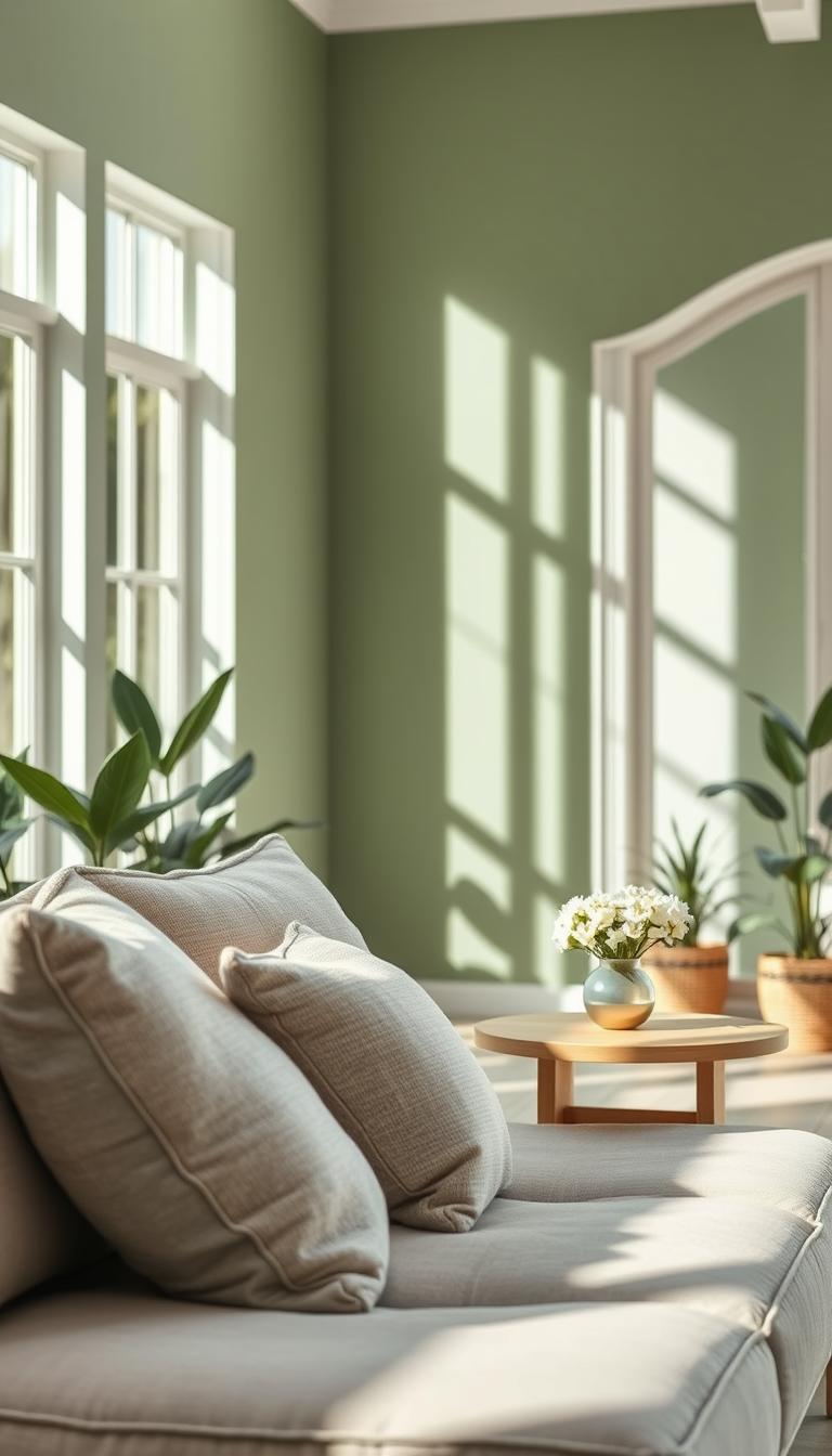
I specify sage green walls for wellness-focused makeovers because this soft, gray-tinged green quiets visual noise. It reads like nature’s whisper on your surfaces and lowers stress the moment you enter a room.
In this buyer’s guide, I’ll walk you through choosing the right paint and color companions so your home feels grounded and warm, not cold or muddy. I share real-life tips on light, room size, and finishes so the color works in daily life.
I’ll also show brand picks from Benjamin Moore and Sherwin-Williams, a practical swatching routine, and small styling moves—textiles, wood tones, and metallics—that add depth without overwhelming quiet spaces.
Key Takeaways
- Sage green walls calm busy rooms by muting visual clutter.
- Pick paint with the right undertone for your light and trim.
- Use textiles and warm woods to keep the space inviting.
- Swatch on multiple walls and view at different times of day.
- Decide DIY vs. pro based on room size and finish needs.
Why Sage Green Walls Are Trending Now for Wellness-Focused Homes
More clients are asking for muted plant-inspired hues that feel restful and lived-in at once. I hear the same request across kitchens, living rooms, bathrooms, nurseries, and even front doors.
Greens connect us to landscape cues our brains read as safe. That link makes a space feel calmer the moment you walk in.
Practical perks: this palette hides scuffs better than stark white and adapts from bedroom serenity to a lively living area by shifting depth and accents.
- Muted tones act like a neutral but keep a soft, natural look.
- One shade can flow through multiple rooms for cohesion.
- Pairs well with woods, linens, and simple metal finishes.
| Room | Preferred Depth | Why it Works |
|---|---|---|
| Bedroom | Soft, low-LRV shades | Soothes the nervous system; aids sleep |
| Living | Mid-depth tones | Inviting without high contrast |
| Kitchen/Bath | Balanced with gray backbone | Hides wear; pairs with natural materials |
How to Choose the Best Sage Green Paint for Your Space
Choosing the best muted herbal paint starts with knowing how undertones behave in your light. I always read undertones first—do you want a cool blue-gray whisper or a warmer greige note that feels earthy?

Reading undertones and LRV
Undertones change everything. A hint of blue will cool a sunlit room; a greige tilt warms a north-facing space.
| LRV Range | How it reads | Use in |
|---|---|---|
| 30–40 | Soft, herbal depth | Bedrooms, small rooms |
| 40–50 | Classic sage balance | Living rooms, kitchens |
| 50–55 | Light, airy sage | Bright south-facing spaces |
Match shade depth to room orientation and mood
For low-light rooms I pick mid-LRV paints with warmer undertones so the color won’t read flat.
In bright, south-facing rooms you can try cooler options—sunlight softens blue-gray so it stays balanced, not icy.
- Small rooms: more gray so the wall recedes.
- Large rooms: medium-depth shades to anchor floors and furnishings.
- If a sample feels off, test the next shade up or down—one step often fixes undertone surprises.
“Sample on multiple walls; light and fixed surfaces will reveal the true match.”
Quick checklist: confirm the paint colors near tile and counters, test at different times, and trust how the shade sage plays with your fabrics and wood tones.
Top Sage Green Paint Colors from Sherwin-Williams and Benjamin Moore
I keep a short list of go-to paints when clients ask for a timeless herbal tone that feels lived-in, not fussy.
Sherwin-Williams favorites cover a range from airy to moody. Contented (LRV 52) is the crowd-pleaser — airy but grounded. Soft Sage (LRV 50) gives a spa-like hush for bedrooms and nooks. Oyster Bay (LRV 44) and Austere Gray tilt cooler with blue-gray restraint for bright rooms.
For depth, Acacia Haze (LRV 32) and Evergreen Fog (LRV 30) work beautifully on cabinets or a feature wall. Create (LRV 60) is the lightest option and reads like a pale green-gray in sunlit spaces.

Benjamin Moore picks add slightly different energy. Saybrook Sage leans more green-forward if you want garden feeling. October Mist is my warm-leaning, muted choice for natural materials. Aganthus Green holds its own against bolder textiles when you need more color.
Quick rule: stay near LRVs 30–55 to dial depth without losing that subtle herbal identity. If a sample reads too blue, test a warmer neighbor; if too warm, counter with a cool gray-green.
| Brand | Sample | LRV / Best Use |
|---|---|---|
| Sherwin-Williams | Contented | 52 — airy, living rooms |
| Sherwin-Williams | Evergreen Fog | 30 — cabinets, accents |
| Benjamin Moore | October Mist | — muted warm, pairs with oak |
Undertones Decoded: Nailing the Right Sage for Your Home
Undertones are the secret mood-setters; they decide whether a hue reads calm or chalky in your space. I start every client visit by holding samples near trim, tile, and natural light. That quick test tells me the direction—cool or warm—before any cans are opened.

Cool-leaning sages with blue-gray vs. warmer earthier sages
Cool-leaning tones pull toward blue-gray. They feel clear and modern next to stainless, crisp whites, and stone.
Warmer greige tones add soft yellow-beige notes. They cozy up to oak, terracotta, and woven textures.
Avoiding “too dark green” or “too light green” outcomes
- If the paint reads like baby mint, you’ve likely gone too light or lost gray—bump the shade sage deeper or grayer.
- If the room feels heavy, you’ve drifted toward dark green—raise the LRV or pick a cooler backdrop to lift the look.
- Always sample two neighbors—one cooler, one warmer—to see how fixed finishes shift the final colors in your home.
“Undertone balance makes the whole palette exhale—from walls to textiles to art.”
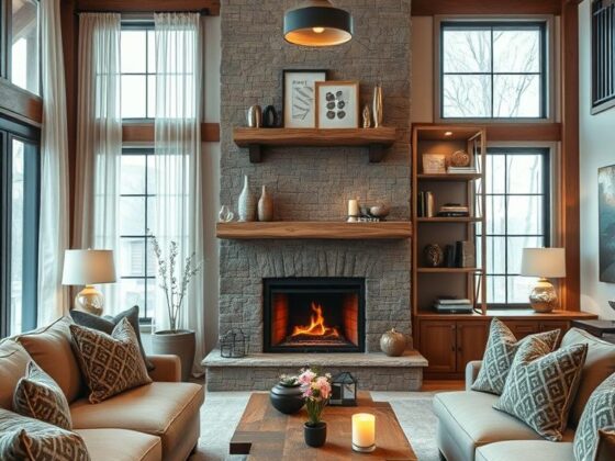
Room-by-Room Playbook: Using Sage Green Walls in Every Space
A room-by-room approach helps you use muted herbal tones where they calm, energize, or simply hold the backdrop for daily life.

Bedrooms and sleeping quarters
I favor mid-light paints and soft textiles — linen duvets, wool throws, layered rugs. That combo makes the bedroom feel held, not heavy.
Try: Benjamin Moore Tea Light on walls with a darker headboard for contrast and calm.
Living rooms and libraries
Layer two related hues: a lighter wash on walls and a deeper tone on built-ins. Farrow & Ball Lichen reads regal with warm wood and gold accents.
Tip: woven textures and mixed woods keep the space collected and inviting.
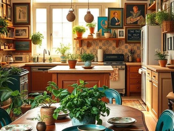
Kitchens and cabinets
Choose a version with gray undertones — think Farrow & Ball Dove Tale — to pair with oak, walnut, and stone counters.
Terracotta floors or accessories add earthy warmth so the palette never feels chilly.
Bathrooms and powder rooms
Creamy neutrals on ceilings or adjacent walls lift the room. A painted vanity or wainscot plus metallic mirrors gives instant polish.
Hallways, trim, porches and flow
Use the color to carry continuity between rooms. Paint doors or trim one shade deeper for subtle architectural emphasis.
On porches, a painted door or beadboard bridges indoors and out and boosts curb appeal when trees are bare.
“Paint choices should support how you live in each space — calm for sleep, depth for gathering, warmth for meals.”
- Quick ideas: home office — muted tones to reduce glare; dining — deeper hues for intimacy; kids’ rooms — soothing walls with playful accents.
- Keep samples on-site and view at different times of day before committing.
Sage Green Color Pairings Backed by Designers
Pairings are the quiet tools that deepen calm and add personality to a soft palette. I lean on material and small accents to shape how the hue reads in a room.

Wood and terracotta: organic warmth and texture
Oak floors, walnut shelves, or terracotta pots give the color honest warmth. Natural wood tones bring tactile depth so the room feels rooted, not staged.
Creamy neutrals and white: fresh balance without sterility
Swap stark white for soft cream to keep the palette kind to skin tones. The result is fresh and relaxed—a gentle contrast that reads lived-in.
Soft gray, dusty pink, sky blue and taupe: calm sophistication
A gray sofa or taupe rug keeps the look disciplined. Add dusty pink pillows or sky-blue accents to lift the mood without overpowering the base tones.
Dark green layering and metallic notes
Use a deeper green on cabinetry or an accent piece to add dimension. Finish with a single brass lamp or framed mirror for a warm gold glint that elevates the space.
Design tip: textiles—bouclé, linen, wool—mute sound and let the colors breathe.
Metallic Accents That Elevate Sage Green
A few well-placed metals can turn a muted palette from quiet to quietly luxurious. I’ve seen clients swap hardware and suddenly the whole room reads intentional. Metals help the paint sing without adding more color.
Gold and brass for luxe warmth
Gold and brass bring a soft, sunlit glow that feels both luxe and lived-in.
In the kitchen, brushed brass knobs and pulls against sage add instant warmth and lift cabinetry without a full reno.
In the bathroom, polished or satin gold fixtures read spa-like and calm. Repeat a warm finish two or three times—a faucet, a light, a mirror—to make the look cohesive.
Silver and stainless for cool shimmer in kitchens and baths
Want a fresher, crisper vibe? Chrome, silver, and stainless bring clean shimmer that keeps the color feeling modern.
Stainless hardware pairs especially well with appliances and helps small rooms feel brighter. Metallic mirrors amplify light and make compact spaces read larger.
- Balance is everything: repeat your chosen metal in two to three places so it reads intentional.
- Mix metals carefully—pair warm brass with black accents to ground the glow.
- Matte finishes reduce glare in restful rooms; polished finishes add glam for entertaining spaces.
- Test metals next to your paint swatch—reflective surfaces can shift perceived color.
“Small swaps—switch plates, knobs, or a mirror—often give the biggest return on style.”
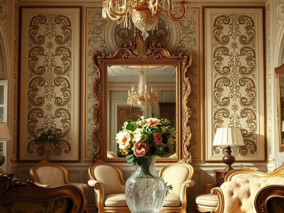
Sage Green Walls
If you’re curious about this palette, begin with one wall to see how light and life change the tone.
I often ask clients to try an alcove or fireplace surround first. Living with a single painted surface lets you test shade and sheen without committing the whole room.

- Start small: a feature wall gives real-world feedback—view at morning and evening.
- Whole-room refresh: choose a paint with a gentle gray base so the walls read sophisticated, not juvenile.
- Ceilings: keep them soft—off-white or a paler tint of the wall color avoids a harsh cut line.
- Open plans: repeat the hue at lower intensity in adjacent areas or textiles for a smooth flow.
- Flooring and texture: natural rugs (jute, sisal) plus a plush rug layer comfort and tame sound.
- Adjusting warmth: if the color reads cool, add wood and warm metals; if it reads warm, introduce gray textiles or stone accents.
- Lighting: diffused lamps flatter the paint at night so the shade doesn’t flatten to gray.
- Art and frames: pick one frame finish—black, wood, or gold—and repeat it for cohesion.
- Maintenance: choose a scrubbable finish in high-traffic areas to keep the look fresh.
“Start with one element. Live with it. Then decide if the whole room needs the same treatment.”
Interior Design Ideas: Create a Sage Green Accent Wall with Impact
A single painted plane often becomes the room’s stage—choose it where life already gathers. I tell clients to pick the spot that already earns attention, like behind a bed or a fireplace. That way the accent wall feels intentional, not accidental.
Finding the focal wall and scaling furniture and art
Pick a wall that has a reason to be seen—behind a bed, a fireplace, or a shelving unit. Scale art larger than you think; one statement piece or a compact gallery prevents the surface from feeling busy.
Contrast strategies with trim, ceilings, and doors
Use soft white or creamy trim to refine the edges. Consider painting doors one shade deeper to echo the hue and add rhythm through the space.
- Bedroom walls: paint the headboard wall to create an instant sanctuary. Layer linens in creams and stone.
- Use paint colors one or two steps lighter on adjacent walls to keep the look cohesive.
- Tie the wall to the room with repeated accents—pillows, throws, or a rug that nods to the color without matching exactly.
- If light is low, choose a slightly warmer tone; in bright corners, cooler versions read crisp.
- Renters: large sage canvases mimic an accent wall and move with you.

“Step back and squint—do your eye and breath slow? If yes, you’ve hit the balance between impact and calm.”
Cabinetry, Built-Ins, and Millwork in Sage
Painting millwork or cabinets changes a room’s mood more than you might think. I tell clients that cabinetry behaves like furniture—it can anchor a kitchen or library in a way a wall rarely does.

When to choose sage cabinets vs. sage walls
Choose painted cabinets when you want the color to read as furniture. Deeper tones like Evergreen Fog (LRV 30) excel on shaker doors and islands because they hold up visually and feel deliberate.
Choose painted walls when existing cabinets are natural wood or white. That keeps the room light while letting the architecture stay calm and warm.
Hardware finishes that complement green paint colors
Hardware is a quick, high-impact update. Warm brass or unlacquered brass adds vintage charm. Muted nickel or satin finishes feel timeless and pair well with cooler counters.
- Modern edge: matte black pulls on mid-tone cabinets.
- Small kitchens: paint lowers or the island and keep uppers lighter to avoid heaviness.
- Built-ins: go a half-step deeper than adjacent walls so shelves and objects pop.
“If you’re unsure, test a pantry or bar first—live with it before committing to the whole room.”
Finish and Sheen Guide for Sage Green Paint
Sheen decides more than shine—it shapes how a room reads and how paint performs under real light.

Matte, eggshell, satin: where each sheen shines
Matte/flat softens surface texture and hides minor flaws. It’s my pick for bedrooms and media rooms where a velvety finish supports rest.
Eggshell is my go-to for most walls. It diffuses light, cleans gently, and keeps the tone from looking shiny in daylight.
Satin raises reflectivity and durability. Use it in kitchens, baths, and kids’ spaces where you’ll wipe surfaces often.
Durability, cleanability, and how sheen affects color perception
Higher sheen makes a color read lighter and sharper under bright fixtures. That can reveal cool or blue undertones you didn’t expect.
For textured plaster or beadboard, low-luster or satin shows detail without glare. On cabinets, satin or semi-gloss balances cleanability with a refined look.
| Sheen | Best Use | Perception | Durability |
|---|---|---|---|
| Matte / Flat | Bedrooms, media rooms | Velvety, absorbs light | Low (touch-up friendly) |
| Eggshell | Living rooms, hallways | Soft, balanced | Moderate (light cleaning) |
| Satin / Semi-gloss | Kitchens, baths, cabinets | Lighter, crisper | High (wipeable) |
“Always test sheen and color together; your perfect tone in matte might feel overly lively in satin.”
Quick tip: if your walls are imperfect, favor lower sheen. And always sample the chosen sage green paint in the room at several times of day to confirm the final look.
Sampling Strategy: Swatches, Peel-and-Stick, and Large Test Boards
I start every project with moving test boards; light and fixed finishes tell the real story. Sampling is a small step that prevents big mistakes.
Work in real light. Paint colors shift from morning to evening and between north- and south-facing rooms. I ask clients to view samples at three times of day and photograph them to capture what the eye normalizes.
Testing sages in changing light across the day
Pull three to five options that share an undertone family and similar LRV. Paint large boards (at least 12×12 inches) and move them around the space.
Test behind sofas, over counters, and near windows. For exteriors or sun-drenched rooms, remember deeper options read lighter outdoors.
Comparing close shades to confirm undertones
Line up a cooler choice beside a warmer neighbor. The side-by-side contrast makes undertones obvious. Use peel-and-stick for quick reads, then paint final boards to check sheen and texture.
- Label each sample with brand and shade — benjamin moore and sherwin williams notes are helpful later.
- Photograph at consistent times for a few days to see shifts.
- If torn, live with your finalists on different walls; one may pull bluer, another warmer based on reflectance.
“Trust your notes and your first instinct — the right green paint should calm the room the moment you see it.”
Styling Sage: Fabrics, Woods, and Stone That Sing with Green
The trick isn’t just the paint; it’s the materials you place beside it—wood, stone, and textiles decide the mood. I often lean on a short palette so rooms feel calm and collected.
Pairing oak, walnut, and reclaimed woods
Oak introduces honeyed warmth that flatters muted tones and softens cooler light. Walnut brings chocolate richness and a modern edge—great for a cozy library or kitchen island.
Reclaimed wood beams or a console add patina. They make even a new-build feel storied next to painted cabinets.
Marble, soapstone, and terracotta to ground the palette
Marble veining and soapstone’s matte depth keep surfaces tactile and calm. Terracotta floors or planters are my go-to for grounding—earth meeting herb feels natural and timeless.
- Linen, cotton, and wool layer softness into decor without fuss.
- In a kitchen, pair cabinets with warm wood and stone for balance that ages well.
- If greens read cool, add leather, woven baskets, or brass; if warm, choose gray-veined stone or pewter.
- Keep patterns low-contrast and edit surfaces—fewer beautiful materials beat many competing finishes.
“A few honest materials make the palette feel intentional and calm.”
Common Mistakes to Avoid with Sage Green
Before you buy cans, know the easy traps that turn calming hues into clichés. I catch these on most projects—so I share them here to save you time and regret.
- Going too light: your walls risk reading minty or washed out. Step into a deeper shade sage or choose a stronger gray base to keep things sophisticated.
- Going too dark: the room can slip into plain green and lose that herbal calm. Check LRV and view samples in the room’s worst light before committing.
- Ignoring undertones: tile, counters, and flooring affect how a paint behaves. Always sample beside fixed finishes to avoid clashes.
- Wrong whites: pairing crisp white with cool tones can feel sterile. Try creamy off-whites for softer light and healthier skin tones.
- Skipping sheen strategy: glossy surfaces create glare; eggshell or matte usually preserves mood and hides texture better.
- Mixing too many metals or woods overwhelms the calm—pick one primary finish and one support.
- Don’t copy a photo without tailoring the choice to your light and furnishings.
- Choose scrubbable paint where hands and pets roam—maintenance matters for wellness.
- Finally, chasing the “best sage” online rarely works—pick what reads right in your space, not in someone else’s.
“Test large samples, live with them for a few days, and trust what soothes you in the room.”
Budgeting and Planning Your Painting Project
A realistic budget and clear timeline stop painting stress before the first drop cloth goes down. I start every job by mapping the space and noting repairs, doors, and trim so the true cost is visible up front.
Estimating coverage, primers, and tools
Measure square footage and plan for two coats plus primer when covering dark surfaces. Trim and doors need separate products and often more finish coats.
- Tools matter: quality roller covers, angled brushes, tape, and drop cloths affect the final result.
- Prep counts: cleaning, light sanding, caulk, and spackle make the color read true.
- High-traffic areas: in the kitchen or busy room, budget for mid- to premium lines that clean well.
When to DIY vs. hire a pro
DIY fits straightforward rooms and trim touch-ups. I recommend a pro for cabinet spraying, tall stairwells, or extensive repairs — execution can make or break the outcome.
| Project | DIY? | Why |
|---|---|---|
| Single room refresh | Yes | Lower cost, simpler prep |
| Cabinet or trim spraying | No | Requires specialized equipment |
| Full home repaint | Depends | Scale, time, and finish needs |
Build in time for sampling and keep receipts for returns—label cans so your final paint colors and finishes match up later.
Care and Maintenance: Keeping Sage Walls Looking Fresh
Tending to painted surfaces is the easiest way to protect the calm you created in a home. I tell clients that small, regular habits stop wear from stealing the look you worked for.
Daily and weekly basics: dust surfaces lightly and spot-clean with a damp microfiber cloth. Gentle care preserves color and sheen longer than aggressive scrubbing.
- In the kitchen and bathroom, wipe splashes promptly—grease and steam dull even premium paint.
- Keep touch-up paint labeled and stored; a quick dab removes scuffs and keeps a wall seamless.
- Use felt pads behind frames and headboards to prevent micro-scratches that catch light.
- Check caulk and seams once a year; tidy lines help the color read crisp and serene.
- Rotate art occasionally so light exposure evens out across the room.
Mind humidity—run fans after showers and ventilate when you burn candles. Soot or persistent moisture can haze the finish over time.
A little maintenance preserves the wellness benefits you created. Live with the space for a season, then decide if a refresh is needed. For more on picking the perfect muted hue, see my muted-sage-green guide.
Tip: refresh high-touch doors and trim more often—their crispness makes the whole palette feel intentional.
Conclusion
A single subtle tint can turn a busy space into a soft, restorative backdrop for living. I’ve seen a quick paint change settle breath and sharpen focus in bedrooms and living nooks.
Pick a shade by testing samples in your light and beside fixed finishes. Trust how a swatch reads at morning and night. For millwork or a feature wall, a soft sage or a matching tone sage green paint keeps the decor calm and cohesive.
Step back before you go dark green—stay in the restorative window. Add small warm touches—gold hardware, layered neutrals, and honest woods—to lift the tone without noise.
Ready to begin? Gather samples, try them across the day, and choose the shade that simply makes you breathe easier. I still recommend Sherwin-Williams and Benjamin Moore for reliable options that behave well in real homes.