Ever wondered whether a bold hue can make your sleep space feel warm, calm, and utterly livable?
I asked that question when I set out to craft a personal retreat in my own home. I tested deeper, earthy tones like Mylands Huguenot No.49 and brighter notes such as Red Post Hill No.68 to see how they shift mood and light.
I’ll walk you through the exact process I used—from color psychology and sample testing to layering textiles, art, and finishes so the room breathes and stays restful.
You’ll learn where a strong color works hardest—walls, furniture, or fabrics—and simple ways to balance it with neutrals. I share practical tips designers use in galleries to make art and atmosphere sing.
Key Takeaways
- Choose the right shade: earthy hues calm, brighter tones energize.
- Test samples at different heights and light times before committing.
- Introduce color via paint, textiles, or furniture depending on your floor plan.
- Layer materials and finishes to add softness without clutter.
- Use neutrals and scale to make a small space feel intimate, not cramped.
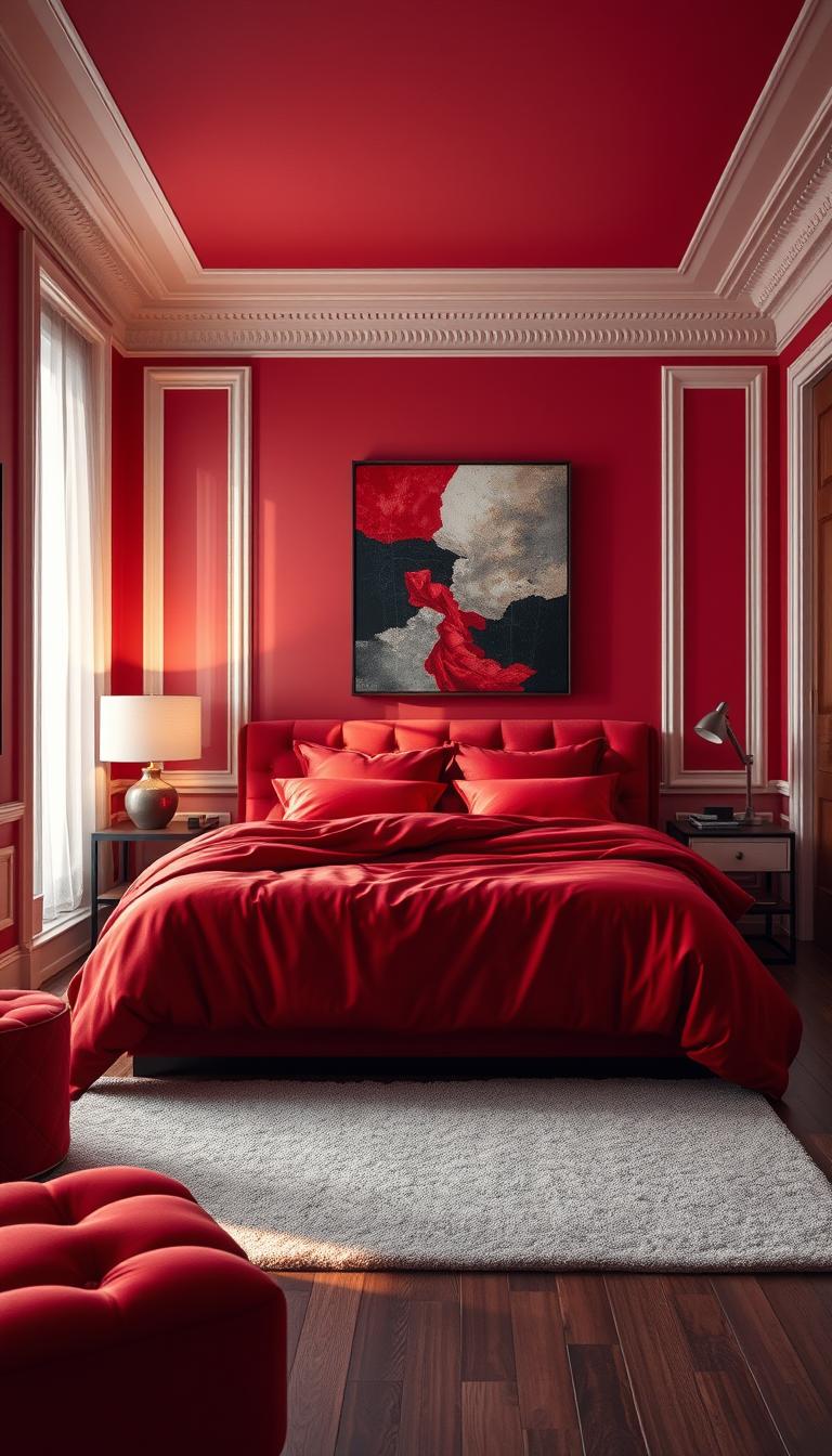
Start Here: What Makes a Red Bedroom Work Right Now
I began by mapping where the sun hits the room and which tones read warm or cool at different hours.
Deeper reds like Huguenot No.49 feel earthy and comforting, while brighter hues such as Red Post Hill No.68 bring energy and drama. Museums use warm reds to make art pop by emphasizing light, so the same idea works in a personal bedroom.
Natural light changes everything. Morning sun pulls cooler; afternoon sun warms. Match your chosen shade to that cycle so the color supports rest, not stimulation.
Color-drenching a dim room with a deep tone can create a cocooning, restorative space. In bright rooms, soften the hue and add matte finishes or linens to cut glare.
- I map the sun path before I pick paint.
- Use texture — velvet, linen, wood — to tame how tones read under lamp and daylight.
- Let red frame a focal point: headboard wall, fireplace, or reading niche.
As a rule, define the room’s purpose first. Then choose placement, finish, and proportion that support that intent. That’s how a designer approach keeps the design feeling intentional and calm.
Choose Your Shade of Red with Confidence
Choosing a shade is less about rules and more about how a color makes you feel at home. I guide clients by matching light, texture, and furniture before we pick one family of tones to explore.
Deep, earthy tones for warmth and sophistication
For grounded elegance I lean on deep, earthy options. Think Mylands Huguenot No.49—its brown and terracotta undertones feel cocooning and calm in a bedroom.
Pair these with plush textiles and warm woods to deepen the effect.
Bright, lively colors for statement-making energy
If you want a spark, try brighter hues like Red Post Hill No.68. Use them on smaller planes or as contrasts so the color reads joyful, not jarring.
Floral and rosy tones to bring the garden indoors
Floral, rosy notes—Blomster JB01 vibes—soften a room and add romance. They work beautifully as walls or textiles for a fresh, natural feel.
- Sample at scale: brush two coats on poster boards and move them through the room to watch how the hue shifts with daylight and lamps.
- Match undertones to flooring—cool gray floors pull tones cooler; warm oak makes them glow.
- Use texture to balance: velvet and mohair for depth; airy linens for breathability.
- Keep undertones consistent so adjacent tones feel harmonious.

Build a Balanced Color Scheme with Neutrals and Texture
Before you splash paint, imagine how textiles and wood will soften that statement hue.
I keep things tight: one hero color, one grounding neutral paint, and two main textures. That simple framework helps a room feel layered, not busy.
Pair reds with neutral paint, soft whites, and natural materials
Soft whites or mushroomy beiges calm a bold choice and let it tell the story. A chalky neutral creates a quiet field while velvet or linen add depth.

- I repeat the chosen hue in two to three accents—pillows, a throw, or a lamp—so it never feels isolated.
- Natural materials—oak, walnut, rattan, wool—absorb and diffuse color and make the bedroom feel tactile and restful.
- Pair a strong tone with a powdery companion like pale lilac or taupe to bridge warmth and lightness.
- Use sheen with intent: matte walls for softness, eggshell trim for a subtle lift, and low-luster metals to glow.
Keep pattern scale varied—one large, one small—so the space reads like a considered scheme rather than a flat field of color. That balance is what turns bold choices into calm, livable rooms.
Walls That Wow: Smart Ways to Use Red Paint
I often start with one confident decision: pick the wall that will do the heavy lifting. That choice makes the rest of the room easy to build around.
Accent wall strategies add instant interest and warmth without overwhelming the whole space. Anchor the bed wall or a fireplace wall, then repeat the same tone in a duvet or cushions so the color reads intentional, not isolated.

Accent wall tactics that add impact without overwhelm
- Put color on the feature that deserves attention—paneling, built-ins, or a chimney breast—and keep adjacent walls quieter for relief.
- Stop the painted field at logical breaks: inside corners, trim lines, or millwork changes to keep transitions crisp.
- Choose a slightly grayer or browner tone if you want depth without visual noise; test samples vertically and near corners.
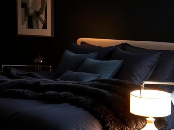
Color-drenching for cocooning depth in low-light rooms
In a dim bedroom, color-drenching can feel like a warm hug. Using Mylands Arts Club No.281 or a similar deep option across wall, trim, and doors creates enveloping depth.
Pick a matte or ultra-matte finish for a velvety backdrop and eggshell for trim to keep edges defined. If sleep is a worry, limit the bold tone behind the headboard and use subdued bedding to soften the field.
Wallpaper, Murals, and Patterned Backdrops
Swap a painted wall for a papered surface and you instantly add texture and story. I reach for wallcoverings when I want drama but not the permanence of full repainting.
Glossy papers can act like a second skin. Designers like Kati Curtis use solid glossy coverings to add dimension and a tactile sheen that catches light.
Glossy wallcoverings for extra texture and dimension
The sheen softens shadows and makes the surface read richer. I balance a glossy field with matte furniture and natural fibers so the room feels layered, not reflective.
Playful prints that personalize your space
Mally Skok shows how small-scale floral or stripe prints bring personality without overwhelming sleep. For kids, I pick smaller motifs and echo the palette in trim or bedding.
Commission a custom red mural for a unique focal point
When architecture feels boxy, a mural reshapes the eye. Garrow Kedigian’s custom piece for Hovia turned a rigid white box into something organic and immersive. Botanicals or abstract geometry are my go-to motifs.
- I always sample sheen and color under real lighting — gloss amplifies, linen mutes.
- Bright painted frames paired with striped blinds add a playful focal point.
- Ground glossy papers with jute rugs and wool throws for balance.
| Option | Effect | Best Use | Maintenance |
|---|---|---|---|
| Glossy wallcovering | Adds depth and light bounce | Feature wall behind bed or fireplace | Wipe clean; avoid harsh cleaners |
| Small-scale print | Personality without overwhelm | Kids’ walls, nooks, or alcoves | Moderate care; pattern hides wear |
| Custom mural | Transforms interior perception | Boxy rooms or long blank walls | Professional install; low maintenance |
| Textured linen paper | Soft, muted backdrop | Whole rooms for calm, tactile feel | Dust gently; avoid damp |
Ideas like these let a designer move feel into the room without heavy structure changes. Try a sample strip, live with it for a week, then decide.
Make a Statement with Furniture in Red
A statement piece does heavy lifting—often more than a painted wall ever will.
I start clients with furniture when they’re not ready to repaint. A wood or metal bed frame in a saturated tone anchors the space and feels decisive without a full overhaul.
Canopy frames read like architecture. Pair a deep frame with cream linens and aged brass for a collected, timeless look that still feels restful.

- Red velvet seating—an armchair or settee—adds luxe and makes a practical landing spot at the foot of the bed.
- Mix eras: an antique nightstand beside a modern painted frame creates curated tension, not a theme.
- For small spaces, choose open-legged pieces so color breathes; in larger rooms, go chunkier for presence.
- I recommend performance fabrics so saturated hues stay beautiful with everyday use.
Let the piece lead. Keep the palette tight and echo the hue once or twice in pillows or art so the red bedroom reads intentional, not forced.
Let the Headboard Lead the Room
When I pick a headboard, I picture it as the room’s punctuation mark—bold, precise, and impossible to ignore.
An upholstered headboard gives instant architecture and comfort. It anchors the bed and makes the whole space feel intentional.
Pair a warm red headboard with cool walls to stop the palette from feeling chilly. The warmed fabric brings the sleep space back to life and creates a welcoming focal point.
Silhouette matters: tufting reads like quiet luxury, curved wings hug the sitter, and a simple slab keeps things modern and calm.
- Fabric choice: velvet deepens color and softens sound; linen lightens the mood and breathes.
- Echo the headboard tone in a throw or lampshade so the bed reads as a complete composition.
- If ceilings are low, go wider and lower; tall rooms call for a higher headboard to celebrate volume.
“A strong headboard can anchor a small room and make a bold plan feel thoughtful.”

As a designer, I use the headboard as a strategic move—one decision that simplifies the rest of the scheme.
Test the Waters with Bedding, Throws, and Pillows
Try the textiles first — they’re the easiest way to see how a hue behaves in real life. I tell clients to start with what moves: a duvet, a quilt, or a settee that you can carry from room to room.
I call bedding the commitment-free zone. Layer a cherry blanket or a single crimson throw and live with it for a week to see how it reads in morning and evening light.
Repeat the same tone in smaller accents — a pillow or bed scarf — to knit the whole scheme together. That repetition stabilizes the palette and makes the choice feel intentional, not accidental.
If patterns make you nervous, pick a sham with a border or piped edge for a precise, tailored hit. For braver clients, I mix a large floral with a fine stripe but keep the color family consistent so the bed looks curated.
- Start with one red piece, then add a coordinating pillow in the same tone.
- Swap textiles seasonally—deeper tones for cool months, rosier notes for spring.
- Choose pre-washed cottons or performance fibers for easy care and pet-friendly use.

Pro tip: try a removable cover or slipover on a settee. It’s low cost and high impact. For more tools and samples, I keep a folder of design resources that help clients test color without the commitment.
Windows that Pop: Shades, Curtains, and Painted Frames
Windows can be your room’s best accessory when you treat them like small stages for light and color.
I love a striped blind paired with a bright painted frame—think Mylands FTT-009 Bright Red—to create a playful feature that feels intentional, not fussy.
A red-trimmed Roman shade reads crisp and tailored. It’s easy to repeat the fabric elsewhere for a cohesive thread through the room.
Painting the frame can turn daylight into a design moment. The painted edge literally frames your view like a piece of art against the wall, so sample the paint on the actual sash before you commit.
If privacy matters, choose a lined shade with a colored face fabric. By day you get saturated color; by night the lining gives a warm, soft glow.
- Pair an energetic frame with neutral curtains so the window reads sculptural, not chaotic.
- Match the tone to your larger palette—exterior light will shift how it looks inside.
- When ceilings are low, mount hardware higher to visually lift the wall and let the detail elongate the space.
“A well-dressed window does more than control light; it sets the mood.”

Think of these moves as small bets with big impact. A single shade or a painted sash can make the whole space feel resolved.
Ground the Room: Rugs and Red Carpet Done Right
Start with the ground and the rest of the room suddenly reads like a considered composition.
I recommend a carpet or rug that anchors the scheme rather than competes with the walls. Choose a saturation that supports your palette—deep tones can feel rich, while marled fibers read softer and gentler in small bedrooms.
When the floor is vivid, soften adjacent walls with a dusty blue or warm neutral. Miles Redd’s work shows how a bold underfoot field can charm when balanced by calmer paint and a coordinating border that frames the wall and the rug alike.

- Tailor the edge: a contrasting border in the rug or a painted wall frame ties architecture to textile.
- Fiber matters: flatweaves breathe and wear well; plush piles feel luxe but need more care.
- Pattern use: let the rug’s dominant color reappear in a throw or pillow so the accent feels intentional.
“A vivid carpet can be the foundation of a charming space when balanced with softer walls and textiles.”
| Rug Type | Effect | Best Use | Care |
|---|---|---|---|
| Marled flatweave | Warm, subtle depth | Small bedrooms; high traffic | Shake or vacuum regularly |
| Plush wool pile | Luxurious depth and warmth | Primary bedroom; under bed | Professional clean; spot treat |
| Patterned rug with border | Graphic anchor; ties palette | Rooms needing a focal accent | Vacuum; rotate to even wear |
| Low-pile natural fiber | Textured, breathable | Casual rooms or layered looks | Dust and spot clean; avoid damp |
Small, deliberate moves—one anchored rug, a softened wall color, a crisp border—are how I make bold floors feel calm and considered. It’s a simple design trick that changes how the whole bedroom behaves.
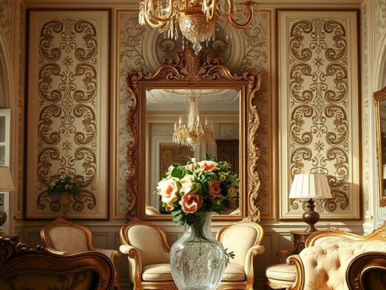
Art-First Design: Use Red as the Palette Anchor
I often let a painting decide the palette—then build the room around that emotional center. Start with the piece that moves you and the rest becomes simpler.
Galleries know this trick. Dulwich Picture Gallery and the National Portrait Gallery use bespoke hues like Dulwich Red to make art sing. A deliberate backdrop makes colors in a work feel louder and truer.

Practical moves:
- Pull a dominant red from a favorite artwork and let it guide your wall or accent textiles.
- Use a low-sheen paint on the wall so pieces don’t glare and the gallery effect stays calm.
- Repeat the chosen tone in one large plane—carpet or bedspread—and one small detail like a lamp or cushion.
Try a slim colored frame or mat to whisper the tone back into the piece without overmatching. If your collection mixes styles, pick a complex red with brown or plum undertones as a unifying backdrop.
“Start with the art—then echo that color in carpet, bedding, and small touches for a curated, lived-in home.”
Maximalist or Muted: Pick Your Decorating Mood
Start by asking: do I crave drama or softness? The answer steers scale, sheen, and the way reds read on walls and textiles.
I often coach clients to pick a mood first. That single decision makes later choices—fabric, print, and finish—feel intentional instead of overwhelming.
Go bold with layered patterns, shine, and saturated hues
If you love maximalist decorating, layer pattern scales: a large floral duvet, a striped blind, and a glossy wallcovering. It feels collected and jubilant when you repeat a tone in three places only.
Shine is your spice: lacquered paper, silk lampshades, and antique brass bring depth without glare. Keep one solid bed blanket or a neutral nightstand to give the eye a rest.
Keep it mellow with muted tones and soft, bohemian cues
If you prefer quiet, move toward softened options with dusty undertones. Washed linens, woven throws, and low-sheen walls create a relaxed, boho-informed look.
One confident accent wall can balance a room of color. Let it peek behind shelving or the headboard to add depth without domination.
“Designers mix high and low—custom mural with simple cotton bedding—so rooms feel special and livable.”
- Layer patterns but limit to three main shades for clarity.
- Use glossy accents sparingly to lift saturated tones.
- Blend a bold wall with muted textiles to keep the look approachable.
| Approach | Key Moves | Best For |
|---|---|---|
| Maximalist | Large prints, lacquered papers, mixed metals | Those who want exuberant, collected spaces |
| Muted / Bohemian | Dusty shades, washed linens, woven textures | Calm, tactile, restful bedrooms |
| Hybrid | One strong wall, simple bedding, select glossy accents | Balance between drama and everyday livability |
Light It Well: Natural Light, Lamps, and How Reds Shift
Light changes everything — it can make a color feel cozy or overly intense in the span of an afternoon.
I always study natural light first. North-facing rooms cool tones; south-facing ones warm them. That observation guides which shades I test and where I place samples.
Work with natural light to flatter your chosen hue
In darker spaces, color-drenching can create a cocooning effect. Deep, browner options glow under warm bulbs and add real depth to the space.
Select warm lighting and bulbs to enhance depth and comfort
Layer lighting: bedside lamps at 2700–3000K, a dimmable overhead, and a low-glow sconce. Matte finishes drink light; a bit more sheen on trim keeps edges crisp.
- Test bulbs with your paint cards at night — some LEDs skew the color.
- For color-drenching, carry the paint to the ceiling and use warm pools of light to sculpt the room.
“Always live with samples at different times — daylight and lamp light tell different stories.”
Design for Real Life: Kids’ Rooms, Guest Rooms, and Small Spaces
Use small-scale pattern and one confident accent to keep a compact room lively and calm. I prefer quick tests—swap a shade or chair before committing to paint. Small moves feel low-risk and teach you what the space needs.
Playful pops and small-scale prints for children’s rooms
Kids respond to color in little hits. I pick striped Roman shades, a cherry chair, or a dotted quilt so the room feels joyful without being overwhelming.
Keep prints compact. Small motifs read friendlier in tight rooms and avoid visual noise. Repeat the same red in two places—on a pillow and a blind—to make the look feel intentional.
Fresh, inviting touches for guest bedrooms
For a guest room, I aim for memorable but restful. A soft red throw and two pillows make the bed feel considered and cozy.
Finish the moment with fresh flowers, a carafe, and a small bedside tray. Those tiny rituals make guests feel welcomed and relaxed.
“A thoughtful towel, a pitcher of water, and a quiet lamp turn a spare room into a kind stay.”
- Durable finishes: choose wipeable fabrics and stain-resistant rugs for real life.
- One red furniture piece: a bench or petite dresser adds personality without crowding a small room.
- Lift the eye: a slim stripe near the ceiling or a colored pelmet makes compact spaces feel taller.
| Space | Best Accent | Care Tip |
|---|---|---|
| Child’s room | Striped shade or small chair | Performance cotton; machine-wash covers |
| Guest room | Soft throw + two pillows | Washable throws; rotate linens |
| Small room | Slim stripe or pelmet | Keep scale small; avoid heavy furniture |
For inspiration on using a strong wall without overdoing it, I often point clients to a practical red walls guide. It shows how to balance bold choices with calm finishes.
Plan Like a Designer: Samples, Timing, and Budget-Friendly Moves
Begin with a single, portable test board so you can watch the color shift through the day.
I never skip samples—brush two coats on big boards, move them around, and live with them under daylight and lamp light. This is the easiest way to know if the paint will read warm or cool in your room.
Work in phases. Start with textiles or one wall before committing to full-room coverage. That spreads cost and cuts decision fatigue.
- Budget wins: paint just a headboard wall, add a narrow border, or swap in a few red paint lampshades for instant lift.
- Timing: paint and paper first, then rugs, then furniture and bedding so you can fine-tune without redoing steps.
- Track undertones: photograph swatches on your phone to match new finds to your hero tone.
If second thoughts arrive at midnight, breathe. A bulb swap, a wool rug, or an extra pillow can rebalance the whole scheme affordably. Museums and designers test and iterate for a reason—small moves add up.
| Step | Why it helps | Budget tip |
|---|---|---|
| Sample boards | Shows color under real light | Use poster board; repaint when reused |
| Phased work | Reduces cost and stress | Start with textiles then paint |
| Undertone tracking | Keeps purchases cohesive | Photo swatches on your phone |
Conclusion
The closing decisions—bedding, a headboard, and light—turn ideas into a restful place.
I’ve given you the playbook: pick the right red, place it with purpose, and steady the scheme with texture and neutral layers. Small moves often have the biggest effect.
Start with one test—swap a duvet or add a painted frame—then scale up to paint or paper when the look feels right. Let a favorite art piece or object set the tone so the interior reads personal and cohesive.
Use layered lighting and natural materials to warm the space. Trust your eye, live with samples, and adjust. That’s the best way to create a red bedroom that feels expressive and deeply livable.