What if the secret to a restful sanctuary isn’t soft neutrals but a bold, passionate hue? I used to think vibrant shades like crimson or burgundy were too intense for sleep spaces—until I discovered how strategic design transforms them into calming escapes. Let me show you why this unexpected choice might be your ticket to a room that energizes your mornings and soothes your evenings.
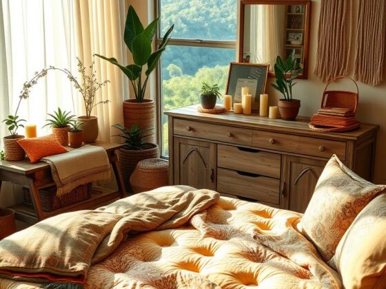
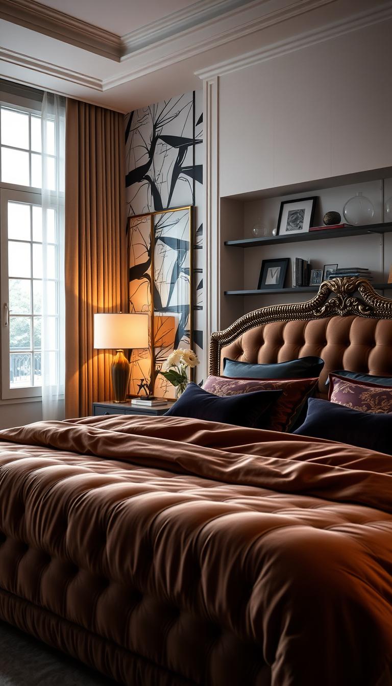
Many assume bright tones overwhelm small areas, but when balanced with textures and lighting, they add depth without shrinking the space. The key lies in pairing rich reds with warm neutrals like caramel or oatmeal. Think velvet throw pillows against linen bedding or a matte accent wall beside soft wood tones.
Through trial and error (and plenty of designer consultations), I’ve learned how this dramatic color actually lowers stress when used thoughtfully. You’ll soon see why top interior experts call it “nature’s ultimate neutral”—it works with every style from modern farmhouse to Art Deco glam.
Key Takeaways
- Transform bold hues into relaxing spaces using layered textures
- Balance red’s intensity with natural materials like wood and linen
- Enhance room coziness through strategic lighting placement
- Apply professional color theory to avoid overwhelming the space
- Create personal sanctuaries that reflect unique style preferences
Setting the Scene for a Cozy Retreat
Ever wonder why some rooms instantly make you feel alive? Working with bold hues taught me that color shapes experiences more than furniture layouts or decor ever could. Let’s explore how this vibrant choice rewires your relationship with your private sanctuary.
Understanding the Impact of Red in Your Space
Clients often ask me, “Won’t intense shades make my room feel smaller?” Here’s the truth: when paired with matte finishes and layered textures, rich tones create depth. A client’s 12×12 foot space felt expansive after we added terracotta walls with woven rattan nightstands. The secret? Contrast creates dimension.
The Role of Color Psychology
Studies show crimson stimulates adrenaline, while muted brick tones promote calmness. I recommend this quick reference guide for choosing your ideal shade:
| Red Tone | Psychological Effect | Best For |
|---|---|---|
| Terracotta | Grounding, earthy | North-facing rooms |
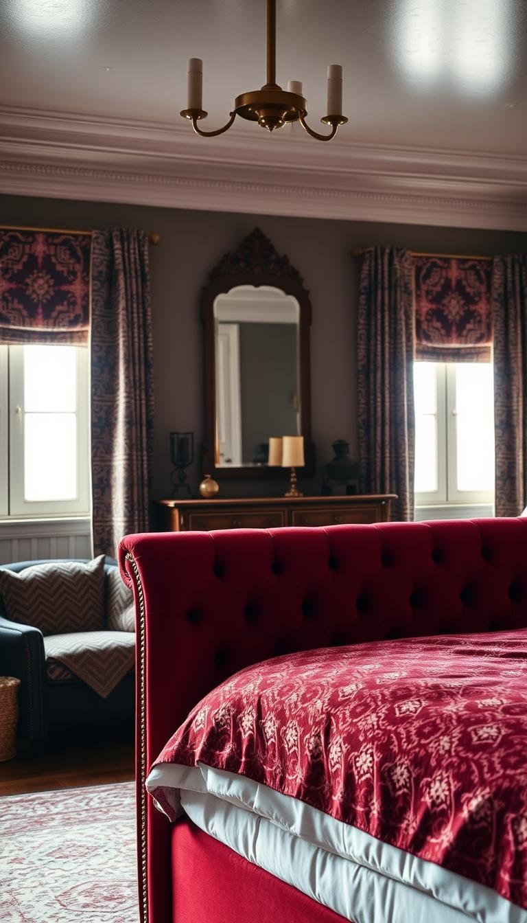
| Burgundy | Luxurious, intimate | Master suites |
| Coral | Energizing, joyful | Morning spaces |
| Oxblood | Dramatic, focused | Home offices |
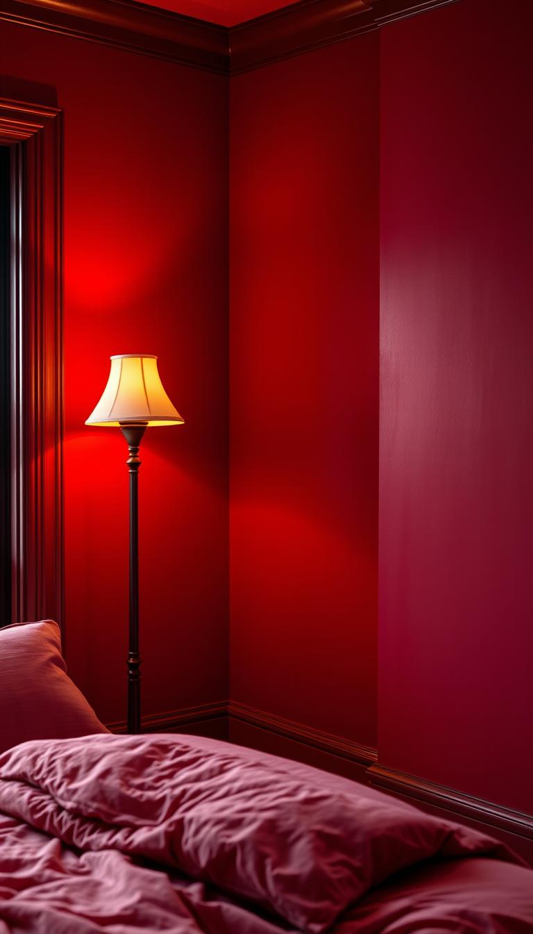
Lighting transforms these effects completely. Dimmable amber bulbs turn fiery accents into sunset glows at bedtime. For walls, try removable peel-and-stick samples first—they prevent costly repaints if the mood feels off.
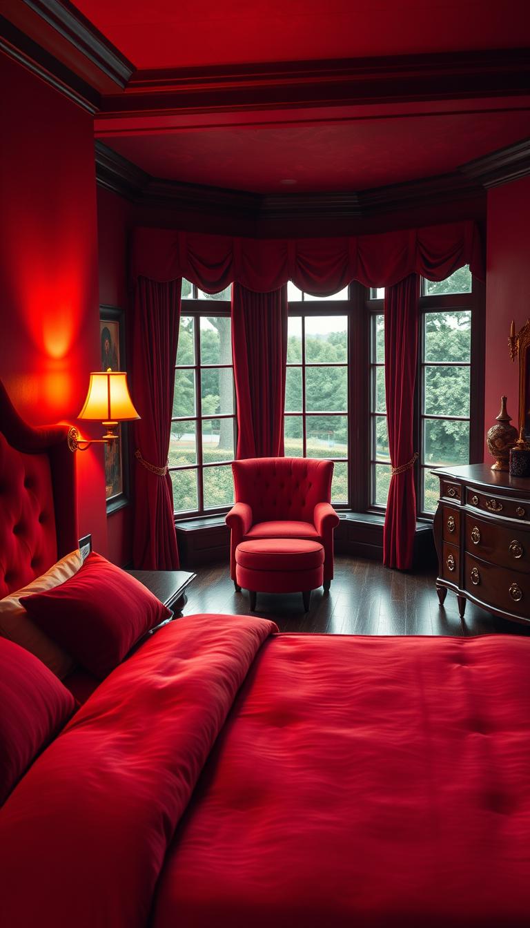
Embracing Boldness with a Red Bedroom
Why settle for beige when your sleep space could radiate confidence? Choosing bold red isn’t just about color—it’s a declaration of self-expression. I’ve seen clients transform generic rooms into jaw-dropping sanctuaries by letting this hue take center stage.
Take inspiration from designer Janie Molster’s approach: Moroccan lattice patterns against crimson walls, accented with brass sconces. This unexpected pairing proves fiery shades elevate curated collections. Framed artwork gains gallery-worthy impact, while vintage rugs feel richer against the vibrant backdrop.
What surprises most people? The warmth. A client once confessed, “I expected chaos, but this feels like a hug.” That’s the magic of balancing intensity with intention. Layer plush velvet throws over crisp linen sheets. Use metallic finishes to bounce light around the space.
True boldness means designing for you—not trends. One homeowner showcased their grandfather’s war medals against oxblood walls. Another mixed neon signs with terracotta tones. Your space should tell your story in every brushstroke.
Remember: courage in design mirrors courage in life. Start small with a lacquered nightstand or ruby-toned drapes. Once you see how these accents transform energy, you’ll wonder why you ever played it safe.
Selecting the Perfect Shade of Red
Choosing paint colors feels like matchmaking—find the hue that sparks joy without clashing with your morning coffee ritual. Dominic Myland of Mylands puts it perfectly: “Deeper reds whisper elegance, while brighter ones sing energy.” Your ideal shade depends on how you want the space to feel, not just look.
Exploring Warm and Earthy Tones
Earth-inspired shades transform spaces into grounded retreats. My go-to recommendation? Mylands’ Huguenot™ No.49. Its clay-like depth pairs beautifully with:
- Rattan headboards
- Linen curtains
- Raw wood flooring
These tones work magic in low-light rooms. One client’s north-facing space gained warmth with terracotta walls and ochre throw blankets—no sunlight required.
Balancing Vibrancy with Subdued Hues
Sun-drenched rooms can handle boldness. Red Post Hill™ No.68 makes south-facing walls glow like sunset. But balance is key. Try this pro formula:
| Light Condition | Recommended Shade | Mood Created |
|---|---|---|
| Morning glare | Muted brick | Cozy intimacy |
| Evening shadows | Rosy coral | Soft energy |
| All-day neutral | Dusty terracotta | Timeless calm |
Test peel-and-stick samples at different times. You’ll notice how floral reds soften under lamplight, while oxblood tones deepen at dusk—like having four colors in one.
Choosing a Theme: Maximalist vs. Minimalist
Your bedroom’s theme acts as a silent narrator of your daily life story. Designer Kati Curtis proved this when she transformed a Massachusetts home using vinyl-treated crimson wallcoverings that supported intricate maximalist patterns. The result? A space bursting with tactile energy where every texture played a role.
When to Go Bold
Maximalism thrives on layered storytelling. I once worked with a client who draped their entire wall in damask-print fabric instead of paint. Paired with gilded frames and velvet ottomans, the space felt like a curated art gallery. This approach works because rich hues handle visual complexity better than neutral tones.
Finding the Right Balance
Minimalist schemes demand precision. A single lacquered dresser or framed abstract painting in bold tones can anchor an otherwise neutral room. One homeowner achieved this balance by painting only their closet doors—a clever peekaboo effect that energized the space without overwhelming it.
Remember: Your color scheme evolves with you. Start with removable wallpaper samples or swapable throw pillows. Over time, you’ll discover which elements spark joy when you wake—and which belong in yesterday’s design chapter.
Incorporating Patterns and Textures
What if your walls could whisper stories through their folds and creases? Working with layered designs taught me that patterns aren’t just decoration—they’re emotional anchors that shape how we experience a space. Let’s explore how to weave visual poetry into your sanctuary.
Mixing Wallpapers, Drapes, and Fabrics
Designer Mally Skok’s Brimfield print wallcovering proves bold patterns create intimacy. I recently used this playful design in a client’s space, pairing it with linen sheers and a geometric rug. The result? A room that feels curated yet effortlessly cozy.
Here’s my golden rule: Start with one hero pattern, then build around it. If your wallpaper has large motifs, choose bedding with subtle stripes or organic shapes. Velvet throw pillows add tactile contrast against smooth cotton duvets—this interplay creates depth without chaos.
Smaller rooms thrive with scaled-down prints. Try these combinations:
- Mini floral drapes with tonal textured wallpaper
- Pinstripe bedding alongside abstract art
- Banded wool throws over solid-color chairs
Remember, patterns need breathing room. Leave 30% of surfaces neutral to let designs shine. When done right, your space becomes a symphony of visual rhythms that calm rather than overwhelm.
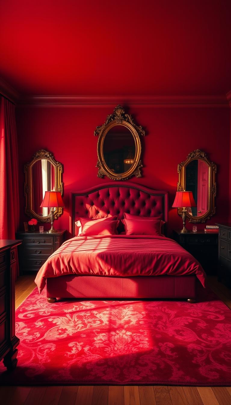
Creative Accent Walls and Custom Murals
What if one wall could rewrite your room’s entire story? I’ve seen accent walls transform bland spaces into showstoppers. Designer Garrow Kedigian proved this by framing his Parisian bed with crimson paneling—turning a simple sleeping area into a jewel-box retreat.

Murals offer even more personalization. When Hovia created hand-painted botanicals for a client’s stark white room, the space gained organic movement. This approach works because:
| Mural Style | Room Impact | Best Paired With |
|---|---|---|
| Abstract brushstrokes | Adds energy | Minimalist furniture |
| Nature scenes | Creates calm | Wood textures |
| Geometric patterns | Enhances structure | Metallic accents |
Always echo your wall art colors elsewhere. A terracotta mural needs matching ceramic lamps. Burgundy paneling demands cognac leather throws. This creates visual rhythm without matchy-matchy perfection.
Don’t fear imperfections. I recently used a textured plaster wall with uneven red tones—the organic variation made the space feel lived-in and cozy. Gradient effects work similarly, blending from bold to soft across the surface.
Your walls should whisper your story, not shout trends. Whether through bold paint or bespoke murals, let this canvas reflect what makes your heart sing when you wake.
Innovative “red bedroom” Design Ideas
Forget everything you know about traditional color rules—the most memorable spaces often break them beautifully. Let me show you how to use this fiery hue in ways you’ve never considered, creating depth and personality without overwhelming your sanctuary.

Miles Redd’s iconic crimson carpet technique changed how I view foundational elements. By grounding a space with plush ruby flooring, he lets walls breathe in soft cerulean tones. This unexpected reversal proves boldness thrives beneath your feet. Try these fresh applications:
| Innovation | Effect | Pairing Tip |
|---|---|---|
| Ceiling trim | Draws eyes upward | Match to curtain rods |
| Door frames | Creates flow | Use semi-gloss finish |
| Built-in shelves | Adds dimension | Accent with brass bookends |
Details make the difference. A client recently transformed their sleep space using only cranberry-toned hardware and art frames. The result? Cohesive warmth without a single painted wall. Consider these subtle touches:
- Hand-blown glass pendant lights
- Embroidered throw pillow edges
- Textured ceramic drawer pulls
Color pairing secrets? Navy velvet chairs pop against merlot walls. Sage green bedding cools terracotta accents. These combinations work because they balance energy with serenity. Test samples under both natural and artificial light—you’ll see tones shift beautifully throughout the day.
True innovation lies in personalization. I once designed a headboard wrapped in vintage scarletsilk scarves. Another project featured gradient ombré curtains. Your space should reflect what makes your heart race (in the best way) when you walk in.
Furniture and Decor: Making a Statement
Your space becomes truly yours when furniture choices echo your personality. I once watched a client’s neutral room transform as we added a deep merlot headboard—suddenly, every morning felt like waking up in a curated gallery. This is where design shifts from concept to lived experience.
Headboards and Statement Pieces
Antiques collector Ariene Bethea taught me bold furniture anchors entire spaces. Her warm crimson headboard balanced cool blue walls, proving vibrant pieces needn’t overwhelm. Try these approaches:
A carved canopy bed with medieval flair creates instant drama. Or test commitment-free options like ruby-hued settees—they’re the design equivalent of a first date. One client’s lacquered dresser became their room’s heartbeat, its glossy surface reflecting carefully chosen art.
Selecting Bedding and Rugs
Texture pairing makes or breaks comfort. Layer crisp percale sheets under nubby wool throws for contrast. My go-to trick? Position your rug so it peeks 18 inches beyond the bed—this grounds the space visually.
Remember: your bedding should invite touch. A client’s terracotta linen duvet cover gained depth when paired with leather-bound books on their nightstand. Every element whispers, “This is home.”