Can a bold color actually make your home feel calmer? I ask that because I’ve guided clients who feared a saturated hue, only to find a soft, restorative space when we made thoughtful choices.
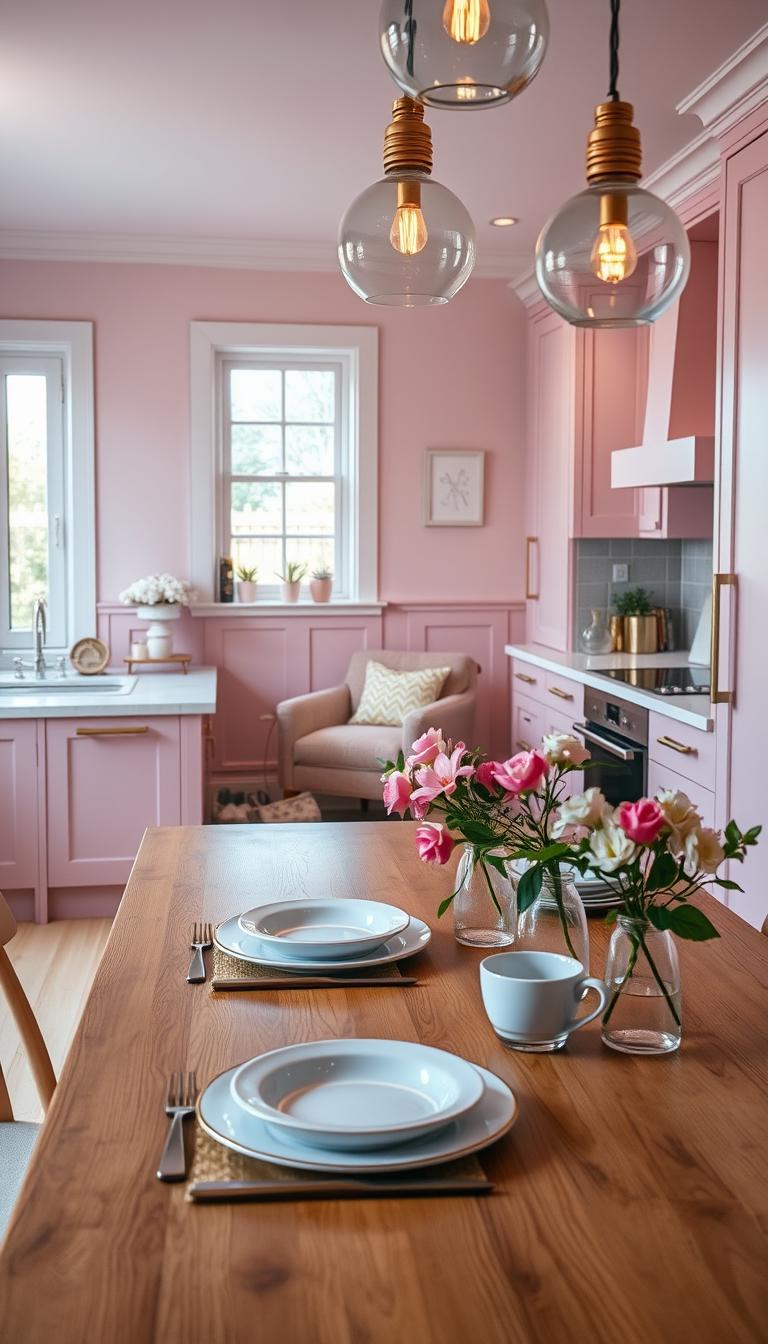
I’ll show you how a gentle pink hue can soothe the nervous system and lift a room without feeling sugary. We’ll cover how to weave color through walls, cabinets, tile, and ceiling so the space reads cohesive from morning coffee to late-night tea.
Think in layers: light, texture, and proportion. Small moves—like a blush fish scale backsplash or a patterned antique-look tile—can act like a rug and set the mood. Big moves—an island or painted cabinets—need balance so the interior stays open and airy.
Key Takeaways
- Choose a calming pink hue to support a restorative, everyday look.
- Distribute color across walls, tile, and hardware for cohesion.
- Use light and texture to keep the space airy and welcoming.
- Visualize real-room examples before buying samples.
- Phase changes by budget with high-impact, low-commitment updates.
Start with Shade: Choosing the Right Pink Hue for Your Kitchen
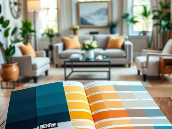
Before you commit to paint, notice how the light alters tiny samples across a day. I always test chips on the walls to see how north and south light shift the tone.
Soft and blush tones—think muted salmon or a whisper of rose—give an airy, wellness-driven feel. They warm counters and flatter faces at the prep zone. These are my go-to for small rooms because the light bounces and the space reads open.
Hot pink and magenta deliver energy. Use them on one plane—cabinets or a tile field—so the effect stays joyful, not crowded. Saturation works best in larger rooms or as an accent zone.
Dusky, brown-leaning shades act almost like a neutral. They ground blue cabinets, natural wood, or dark cabinetry. These tones lend a sophisticated warmth without stealing the show.
“Read the light, map the undertones, and let one dominant hue lead—support and accent come after.”
| Shade Family | Best Use | Pairings |
|---|---|---|
| Soft / Blush | Whole room or walls in small spaces | Light wood, white counters, brass |
| Hot / Magenta | Single plane accents | Terrazzo, neutral walls, matte black |
| Dusky / Brown-leaning | Grounding cabinets or walls | Blue cabinetry, natural wood, stainless |
Pink Cabinets That Set the Tone
I start most projects by deciding where the cabinets should whisper and where they should sing. That approach keeps the room calm while letting color become a thoughtful element of the design.

Shaker-style pink cabinets with marble countertops
I often spec shaker-style cabinets for timeless lines. Paired with a white marble countertop and a short marble backsplash, the look reads classic and calm.
Finish tip: oil-rubbed bronze hardware adds subtle depth and a lived-in feel.
Hot pink flat-front cabinetry with terrazzo backsplash
For a modern edge, hot flat-front cabinets against a terrazzo tile field feel fresh. I soften the effect with neutral walls and matte metals so the kitchen stays livable.
Two-tone looks and balancing bold cabinetry
Two-tone is a confidence builder—pink uppers with white base cabinets keep sightlines light. Wood countertops warm the base and a quiet floor grounds the whole look.
- Satin or matte sheen hides fingerprints and tames saturation.
- Make the island the colored piece and keep perimeter units neutral when space is tight.
Backsplash Brilliance: Tile Backsplash Ideas in Pink
A backsplash is where texture and color meet to define how a room feels at eye level. I treat that strip as an opportunity to add calm or a little joy.

Fish scale and square tiles in blush for texture
I reach for blush fish scale or small square tiles when clients want texture without noise. The soft curve or grid catches light and feels tactile between white cabinets and marble counters.
Glossy hot pink tiles as a focal point
Glossy hot pink tiles work best in a compact field—behind a range or over a sink. They make a joyful focal area next to blue or black cabinetry without taking over the walls.
What pairs best with pink cabinets: white, gray, or black
If you’ve committed to colored cabinets, a white backsplash balances the palette and keeps the look fresh. Light gray tile cools soft tones and reads modern. For drama, a black or deep gray field will ground light cabinetry—just keep surrounding surfaces light so the kitchen stays luminous.
- Tile size: larger formats mean fewer grout lines and a quieter feel.
- Material choice: concrete-look ceramics add subtle movement; handmade squares add organic variation.
- Grout: tone-on-tone for calm; contrast for punch.
Tip: End tile cleanly at cabinet edges in open plans so sightlines stay tidy and the overall design feels composed.
Elevate with Countertops: Marble, Terrazzo, and Wood
The right surface ties cabinets, hardware, and light into a cohesive look.
Countertops set the stage for your color choices. I pick materials that support a calm mood and to make daily life easier.
Marble and short marble backsplash pair beautifully with pastel shaker cabinets. White marble brings natural veining that reads like a soft pattern without clutter.
It feels timeless and cool under natural light. Note: marble needs sealing and gentle cleaners—plan for that.

Terrazzo that calms vibrant hues
Terrazzo’s chips bridge saturated colors and metals. With hot cabinetry and gold hardware, terrazzo counters and a matching field quiet the intensity.
Terrazzo is forgiving and durable—great if you want bold color without constant worry.
Wood surfaces to warm soft tones
Wood counters—oiled oak or walnut—add tactile warmth beside white bases and soft pink uppers. They age with patina and make the room feel lived-in.
I recommend honed or satin finishes to diffuse glare. Keep edge profiles simple—eased or pencil edges keep the design serene.
“Mixing materials—wood on an island and terrazzo or quartz on the perimeter—gives you warmth without sacrificing durability.”
- Map maintenance up front: sealing for marble, routine oiling for wood.
- Test samples under your room’s light so the hue reads as you expect.
Perfect Color Pairings: Green, Gray, Black, Blue, and Brass
A smart color combo does more than look pretty — it organizes mood and flow. I use pairings to balance warmth, light, and function so the room feels collected and calm.
Green and pink cabinetry for midcentury charm
I love pairing green with pink cabinets for a midcentury vibe. Wood tones ground the palette and a glazed pink tile bounces light for an upbeat, cozy feel.
Gray concrete-look surfaces to cool soft tones
Concrete-look counters and backsplashes cool soft hues. The tactile surface steadies the palette and reads modern without fuss.
Black cabinets with pink walls for high-contrast drama
Dark cabinets gain warmth next to lighter walls. Keep counters simple and use brass pulls so the room never feels stark.
Navy and blue accents that sharpen soft tones
Introduce navy in a runner or stool to repeat the tone and sharpen contrasts without overcommitting.
Brass hardware and gold accents to add glam
Tip: Flip the pairing on an island—green base, pink perimeter—for a collected, furniture-like composition. I edit my palettes: one dominant, one secondary, one accent. That keeps the design spacious and the home feeling serene.
Walls that Wow: Pink Walls Without the Commitment
A fresh coat on the walls is the quickest way to change a room’s mood without touching cabinets.

I often recommend painting only the walls when clients want a fast refresh. It’s low fuss, low cost, and the result is immediate.
Painting only the walls for a quick transformation
When you want change without new cabinetry, I’ll paint only the walls—instant mood shift, minimal downtime, and a calming effect if we keep the shade gentle. A light pink on the walls paired with white cabinets opens the space and keeps sightlines clean.
Dusky “sulking room” pinks with dark wood or blue cabinetry
My favorite secret is a dusky, tan-leaning pink hue. It flatters dark wood and blue cabinetry and reads like tailored warmth. Paint the hood the same color as the walls to blend architectural elements and reduce visual clutter—small way, big payoff.
- Choose a washable, low-VOC finish for easy maintenance and wellness.
- Sample two or three hues on bright and shady walls to see real shifts in light.
- Keep trim soft white or greige so the wall color leads without loud contrasts.
“Wall paint plus a few coordinated textiles can make your pink kitchen feel newly designed in a weekend.”
Wallpaper, Ceiling, and Statement Surfaces
Small statement surfaces — a papered wall or a tinted ceiling — can read like jewelry for a room. They add personality without a full renovation and give you a chance to test a look before committing to permanent changes.
Tropical and patterned wallpaper with pink bases
I often specify botanical wallpaper with a pink base because green leaf patterns bring contrast and life next to painted cabinets or a range hood.
Tip: Pair busy wallpaper with streamlined cabinetry so the pattern feels joyful, not chaotic. If you want low risk, removable wallpaper gives the same statement with easy swap-out later.

Ceiling color choices to reflect light and calm the room
Ceiling color is a quiet superpower. A soft white or blush-tinted white reflects light and keeps the space bright and calm.
Keep finishes low-sheen so light scatters gently—matte papers and satin paints reduce glare and let the color support the room’s mood.
Using an accent wall to add depth in minimalist layouts
For minimalist plans, a single statement wall—papered, tiled, or painted—adds depth without cluttering the space.
- Let counters and backsplash tile stay simple so the statement wall can breathe.
- Repeat one color from the paper—say the green of the leaves—in stools or plants to stitch the palette together.
- A pink walls accent behind open shelving makes ceramics pop and creates an instant curated backdrop.
“Statement surfaces let you try bolder decor moves while keeping the room grounded.”
Lighting and Hardware: Brass, Pendant Lights, and Fixtures
Lighting and metal finishes are the jewelry of a room — small choices, big payoff. I choose fixtures that flatter color and bring the whole look together.
Choosing pendants that flatter tones: I favor pendants with diffusers or warm shades. Avoid blue-cast LEDs; they cool warm hues and flatten faces. For small spaces, pick slender pendants. For tall rooms, scale up and lower the drop for intimacy.
Brass hardware to bridge palettes: Brass reads like soft sunshine against dark cabinets and light walls. I often match the faucet, pulls, and visible trim so the finish feels intentional, not piecemeal.
“Dimmers are non-negotiable — they let you tune light from brunch brightness to calm evening prep.”
- I layer: pendant for task, under-cabinet for work, and warm ambient sources for glow.
- Crystal or colored-glass fixtures add sparkle—keep the shape simple so they don’t fight cabinetry.
- Consider ergonomics when choosing knobs vs. pulls to support daily use.
| Fixture | Best Use | Why I Choose It |
|---|---|---|
| Slender pendant | Small kitchens, islands | Preserves sightlines; warm diffuser flatters color |
| Statement glass chandelier | Tall ceilings, dining-adjacent | Adds sparkle; lifts saturated palettes without heavy contrast |
| Under-cabinet light | Prep surfaces | Task-focused, warms countertops, reduces shadows |

Appliances with Personality: Pink Kitchen Appliances
Sometimes the easiest design move is an appliance with personality—no demo required. I often advise clients to start small: a single colored range or a retro fridge can rewrite the room without repainting cabinets.
Why it works: a well-placed appliance reads like jewelry. It anchors the sightline and gives the space a playful edge while the rest of your palette stays calm.
I recommend matching sheen to nearby finishes. A matte finish reads softer next to muted cabinetry. A glossy surface pops against subdued walls.
- Low-commitment wins: kettles, toasters, and small appliances are rental-friendly and easy to swap.
- Single stoves look stunning against dark green cabinets and marble-look quartz—especially with warm metals and crystal pendants.
- Measure and sightline before you buy; a statement appliance should feel integrated, not crowded.
“A single appliance can give your room a fresh personality without a full remodel.”
| Appliance | Best Use | Finish | Design Tip |
|---|---|---|---|
| Range / Stove | Focal wall or island | Matte or glossy | Pair with neutral backsplash and brass accents |
| Fridge | Large visual anchor | Gloss for retro, matte for modern | Keep nearby counters simple to let it sing |
| Small appliances | Rentals and testers | Gloss or satin | Swap seasonally to test a permanent change |
| Full suite | Coordinated look | Same sheen family | Best for long-term commitment to the look |

Islands, Layouts, and Small-Space Strategy
An island can act like a piece of furniture—anchoring the layout while keeping the rest of the room calm.
I often make the island the colored element so it reads like a freestanding unit. That way perimeter cabinets stay neutral and airy. It creates a gentle focal point without overwhelming the walls.
Pink kitchen islands as a subtle focal point
Tip: size the island to preserve traffic lanes. Keep at least 36–42 inches of clearance so mornings flow without bottlenecks.
Open shelving and wall-mounted storage to keep counters clear
In small spaces, I favor open shelving and wall drawers. They free counters and show off a tile or paint choice. A single linear shelf on tall walls stages daily items without clutter.
- Durable finishes at the island—wipeable panels and resilient tops—make beauty liveable.
- Repeat the island’s pink in two accents—stools or a runner—for cohesion.
- Choose compact appliances to maximize sightlines and breathing room.
| Strategy | Best For | Why It Works |
|---|---|---|
| Furniture-style island | Open plans | Creates focal point without heavy cabinetry |
| Wall-mounted storage | Narrow galley layouts | Frees counters, improves flow |
| Linear shelf | Tall walls | Stages items, keeps visual calm |

Flooring and Tile Patterns to Ground the Pink
Floor choices quietly set the mood; pick wisely and the room feels rooted and calm.
I often “draw” a floor rug with patterned or antique-look tiles under an island. Cutting a vintage tile field into a framed zone anchors the island like a furniture piece. It defines a dining or prep area without busying the whole floor.

Patterned tiles as a rug effect
Antique-look tiles act like a rug — they bring pattern and warmth. A black-and-white tile field adds energy for contemporary pink/blue schemes while other surfaces stay simple.
Natural wood for balance
Natural wood floors are the ultimate balancer for pastel and bolder tones. I match undertones: red oak suits peachier hues; cooler woods suit mauve-leaning hue choices. A butcher-block counter pairs beautifully with a glossy hot backsplash and mixed cabinetry colors.
- Tip: In tight kitchen plans, larger planks or bigger tiles reduce grout lines and make the space feel more open.
- Echo one floor tone in the backsplash or accessories to stitch the palette and keep the overall look calm.
- Choose durable finishes and easy-clean grout so beauty survives everyday life.
Style Your Pink Kitchen: Scandinavian, Rustic-Modern, and Retro
You can make the same hue read Scandinavian, rustic, or retro simply by changing texture and scale. I rely on material choices to steer the mood: tile, wood, and metal tell the story more than paint alone.
Scandi calm: pastel cabinets with geometric tiles
I lean into clean lines and pale counters for this style. Pastel cabinets, marble tops, and geometric or fish scale tile keep the room crisp and airy.
- Design: minimal hardware, white shaker cabinetry, large windows or bright lighting.
- Pastel touches repeat in textiles for cohesion.
Rustic-modern balance: light pink cabinetry with concrete-look backsplash
Contrast is the secret. Light pink cabinetry pairs with gray, concrete-look tile and black appliances for grounded serenity.
- Warm wood shelves and stools add tactility.
- Keep the palette tight — three colors max — so the design reads intentional.
Retro flair: bubblegum walls with green tile
Go joyful: bubblegum walls, green tile, patterned flooring, and vintage appliances give classic charm without being childish.
- Right-size patterns by room scale; larger geometrics for big rooms, smaller tiles for jewel-box spaces.
- A single brass pendant bridges all three styles — small piece, big ambiance.
“Wood details warm every scheme and make the design feel human and lived-in.”
Budget-Friendly Updates for a Pink Kitchen Look
A few strategic updates can make your room feel intentional and calm, fast.
The easiest way to test a new color is paint the walls and live with the look for a week. Paint is cheap, fast, and reversible. It tells you whether to go further without committing to new cabinetry.
Add pink small appliances and textiles next—kettles, toasters, and curtains give a cheerful hit. Swapable pieces are a low-risk way to trial color and refresh your decor.
Hardware is a budget hero. New brass pulls or a brass hardware set instantly warm a neutral palette and feel luxe in the hand.
Try removable wallpaper on a pantry or breakfast nook for pattern without permanence. Open shelves are another low-cost stage—curate blush bowls, a rosy vase, and a leafy plant for big mood from small items.
I usually phase changes—paint, then appliances, then one lighting update (a pendant and a dimmer). That way your home stays usable while you build the look you love.
“Small swaps—done in the right way—create a layered, edited decor without breaking the budget.”
For more step-by-step ideas, see pink kitchen ideas.
Conclusion
A mindful edit—one surface, one metal, one light—will give the room a lasting, composed feel. I ask you to start small and live with the change for a week. That way you learn how the color works with your light and routine and your home begins to hum.
Use a single idea from these pink kitchen ideas and pair it with a simple rule: three tones max. Try one of these kitchen ideas—a painted wall, a tile field, or an appliance—and build from there so the kitchen stays intentional, calm, and useful.
Lean on texture, warm metals, and layered lighting. Those quiet moves help color read as an elegant statement in the interior and let the whole kitchen feel like a welcoming space you actually want to live in.