Homiscape.com
  • Homepage
  • Ideas by Room
    • Bathroom
    • Bedroom
    • Home Office
    • Kitchen
    • Living Room
    • Outdoor
Categories
  • Bedroom
  • General
0
0
Homiscape.com
Subscribe
Homiscape.com
  • Homepage
  • Ideas by Room
    • Bathroom
    • Bedroom
    • Home Office
    • Kitchen
    • Living Room
    • Outdoor
Pantone Color of the Year
  • General

Pantone Color of the Year 2026: Trends and Inspiration

  • January 10, 2026
  • Jade Hunt

Total
0
Shares
0
0
0

Can a soft white actually reset how we live and feel for an entire year? I asked that when the announcement landed, and I still think it’s a good question.

I’ve worked with clients who treat neutrals like blank slates. This pick—Cloud Dancer, PANTONE 11-4201—shows a different view. It reads like a breath. It suggests calm, clarity, and a fresh start during a noisy time.

I’ll outline why this selection matters for homes and wellbeing. I’ll explain how the pantone color institute tracks global trends and why a balanced white can shape mood. I’ll also flag where you’ll spot this hue next, from phones to furniture.

You won’t just learn a name; you’ll get practical ideas to use this shade with wood, stone, and light so your rooms feel intentional—never flat.

Key Takeaways

  • Cloud Dancer (11-4201 cloud) is a soft white chosen for calm and reflection.
  • The pantone color institute bases its pick on global trend analysis.
  • This hue will appear in products from phones to furniture and stationery.
  • Use whites as tones with personality next to natural materials.
  • The selection signals a cultural shift toward clarity, peace, and wellness.

Pantone Color of the Year 2026 Announced: Cloud Dancer (PANTONE 11-4201)

A lofty white arrives at a time when many of us crave simpler, quieter spaces.

Cloud Dancer (11-4201 cloud dancer) is described as a soft, airy white meant to steady cluttered visual lives. It reads like a blank page that invites creativity and calm.

What this shade is and why it matters

Cloud Dancer is the first true white selected since the program began in 1999. That alone makes this color year 2026 a notable moment for design and culture.

Pantone’s rationale and selection process

The pantone color institute framed the choice around clarity, reflection, and a fresh start. Their team tracks global trends year-round—fashion, interiors, tech, and social media—to forecast what people need next.

Where you’ll see it

  • Products: Motorola phones, Post-it Notes, Command strips, Joybird furniture, Play-Doh
  • Applications: trims, textiles, brand photography, wellness-focused rooms
Aspect What to expect Practical tip Impact
Name Cloud Dancer / pantone 11-4201 Try small items first Low-risk testing for homes
Rationale Clarity, reflection, creativity Use on trim or doors Calmer rooms, clearer focus
Selection Year-round trend analysis by color institute Follow brand collaborations Widespread availability
Style tips Pairs with wood, stone, greenery Layer with linen and wool Warm, peaceful interiors

Quick takeaway: If you’re color-shy, use this hue as an on-ramp. A little Cloud Dancer goes a long way toward a quieter, more intentional home.

Reactions and Debate Around the Pantone Color of the Year

Reactions landed fast—some cheered a clean slate, others flagged a deeper symbolic knot.

Supportive voices praised Cloud Dancer for its practical role in design and branding. Creative leads said the hue gives visual breathing room, helps photography, and makes products pop. Scott Woodward called it calming and versatile, useful across fashion and interiors.

A graceful dancer, dressed in flowing fabric that swirls in vibrant shades inspired by Pantone Color of the Year 2026, leaps among fluffy, billowing clouds. In the foreground, the dancer's figure is captured mid-motion, her expression one of exhilaration and freedom. The middle ground features an expanse of soft, cotton-like clouds with a gentle play of pastel colors, reflecting the hues of the dancer's outfit. The background includes a slight hint of a soft, blue sky transitioning to warm sunset tones, creating a tranquil but dynamic atmosphere. The lighting is soft and diffused, casting gentle shadows that enhance the dancer's movement. The composition should be photorealistic, shot from a slightly low angle to emphasize the dancer's ascent into the sky, evoking a sense of inspiration and creativity.

Criticism and cultural context

Critics pushed back on timing and symbolism. Calls of “whitewashing” and “Pantonedeaf” trended on social media and in media outlets. Some tied the choice to wider cultural debates about inclusion and representation.

Pantone’s response and how to read it

“Chosen for calm, clarity, reflection, and creativity,” said Leatrice Eiseman, noting a human-centered process.

As a homeowner, separate the debate from your rooms. Use Cloud Dancer where it supports focus and rest. For brands, test with your audience and pair the shade with diverse imagery and warmer tones—mocha mousse or peach fuzz—to avoid an editorial-only look.

View Key point Practical tip
Support Versatile for layouts Use as negative space
Critique Timing & symbolism Pre-test with communities
Company stance Nonpolitical, human-centered Explain intent clearly

Trends, Applications, and Influence Across Design and Fashion

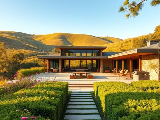
Quiet tones are no longer shy—this balanced white now anchors high-end minimalism and everyday rooms.

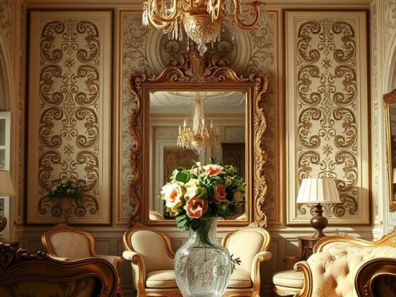
This hue lands squarely inside quiet luxury. Celeb wardrobes and serene interiors show how understated whites read as curated, not plain.

A graceful figure, embodying the essence of a "cloud dancer," elegantly poised amidst fluffy white clouds in a vibrant sky. The dancer wears a flowing dress in the 2026 Pantone Color of the Year, rich in hues that evoke modern trends in fashion and design. In the foreground, delicate ribbons and fabrics swirl around the dancer, capturing the soft light. The middle ground showcases layered clouds reflecting golden sunlight, casting a warm glow. The background features a serene blue sky, gradually fading to a soft pastel. The scene is illuminated by a golden hour light, adding warmth and depth, with an ethereal atmosphere. Shot from a low angle to emphasize height and grace, the overall mood is dreamy and inspirational.

History matters. After turquoise, honeysuckle, and peach fuzz, the selection continues a thread: designers lean into care and calm. That pattern helps me pick lighting, texture, and acoustics for wellness-first spaces.

Competing forecasts and practical pairings

Forecasters like WGSN pushed Transformative Teal as a bold alternative. If you want energy, use teal accents against soft white walls—invigorating but still grounded.

Here are simple, repeatable plans I use with clients:

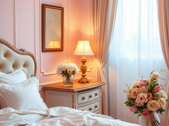
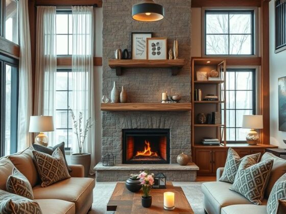
  • Living room: soft white walls, limewash for depth, oak floors, nubby rug, linen drapes.
  • Wellness nook: white backdrop, tall plant, stone diffuser, water carafe for calm contrast.
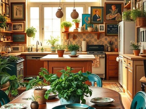
  • Kitchen: white uppers, darker lowers (mocha or walnut), handmade tile for texture.

Texture is the secret weapon—bouclé, raw linen, and raked plaster make the white feel warm in daylight and cozy under lamps.

“Treat this white as breathable negative space; let hero tones and products read cleaner.”

For brands and UI, use that negative space to lift photography and simplify layouts. If you want deeper context on the announcement and industry reaction, see this short feature on Cloud Dancer and coverage.

Conclusion

Think of Cloud Dancer as a helpful pause in a loud year.

I encourage you to start small: test a sample on a sunlit wall and watch it through day and night. Note how light, wood, and textiles warm its feel.

Use it as a backdrop for bold accents—try a teal pillow or an earthy cabinet. If you rent, swap bedding or lamps first; you get mood without commitment.

Expect to see this shade across product drops and campaigns this year. For a quick 2026 preview, see pantone color year preview.

Trust your senses. When a room makes you breathe easier, that’s your sign to lean in—one calm choice at a time.

FAQ

What is Cloud Dancer (11-4201) and why does it matter?

Cloud Dancer, numbered 11-4201, is a soft, lofted white chosen for 2026. I see it as a design pause — a neutral hue that creates calm and clarity in interiors, fashion, and branding. It matters because it signals a cultural shift toward simplicity and restorative spaces.

How was this shade selected?

The institute’s team tracks global trends across culture, retail, tech, and social behavior. They synthesize data, studio research, and editorial insight to pick a tone that reflects current needs — in this case, a color that evokes fresh starts and quiet reflection.

Where will we see this shade used most?

Expect it across home goods, wellness spaces, tech product finishes, and packaging. I’ve seen designers pair it with warm neutrals like mocha mousse or soft peach tones to create layered, soothing palettes that read as both modern and lived-in.

Is choosing a white controversial?

Yes, it sparked debate. Supporters praise its versatility and neutrality. Critics raise cultural concerns about symbolism and timing. The official stance stresses a human-centered, nonpolitical intent focused on clarity and creative renewal.

How can homeowners use this shade without feeling sterile?

Layer textures — matte plaster, natural wood, soft linens. Add accents in muted peaches or mocha for warmth. Lighting matters: warm bulbs and dimmers keep spaces cozy. I often advise clients to treat it as a backdrop for art and tactile elements.

How does this choice compare with other forecasted trends?

It contrasts with more saturated forecasts like transformative teal, yet complements the move toward wellness and quiet luxury. Think of it as a balancing note in broader palettes that include calm blues, earthy tones, and soft pastels like peach fuzz.

Will this influence product design and retail palettes?

Definitely. Brands tend to adopt the tone for limited runs, marketing campaigns, and brand systems. You’ll notice collaboration drops in homewares and tech where a clean, reassuring finish supports premium positioning.

Can this hue work in small spaces or busy rooms?

Absolutely. In compact areas it can open sightlines and boost light. In busier rooms, use it on ceilings or large surfaces to calm the scene, then anchor with texture and a few deeper accents to avoid a flat look.

Are there sustainability or wellness benefits tied to the choice?

The selection taps into wellbeing trends — spaces that promote rest and clarity. While the shade itself isn’t a sustainability measure, designers often pair it with natural, low-VOC materials and mindful sourcing to reinforce healthful interiors.

How should brands announce or use this hue in campaigns?

Frame it as part of a narrative about clarity, care, and fresh starts. Show real spaces and human stories. I recommend practical visuals — before-and-after rooms, tactile close-ups, and paired palettes that include mocha mousse or soft peach to humanize the tone.
Total
0
Shares
Share 0
Tweet 0
Pin it 0
Related Topics
  • Color Forecast
  • Color of the Year 2026
  • Creative Inspiration
  • Design Trends
  • Pantone Color Trends
  • Pantone Inspiration
  • Trending Hues
Jade Hunt
Jade Hunt

Hi, I’m Jade Hunt — your friendly guide to creating a beautiful, comfortable, and functional home. At Homiscape.com, I share practical home organization tips, budget-friendly decor ideas, and minimalist lifestyle hacks to help you design a space you’ll truly love. With over 7 years of experience exploring home improvement trends and DIY projects, I believe every home has the potential to be warm, inviting, and uniquely yours. Whether you live in a small apartment or a spacious house, my goal is to inspire you to make the most of every corner. Let’s turn your living space into your dream home — one idea at a time!

Previous Article
Coquette Bedroom
  • General

Create a Romantic Coquette Bedroom: Expert Tips

  • January 9, 2026
  • Jade Hunt
View Post
Next Article
Corbin Bernsen House
  • General

Corbin Bernsen House: Where Design Meets Wellness

  • January 10, 2026
  • Jade Hunt
View Post
You May Also Like
Adult Bedrooms
View Post
  • General

Designing Adult Bedrooms for Better Sleep and Style

  • Jade Hunt
  • January 30, 2026
Rococo Decor
View Post
  • General

Bringing Rococo Decor into Your Home: Tips & Ideas

  • Jade Hunt
  • January 30, 2026
Spring Centerpiece
View Post
  • General

Spring Centerpiece Ideas to Brighten Up Your Home Decor

  • Jade Hunt
  • January 30, 2026
Modern Laundry Room
View Post
  • General

I Upgraded My Modern Laundry Room: Here’s How You Can Too

  • Jade Hunt
  • January 29, 2026
Modern Rustic Living Room
View Post
  • General

Modern Rustic Living Room Ideas for a Cozy Home

  • Jade Hunt
  • January 28, 2026
Maximalist Kitchen
View Post
  • General

My Journey to a Beautiful Maximalist Kitchen: Expert Insights

  • Jade Hunt
  • January 28, 2026
Ikea Double Desk
View Post
  • General

Ikea Double Desk: Perfect for Shared Home Workspaces

  • Jade Hunt
  • January 27, 2026
Converted Church Home
View Post
  • General

Creating a Converted Church Home that Nurtures Wellbeing

  • Jade Hunt
  • January 27, 2026
Homiscape.com Homiscape.com

Input your search keywords and press Enter.