Have you ever wondered how a calm color scheme can change the way you feel at 2 a.m. while soothing a fussy baby?
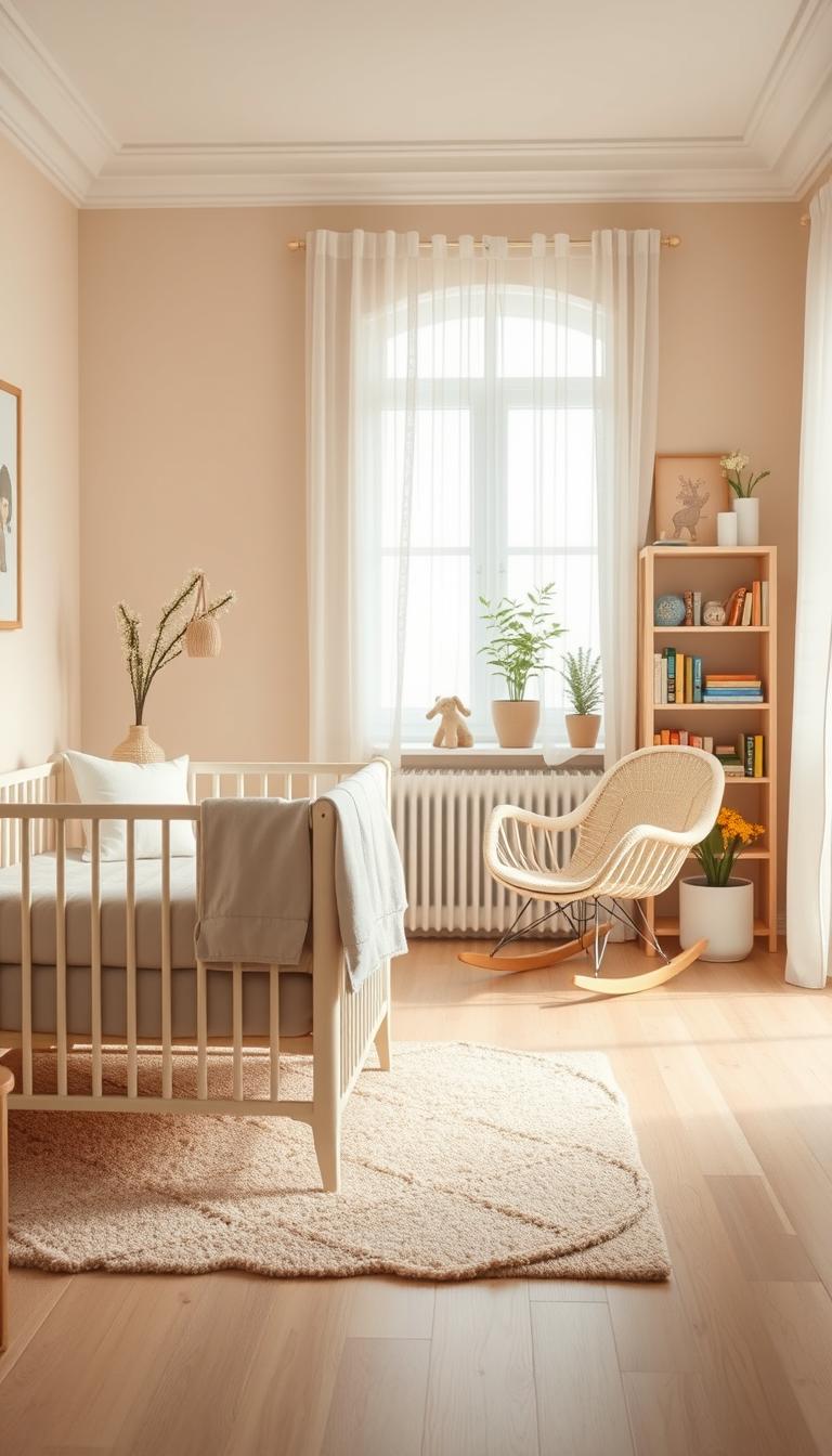
I start every room by centering wellness—soft shades and gentle textures lower stress for you and your child. This approach builds a timeless space that grows with your family so you don’t repaint every year.
From soft whites and beige to blue-grays, we layer natural woods and woven textiles to create warmth, not a sterile look. I map the room into clear zones—sleep, feed, change, read—so the design works as beautifully as it looks during late nights.
You’ll find practical swaps here too: stain-resistant ivory seating, rattan baskets, and dimmable lighting that keep things tidy without sacrificing style. Think of neutrals as a foundation that lets a few curated pops of color support baby’s developing senses.
Key Takeaways
- Calming palettes lower stress for parents and infants.
- Neutral color foundations offer long-term versatility.
- Design by zones to make nightly routines easier.
- Choose durable, sustainable pieces for longevity.
- Small accents keep the room lively for development.
Why a Neutral Nursery Works Now: Calm, Timeless, and Gender-Neutral by Design
A low-contrast color scheme quietly supports better sleep for both baby and parents. I’ve seen it in client rooms: soft beiges, warm grays, and muted whites create a calmer visual field that helps lower arousal at night.
Less visual stimulation means fewer cues for the nervous system. That matters at 2 a.m. when everyone needs to settle fast. Balanced colors make transitions to sleep smoother and evenings more manageable.
Designing gender-neutral from the start also pays off. You can fully kit the room now, reuse furniture later, and skip repainting. That reduces waste, saves money, and keeps hand-me-downs looking fresh.
- Timeless color schemes keep the room feeling current without constant updates.
- Restraint highlights texture—wood grain, woven baskets, and boucle—so the space still feels layered.
- Neutrals amplify light in dim rooms, making small spaces look larger.
| Benefit | Why it Matters | Practical Tip |
|---|---|---|
| Lower visual arousal | Supports calmer sleep cycles for infants and adults | Choose low-contrast wall and textile tones |
| Long-term reuse | Easy to adapt for siblings and changing tastes | Invest in timeless crib and dresser finishes |
| Highlighting texture | Adds richness without bright color | Layer rugs, baskets, and soft upholstery |
Bottom line:this design approach feels good now and scales with your family. It’s practical, restful, and—yes—beautiful.
Neutral Nursery Ideas
Start by imagining layers of soft color and tactile finishes that make the room feel warm and calm. I build the scheme in three bands—light base, mid-tone layers, and small accents—so the room reads cohesive and restful.
Layer soothing tones for depth without visual clutter
I layer tones—ivory with warm taupe, soft gray with blue-gray—to create depth that feels cozy, not crowded. Keep to three core tones and repeat materials across the space so your eye finds rest points: wood on the crib, frames, and shelf ledge.
Blend patterns and textures to keep neutrals interesting
Introduce gentle pattern on one wall or a canopy. Pinstripes, tiny dots, or a petite motif add interest without over-stimulating the baby. Vary texture intentionally—smooth paint next to tongue-and-groove, boucle upholstery beside rattan baskets.
“Small-scale wallpaper and large-knit throws—together they keep a calm room lively.”
- Use scale wisely: small pattern on walls, big-knit textiles on furniture.
- Ground the space with mid-tone rugs or poufs at floor level.
- Try a quiet focal point—three softly framed animal prints above the crib.

Build Your Neutral Color Palette: From Soft Whites to Earthy Hues
I start with a crisp base—bright whites or warm ivory—and plan from there. That simple choice sets the room’s light and the look you’ll carry through textiles and furniture.

Bright white and ivory for a crisp, airy foundation
Bright whites make decor pop and keep the room feeling open. If light is limited, pick stain-resistant ivory seating to stay warm without losing brightness.
Complementary beige and warm taupes for instant coziness
Beige layers add warmth and pair beautifully with natural wood and greenery. They give a hug to the space without feeling heavy.
Smooth gray and soft blue-gray to ground the room
Gray is timeless and expands small rooms visually. Soft blue-gray helps wall art and linens stand out while keeping naps calm.
- Layer in threes: base, mid-tone, small accent for balance.
- Sage green or earth tones work as a soothing, nature-forward touch.
| Hue | Why I Use It | Practical Tip |
|---|---|---|
| Whites & Ivory | Bright foundation that reflects light | Test in morning and evening light |
| Beige & Taupe | Adds warmth and pairs with wood | Use on textiles or a single wall |
| Gray & Blue-Gray | Grounds the scheme and enlarges small spaces | Apply on furniture or lower wall panels |
| Earth Tones & Sage | Natural calm and boho-friendly pairing | Introduce through rugs, baskets, and art |
Quick rule: aim for three core hues plus one accent. That keeps your color scheme adaptable as the baby grows and the room evolves.
Wall Ideas that Add Interest: Paint, Paneling, and Wallpaper
A thoughtful wall treatment can lift a room without adding visual noise. I use simple moves that read layered and calm.
Half-wall paneling in bright white gives a crisp, durable base. Paint the lower section in white and a warmer tone above to make ceilings feel higher. Cap the panel at 36–48 inches depending on ceiling height for balanced proportion.
Tongue-and-groove or strip wood panels add vertical rhythm and easy-clean surfaces. An eggshell finish stands up to fingerprints and life. Simple strip paneling is a weekend DIY that brings instant character.
When you want pattern, choose neutral wallpaper with soft stripes or petite motifs. Use it as a feature wall behind the crib or go all-over in a micro-pattern for a cozy cocoon. Keep scale small to medium in compact rooms so the space breathes.

“The right wall treatment becomes your backdrop, letting art, shelves, and lighting shine.”
- Carry wall color into a few textiles so the room feels intentional.
- Use tongue-and-groove for durability and easy maintenance.
- Feature wallpaper behind the crib for soft movement without overload.
| Treatment | Why it Works | Best Finish | Quick Tip |
|---|---|---|---|
| Half-wall paneling | Creates a crisp visual base and raises perceived ceiling height | Bright white, durable paint | Cap at 36–48 in for balance |
| Tongue-and-groove | Adds architectural charm and wipes clean easily | Eggshell | Paint in a mid-tone for cozy depth |
| Strip wood paneling | Introduces vertical rhythm and a DIY-friendly update | Natural or painted | Keep strips narrow for subtlety |
| Neutral wallpaper | Adds pattern and gentle movement without overstimulation | Small-scale stripes or motifs | Feature wall or micro-pattern all-over |
Design note: subtle undertones—warm taupe vs. cool gray—shift mood more than bold color. Choose a wall treatment that becomes the room’s quiet backdrop and lets your accessories sing.
Texture Is Everything: Add Warmth with Natural Materials
Texture transforms a room more than paint ever will. I start by choosing tactile pieces that make the room feel lived-in and calm.

Wood anchors the major furniture: crib, dresser, and shelf. Natural grain gives instant warmth and ages beautifully with small dings that tell a story.
Wood, rattan, seagrass, and boucle for tactile comfort
I layer rattan baskets and a seagrass hamper for breathable storage. Boucle on a glider or ottoman reads cloudlike—perfect for late-night cuddles.
Layer rugs, throws, and cushions to soften the space
Start with a low-pile rug for easy cleaning, then add a sheepskin-style throw for tummy-time softness. Mix ceramic lamps, linen curtains, and knit cushions so every corner invites touch.
“Treat texture like a lullaby—repetitive, soothing, and soft to the touch.”
- I repeat materials around the room for cohesion: woven baskets by the changing station, a woven pendant overhead.
- Keep the palette calm so textures do the talking—this is how you get richness without visual noise.
| Material | Why it Works | Practical Tip |
|---|---|---|
| Wood | Warmth and durable anchor pieces | Choose mixed finishes for depth |
| Rattan & Seagrass | Breathable, lightweight storage | Use baskets for toys and laundry |
| Boucle & Fleece | Soft seating and cozy throws | Apply on gliders and small ottomans |
Result: a neutral nursery that feels warm, tactile, and settled from day one.
Furniture Choices that Grow with Your Baby
Choose furniture that earns its keep—pieces that transition with your child save money and reduce stress. I favor a simple plan: a few lasting anchors, flexible storage, and stain-ready seating.
Warm wooden cribs and mixed wood finishes
Warm wooden cribs and mixed wood finishes
Warm wood cribs anchor the space. Don’t worry about exact matches—mixing oak and walnut adds depth and character.
Keep a consistent undertone across wood and textiles so the look reads intentional.

Stain-resistant seating for practical, bright neutrals
Choose stain-resistant ivory seating for brightness with easy cleanability. Neutral color upholstery lets you refresh the room with a new pillow or throw.
- I prioritize convertible furniture—a crib that converts and a dresser that doubles as a changing station.
- Look for rounded corners, sturdy hardware, and Greenguard certification for safer air quality.
- Modular book ledges and closed storage keep clutter down and let you rotate toys and books.
“The right furniture mix supports sleep, feed, and play without crowding your flow.”
| Piece | Why it matters | Quick tip |
|---|---|---|
| Convertible crib | Lasts beyond infancy | Choose solid wood with good hardware |
| Stain-resistant glider | Bright look, easy upkeep | Pick compact scale for small rooms |
| Slim dresser | Storage without overwhelm | Top with a changing pad for double use |
Create Functional Zones: Cozy Corners You’ll Use Daily
A well-zoned baby room makes midnight work feel effortless—tiny moves yield big calm. I map the room to routines so each corner supports what you actually do: feed, change, and read.
Reading nook with ledges and layered lighting
Place the reading/feeding spot by the window with a compact glider. Install slim book ledges on the wall so covers act as rotating wall art—functional decor that invites story time.
Layer lighting: a dimmable floor lamp, a low-glare sconce, and a soft nightlight for late feeds. This trio keeps the space usable without jolting sleep cycles.
Add a knit blanket on the glider and a washable mat underfoot. Those small tactile pieces make long reads and nursing sessions comfier.

Neutral changing station with natural baskets and hooks
Keep the changing station near storage and within sight lines of play. Use wooden hooks for swaddles and a rattan or Moses-style changing basket for diapers so essentials are at arm’s length.
Containment is half the battle: add a shallow bin for creams and a lidded pail for wipes. Choose an easy-clean changing pad and wipeable surfaces—you’ll thank yourself at 3 a.m.
- I map zones to routines: feed by the window, changing near storage, soft play where you can watch.
- Use walls for vertical organization—peg rails, baskets, and a slim shelf for a diffuser or sound machine.
- Repeat materials from elsewhere so each zone feels connected; these pieces act as subtle accents and tie the space together.
“A few thoughtful zones make daily life in a small room feel organized and calm.”
| Zone | Key pieces | Quick tip |
|---|---|---|
| Reading/Feeding | Glider, book ledges, layered lights | Keep a knit blanket nearby |
| Changing | Rattan basket, wooden hooks, wipeable pad | Shallow bin for creams, lidded pail |
| Play | Low rug, open sight lines, soft bins | Repeat textures from other walls and furniture |
Theme Ideas that Stay Neutral: Safari, Boho, and Coastal
Simple themed touches help a room read cohesive while staying flexible for future changes. I favor themes that whisper, not shout—so you can update a pillow or swap one framed print and get a whole new look.

Neutral safari with animal wall art and soft accents
For a safari theme I keep the base soft and add animal art in sepia or charcoal. Lions, giraffes, and elephants in muted tones give gentle contrast without loud colors.
Tip: Add plush textures and woven accents so the theme feels cozy. A tiny felt mobile or soft toy keeps playtime warm and playful.
Boho textures, pampas, and airy curtains
Boho leans on texture—floaty voile curtains, pampas in a handled vase, and layered wood and rattan. These elements create a calm, collected style that ages well.
Relaxed coastal neutrals with terracotta and deep blues
Start with sandy hues, then use terracotta and a touch of deep blue to anchor the palette like shore and sea. Repeat one blue across a pillow, book spine, and art mat so the room reads cohesive.
- Choose wood finishes to match mood: light oak for airiness, walnut for a warmer vibe.
- Limit motifs to two or three pieces so the decor feels curated, not staged.
- Keep the theme flexible—small swaps take the room from safari to coastal with ease.
| Theme | Key Pieces | Why it Works |
|---|---|---|
| Safari | Sepia animal art, plush textures, felt mobile | Gender-neutral, warm, long-lasting |
| Boho | Voile curtains, pampas, rattan baskets | Textural depth, relaxed and layered |
| Coastal | Sandy base, terracotta accents, deep-blue touches | Airy yet grounded; versatile color play |
Stripes, Patterns, and Prints that Elevate Neutrals
A well-placed stripe or delicate motif can turn a plain wall into a soft focal point.
I reach for stripes when I want quiet structure. They elongate walls and add rhythm without crowding the senses.
Striped wallpaper feels timeless. Use it as a feature behind a crib or wrap the whole room for a cocooning effect.
Soft neutrals or light pastels read elevated and create an instant backdrop for shelves and art. Mix one patterned wall with solid textiles for balance.

“Ground a black-and-white scheme with natural materials and warm lighting so it feels welcoming.”
- Repeat a stripe or dot in a pillow or curtain trim to keep the scheme consistent.
- Use peel-and-stick wallpaper in rentals—easy to remove, zero commitment.
- Anchor busy prints with a solid rug and plain bedding to let each element breathe.
Practical touch: patterns work well on drawer liners and changing pad covers—little delights during daily tasks.
| Pattern Type | Best Use | Quick Tip |
|---|---|---|
| Vertical stripes | Make ceilings feel taller; great on a single feature wall | Choose soft tones to avoid high contrast |
| Micro-print wallpaper | All-over cocooning effect in small rooms | Pair with solid textiles to prevent busyness |
| Monochrome prints | Modern, graphic look | Warm with wood, woven textures, and soft lighting |
Sage Green Accents: The Easy-On-the-Eyes Neutral Adjacent
Sage green is my go-to “colored neutral”—soft on the eyes and grounding in morning or lamplight. It works as a calming accent that helps a baby settle without turning the room cold or flat.
Feature walls, paneling, and soft textiles in sage
Try a sage feature wall behind the crib or paint the lower paneling below a chair rail. That single move adds structure and serenity in one simple step.
Sage textiles—crib sheets, a linen shade, a throw—are reversible, easy to test, and simple to evolve as tastes change. Pair the shade with warm whites and natural wood to keep the space feeling organic and fresh.

- Balance the tone: pick a warmer sage if the room runs cool; a grayer sage if it’s sunny.
- Repeat sage in two to three places for cohesion—one wall, one textile, one small accessory.
- Add a contrasting texture—brass lamp or matte black hardware—to sharpen the overall look.
“Sage pairs beautifully with animal prints or botanical sketches—small nature nods that echo the color’s roots.”
For more on matching shades, see a practical guide to complementary hues in this sage color palette reference.
Gallery Walls and Wall Art: Personality without Overpowering Color
I build gallery walls with intention: consistent frames, varied scales, and generous matting for a calm read.
Try a trio of safari animal prints above the crib in sepia or charcoal tones. Those colors add definition without loud contrast and are easy to update as the child grows.
Mix personal moments—an ultrasound photo or handwritten lullaby—with illustrations. That blend makes the baby room feel storied and warm.
- I center the arrangement on the crib width and allow breathing room around edges.
- Use easy-change frames so you can swap pieces as interests evolve.
- If you have patterned wallpaper, pick simple art with larger mats so patterns and frames don’t compete.
- Repeat one element—frame wood tone, mat color, or subject matter—to tie the scheme together.
- Include a tactile woven hanging for dimension without adding color noise.
“A thoughtful gallery turns neutral decor into personal poetry.”
| Focus | Why it Works | Quick Tip |
|---|---|---|
| Consistent frames | Creates visual calm across multiple pieces | Pick one wood tone or black for cohesion |
| Varied scale | Adds rhythm without cluttering walls | Mix large and small frames, keep even spacing |
| Soft lighting | Highlights art and creates evening warmth | Add a small sconce or picture light above the arrangement |
Smart Decor Accents: Bunting, Canopies, and Greenery
Small decor accents can instantly lift a room—think of them as jewelry for the space. I use playful pops to add personality while keeping the overall calm of a neutral nursery.
The easiest move is a single strand of colorful bunting. I treat it like jewelry—one line across a corner adds cheer without crowding the palette.
A lightweight canopy over a reading nook softens sound and creates a cozy retreat for stories. Choose gauze or linen for gentle texture and easy washing.
- I add faux or low-maintenance greenery for organic life without upkeep.
- Keep accents muted—sage or soft pastels so the style stays serene.
- Echo a pop in two other places (a pillow, a book spine) to tie the theme together.
- Mind the space above the crib—hang only lightweight items or leave it minimal for safety.
“Thoughtful touches turn a neutral nursery into a nurturing haven.”
These small touches add warmth and a finishing touch that welcomes baby without changing the functional space.
Lighting for a Serene Neutral Nursery
I build lighting as layers—ambient, task, and a low nightlight—so the room supports every routine. Layering means you can soften the whole space for sleep or brighten a corner for feeds without harsh shifts.
Choose warm, dimmable bulbs (about 2700–3000K). They flatter neutrals and keep circadian cues gentle for your baby. Fabric or frosted shades diffuse shadows and calm the overall tone.
Avoid glare on the changing pad and keep pathways softly lit for night checks. I use smart plugs or a dimmer remote so I can adjust one-handed while holding a sleepy infant.
- Soft ceiling glow for ambient comfort.
- Reading/task lamp by the chair for feeds and stories.
- Low nightlight or shaded sconce for quiet checks.
| Fixture | Bulb | Quick Tip |
|---|---|---|
| Ceiling | Warm, dimmable | Use frosted shade to soften color |
| Task lamp | Warm 2700–3000K | Position to avoid glare on changing pad |
| Nightlight | Low-lumen | Shaded sconce or salt lamp for ambience |
“The right light makes your neutral palette glow, not glare.”
Safety note: contain cords, secure fixtures, and repeat finishes—brass, wood, or matte black—so lighting feels integrated into your color story.
Designing Small Nurseries: Light, Vertical Lines, and Storage
You can stretch a compact room with paint, paneling, and storage that works overtime.
Keep the palette pale and warm—ivory, beige, or soft gray will bounce light and make tight quarters feel larger. A light gray wall can read warm and expansive when paired with natural wood tones.
Simple strip wood panels or a slim beadboard add verticality and instant character. Even one treated wall shifts proportion and draws the eye up.
- Try a narrow stripe wallpaper or a painted stripe above a chair rail to elongate the room without clutter.
- Prioritize multi-use furniture—a dresser as a changing station, a compact crib, and under-crib bins save precious floor space.
- Float shelves and book ledges to free the floor while keeping favorites within reach.
Use a light, low-pile rug and leggy furniture so more floor shows. Mirror placement opposite a window doubles perceived space—angle it to avoid direct crib reflections.
“A tight color story and small edits keep a little room calm and highly functional.”
| Quick Tip | Why It Works | Where to Apply |
|---|---|---|
| Tall paneling | Creates vertical rhythm | Single focal wall |
| Multi-use pieces | Maximizes storage | Dresser/change station |
| Over-door hooks | Captures unused space | Behind door or closet |
Edit often. Rotate toys and books so the room stays calm, useful, and ready for growth.
Sustainability and Reusability: The Gender-Neutral Advantage
Designing for longevity frees you from constant updates. I choose pieces that age well so the space needs fewer edits when families grow.
Reuse furniture and decor across future babies
I favor classic cribs, solid dressers, and washable covers. A few swapped textiles and new art make the space feel fresh without replacing big pieces.
Durable furniture and adaptable textiles mean less buying and more time with your child. Pick finishes that can be refinished or repurposed later.
Lower waste, less repainting, more peace of mind
Keeping walls and large surfaces neutral cuts repainting dramatically. You’ll avoid landfill churn and the stress of seasonal overhauls.
- Borrow or buy secondhand where safe—refinish a wood dresser for instant style.
- Choose recyclable materials and washable covers to extend life cycles.
- Plan flexible storage—bins and baskets that move from newborn to playroom.
“Sustainability here equals sanity later—less repainting, less repurchasing, more time with your family.”
Quick Styling Tips to Nail Your Neutral Look
I keep styling simple so the room feels calm and useful. Pick a tight palette and stick to it—this makes choices faster and nights easier.
Try this checklist:
- Three core tones: choose ivory, taupe, and blue-gray and commit—tight color scheme, calm mind.
- Repeat textures: use wood, rattan, and boucle at least three times across the room for cohesion.
- If you add wallpaper, keep bedding plain. If bedding has pattern, choose a solid wall—let one element be the star.
- Pick stain-resistant whites or a washable slipcover for seating and a wipeable changing pad for ease.
- Place the crib on the quietest wall and layer a soft throw over the glider for late-night feeds.
I mix two wood finishes—one light, one medium—and repeat each twice to avoid a matchy look. Add one sage touch in three spots (pillow, art mat, bin) to guide the eye.
“Corral small details in lidded baskets, use dimmers on main lights, and edit monthly to keep the space fresh.”
These small rules keep a room serene, practical, and ready to grow with your child.
Conclusion
Aim for a space that soothes on sleepless nights and grows with small hands.
You’ve got the blueprint: a calm palette, tactile layers, and clear zones that make nightly routines easier. Repeat warm wood and woven textures so the room reads cohesive, cozy, and useful.
Keep walls quiet and let art and textiles add personality you can swap as tastes change. Choose sustainable, gender-neutral pieces—convertible crib and washable covers—to save time and reduce waste.
Light well, store smart, and edit often. A neutral nursery built around function will feel peaceful now and adaptable for years. I’m cheering you on as you create a warm, practical baby room.