Can a dark, quiet space in your home actually make you feel calmer and more creative? I ask that because I’ve seen it happen again and again.
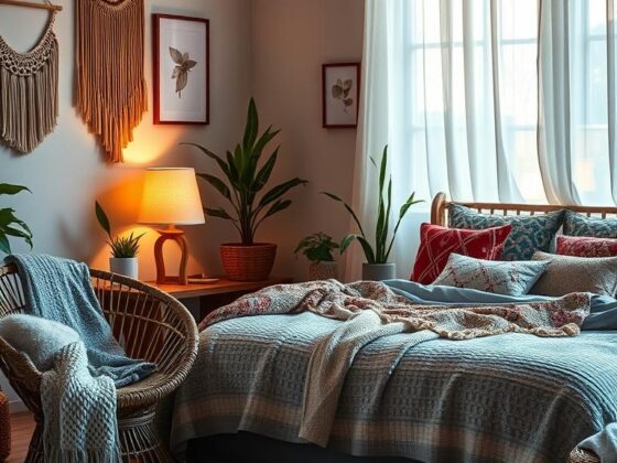
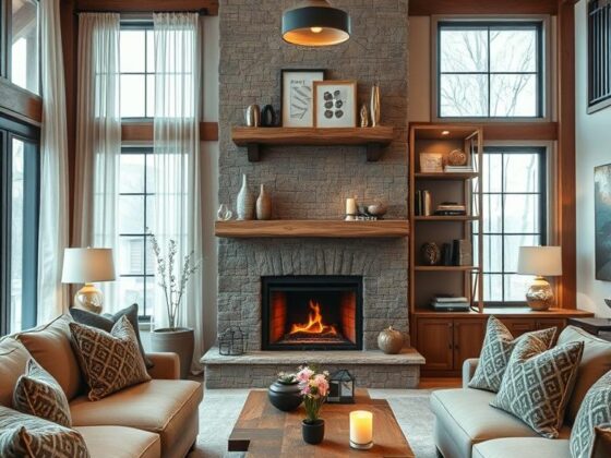
I guide clients toward a restrained dark moody palette that reads as spa-like calm. Simple materials — wood, stone, brick — keep maintenance low and the look timeless.
In small rooms, a few smart moves make a big difference: partial tiling, a large mirror, brass accents, glossy tiles, and a plant or two. These choices keep the palette rich but not heavy.
I’ll share practical ideas that respect budget and timeline. You’ll get approachable ways to blend colors, textures, and layered light so the space feels like an exhale the moment you step in.
Key Takeaways
- Dark palettes can create calming, sophisticated spaces without feeling cramped.
- Use foundational materials—wood, stone, brick—for timeless, low-maintenance decor.
- Small updates like mirrors, brass accents, and glossy tiles boost light and luxury.
- Plan for lasting choices over quick trends to keep the space elegant as it ages.
- Layered lighting and clutter-light layouts support wellness and daily ease.
- Practical weekend projects and larger remodel steps will both be covered.
Why Go Dark? The Case for a Peaceful, Moody Bathroom Retreat
I often tell clients that a darker palette can feel like a gentle exhale — calm, curated, and quietly luxurious.
Spa-like calm and low maintenance are the biggest wins. Dark colors hide water spots and soap smudges better than pale schemes, so routine upkeep feels lighter. The result reads luxe and restful, not fussy.
Design flexibility is another plus. The same dark envelope can read modern with clean lines or lean vintage with worn brass and textured elements. That versatility makes this approach a long-term style win.
Lighting and reflective surfaces matter. Thoughtful, dimmable layers let the room shift from brisk morning to slow evening. Mirrors and a touch of metal bounce available natural light so the space keeps depth without feeling closed in.
- Deep hues reduce visual noise and create a cocoon-like calm.
- Fewer visible water marks mean easier daily care.
- One palette, many styles — modern minimal to vintage character.
- Dimmable lighting and mirrors keep function high while keeping mood intact.
I coach clients to choose restraint: fewer, better elements that make a clear statement. Do that, and the room becomes a personal retreat — not a fleeting trend.
Moody Bathroom
Start small: try painting a single panel in a deep shade to feel how darkness changes the mood.
I often ask clients to test one change first—less risk, more learning. Paint a wall in Behr’s Cracked Pepper or hang a dark House of Hackney print in a powder room. These quick moves reveal how tones and texture behave in real life.

- Swap a dimmable bulb and add a plug-in sconce to layer light the easy way.
- Partial tiling with glossy dark tiles plus a lighter floor keeps the room open.
- Introduce brass accents and a warm wood stool for a human touch.
- Use an oversized mirror to widen the perceived space and reflect candlelight.
- Add plants and edit countertop decor so textures and tones can sing.
“One small experiment taught my client more than a full remodel ever did — and she loved living with the choice.”
| Quick Tweak | Impact | Effort |
|---|---|---|
| Accent wall paint | Immediate shift in mood | Low — weekend DIY |
| Plug-in sconce + dimmer | Layered light, evening warmth | Low — simple install |
| Partial glossy tiles | Sheen and balance with light floor | Medium — contractor recommended |
Tile-Driven Drama: Dark Tiles That Shape the Space
Dark tiles do more than color a room — they sculpt it. I often choose glossy blacks, deep blues, or forest greens because they reflect light and add depth without feeling flat.

Partial-height tiling keeps a small bathroom airy. Stop tile below the ceiling and let paint finish the wall. That crisp border gives breathing room and a modern edge.
Pair those dark walls with a pale floor — terrazzo, light stone, or oak-look porcelain works well. A slim floating vanity in warm wood balances the cool tiles and opens sightlines across the floor.
- Glossy + matte. Use glossy tile to bounce ambient light and a matte tile in a focused zone for tactile contrast.
- Stone and marble accents. Add a marble ledge or stone shelf as a quiet luxury, not a busy patchwork.
- Repeat in wet zones. Run the same tile from tub to ceiling to visually elongate walls and simplify cleaning.
“I like deep blue tiles with brass and warm wood — it feels timeless,” a designer friend told me after a Manhattan reno.
| Choice | Effect | Why I Recommend It |
|---|---|---|
| Glossy dark tile (black/indigo/green) | Reflects light, adds depth | Creates drama without absorbing all lumen |
| Partial tiling + pale floor | Feels airy in compact spaces | Balances weight and keeps the floor visible |
| Stone or marble ledge | Quiet luxury, low visual noise | Ages better than busy patterned tile |
Painted Perfection: Wall Colors That Create Depth and Calm
Choosing the right dark paint can feel like tuning an instrument — small shifts change the whole note.

I like Behr’s 2024 Color of the Year, Cracked Pepper, for its soft, slate-like depth. It reads rich without going harsh. Pairing this charcoal tone with warm wood and cream linens keeps the room inviting.
Charcoal to slate
When a client wants calm but not cave, I reach for that deep gray. Full-dark walls work if the lighting plan is strong. Otherwise, anchor one wall or use wainscot and paint the upper walls a mid-tone.
When to go full dark vs. accents
- Sample large swatches on multiple walls — shades shift with daylight and bulbs.
- Paint a vanity or paneling first as a reversible test.
- Keep the ceiling lighter so the room feels lifted in the evening.
- Don’t skip primer — deep tones need true coverage for color fidelity.
Tip: This is an easy way to meet the mood halfway before committing every surface.
| Choice | Effect | Best Use |
|---|---|---|
| Cracked Pepper (charcoal) | Soft, slate depth | Accent wall or full room with strong lighting |
| Mid-tone supporting paint | Balances contrast | Upper wall or adjacent rooms |
| Warm wood + cream linens | Warms the palette | Complements dark walls in a small bathroom |
Wallpaper With Mood: Florals, Botanicals, and Artistic Prints
A printed wall makes daily routines feel a little more ceremonial. Dark-base papers can add depth without closing a room in. I reach for patterns with lighter highlights so the design reads rich, not heavy.

House of Hackney’s Artemis and Midnight Garden are perfect examples — they borrow old-master florals and soften them with brighter touches. Midnight Garden, in particular, channels Dutch-Masters romance and works beautifully in a powder room where scale is forgiving.
Designers often pair a wallpaper tone with deep green tiles so the motifs echo, not clash. That cohesion makes the palette feel intentional and calm. In small baths, a single papered wall or a floral “ceiling” reads like a curated moment.
- I love dark-base florals with lighter highlights — they feel moody but not oppressive.
- Balance bold print with plain fixtures and simple mirrors so the composition stays elegant.
- Ventilation matters — use vinyl-coated paper or keep panels away from direct splash zones.
“In a powder bath, pattern becomes the statement — and it’s often the most memorable part of the reno.”
For resources on sharing your project or adding social touches, check this share buttons guide to make documenting the process easy and stylish.
Light the Night: Layered Lighting and Mirrors That Brighten Dark Spaces
Layered lighting turns a dark wash of color into a room that feels intentional and welcoming. I design lighting to do more than illuminate — it sculpts mood, shows texture, and helps the room breathe.
Start with three layers: recessed ceiling LEDs for ambient wash, vanity sconces for task light, and an accent—backlit mirrors or toe-kick lighting—to add drama. Dimmers are essential so the light shifts from bright mornings to quiet nights.

Vanity, ambient, and accent
Place sconces at eye level, flanking a mirror, to avoid harsh shadows on the face. Choose damp-rated fixtures near wet zones and hide wiring for a clean look. If natural light is scarce, use cooler temps by day and warmer light at night to support circadian rhythm.
Mirrors and reflective surfaces
A large mirror or a backlit mirror doubles perceived width and softens shadows. Metallic fixtures—brass or chrome—catch and carry light across a wall or tile band. Use reflective touches sparingly so they read as accents, not clutter.
“A backlit mirror changed how my client used the powder room — it felt wider and more forgiving overnight.”
| Layer | Purpose | Typical Fixture |
|---|---|---|
| Ambient (ceiling) | General light for the whole room | Recessed LEDs with dimmer |
| Task (vanity) | Even facial illumination | Eye-level sconces or vertical LED bars |
| Accent | Depth, drama, night guidance | Backlit mirror, toe-kick, picture light |
Color Stories: Dark Gray, Deep Blue, and Forest Green Palettes
The right trio of hues can turn a dim room into a calm, composed retreat.
I pick a tight palette so each element reads intentional. That makes a small room feel curated, not cluttered.

Charcoal sophistication with brass or chrome
Charcoal—think Behr’s Cracked Pepper—pairs beautifully with metal. Choose brass for warmth or chrome for a sleek, cool look.
Tip: Crisp linens and a single warm metal lift the scheme.
Navy and indigo with white accents for ocean-inspired contrast
Deep blue opens when you add white accents and a large mirror opposite a window.
That mirror acts like a second window and brightens the whole look.
Emerald and moss greens with wood and botanical elements
Greens want texture—wood vanities, stone, and leafy prints keep the palette alive.
Echo these tones in textiles near a freestanding tub so the tub reads grounded, not floating.
- Keep palettes tight: three core hues plus one metal.
- Use mirrors to amplify natural light for any palette.
| Palette | Effect | Finish Recommendation |
|---|---|---|
| Charcoal + brass | Elegant, warm depth | Matte charcoal walls, polished brass fixtures |
| Navy + white | Calm, airy contrast | Large mirror, white trim, indigo tile |
| Emerald + wood | Grounded, botanical feel | Warm wood vanity, stone shelf, leafy prints |
“A tight palette makes everything feel like it belongs.”
Material Mix: Wood, Stone, and Marble for Texture and Warmth
Begin with a tactile trio — warm wood, honed stone, and a little marble — and build from there. These elements give a dark moody scheme a human scale. They also age with grace, so your investment still feels good years from now.

Warm wood vanities and shelving to soften the palette
A warm wood vanity is like a friendly gesture in a deep color story. It instantly balances charcoal or navy walls and makes the space feel more welcoming.
Open shelves in the same tone let you curate tactile objects—folded towels, a carved tray, a soap dish—so each touch matters.
Marble veining and stone textures for luxe depth
Use marble sparingly: a counter edge, a ledge, or a small splash. The veining adds quiet movement without noisy patterning.
Stone floors or a single stone feature ground the room. Mixing satin, honed, and polished finishes helps light dance across surfaces instead of flattening them.
- I start with honest materials—wood, stone, marble—because they soothe the senses and outlast trends.
- Keep lines simple; when materials sing, you don’t need fussy details.
- Edit shelving to a few tactile objects so the touch points feel intentional.
“A warm wood vanity felt like the hug my client needed after we went full charcoal on the walls.”
Fixtures, Vanities, and Finishes: The Details That Make a Statement
Choose fixtures and a vanity that feel familiar to your hand—that’s where design becomes daily comfort.
Finish matters. Matte black paired with brass or gold gives modern drama. Chrome or brushed nickel reads cleaner and more contemporary. I ask clients which feeling they want to reach first—warmth or precision—then layer the rest.

Matte black, brass, or gold: selecting finishes for mood
Matte black feels graphic and bold. Brass and gold add glow and soften deep tones. Marble pairs beautifully with brass for classic warmth, while chrome or nickel fits a modern look.
Vintage silhouettes vs. sleek modern lines
If you love vintage, pick a shaped faucet, a framed mirror, and ornate sconces for Dark Academia romance. Prefer sleek? Choose a slab-front vanity, clean hardware, and a backlit mirror for a gallery-style look.
“We swapped in a matte vanity and warm brass and the room finally felt like ours,” a client told me after a quick update.
- Start with your fixtures and vanity—they’re daily touchpoints.
- Tie metals across two to three places for cohesion.
- Echo tub filler’s metal with a small accessory to anchor the composition.
- Prioritize soft-close drawers and easy-clean finishes for lasting ease.
| Element | Effect | Recommendation |
|---|---|---|
| Matte black fixtures | Graphic, modern statement | Use on faucets and hardware |
| Brass or gold accents | Warm, soft glow | Pair with marble or warm wood |
| Chrome/Nickel | Contemporary, crisp | Best with white contrasts and slab vanities |
| Vanity choices | Defines storage and style | Choose slab-front for sleek or framed for vintage |
Small Spaces, Big Mood: Designing Dark Bathrooms Without the Gloom
You can make compact spaces read larger simply by choosing what to reflect. In tight rooms, I lean on a few clever moves so the room keeps depth without feeling heavy.

Mirrors, partial tiling, and lighter floors to expand the room
A large mirror over the vanity stretches sightlines and doubles the available light. It also calms visual clutter by creating a single reflective plane.
Partial tiling keeps weight low; stop glossy dark tiles at a white border and let paint lift the upper wall. A pale floor — pale stone or terrazzo — bounces light back up so the envelope reads airy.
Plants, warm metals, and balanced mid-tones for lift
Add a single plant for texture and life. It takes almost no room but changes the bathroom feel instantly.
Warm metals like brass act as tiny sunbeams. Repeat them on hardware and one small accessory to make the palette sing without crowding the space.
- I use one focal feature — a band of tiles, a painted wall, or a small tub — and quiet everything else.
- Edit storage with baskets and trays; containment equals calm in compact spaces.
“A big mirror and a light floor were the two things that made my client stop worrying about size,” — true in so many small projects.
Conclusion
Good design lets light and materials do the heavy lifting. Choose a calm color, anchor the walls with honest stone or simple tiles, and let layered lighting shape the mood. A well-placed mirror and a thoughtful ceiling glow can make a small room feel generous.
I always recommend testing one idea first—paint a vanity, try a sheet of wallpaper, or swap fixtures. Keep foundations timeless—marble, warm wood, matte metal—then update the look with paint or a new vanity finish.
Start small and trust the process. For a project that leans dramatic, see this dramatic moody renovation for inspiration. You’ve got the playbook—now make the space feel like home.