Have you ever walked into a room and felt your shoulders drop? I open the door with a simple idea: when a property blends concrete calm with horizon-wide vistas, you can translate that feeling into a color story at home—even if your view is a fence, not foothills.
In this guide, I’ll show how a Pacific Palisades retreat’s quiet drama informs palette choices that soothe your nervous system and still feel elevated and livable.
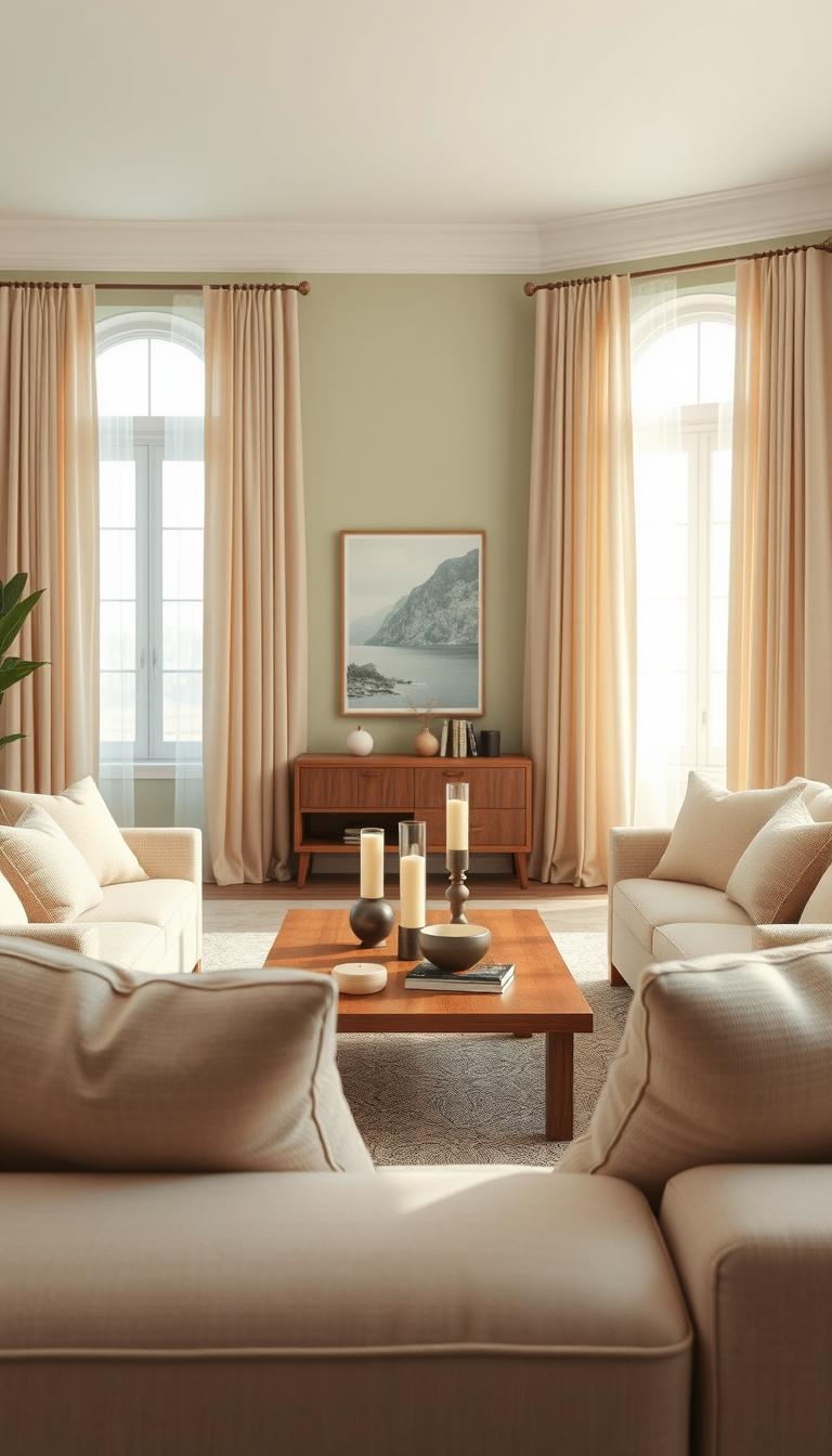
You’ll learn how mountain-facing glass, pocket doors, and two-story light become cues for softer whites, misty blues, and stone-tinted neutrals that make routine moments feel like a reset. I also share practical tips for families juggling kids and pets so rooms look curated, not precious.
Along the way, I flag quick wins—paint sheens, undertones, and trim tricks—that keep palettes crisp and cozy. If you want more deep dives, a note at the end explains how to receive latest news and design updates from our team, written by a staff writer december.
Key Takeaways
- Translate architectural light and views into soothing color stories.
- Choose misty blues and stone neutrals for a reset-like calm.
- Use sheen and undertone tricks to avoid cold or muddy finishes.
- Practical edits keep family spaces stylish and livable.
- Sign up to receive latest news for ongoing palette inspiration.
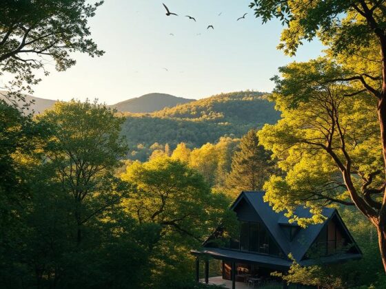
News: Inside Larry David’s Pacific Palisades listing with 180-degree mountain views
The listing turns views into a design move: sightlines and materials that make the mountains part of every room.
What sold me first was the architecture. Built in 2013 by Johnston Marklee on a half-acre lot bought for $2 million in 2011, the house spans over 5,000 square feet with four bedrooms and five baths. Listed at $8,975,000, it offers 180-degree mountain views from every room.
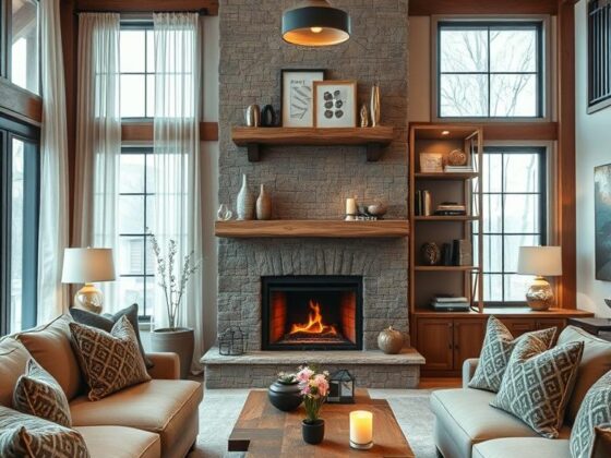
The living room anchors the plan. Concrete walls ground the space while oversized pocket doors open to a sun-drenched outdoor area. Glass walls and two-story ceilings amplify light and give the impression that the mountains move closer as you walk through the living areas.
Those long sightlines mean finishes must play nice with constant light. I recommend low-sheen paints and limewash feature walls so colors read warm, not washed out. With mountain views every turn, quieter palettes gain depth from the landscape.
Architecture, layout, and cultural context
The bones do the talking—clean volumes, honest materials, and circulation that nudges you from entry to horizon. From a lifestyle angle, this coincided with the final curb enthusiasm season and created gentle real estate buzz.
- Johnston Marklee’s plan makes the lot feel larger—views become rooms of their own.
- Oversized pocket doors dissolve the barrier between inside and out.
- Two-story glass lifts finishes; choose colors a half-shade deeper to avoid a washed look.
Note: As a staff writer december might point out, the takeaway is practical: let long mountain views guide a restrained, durable palette that lives easily with light and life.
Larry David Home design cues: translating mountain-and-coast calm into color
Big windows change everything. With two-story glass and steady mountain light, colors shift by hour. I aim for hues that respond—soft grays, misty blues, and stone neutrals—so the room feels steady, not staged.

Palette from the Palisades
I pull a quiet trio: weathered concrete gray, morning-marine mist, and oat-and-sand neutrals. These calm the pulse while keeping texture in view.
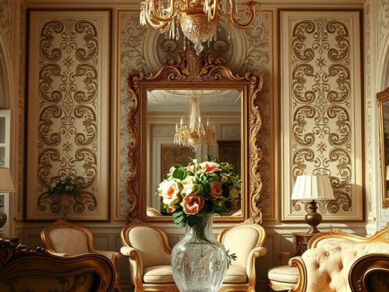
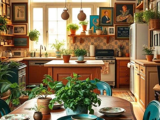
Montecito inspiration
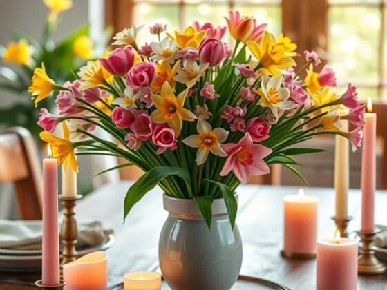
The 1920s cottage gives garden-forward warmth—creamy warm whites, clipped-hedge greens, and red-brick accents that echo the patio after golden hour.
Materials and light
Pair concrete and glass with white oak, linen, and bouclé. Test swatches in morning and afternoon; choose the deeper of your favorites so the final room reads grounded.
Room-by-room ideas
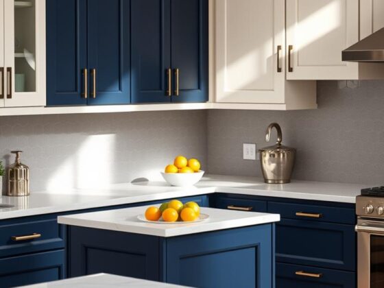
- Living: low-sheen misty blue or gray and natural wood.
- Dining: warm white walls, mid-tone table, flax drapery.
- Primary: gray-green headboard, mineral-blue linens, ecru walls.
| Area | Primary Hue | Accent |
|---|---|---|
| Living | Misty blue-gray | White oak, linen |
| Dining | Warm white | Red-brick or mid-tone wood |
| Primary suite | Gray-green / mineral blue | Bouclé, raw silk |
If you want paint picks I test in Westside light, tap me and you’ll receive latest swatches from a staff writer december.
Real estate and lifestyle notes for Westside and surrounding areas
When Pacific Palisades meets Santa Monica energy, you get a design lab where markets and moods collide.
I watch the area as both a market report and a style storyboard. Westside real estate shows how architecture and street life trade cues—quiet, hilltop finishes influence calm palettes while busy corridors demand durable, forgiving materials.
Market watch and culture:
Market watch and culture: Pacific Palisades to Santa Monica—latest news, living well, and design trends
This season’s latest news events include community gatherings like the monica pub crawl and various santa monica pub meetups that double as charity touchpoints. I love when neighbors rally to raise funds westside; those moments shape public spaces and patio design.
Food headlines matter too. County pizza chain openings and chatter about a pizza chain open near an abbot kinney location hint at where foot traffic will concentrate. That affects daylight, noise, and where you place bedrooms and window treatments.

Event flyers read like verbs—pub crawl, pub crawl raise, crawl raise funds—and they’re a great way to meet local makers and swap paint tips. The 17th annual santa gatherings and annual santa monica traditions keep the neighborhood feeling like a village, even as markets shift.
“Map foot traffic and street energy before you pick paint or curtains—your block tells you what will live well.”
- Watch open abbot and open abbot kinney launches for weekend crowd spikes.
- Expect parking and light spill near new storefronts; plan acoustics accordingly.
- Newsletter options help you receive latest news—newslettersubscribe newsletter receive quick design and market drops from yours truly.
Bottom line: the surrounding areas cross-pollinate. What opens on one block often nudges color and material choices a few streets over, so fold local culture into your design plan and you’ll live better here.
For a closer look at a hilltop listing that inspired these notes, see this piece on the Pacific Palisades property: Palisades hilltop listing.
Conclusion
Start with the view, then tune tone and texture until the room breathes with it. If the landscape speaks, let your palette whisper. Keep layers soft, repeat tones, and favor materials that age gracefully.
Whether you’re on a half-acre lot or a compact city parcel, borrow mountain-and-coast cues so your home calms the body the moment you walk in. Rooms near bright exposures should lean cooler; tucked corners can read warmer.
, These choices matter in real estate and in daily life—subtle restraint yields spaces that feel effortless and lived-in. Want swatches, fixture picks, and layout notes? newslettersubscribe newsletter receive or sign up to newsletter receive latest to receive latest news and field-tested recommendations.