What if a single splash of hue on your cabinets could change how your whole home feels — calmer in the morning and more joyful by dinner?
I’ve seen the trick work again and again in real projects. Cobalt blue with chrome, neon yellow islands next to blue‑gray bases, and powder blue paired with walnut all bring mood and function together. These moves keep a kitchen lively without losing resale or sanity.
I’ll show practical ways to test color under your light, sequence paint and hardware, and use simple backsplashes so the result feels intentional. Small shifts — a painted island, new kitchen cabinets, or swapped hardware — deliver high-impact upgrades in any space.
If you want inspiration that balances joy, durability, and everyday living, stick with me. Ready to continue reading? Let’s dive into ideas you can try step by step.
Key Takeaways
- Bold cabinet color can transform mood and function in a kitchen.
- Pair saturated hues with quiet materials for a cohesive look.
- Test paint in your lighting before committing.
- Small changes—an island or hardware—yield big impact.
- Choose finishes that make a bold color feel grounded and livable.
Why Colorful Kitchens Are Trending Now
Designers now treat cabinets as the main canvas, letting walls stay calm and bright. This approach gives homeowners control: paint and finish are reversible, so you can test a new color without a full remodel.
Rich tones—forest greens, deep blues, and warm corals—pair with simple backsplashes and mixed metals. Removing some upper cabinets and keeping the backsplash minimal creates airiness and helps your chosen tones read clearly in different light.
I tell clients to sample paint in morning and evening light. Undertones shift, and a swatch that sings at noon may feel flat at dusk. Metallic hints—gold or chrome—add spark without competing with the main hue.
- Mood benefits: color psychology shows nature-forward tones can calm or energize a kitchen.
- Low risk: paint on cabinets is an affordable way to try a bold idea and still protect resale value.
- Small spaces win: concentrated color defines zones and adds depth with bright walls and reflective surfaces.
We’re cooking and entertaining at home more, so kitchens must perform and uplift. Want data-backed benefits and ready-made palettes? Continue reading for pairings you can copy in your kitchen design.
Sunny Statements: Yellow Kitchens That Boost Mood
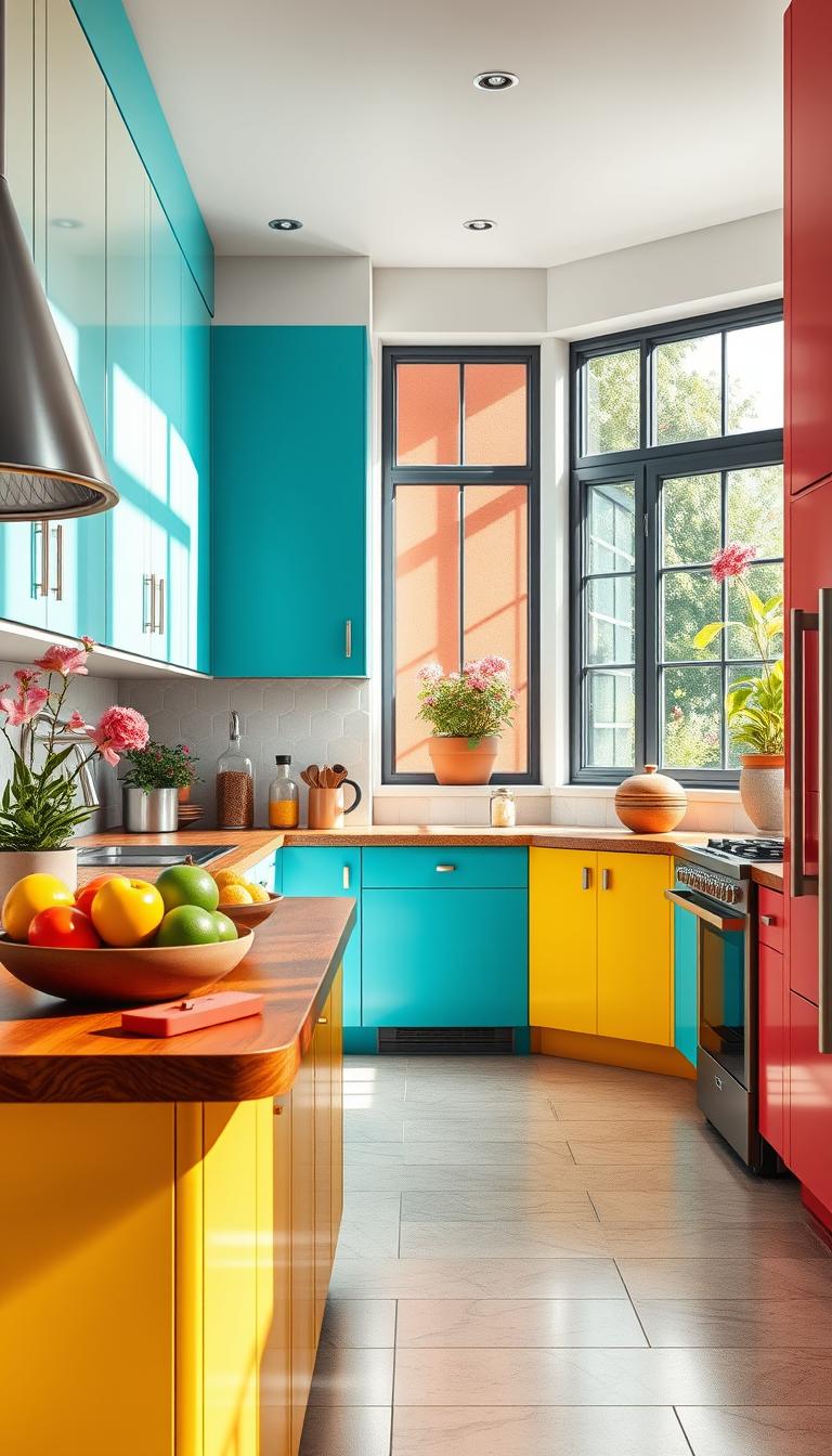
A yellow island can flip the mood of your cooking space in a single weekend. I’ve seen neon and pastel tones do very different jobs — one sparks energy, the other soothes.
Bright yellow islands paired with blue‑gray cabinets create instant contrast and a beachy calm without feeling literal. Try a saturated shade on the island and keep cabinet faces quiet for balance. If you keep your cabinets white, the island becomes a color bridge between warm wood and cool counters.
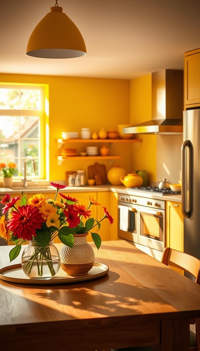
Bright yellow islands with blue-gray cabinets for instant contrast
Quick wins:
- I love a bright island against blue‑gray cabinets — yellow equals optimism and reads fresh near brushed chrome or stainless.
- Pick a durable enamel or catalyzed finish for the island so it stays scrub‑able and bright.
- Simple backsplash and quiet hardware keep the yellow from feeling fluorescent.
Pastel lemon walls for a soft, wellness-forward backdrop
Soft lemon walls warm morning light and won’t compete with art or dishes. Sunny yellow also pairs beautifully with a blue patterned tile backsplash for a playful rhythm.
Try Acorn Squash by Glidden or Sundance by Benjamin Moore as a test—sample a saturated and a soft shade before you commit.
If you want a feel-good kitchen that still reads intentional, these are small, high-impact kitchen ideas. Continue reading and grab a sample now.
Blue Hues: From Cobalt to Powder Blue
Blue tones move between bold and gentle, and each shade writes a different story for your kitchen.
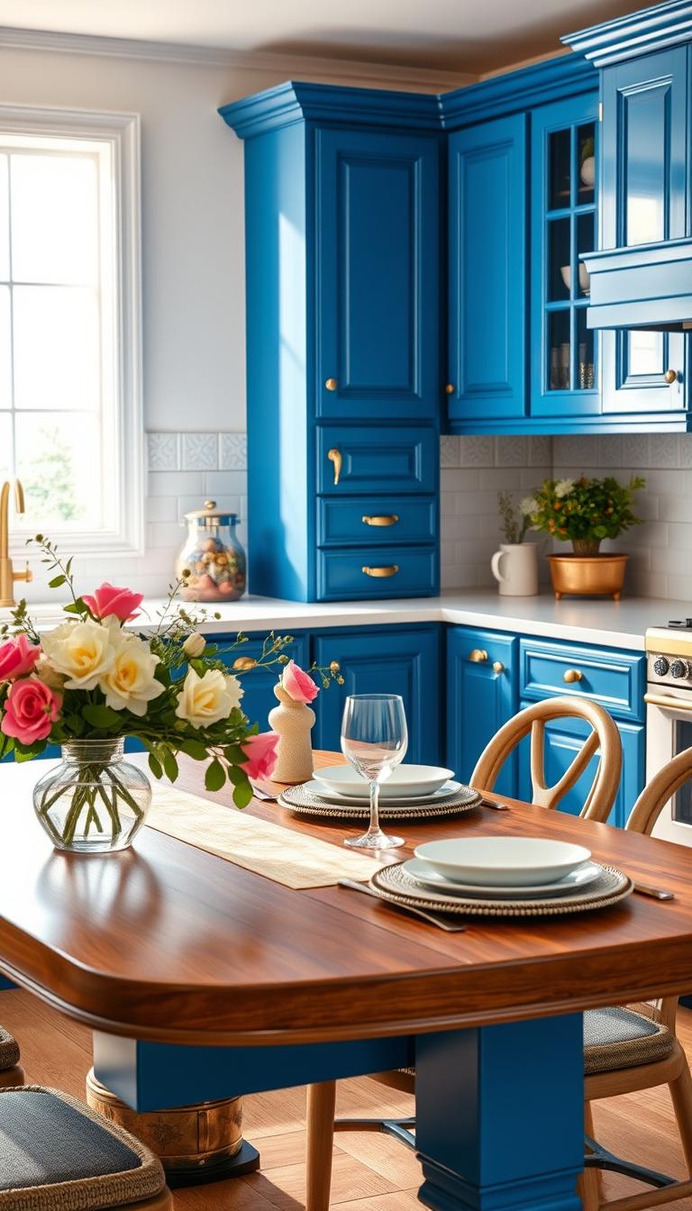
Cobalt cabinets sing when everything else plays quiet. A simple slab or narrow-set backsplash keeps the eye on the finish, while chrome and stainless steel hardware adds crisp sparkle. I recommend a light, low-contrast countertop so the color stays the hero—think Behr’s Dark Cobalt Blue for a true statement.
Cobalt blue cabinets with simple backsplash and chrome finishes
Keep tile minimal and choose a durable paint or enamel on cabinet faces. Small touches—soft-close hinges and polished pulls—make daily life nicer and protect the finish.
Pastel blue cabinetry elevated by gold hardware and walnut accents
For a softer approach, powder or pastel blues pair beautifully with warm walnut and gold pulls. Backdrop Home’s The Early Stuff is a great powder tone I’ve used for family kitchens. The mix reads luxe but calm.
Navy lowers with crisp white walls and no upper cabinets
Navy lowers with bright cabinets white walls open sightlines. Skipping some upper cabinets makes compact spaces feel taller and airier. A white-veined slab ties the look together and balances depth.
- Sample two shades—saturated and pastel—and view them in both natural and pendant light.
- Add an island panel a shade off the main run for subtle depth.
- Design tip: pick narrow tile or a slab backsplash to avoid visual clutter.
Want your blue to sing without shouting? Continue reading—I’ll show you when to bring in wood, where to use metal, and how to keep the countertop choice easy.
Teal to Seafoam: Coastal-Cool Cabinetry
When teal turns toward the moody side, it behaves almost like a neutral in a cozy kitchen. I use Valspar’s Sailing By Moonlight as a go-to for rooms that need depth without heaviness.
Moody teal that reads like a neutral in cozy rooms
Moody teal grounds a layout and pairs well with walnut or oak floors. It hides everyday wear and still reads intentional. I specify satin or semi-matte on cabinet faces to cut glare and show the depth of the hue.
Light teal cabinetry with marble countertop and slab backsplash
Light teal cabinets look boutique when a dramatic marble countertop climbs the wall as a slab backsplash. If you cook a lot, pick a marble-look quartz for the working surface and keep the real stone as the vertical showpiece.
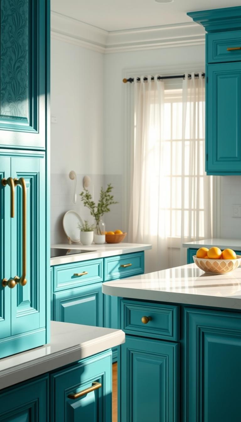
Seafoam green with baby blue walls and woven lighting
Seafoam green cabinets with baby blue walls and woven pendant lighting make a kitchen feel like ocean air. Polished nickel cools the palette; aged brass warms it. Add a slim natural wood island end for balance.
- Quick wins: test swatches vertically under your real light.
- Teal plays beautifully with terracotta, walnut, or oak—so you can keep floors.
- Satin finishes and consistent hardware make the color feel cohesive.
Love that serene, sea-kissed mood? Continue reading and I’ll help you dial the shade to match your light and lifestyle.
The New Greens: Sage, Forest, Botanical, and Glossy
Greens now span from whisper‑soft sage to glossy grass—each shade writes a different story for a kitchen. I use these tones to set mood and to tie a room to the outdoors without going literal.
Sage green cabinets with white walls for farmhouse warmth
Sage green cabinets against cabinets white walls deliver that easy farmhouse warmth I love. It reads friendly near wood beams or butcher block.
Forest green lowers with white uppers to balance depth
For small footprints, put the depth low. Forest lowers with white uppers keep sightlines bright while giving weight where it matters.
Glossy grass green for pantries and second kitchens
Glossy grass green is great for a butler’s pantry or scullery. The sheen reflects light and turns a service space into a jewel box.
Botanical greens paired with leafy wallpaper
Botanical green plus leafy wallpaper creates a nature-forward backdrop without painting every surface. It feels curated, not forced.
- Test two paints: a soft sage and a deeper forest—greens shift with daylight and bulbs.
- Hardware: antique brass warms greens; polished nickel cools them.
- Finish: choose enamel or catalyzed coating for high-traffic cabinetry.
Keep counters light and simple so the greens read clear and fresh.
I’ve used these greens in client projects to make a calm, resilient room. Try a sampler and see how the color changes across the day—good kitchen design starts with observation.
Red to Coral: Warm, Energizing Cabinet Colors
Red and coral bring a pulse to a kitchen, turning routine tasks into small celebrations. I’ve used wine tones on full runs and on single focal pieces—and both ways feel intentional.
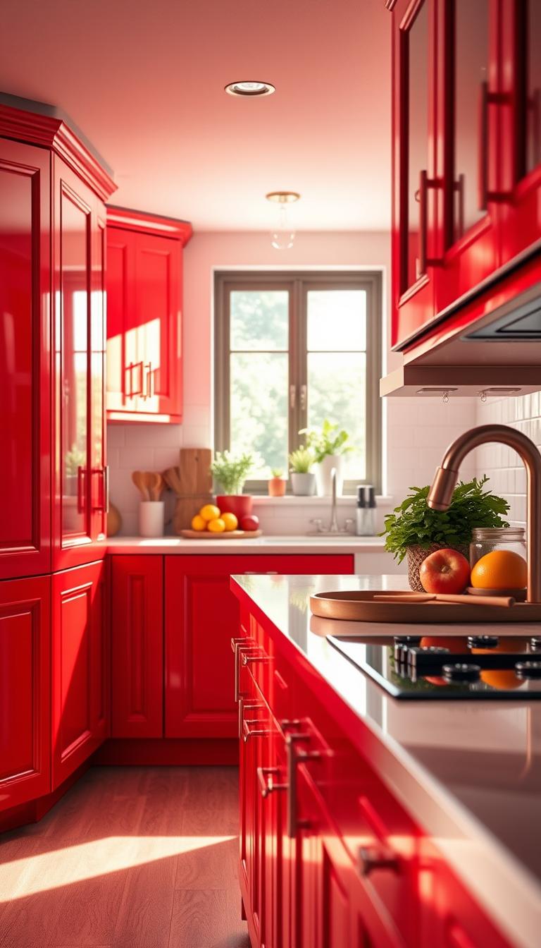
Wine-inspired monochrome wraps the wall and cabinets in one deep shade for drama. Gold hardware acts like jewelry; it warms and refines the palette.
Wine-inspired monochrome cabinetry and walls with gold hardware
A full monochrome scheme reads cozy and curated. Test earthy reds—rust and burgundy—to see how the shade shifts in morning and evening light.
Coral accents with deep teal for vibrant contrast
Coral plays beautifully with deep teal. Use coral on select upper cabinets or a pantry door so the eye moves while deeper tones anchor the base.
- Keep the backsplash simple: zellige or a stacked plain tile keeps saturated tones elegant.
- Start small if red feels bold—try a hutch, bar niche, or pantry before repainting every cabinet.
- Balance warmth with stainless or chrome to stop the scheme from feeling too hot.
| Approach | Best Use | Finish / Hardware |
|---|---|---|
| Wine Monochrome | Full runs, window treatments, walls | Matte or satin paint; gold pulls |
| Coral Accents | Upper cabinets, pantry doors, islands | Semi-matte; brushed nickel or chrome |
| Mixed Warm-Neutral | Eclectic or mid-century homes | Durable enamel; oak stools, terracotta elements |
“Ready to energize your routine the right way? Continue reading and I’ll help you find the just-right red or coral for your kitchen design.”
Pretty in Pink: Soft Shades That Read Neutral
A whisper of blush on cabinet faces often reads more like a neutral than a statement. Soft pink can warm a room without stealing the scene. It settles into a modern or classic plan and invites touch.
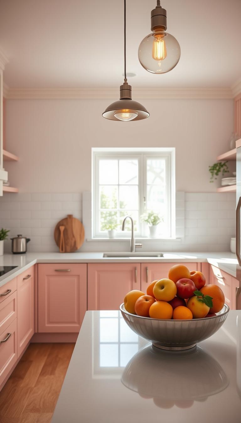
Soft pink cabinets with gold hardware for warmth
I find that pairing blush cabinetry with gold hardware makes the tone feel curated, not sugary. Use a light, low-vein countertop to keep the eye on the finish and avoid competing patterns.
- Sample a desaturated paint color first; it reads sophisticated, not sweet.
- Keep walls pale and lighting warm so the space glows rather than glares.
- Start small—an island panel or larder door—if you’re pink-curious.
Soft pink pairs beautifully with white oak or walnut. Minimal accessories help the cabinetry act as the star of your kitchen design.
“Soft pink acts like a warm neutral when balanced with warm metals and soft lighting.”
| Feature | Best Use | Finish | Why it Works |
|---|---|---|---|
| Blush cabinets | Full runs or island panels | Satin | Reads neutral; softens lines |
| Gold hardware | Pulls, knobs, faucets | Aged or polished gold | Adds warmth and refinement |
| Light countertop | Quartz or low-vein marble | Matte or honed | Keeps focus on color; adds calm |
Purple Power: From Lavender to Deep Plum
Purple can read like a restful retreat or a theatrical flourish depending on the tone and finish you pick. Deep purple—think Glidden’s Purple Basil—feels dramatic yet calm when paired with bright creams and white walls.
I’ve used deep purple cabinets on a bar run and watched the room settle in low light, then glow in afternoon sun. For a sleek profile, choose high-gloss cabinetry, minimal hardware, and modern lighting to let highlights and shadow play do the work.
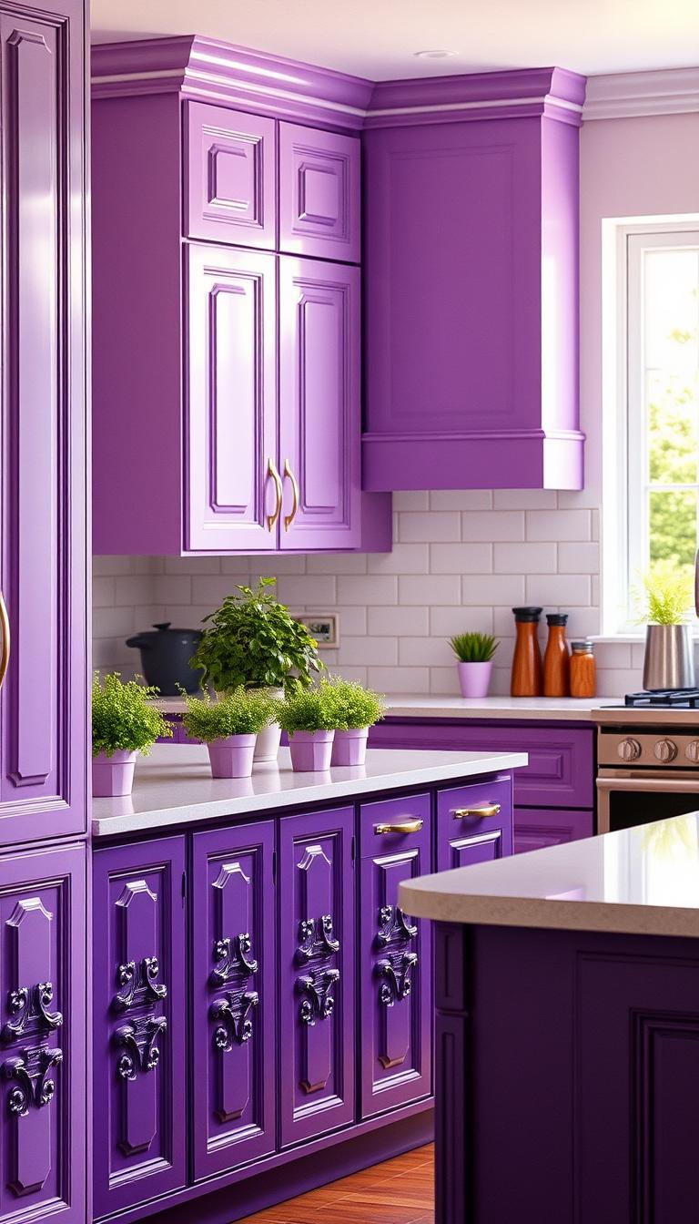
Deep plum as a bold yet calming cabinet choice
Deep purple cabinets surprise in the best way—calming in low light, dynamic in daylight. Keep countertops light and quiet so the shade can breathe.
High-gloss purple with modern lighting for drama
Go high-gloss and streamline pulls. Designers often use bubble pendants or linear LEDs to bring out depth in glossy finishes.
- Try a moment: start with an island or bar before painting the whole kitchen.
- Swatch both: lavender for airiness, plum for drama—view them under your real light.
- Warm it up: add wood stools or shelves so purple doesn’t read too cool.
“A satin or gloss finish reads contemporary; matte feels artsy and soft—choose based on style and maintenance.”
I use these moves with clients when we fine-tune a kitchen design—love a little glamour with calm? Continue reading and I’ll show how to right-size purple for your space.
High-Contrast Classics: Black, White, and Silver
Black and white can feel both crisp and inviting when done with care. I favor matte black cabinets balanced by bright cabinets white tile and a silver-veined stone. The result is graphic but lived-in.
Matte black cabinetry with white tile and silver‑veined stone
Matte black cabinets with white tile and a silver-veined marble countertop deliver that iconic, graphic look. A silver wave slab or a light marble strip softens the jump from black to white and reads intentional.
Many clients skip some upper cabinets to keep the plane open. That choice makes even a small kitchen feel gallery-like. Add one warm gold sconce or a pair of pulls so the room feels human, not stark.
- I recommend durable enamel on black surfaces; it wipes clean and resists fingerprints.
- Keep grout lines narrow—details show in high contrast.
- A simple black island with light stools and stainless steel appliances keeps the composition balanced.
When you want a bold look that photographs beautifully and lives even better, this classic delivers.
For sourcing tips and maintenance tricks, continue reading—I’ll share what to prioritize in your kitchen design.

Metallic Accents: Gold, Brass, and Reflective Finishes
When the right metal meets quiet stone, the room starts to feel like an elegant stage. I use gilded textures and mirrored details to push a space toward party-ready without making it fussy.
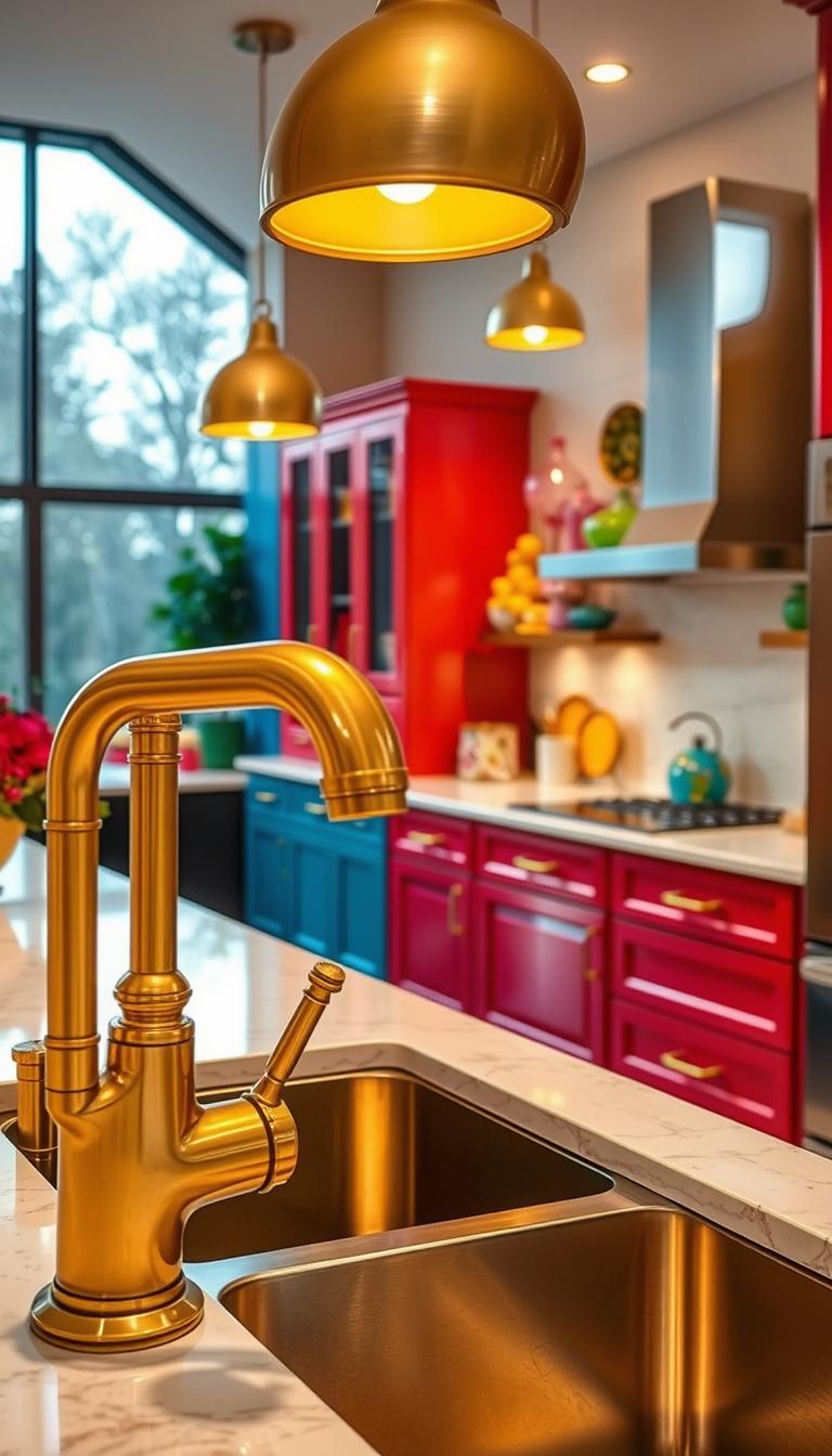
Gilded textures, neutral marble, and small mirrors give a club-like, disco energy that still reads sophisticated. Copper range hoods and gold pulls warm saturated cabinets and anchor a dramatic wall.
- Pick one hero metal and echo it in tiny accents for cohesion.
- Pair bold cabinets with quiet stone to avoid visual noise.
- Reflective finishes bounce lighting, so you can rely on mood bulbs over heavy wattage.
- Choose textured finishes where hands touch to hide fingerprints.
Use mirrors or a slim brass shelf edge as jewelry for the run. Copper hoods age into a warm focal point and lift the entire kitchen backdrop.
“Want a little glam that still works on a Tuesday night? Continue reading; I’ll show you where metallic accents do the most good in design.”
| Feature | Best Use | Why it Works |
|---|---|---|
| Gold hardware | Pulls, knobs, faucets | Warms saturated cabinetry and reads like jewelry |
| Copper hood | Range wall | Anchors the space; develops patina |
| Neutral marble | Countertop/backdrop | Keeps metallics from feeling loud; adds calm |
Wood and Earth Tones: Brown, Ivory, and Natural Texture
Warm woods and earthen hues give a kitchen a lived-in, comforting presence that feels intentional. I often steer clients toward brown and ivory when they want calm without losing character.
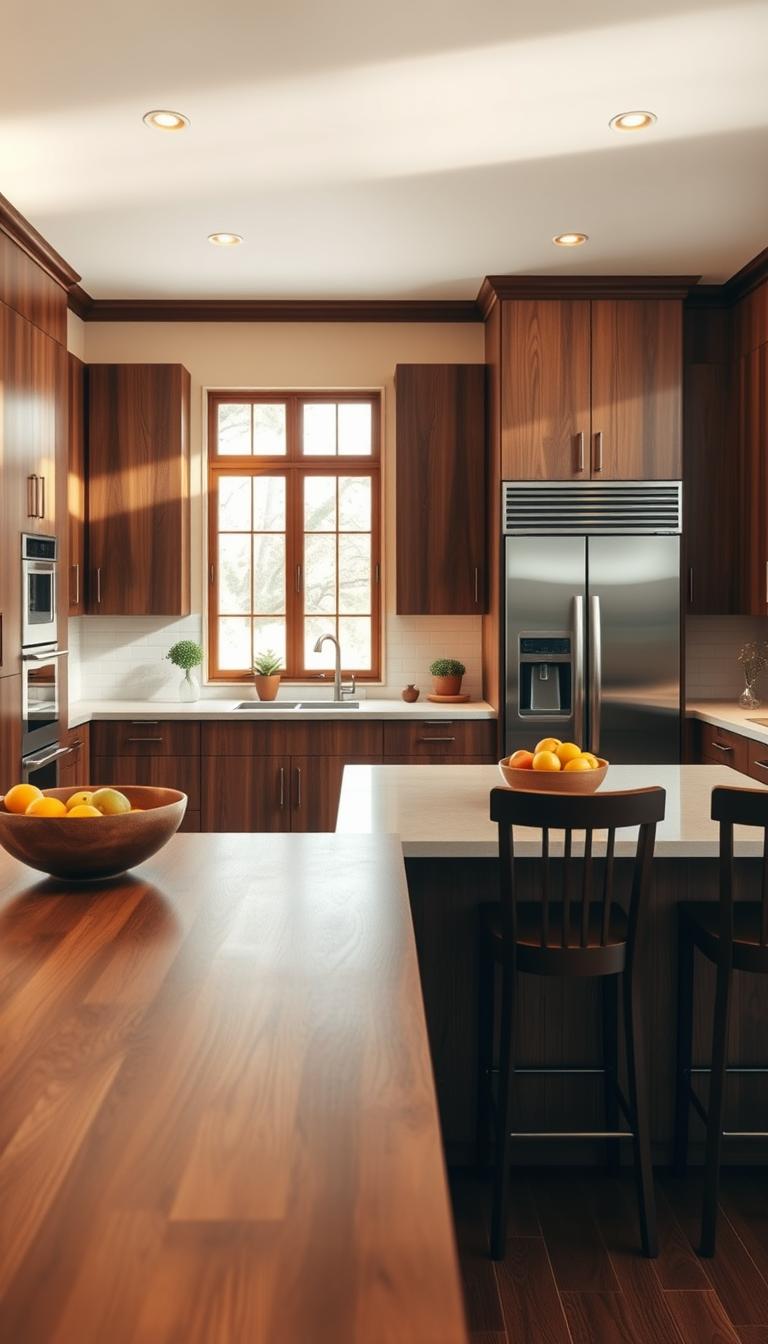
Chocolate brown cabinetry for cozy, calming depth
Deep chocolate brown cabinetry brings instant calm and sophistication. It hides wear well and reads timeless in a busy room.
Ivory walls with deep teal cabinets for European charm
Ivory walls soften pattern-heavy textiles or tile. Pairing them with deep teal cabinets creates that European countryside feel—rich, restrained, and quietly elegant.
- If your floors or beams are warm, let the wood shine and remove extra ornament.
- Keep the countertop light and soft-veined so earth tones hum, not fight.
- Consider a touch of cabinets white on select upper cabinets to lift the palette.
- Designers now mix grass green with brown wood for a modern nature-forward take.
“Use one honest texture—rattan or stoneware—to tie the story together without clutter.”
If you crave a grounded kitchen design that still feels fresh, earth tones with honest wood are your friends.
Two-Tone Cabinet Ideas and Upper vs. Lower Strategies
A darker island and softer wall cabinets create a grounded, airy balance. I use this move when a room needs weight without feeling heavy.
Blue-on-blue works beautifully in sun-drenched kitchens. Put a deeper navy or cobalt on the kitchen island and choose lighter blues or powder tones on wall cabinets. The island reads like an anchor; the uppers keep sightlines open.
Forest green lowers with cabinets white uppers is another reliable play. The deep lower cabinets give depth and hide wear. The white uppers bounce light and keep the room feeling tall.
- Keep hardware consistent so the palette reads cohesive across tones.
- If your space is small, limit deep color to base units to preserve openness.
- Repeat the deeper hue on an open shelf or trim to stitch the look together.
- Choose a quiet countertop and backsplash so the two colors stay elegant, not busy.
- Use the kitchen island to test a bold hue — it’s easier to repaint later.
“Plan the layout with sightlines in mind—what you see from adjacent rooms should feel intentional.”
| Approach | Best Use | Why it Works |
|---|---|---|
| Dark island / light uppers | Open, sunlit layouts | Anchors the room and preserves vertical light |
| Forest lowers / cabinets white uppers | Long runs or galley kitchens | Adds depth while keeping sightlines bright |
| Accent repeat | Shelf, rail, or island trim | Stitches two-tone palette into one story |
If you want the easiest on-ramp to color confidence, continue reading and start your kitchen design with a two-tone plan.
Backsplashes That Make Color Pop
A well-chosen backsplash can lift a bold cabinet shade and give the whole room a tidy, edited feel.
I love a blue patterned tile as a foil for sunny yellow cabinets. It feels playful and balanced. The pattern reads lively without forcing the eye to work too hard.
Blue patterned tile with sunny yellow cabinets
A blue patterned backsplash is my go-to when I want a cheerful contrast. It brightens the space and keeps the yellow from feeling one-note.
Marble veining and slab backsplashes as a luxe backdrop
For a luxe look, run marble from counter to full-height slab. The veining becomes art and calms vivid hues. Green cabinets also love stone with subtle blue‑green veins—nature’s cohesion.
Turquoise tile and mosaic patterns for eclectic style
Turquoise tile or mosaics dial up personality. Keep lines clean and outlets minimal so the pattern can sing. Matte tiles mute glare; glossy tiles bounce light and enlarge a small room.
“Seal porous materials and choose grout that won’t yellow—longevity is part of good kitchen design.”
- If your cabinets white, a statement backsplash adds color without repainting.
- Mind tile scale: large patterns can overwhelm; mosaics add texture gently.
- Hungry for more inspiration? Continue reading for the right countertop pairings.
Countertop Pairings: Marble Countertop, Quartz, and Concrete
A countertop can make or mute a cabinet color—so I choose material like I choose a mood. Start by thinking about how you cook and clean; function should steer the decision as much as style.
Marble countertop slabs that climb the wall give a gallery-like, unified look. The veining becomes a feature that either supports or competes with your cabinet shade, so I always match swatches in several lights.
Dramatic marble countertops that climb the wall
Drama without distraction: a marble slab backsplash reads elegant and calm when the veins flow toward the island or sink. For family use, consider a honed marble or a quartz that mimics marble to reduce etching.
Concrete and quartz for modern color contrast
Concrete and quartz keep lines crisp and care low. Concrete brings a tactile, lived-in patina; seal it well if you love the look. Quartz gives the marble look with less fuss—great for busy households and a smart choice for a kitchen island.
“Good kitchen design balances beauty and practicality; pick the surface that fits your rhythm, not just your feed.”
- I like warm wood touches—stools or an open shelf—to soften cool counters.
- Test samples next to your cabinet finish in daylight and at night; undertones change everything.
- On an island, a thicker edge or waterfall turns the countertop into a sculptural moment.
Want help pairing counters and cabinets? See my detailed guide to pair countertops with cabinets for practical kitchen ideas and step-by-step tips.
| Material | Best Use | Why Choose It |
|---|---|---|
| Marble | Gallery runs, slab backsplashes | High drama; natural veining that supports color |
| Quartz (marble-look) | Family kitchens, islands | Marble aesthetic with low maintenance |
| Concrete | Modern, industrial, patina lovers | Durable, develops character; needs sealing |
| Thicker waterfall edge | Kitchen island focal points | Architectural presence; ties color and form |
Islands, Lighting, and Hardware: Small Choices, Big Color Impact
A boldly painted island quickly becomes the room’s punctuation mark—fun, forgiving, and easy to change. I’ve used this move on tight budgets and in high-end remodels. It gives instant focus and is simple to undo.
Color-drenched islands as focal points
A color-forward island is the safest big swing. It reads like a focal piece and is easier to repaint than a full run of cabinets.
- Keep the countertop quiet so the color leads.
- Repeat the island hue in a small detail for cohesion—inside a glass cabinet or a stool leg.
Pendant lights and playful chandeliers
Layered lighting makes the island sing. Bubble chandeliers add softness; sunny pendants bring cheeky sparkle.
“Dimmers are non-negotiable—your lighting should flex for cooking, dining, and late-night tea.”
Metals to finish the look
Use metals as understated accents to tie the palette together. I pick gold for warmth, chrome for crispness, or stainless steel to match appliances.
- Match hardware scale to cabinet style—slim pulls for modern, chunky knobs for classic.
- If your plan is open-plan, align finishes with adjacent rooms for flow.
Want a guaranteed win? Continue reading and I’ll map the order of operations for your upgrades in smart design.
Colorful Kitchens
A bold hue can act like punctuation in a room, drawing the eye and lifting mood in one move. I pick paint by testing large swatches on-site—light changes everything.
Neon brights to soft pastels: choosing the right paint color
Neon yellow cabinets show how a fearless choice makes a kitchen feel joyous and lived-in.
Tip: sample both saturated and softened versions. Mid-tones age better and are easier to layer with other colors. Let a stone slab inspire your palette—pull two tones from the veining to guide the paint colors.
Small spaces and pantries: going bold in compact rooms
In pantries and butler’s pantries, dark blue‑green or glossy grass green reads luxe and contained. It’s a small stage for a big mood.
- Start small: paint an island or one cabinet bank and live with it for a week.
- Keep the rest restrained—simple backsplash, minimal patterns, unified metal finish.
- Renters: swap hardware, pendants, and stools for instant inspiration without repainting.
- For family kitchens, choose enamel or catalyzed finishes for durability.
Want a simple, step-by-step plan to try now? See this guide and continue reading for a quick action list.
Conclusion
Small shifts in tone often do the heavy lifting in a room’s personality. Across current projects, thoughtful color on cabinetry, islands, and backsplashes—balanced by marble, quartz, and neutral tile—keeps a kitchen feeling personal and timeless.
I recommend starting small: paint an island or swap a backsplash, then live with it for a weekend. Test swatches in your light and trust your eye; durable finishes and smart lighting make the change last.
Balance saturated tones with simple counters and repeat metals and wood to tie the layout together. If cabinets white work for your home, keep them; layer color through a tile or a single cabinet-inset moment.
Use this guide as a checklist: pick one quick upgrade now and one larger project to plan. The right tones will lift your mood and make the space work harder for you.
Ready? Revisit these kitchen ideas when you’re set to take the next step in your kitchen design with confidence.

