Can a simple shade lift your mood every morning? I ask that because neutral baths are safe, but color can turn a routine into a small daily boost.
I’ve seen it work in real homes. Heidi Caillier’s warm purple tiles and terracotta floors feel like a hug. A London flat with terrazzo and forest-green shiplap reads like a jewel box.
I’ll share my field-tested method for picking hues that feel intentional, not random. You’ll learn how paint, tiles, and textiles play different roles.
We’ll focus on what you can change quickly and what needs more time or budget. Expect doable ideas and warnings about lighting traps that make pretty colors fall flat.
By the end, you’ll have a practical roadmap to design a colorful room that matches your style and routine. I’ll help you choose shades that support wellbeing and last for years.
Key Takeaways
- Color can boost mood and transform a plain bathroom into a stylish space.
- I share a simple method to choose hues that feel deliberate and supportive.
- Quick wins: paint and textiles. Long-term: tile and stone.
- See real examples—from purple-and-terracotta charm to jewel-toned nooks.
- Avoid common pitfalls like poor lighting and mismatched undertones.
Why Colorful Bathrooms Are Having a Moment right now
More homeowners are treating the bathroom as a low-stakes place to experiment. I notice people choosing bold hues in private rooms while keeping the rest of the house calm.
Social feeds and before-and-afters make expressive palettes feel accessible. Think fully blue English barn conversions in Bauwerk “Nightshade,” terrazzo-clad London flats with forest-green shiplap, or pink tile with black fittings in townhouses.
- Privacy: a powder room is a small, personal space to try a daring look.
- Designer influence: pros push jewel tones, nuanced pastels, and earthy terrazzo.
- Practicality: better paint tech and moisture-friendly finishes make color durable.
- Wellness: certain hues energize mornings or soothe evening routines.
| Driver | Contemporary Example | Benefit | Quick Tip |
|---|---|---|---|
| Social visibility | Blue-on-blue barn conversions | Normalizes bold choices | Start with a powder room |
| Designer palettes | Forest-green shiplap + terrazzo | Feels elevated, not childish | Use jewel tones as accents |
| Material advances | Moisture-friendly paints & tiles | Longer-lasting finishes | Choose rated products for wet space |
| Wellness focus | Pink tile with black fittings | Supports mood and routine | Match color to time of day use |
The result is bathrooms that feel like micro-retreats. They reflect who you are, not just resale-safe choices.
How to Build a Foolproof Palette for a Bathroom
Start by treating the palette like a recipe—one main flavor, a couple of accents, and a warm finish.
The 1–2 key colors + 1–2 accessory colors + wood tone method
I use this simple framework with clients: pick one or two key hues to do the heavy lifting, add one or two accessory colors, then ground the scheme with a wood tone. Key colors work best on fixed surfaces—tile, a vanity, or the main wall—so the design reads as intentional rather than piecemeal.

Balancing saturation, light, and contrast in a wet room
Light changes everything. Low-light rooms need medium, moody tones. Sunlit spaces can take deeper color without feeling closed in.
- Commit surfaces: fix key hues to tile or stone.
- Use accessories: reserve paint, towels, and mirrors for the smaller accent colors.
- Contrast: introduce metal finishes or a lighter wood if floors, walls, and vanity sit at the same value.
- Test vertically: paint samples next to tile under the bathroom light to see true shifts.
- Grout matters: contrasting grout can highlight pattern; matched grout quiets busy tile.
If you’re stuck with existing tile, go tone-on-tone: match the vanity to the tile and nudge the wall a shade darker or lighter. Finish with a natural wood stool or shelf—one organic note softens the whole hard-surface space.
Designer-Approved Paint Color Ideas for Bathrooms
A well-chosen paint can turn a small bath into a calm retreat or a jewel-like surprise.
Serene neutrals with warmth. I reach for Benjamin Moore White Dove or Swiss Coffee when clients want a soft, clean backdrop. Warm Beige and Taupe Grey pair beautifully with a yellow tub or natural wood for a grounded, lived-in look.

Moody and dramatic
Want theater? Black Beauty on beadboard with bright white above reads tailored, not tiny. Dark Burgundy gives a jewel-tone richness—try brass mirror accents. For a textured green, Portola’s Nitty Gritty Roman Clay adds depth and tactility.
Fresh blues and greens
Farrow & Ball Duck Green or Green Smoke work for lush, enveloping schemes. Slate Blue makes a powder room feel cocooned; Cornflower livens a vanity. Harbor Fog brings a silvery, oceanic clarity.
Playful pastels and purples
Shell Pink or a Sugared Almond-style lavender softens routines. Benjamin Moore Tempest reads like plaster—glamorous in small doses. For a lacquer-box finish, try Glossy Olive on a ceiling or trim.
- One-hero rule: paint door, trim, and vanity the same shade to unify a compact bathroom.
- Texture matters: Roman Clay or high-gloss finishes change how color catches light.
- Always sample: test large swatches by your tile and under real fixtures, day and night.
Statement Tile Moves: From Zellige to Terrazzo
Tiles do the heavy lifting in small wet rooms; the right one makes everything read intentional. Use material and scale to set tone—rustic, jewel-like, or quietly modern.

Glossy green Zellige and forest-green shiplap pairings
I love glossy green Zellige in the shower—it catches light and feels hand-made next to forest-green shiplap. That old-world texture meets modern crispness and gives a designer finish without fuss.
Terrazzo walls and floors for pattern-rich impact
Terrazzo on both walls and floor adds instant pattern and depth. In an award-winning London flat, terrazzo slabs carried the eye and made a compact bathroom feel expansive.
Tip: Keep the vanity simple so the surface variation can shine.
Terracotta and reclaimed Spanish floor tiles for warmth
Reclaimed Spanish floor tiles or terracotta hex warm cool palettes and hide wear beautifully. They’re perfect for family baths and high-traffic floors.
- Mix finishes: matte floor tile for grip, glossy wall tile for bounce—unify with one hue.
- Mind scale: small-format Zellige suits niches; larger terrazzo slabs cut grout lines.
- Shower strategy: repeat the field tile and switch to herringbone or vertical stack on a feature wall.
- Edge details: bullnose or metal schluter in a matching finish polishes corners and protects edges.
- Low-commitment color: lock color into a lower third—floor or half-height wainscot—if you’re cautious.
Ode to One Color: Tone-on-Tone Bathroom Design
When tile already anchors a room, leaning into that single hue is the fastest way to read as deliberate. I use this trick for clients who inherit mid-tone blue tile and want a layered, calm result without ripping anything out.

Layering multiple shades of blue across tile, wall, and vanity
My favorite move is a three-step tonal stack: tile mid-tone, vanity matched, walls a notch darker. It quiets grout lines and gives the eye a rich story.
Small accents—a navy-striped towel or soft teal rug—add interest without breaking the flow.
Matching vanity paint to tile, then shifting wall tone darker
Match your bathroom vanity paint to the tile first. Then test at least two wall shades above and below that match under real light.
- Pick a single metal finish—polished nickel or warm brass—for cohesion.
- Use pale stone counters or a woven mirror to soften the temperature if the tile reads cool.
- Paint the ceiling a whisper lighter to keep the room feeling tall.
Result: a budget-friendly, colorful bathroom that feels intentional, layered, and full of personality. It’s a small set of paint and hardware moves that transform the design.
Bold Yet Livable Color Combos to Try
Try pairings that feel lived-in, not staged — they should survive kids, pets, and busy mornings. Below are four mixes I return to with clients when they want a strong look that still reads friendly.
Emerald, sage, and cream with marble moments
Why it works: Emerald anchors the scheme while sage and cream soften it. Add a marble vanity top or a slim shelf for quiet luxury.
Burgundy and mauve with black-and-white grounding
Burgundy gives drama; mauve keeps it modern and wearable. Use black white accents in floor tiles or framed art to stop the palette from feeling too sweet.
Mustard, peachy pink, and navy with rattan accents
This trio reads joyful and current. Rattan mirrors or a stool add texture and keep the look relaxed. Pick one metal finish—brass or polished nickel—for small fittings.
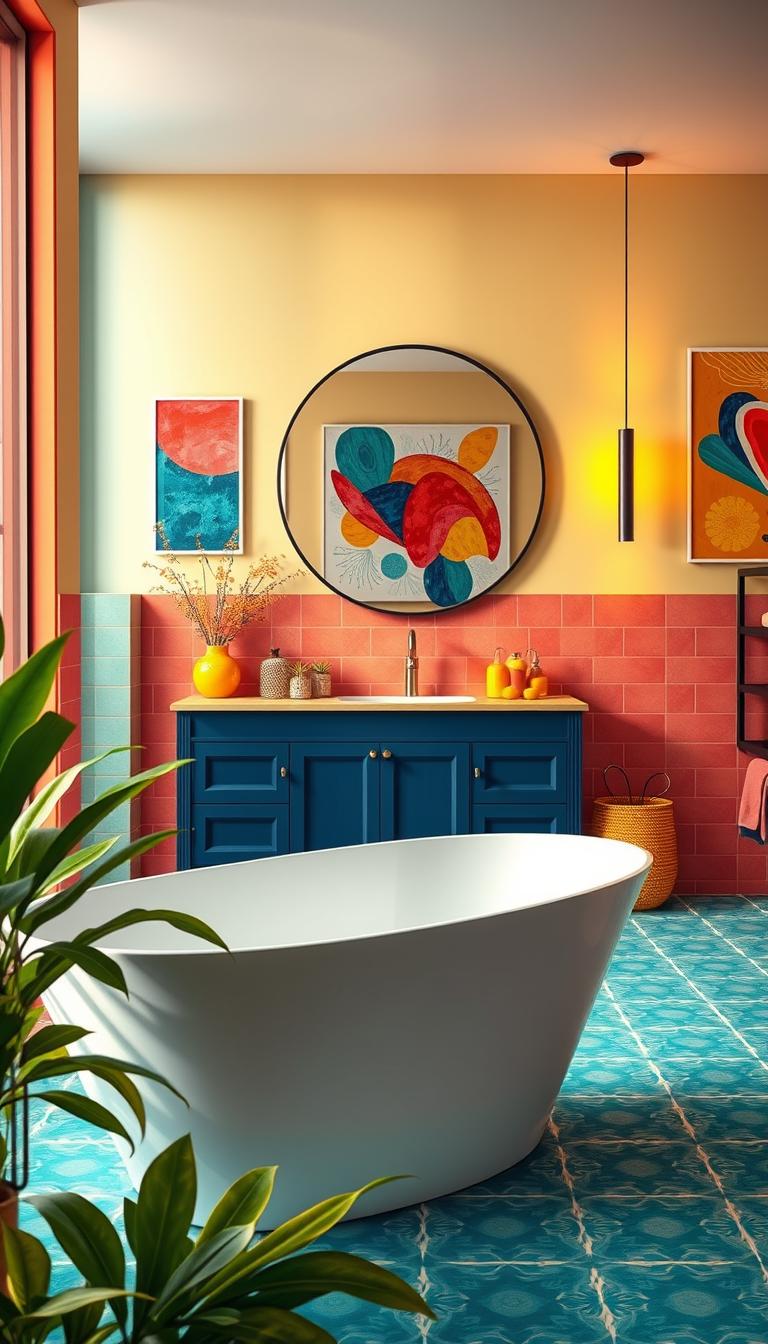
Sky blue, brick/terracotta, and mustard for modern charm
Sky blue paired with terracotta floors feels warm and fresh. A mustard towel or soap dish lifts the scheme without overwhelming the space.
| Combo | Key Element | Use Case | Quick Tip |
|---|---|---|---|
| Emerald / Sage / Cream | Marble vanity | Classic powder room | Hex-and-diamond floor tiles |
| Burgundy / Mauve | Black-and-white accents | Moody master bath | Star floor or striped textiles |
| Mustard / Peach / Navy | Rattan details | Family or guest bath | Keep vanity simple, painted wood |
| Sky Blue / Terracotta | Brick-like floor tiles | Modern bathroom with warmth | Add a mustard towel for punch |
Small Bathroom Color Ideas that Actually Enlarge the Space
The trick in small spaces is to create continuous planes that trick the eye into depth. When you reduce visual interruptions, a room reads larger even if the footprint is tiny.

High-contrast beadboard strategy: Designer Linda Hayslett used Benjamin Moore Black Beauty on beadboard with bright white above to add crisp architecture in a tiny powder room. The black lower wall visually anchors the room while white keeps the ceiling feeling higher.
All-over single-hue soak: Or embrace a wraparound approach—slate blue powder rooms or a muted green like Farrow & Ball Green Smoke on walls, trim, and ceiling create cozy, cocooning depth.
- Keep floor and shower tile simple so the eye sees an unbroken plane; fewer grout lines make the space feel larger.
- Choose a pedestal or narrow vanity and paint it to match the wall so it visually recedes.
- Use a pocket or sliding door and mirrors to bounce light and save swing space.
- Pick one metal finish; fewer finishes equal calm, and calm reads as spacious.
- Introduce vertical lines—beadboard or stacked tile—to imply height, then add soft towels for warmth.
- Limit the palette to two colors plus a neutral for clarity and a bigger-feeling room.
Small moves—smart paint color, one quiet vanity, and tidy tile—add up to a surprisingly roomy result.
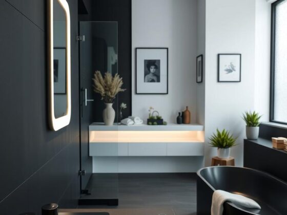
Powder Room Power: Go Saturated, Go Sculptural
A tiny powder room is where I let color and shape get theatrical. It’s the perfect room to take a risk without committing the whole house.

Think jewel-box drama: saturated walls, a sculptural mirror, and bold fixtures create impact in the smallest footprint. A patterned leaf on the ceiling lifts the eye and makes the room feel taller.
Because use is brief, you can choose richer paint than you’d live with all day in a primary bathroom. Let metals gleam—brass or polished nickel reads luxe against deep pigment.
Keep the layout pared back. Minimal storage, one beautiful soap, and a curated hand towel keep things edited. A petite sconce and a curved faucet add soft glow and organic shape.
- Use a saturated wall color as the anchor.
- Wallpaper the ceiling to add whimsy and vertical interest.
- Pick one statement light and one sculptural mirror—no clutter.
- Finish with a small art piece to make the design feel collected.
In short: treat this tiny space as a chance to show intent. A bold powder or powder room stop can become the most memorable room in the house.
Vanity as a Color Anchor: Wood, Marble, and Painted Options
The right vanity can turn a tight powder room into a composed statement. I often begin a bathroom palette at the vanity—it’s the piece you touch daily, and it sets tone for walls, tile, and fittings.

Marble tops that calm saturated walls
Marble vanity tops bring natural movement that softens strong paint. Veining acts like a built-in pattern, so a busy wall feels grounded rather than noisy.
In client projects I pair a marble-topped console with saturated walls and simple pulls. The stone reads subtle and luxurious, and it balances deep pigment without competing.
Rattan and cane to soften vivid color
Cane-front doors and rattan details add breathable texture. They warm a bold base and keep the scheme from feeling precious.
Practical tips:
- I often paint the vanity base in the hero hue so the rest of the room follows.
- Wood tones—oak or walnut—bridge cool tile and warm metals for balanced style.
- Keep hardware consistent: one brass finish across pulls and faucet ties the look together.
- If you’re nervous, paint the vanity and mirror first and live with it before changing walls.
- Floating vanities open visual space; furniture legs add charm in classic settings.
- Always seal stone and use moisture-resistant paint on surrounding walls to protect your investment.
Small, intentional choices at the vanity—material, finish, and hardware—shape how the entire bathroom feels. Start there and the rest of the design becomes easier and more confident.
Walls, Wainscoting, and Wallpaper: Layering Color the Smart Way
Walls tell the story of a room—so I layer texture and pattern to give it a clear voice. A thoughtful mix of panels, paint, and paper makes the look feel designed, not accidental.

Shiplap in mauve or green to add texture without tile
When tiles aren’t in the budget, painted shiplap is a hardworking alternative. Mauve or deep green adds depth and survives splash zones better than raw wood.
Pro tip: repeat the vanity color in the shiplap or trim to tie the room together and make the treatment feel intentional.
Ceilings that surprise: leaf wallpaper and dark blue paint
A ceiling surprise lifts the eye. Leaf wallpaper or a dark blue ceiling makes the envelope feel complete and gives a small room a dramatic, cozy finish.
Keep it zoned: wrap the paper in the showerless powder room or above the vanity to control cost and humidity exposure.
Mixing beadboard, plaster finishes, and paper patterns
Layer smartly: beadboard below, Roman Clay plaster above, and a slim wallpaper border or niche for pattern. That balance keeps the design calm and readable.
- Use moisture-rated wallpaper in zones and seal edges near sinks.
- If the floor or tiles are busy, choose a quiet plaster finish on the walls.
- Let one hero pattern do the heavy lifting; support it with solids and natural wood tones.
Final rule: aim for cohesion—echo a floor tone in your paper’s motif and limit the palette so the room reads curated, not chaotic.
Showers and Tubs: Tile Layouts, Color Blocks, and Gallery Walls
A shower or tub can be the room’s most expressive moment — if you let tile and architectural paint do the heavy lifting. I often pick one move that sets the tone and let the rest follow.

Monochrome niches read luxe. Run one color across field tile, niches, and trims for a calm, unified bathroom. That quiet repeat makes small spaces feel curated instead of busy.
Architectural color blocks add joy without a full rip-out. Think an arched shower door painted Behr Golden Aura against Blooming Jasmine walls — a playful frame that doesn’t touch the tile.
Classic moves I use with clients:
- Pink tile with black fittings feels crisp and modern — a London townhouse look that works stateside.
- Blue clawfoot baths are instant icons; echo the color in a towel or knob to tie the scheme together.
- Keep floors safe with small-format floor tiles for grip, and align grout lines from wall to floor to lengthen the eye.
- Add a small gallery wall above a tub for personality — pick humidity-safe frames and keep art out of direct spray.
- Finish with a clear shower screen so the tile pattern and color block can do the talking.
These simple choices lift the design and make the shower or bath feel intentionally joyful in any bathroom.
Hardware and Finishes: Brass, Chrome, and High-Gloss Paint
Finishes tie the design together — they’re the punctuation marks of the room. I treat hardware as a finishing move. One consistent metal gives a small bathroom authority and calm.
Brass warms jewel tones like burgundy and emerald and lifts pastels such as shell pink or lavender without shouting. Designer Roger Higgins recommends drenching walls and ceiling in glossy Olive by Little Greene for a lush, reflective mood. Linda Hayslett’s Black Beauty beadboard proves black gloss can read tailored and modern.
Choices that make a space sing
- Warm brass pairs beautifully with rich hues and soft pastels.
- High-gloss green or black on walls and ceiling multiplies light and cocoons the room.
- Polished chrome/nickel suits cool blue and gray schemes for a cleaner note.
- Keep finishes consistent across faucet, lighting, and mirror hardware for a quieter palette.
| Finish | Best with | Effect | Quick Tip |
|---|---|---|---|
| Warm brass | Emerald, burgundy, pastels | Adds glow and warmth | Use on taps and mirror frames |
| High-gloss green | Deep jewel walls | Reflective, cocooning sheen | Sand and prime before painting |
| Black gloss | Beadboard or trim | Elegant, tailored drama | Test under warm and cool lights |
| Polished chrome | Blue/gray palettes | Cool, seamless finish | Match with simple stone or wood |
Practical note: with high-gloss paint, prep matters—sand, prime, and use quality rollers to avoid texture. Test metal tones against your paint color and under different light so the plan feels deliberate, not accidental.
Modern Bathroom Color Ideas vs. Classic Looks
Which route should you take: crisp modern contrast or a soaked-in classic shade? Both approaches make a strong visual promise, but they read very differently depending on architecture and finish choices.
Modern leanings favor graphic moments. Pink tile paired with black fittings — a look popular in London townhouses — feels clean, sharp, and current. Keep hardware streamlined, use slab-front vanities, and limit trim so the color blocks do the talking.
Classic interpretations drench the room in one shade. Think English barn conversions painted in Bauwerk “Nightshade” blue, with a matching vanity and a blue clawfoot tub. The result is enveloping and quietly luxurious.
I often advise clients to mix the two when they’re undecided. Modern lines with a traditional palette give you precision without losing warmth. Or keep classic bones and add a crisp pink-and-black accent to modernize the look.
- Pick finish to match intent: matte or limewash for heritage charm; satin or gloss for modern sheen.
- Let your room’s architecture decide—clean-lined layouts can carry bold contrast; cottage details ask for layered, softer shades.
- Designer tip: test your paint color on a full wall near fixtures to judge how the shade reads in your home light.
Budget-Friendly Ways to Add Color Without a Full Remodel
You don’t need a contractor to make a big visual shift—sometimes a quart of paint does the trick. In an afternoon you can refresh surfaces and change how the whole bathroom reads. These are practical, low-cost ideas I use with clients who want impact on a budget.
Painted vanities, mirrors, and beadboard refreshes
Start with one hero surface. Paint the vanity or mirror frame in your chosen hue. Beadboard or a lower wall painted in the same tone ties the scheme together and feels intentional.
Textiles: towels, rugs, and shower curtains as color layers
Swap towels seasonally and add a washable rug or patterned shower curtain to layer color without commitment. Small hardware upgrades and a new light fixture in a single finish instantly elevate the space.
- Batch projects into one weekend and finish by Sunday.
- Use leftover paint for a playful door interior or shelf back.
- If tile feels dated, paint surrounding walls to flatter it and add art to redirect the eye.
- Always choose moisture-resistant products so the refresh lasts over time.
Common Color Mistakes in Bathrooms and How to Avoid Them
What looks perfect in the store rarely reads the same under your bathroom light. Test large paint swatches by the sink and the shower. Try them under both warm LEDs and daylight to avoid surprises.
Grout, finish, and ventilation matter as much as hue. Ignore grout tone and a patterned tile can fight your palette. Mix too many metal finishes and the room feels noisy.
Here are practical ideas to keep your plan tidy and durable.
- Skip tiny samples—use full-sized panels or poster-sized swatches.
- Match or contrast grout on purpose; don’t leave it to chance.
- Limit metals to one finish; two only if one is minor.
- Use moisture-rated wallpaper and a good fan to prevent peeling.
- Choose sheen for function—semi-gloss or satin near water.
- Plan storage early so the space stays edited and calm.
| Mistake | Why it Happens | Fix | Quick Tip |
|---|---|---|---|
| Small paint samples | Color shifts with light | Test large swatches day & night | Pin a 2×3 ft poster for a week |
| Wrong grout | Unplanned contrast or noise | Choose matched or intentionally contrasting grout | Lay a sample tile with grout before install |
| Too many finishes | Visual clutter in tight rooms | Pick one metal; use a second sparingly | Match faucet and mirror frame |
| Poor ventilation with wallpaper | Peel and mildew | Use moisture-rated paper + fan | Zone paper away from direct spray |
Result: a bathroom that looks considered and lasts. Small checks—samples, grout choices, and a ventilation plan—save time and heartache later.
Colorful Bathrooms
True design confidence shows up in occupied homes; below are real baths that balance risk and livability. I pulled practical examples so you can see how one clear choice—tile scale, a painted shiplap, or a gallery wall—carries the look.
Real-room inspiration: from rainbow family baths to terrazzo-clad apartments
A rainbow-accented family bath proves playful doesn’t mean chaotic. Repeat colors across towels and art and the scheme reads intentional, not busy.
Terrazzo wrapped floors-to-walls with forest-green shiplap show how texture and tiles can share the spotlight. The material gives movement while the shiplap adds warmth.
Pink tub, green tiles (shoutout to @myedwardianhouse) balances warm and cool. Repeat each hue at least once—vanity, towel, or frame—to keep cohesion.
- All-blue English barn conversion: a blue vanity, walls in Bauwerk “Nightshade,” and a blue clawfoot show tone-on-tone power.
- Cotswolds bath in Farrow & Ball Bancha pairs organic green with classic fixtures for grounded charm.
- Scottish pink bathroom uses a small gallery wall to layer personality without adding more colors.
- Amsterdam’s Atelier ND proves you can have two distinct baths in one home and still feel unified.
Steal just one idea—a shiplap color, a tile scale, or an art mix—and adapt it to your house. These rooms are less about bravado and more about repeating small moves so the design feels lived-in and true to you.
Conclusion
Let the final decisions be small acts of confidence—one anchored choice at a time. Pick an anchor hue and decide if it lives on the vanity, the wall, or in your tiles so the plan reads intentional.
I lean on trusted paints—White Dove, Duck Green, Black Beauty—and statement surfaces like terrazzo or Zellige when clients need reassurance. Use the 1–2 key colors + 1–2 accents + wood tone rule to keep things simple.
Test everything under your bathroom light and pick a sheen that handles moisture and adds glow. Start small: paint a vanity or swap textiles, then scale to walls or tile as you gain confidence.
Result: a calm, daily oasis that supports routine and feels unmistakably yours.