Homiscape.com
  • Homepage
  • Ideas by Room
    • Bathroom
    • Bedroom
    • Home Office
    • Kitchen
    • Living Room
    • Outdoor
Categories
  • Bedroom
  • General
0
0
Homiscape.com
Subscribe
Homiscape.com
  • Homepage
  • Ideas by Room
    • Bathroom
    • Bedroom
    • Home Office
    • Kitchen
    • Living Room
    • Outdoor
Color of the Year
  • General

Color of the Year 2026: What’s Trending in Home Design

  • January 25, 2026
  • Jade Hunt

Total
0
Shares
0
0
0

Question: Can a single, lofty white shift how we live, shop, and style our homes?

I ask because Pantone named PANTONE 11-4201 Cloud Dancer as the pick for 2026 — a first-time white choice since 1999. I watched the announcement and felt a quiet pivot from loud palettes to calm, reflective spaces.

When an authority speaks, the market listens. Retailers and brands — from Motorola to Joybird and Play‑Doh — will echo this move. You’ll spot that soft tone on phones, furniture, and packaging.

In my work I’ve seen white read as boring or brilliant. It all comes down to undertone, texture, light, and how you arrange contrast and negative space. I’ll walk you through why this matters and how to make Cloud Dancer feel warm, not sterile.

Key Takeaways

  • Pantone’s pick signals a calm design shift with wide cultural reach.
  • Brands will roll out collaborations that make the tone highly visible.
  • Successful use depends on undertone, texture, and layered contrast.
  • You’ll learn what industry voices say and how the selection works.
  • Practical tips will help you use lofty white without losing warmth.

Pantone’s 2026 announcement: Cloud Dancer, a “lofty white,” steps into the spotlight

When Pantone announced PANTONE 11-4201, it felt like a reset: an airy white leading a moment that favors calm over noise.

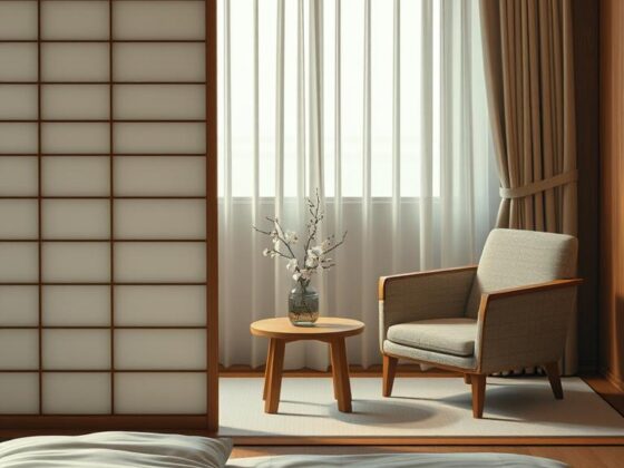
What Cloud Dancer is: PANTONE 11-4201 is a soft, airy shade that reads like a fresh gessoed canvas. It’s meant to quiet visual clutter so textiles, wood grain, and art can stand out.

First-ever white since 1999

This is the first white chosen since the program began in 1999. That announcement signals a pause after years of saturated palettes and suggests buyers want breathable space again.

Inside the institute’s message

“Pantone does not assign political narratives to color,” said Leatrice Eiseman in a public statement. Laurie Pressman called it an “airy white” that opens room for creativity.

That framing came from the global team at the pantone color institute. They position the pick to help a company or consumer see how a single hue can shape mood, not dictate politics.

  • Practical note: test Cloud Dancer in morning and evening light—small samples matter.
  • Where you’ll see it: Motorola, 3M Command, Post-it Notes, Joybird, and Play‑Doh.

Color of the Year reactions: mixed reviews, social media discourse, and cultural context

Within hours the pick lit up social channels, sparking hot takes and earnest questions.

A vibrant, photorealistic digital illustration depicting a variety of social media platforms interacting in a dynamic online conversation about color trends in home design for 2026. In the foreground, a diverse group of people, dressed in professional business attire, use laptops and smartphones, their focused expressions capturing the engagement of online discourse. The middle layer features large, colorful icons of popular social media platforms like Twitter, Instagram, and Pinterest, intertwined with abstract representations of color palettes and design elements emerging from the screens. The background presents a cozy and modern workspace, illuminated by soft natural light from a window, enhancing the atmosphere of creativity and innovation. The composition conveys a sense of collaboration and mixed reactions as participants weigh in on the trending "Color of the Year."

Viral chatter skewed two ways. Some people called it tone-deaf and used words like “whitewashing” and “microaggression.” Others joked that a neutral palette signals recession or quiet luxury. Comments on Pantone’s Instagram ranged from outraged to bemused.

Viral critiques and context

Critics argued the choice ignored social currents and would erase visible identity in design. Those lines of critique landed hard in media and on feeds.

Support from industry voices

Design pros pushed back. Scott Woodward called it calming and useful as negative space. He said a single pale tone can make craft and texture read stronger. That defense came from people who work with brand and packaging every day.

How Pantone decides

Pantone’s process stays purposefully private. Teams watch global signals year-round, then confer. Their public statement stressed emotion over politics.

Reaction Common Claim Representative Voice Takeaway
Outrage Whitewashing, tone-deaf Social commentators Highlights cultural sensitivity
Dismissive jokes Recession signal, meme fodder General public on social media Quick, surface-level responses
Support Calming, versatile Design pros (e.g., Scott Woodward) Practical for branding and interiors
Institutional Apolitical, research-driven Pantone Color Institute Intent: illuminate not impose

I’ve seen clients relax with pared-back palettes—but only when we bring texture and memory into the room. That balance is a simple, useful takeaway for homeowners and companies watching this pantone color year debate.

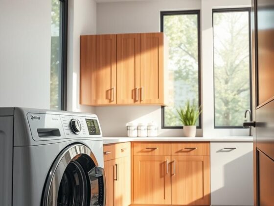
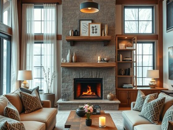
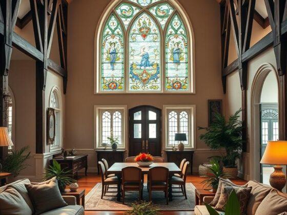
What Cloud Dancer means for home design in the U.S.

Expect Cloud Dancer to act less like a finish and more like a backdrop for everyday life. I tell clients to treat it as a blank stage—one that lets texture and contrast lead.

A serene, photorealistic depiction of a "cloud dancer" gracefully moving among fluffy, soft clouds in a dreamy sky. In the foreground, a figure dressed in elegant, flowing white and pastel clothing embodies a sense of freedom and tranquility, their arms stretched upwards as if embracing the clouds. The middle ground features layers of soft white and light blue clouds, gently illuminated by warm sunlight, casting subtle shadows that create depth. In the background, a vibrant, pastel-hued sunset bathes the sky in shades of pink, lavender, and orange, enhancing the ethereal atmosphere. The lighting is soft and diffused, capturing a tranquil moment in time, with a focus on harmony and serenity. This image will inspire feelings of calm and hope, reflecting the essence of "Cloud Dancer."

Design playbook: layer, contrast, and negative space

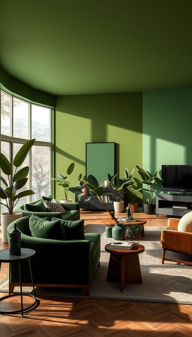
Use limewashed plaster, boucle, linen, hand-knotted wool, rift-sawn oak, and veined stone so a room reads tactile, not empty.

  • Contrast with intention: blackened bronze hardware, oil-rubbed brass, charcoal frames, and inky art lines ground lofty white.
  • Light and undertone: north-facing rooms need warm woods; south-facing rooms can hold crisper trims—always sample at two times of day.
  • Maintenance: pick scrubbable, low-sheen finishes for high traffic; save ultra-matte for low-touch walls.

Warm vs. cool whites in 2026

I expect warm neutrals to stick around for two to three years, but cooler whites may return as a counterweight to maximalism. Try cool tones on cabinetry or tile before repainting a whole home.

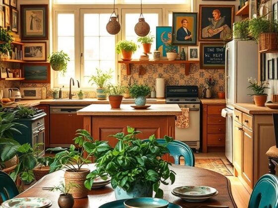
Beyond white: other notable 2026 hues and brand moves

For more context on the official pick see Pantone coverage. If you want to preview how retailers might merchandise neutrals and accents, check a merchandising example here.

Coloro x WGSN rolled Transformative Teal; Graham & Brown pushed Divine Damson; Behr offers Hidden Gem. Use teal on a bathroom tile, damson in a snug library, or Hidden Gem as a chalky backdrop. Pull olive greens, terracotta, mocha mousse, or deep blues into rugs and art to make the scheme personal.

Conclusion

Cloud Dancer arrives as a quiet tool for designers, not a rulebook for taste. It’s a historic pick from Pantone—named by institute leaders to encourage calm and creativity across brands from Motorola to Joybird.

I’ve seen mixed media reaction and lively debate, yet this choice can work when you let texture, wood, and plants do the talking. Treat the shade as backdrop—frame what you love, don’t replace it.

If you’re curious, add a jewel-toned accent or an olive textile before committing to whole rooms. Sample in daylight and lamplight, shop with intention, and trust what feels right in your home as 2026 unfolds.

FAQ

What is Cloud Dancer and why did Pantone name it this year?

Cloud Dancer is Pantone’s selected hue for 2026 — a lofty white presented as a calming blank canvas. Pantone’s Color Institute describes it as a neutral backdrop that encourages reflection and creativity. The institute highlights its versatility for interiors and products, suggesting it supports clean, serene design while letting textures and accents shine.

Is this really the first white pick since Pantone started naming palettes?

Yes. Pantone’s announcement marks the first time a near-white tone has held this role since the program began in 1999. That shift reflects broader cultural interest in simplicity, quiet luxury, and spaces that feel restorative rather than overstimulating.

Who at Pantone explained the choice and what did they say?

Leaders at the Pantone Color Institute, including names like Leatrice Eiseman and Laurie Pressman, framed the selection as an invitation to pause and create. They emphasized neutrality as a creative tool — a way to foreground personal expression and make other hues sing.

Where will I see Cloud Dancer outside design headlines?

Expect Cloud Dancer across product categories — from smartphones and furniture to everyday items like Post-it Notes and Play‑Doh. Pantone partnerships often bring the chosen hue to stationery, home goods, and limited‑edition merchandise.

Why did social media react strongly to this pick?

Reactions split. Some users accused the choice of “whitewashing” or being tone‑deaf given social conversations about representation. Others praised its calmness and practical uses in branding and interiors. The debate reflects how color decisions now carry cultural meaning beyond aesthetics.

Do designers and brands actually like this choice?

Many designers welcome a neutral like Cloud Dancer for its flexibility — it pairs well with texture, contrast, and layered materials. Branding pros see it as a bold move: a neutral can sharpen product photography and let accent colors carry narrative weight.

How does Pantone decide on a pick like this?

The Color Institute uses global trend analysis, industry intelligence, and discreet research. They track fashion, technology, politics, and social attitudes to choose a hue that resonates across markets and industries rather than making a political statement.

How should I use a lofty white at home without ending up cold or sterile?

Pair the white with warm woods, layered textiles, and rich accent tones. Mix matte and glossy finishes, add plants for life, and use negative space deliberately. That balance keeps rooms cozy while preserving the serene feel designers want from this shade.

Will cooler whites replace warmer palettes next year?

Trends ebb and flow. Cloud Dancer points to a moment favoring restraint, but warmer whites and earthier tones remain popular. Expect a dialogue between cool minimalism and maximalist warmth rather than a complete swap.

Are there other notable hues influencing 2026 besides Pantone’s pick?

Yes. Other authorities and brands are spotlighting shades like transformative teal, deeper plums, and muted pastels. These tones offer contrast to Pantone’s white and give designers a broader toolkit for storytelling and branding in 2026.

How can homeowners translate this trend into practical updates?

Start small: repaint trim or a ceiling in a lofty white to brighten rooms. Swap in textured rugs, throw pillows, and lamps in complementary hues. Update one focal piece of furniture or a gallery wall to reflect the calm, collected mood without a full renovation.
Total
0
Shares
Share 0
Tweet 0
Pin it 0
Related Topics
  • Color Palette
  • Color Trends
  • Decor Inspiration
  • Design Trends
  • Home Decor
  • Home Makeover
  • Home Styling
  • Interior Design
  • Pantone Color
Jade Hunt
Jade Hunt

Hi, I’m Jade Hunt — your friendly guide to creating a beautiful, comfortable, and functional home. At Homiscape.com, I share practical home organization tips, budget-friendly decor ideas, and minimalist lifestyle hacks to help you design a space you’ll truly love. With over 7 years of experience exploring home improvement trends and DIY projects, I believe every home has the potential to be warm, inviting, and uniquely yours. Whether you live in a small apartment or a spacious house, my goal is to inspire you to make the most of every corner. Let’s turn your living space into your dream home — one idea at a time!

Previous Article
Japanese Bedroom Decor
  • General

Japanese Bedroom Decor: Bringing Calm into Your Space

  • January 25, 2026
  • Jade Hunt
View Post
Next Article
Living Room Bedroom Combo
  • General

Creating a Harmonious Living Room Bedroom Combo

  • January 26, 2026
  • Jade Hunt
View Post
You May Also Like
Hayden Christensen House
View Post
  • General

Inside Hayden Christensen House: A Design Inspiration

  • Jade Hunt
  • January 26, 2026
Living Room Bedroom Combo
View Post
  • General

Creating a Harmonious Living Room Bedroom Combo

  • Jade Hunt
  • January 26, 2026
Japanese Bedroom Decor
View Post
  • General

Japanese Bedroom Decor: Bringing Calm into Your Space

  • Jade Hunt
  • January 25, 2026
Western Style Bedroom
View Post
  • General

Western Style Bedroom Ideas for a Serene Retreat

  • Jade Hunt
  • January 24, 2026
Grey and Green Bedroom
View Post
  • General

Discover the Perfect Grey and Green Bedroom Color Scheme

  • Jade Hunt
  • January 24, 2026
Man Cave Couch
View Post
  • General

My Man Cave Couch: How to Pick the Coziest Spot

  • Jade Hunt
  • January 23, 2026
Palm Leaves Decor
View Post
  • General

Palm Leaves Decor: Bring the Tropics into Your Home Decor

  • Jade Hunt
  • January 23, 2026
Mermaid Tiling
View Post
  • General

Mermaid Tiling: Elevate Your Bathroom’s Style & Wellness

  • Jade Hunt
  • January 23, 2026
Homiscape.com Homiscape.com

Input your search keywords and press Enter.