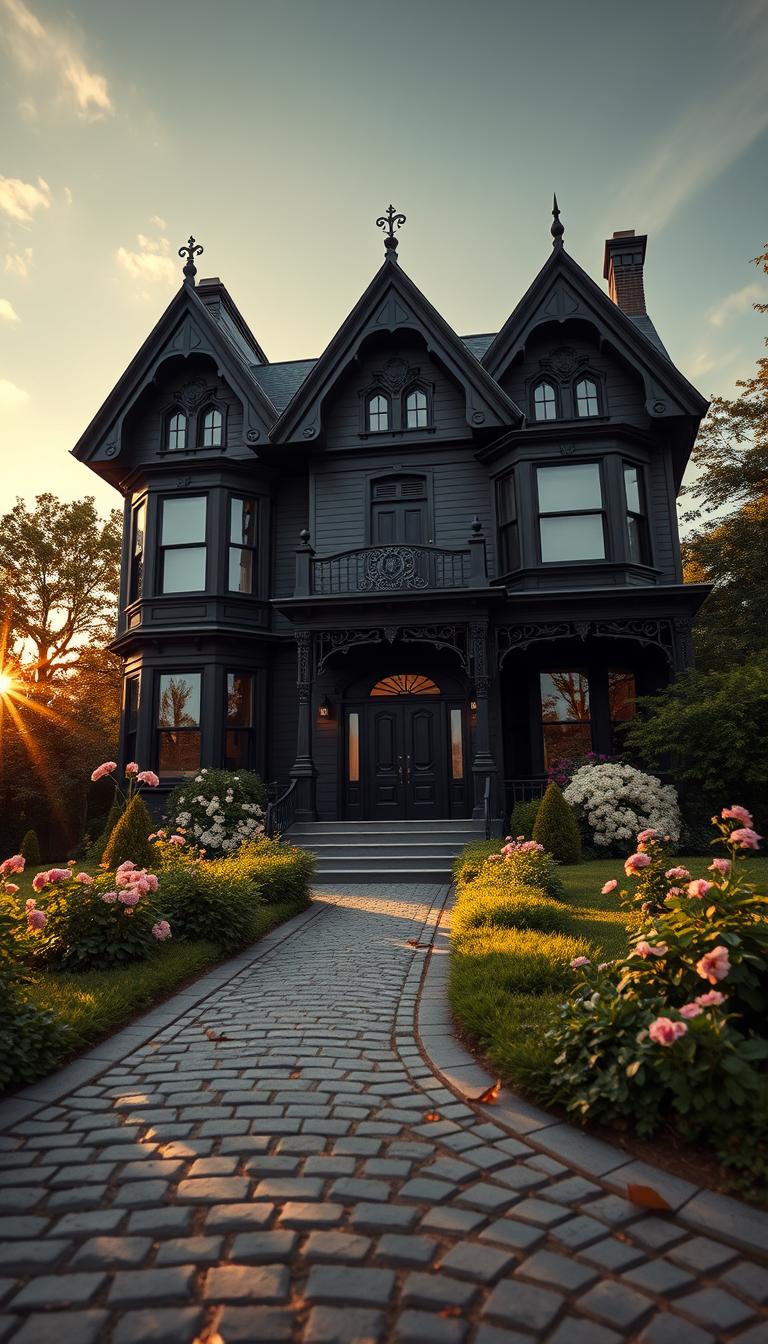
Have you ever wondered why a daring exterior can change the way a neighborhood looks and feels?
I wrote this guide to demystify the idea — to show why it works, how to pick the right shade, and the practical steps I use with clients when we transform a historic house into a confident, elegant home.
One memorable project on Prince Avenue in Athens, GA—an 1893 gem owned by Greg—started from months of sampling and a sudden image-inspired “eureka” moment. The result stopped traffic and divided opinion from love to dislike.
I’ll move from history to hands-on tactics, then room-by-room style so the exterior’s power finds a matching interior rhythm. Expect mentor-level advice: what to test, what to skip, and how to find that one “wow” moment.
This introduction sets the stage for real-world examples, maintenance tips, and the psychology behind dark hues—so you can adapt any inspiration to your own home with confidence.
Key Takeaways
- Understand why a bold exterior can succeed and how light, foliage, and materials change the effect.
- Learn the testing steps I use to pick a shade that fits the house and neighborhood.
- See real examples, including the Prince Avenue 1893 project and a modern Texas finish.
- Get simple, room-by-room actions you can start this week.
- Balance historic respect with modern comfort, performance, and upkeep.
Why Black? The Allure of a Black Victorian House Today
A well-chosen dark tone gives ornate architecture a clearer, more modern voice. It reads crisp from the curb and makes details speak without shouting.
In my practice, a deep finish often sharpens trim and massing. At golden hour porches, railings, and windows pop instead of disappearing.
Debunking myths: It’s not just for Halloween
People in Athens either loved or hated the exterior, but everyone stopped, took photos, and told stories in restaurants and online. The owner insisted it had no holiday theme — it was a tested color choice.
“It stopped traffic and sparked conversation — that was the point,” the homeowner said.
- Clarity: Dark tones simplify visual noise and honor craft.
- Landscape: Green and blooms read brighter against a dark backdrop.
- Resale: Thoughtful execution photographs well and attracts attention.
| Effect | Time of Day | Curb Benefit |
|---|---|---|
| Sharpens ornate trim | Morning cool blue | Instant modern read |
| Mutes busy palettes | Afternoon warm glow | Better photographic appeal |
| Frames gardens | Evening charcoal | Stronger neighborhood cohesion |
I encourage homeowners to choose with intention — make the color express your taste and your life, not a seasonal gimmick.
Victorian Roots and Gothic Influence in American Homes
Look close at period homes and you’ll spot a vocabulary of turrets, gables, and carved trim. These elements formed over decades of taste, craft, and changing technologies. Their visual language still guides how we edit and paint today.
Key features:
- Turrets and spires that add vertical drama.
- Gables and deep porches that cast rich shadow lines.
- Gingerbread trim and turned railings that reward close viewing.

Spooky to splendid: Gothic Revival meets Queen Anne
Gothic motifs—pointed arches and layered ornament—pair with Queen Anne exuberance. The mix feels theatrical, not merely decorative. Black paint often unifies these contrasts without hiding the details.
“Look for proportion first, then accent. The past gives you rules to break wisely.”
| Landmark | Era | Why it matters |
|---|---|---|
| Carson Mansion | 1885 | Shows layered styles in one composition |
| Winchester Mystery | 1885–1922 | Narrative-rich form that invites curiosity |
| The Witch House | c.1675 | Longstanding precedent for moody façades |
These precedents offer inspiration on proportion and detail, helping you choose a coherent style for your own victorian house.
Color Confidence: Lessons from Real-Life Paint Decisions
Paint decisions start with a simple fact: screens lie and daylight tells the truth. I use digital tools as a nudge, never the final say. Photos often over-saturate and skew contrast, so don’t let an app veto a shade you might love in person.

Screen vs reality: why photos and virtual tools can mislead
I always treat screens as suggestion, not proof. The same color can shift wildly in a photograph; your eye on-site is the only reliable view.
Sampling steps: isolating swatches, light/shadow, time-of-day checks
- Process: Brush large swatches on separate boards and move them around the façade.
- Steps: Test in full sun and deep shadow, and check at several times of the day.
- Avoid side-by-side samples—adjacency distorts how you see undertones.
Finding your “wow” moment: from options to a final shade of black
In Athens, Greg’s son shared an image that triggered a sudden “this is it” moment. Multiple samples lived on the wall for months before the pick felt inevitable.
“Living with the swatches over several weekends made the choice clear.”
| Test action | Why it matters | When to do it |
|---|---|---|
| Separate boards | Prevents color bleed from adjacent swatches | Initial sampling |
| Move samples | Shows how trim and texture alter the view | Mid process |
| Document videos | Captures shifts across light and times | Final review weekends |
Give yourself time. That pause is often the difference between regret and a confident, lasting choice.
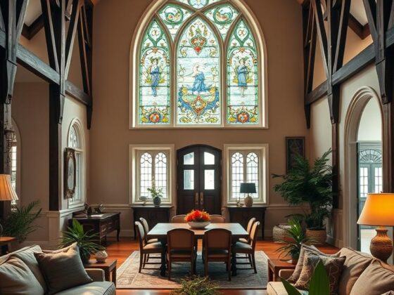
Case Study: The Black Victorian House on Prince Avenue, Athens, GA
On Prince Avenue, a single color choice reoriented how neighbors saw a familiar 1893 façade. I toured the property and watched how that decision changed everyday conversations.

A late-19th-century exterior that stopped traffic
The owner tested shades for months. He first flirted with yellow-and-white, then a designer nudged toward restraint. An image from his son produced the eureka moment.
Interior charm preserved: offices, Airbnb rooms, and an attic tour
Inside, original millwork and stair profiles remain intact. The main floor now hosts offices. Upstairs, four Airbnb rooms welcome guests into the home’s story.
Community reactions: love it or hate it—owning the decision
People in town debated it loudly—restaurants and social feeds were full of takes. The homeowner never wavered.
“She wears black majestically.”
For me, this project is a lesson in aligning taste with architectural truth and standing by the choice for years.
Quick facts
- Built: 1893
- Main uses: offices (main), four guest rooms (second)
- Attic: currently being finished
| Feature | Impact | Note |
|---|---|---|
| Extended sampling | Removed doubt | Months of live swatches |
| Interior preservation | Maintained warmth | Original wood and stairs kept |
| Community reaction | High engagement | Strong opinions, steady owner resolve |
Modern Makeover: A Texas Home’s Bold Black Paint Reveal
In Texas heat, a thoughtful repaint can feel risky — and rewarding. I worked on a local project where Sherwin‑Williams Black Magic covered the siding, Tricorn Black dressed the trim, and Aleutian cooled porch floors and ceilings.
Paint choices
We picked those three tones for subtle contrast and cohesion. Black Magic gives the siding depth. Tricorn Black keeps trim crisp. Aleutian reads cooler underfoot and overhead.
Finish matters
Painters recommended a satin sheen. Satin sheds dust better than flat and reflects a bit of sun — helpful in hot, windy years. We accepted the trade-off: darker surfaces run warmer, but careful prep and premium coatings extend performance.
Before-and-after: porch reconnection
The side porch had been boarded and enclosed with plexiglass, likely since the early 1990s. Restoring it reconnected a lost room to the main approach and made the threshold feel welcome again.
- Durability: Expect roughly ten years of service in this climate with proper prep.
- Design wins: Satin sheen highlights balusters and brackets at dusk.
- Practical note: Good edges and quality primers beat quick fixes every time.
“One quiet shift in tone and one confident finish turned a forgotten porch into a true entry.”
| Element | Material | Impact |
|---|---|---|
| Siding | Black Magic | Subtle depth, modern read |
| Trim | Tricorn Black | Crisp definition |
| Porch | Aleutian (satin) | Cool underfoot, cohesive threshold |
The reveal reads fresh today and respects the home’s history — a reminder that thoughtful design and the right finish make bold choices age well.
Iconic Inspirations: Gothic and Victorian Homes in the United States
Some landmark homes act like tutors — they show you what proportion, light, and ornament really want.
I point clients to a short list of exemplars when we need a visual compass. Each name teaches a different lesson in form, finish, and restraint.

Kat Von D’s Queen Anne (Los Angeles)
This 1896 Queen Anne, bought in 2016 and sold in 2023 for $7.75M, is famous for its blood-red pool. It’s drama made usable — a reminder that bold accents can be deliberate, not gimmicky.
Carson Mansion and New England classics
Carson Mansion (1885) mixes Gothic, Italian, and French motifs into one exuberant composition. In Salem, The Witch House (c.1675) and the House of the Seven Gables (1668) operate as museums with public tours that reward close study of joinery and massing.
Winchester Mystery House & The Castle House
Winchester expanded into 161 rooms by 1922 — a lesson in narrative-driven design. The Castle House in Stillwater (1872) shows how an all-dark exterior can read both contemporary and faithful after an award-winning renovation.
“Study the details — spindles, gables, shadow — and let those moves inform your own projects.”
- Why look: These properties train your eye on proportion and ornament.
- How to use them: Build a mood board, then adapt, don’t copy.
Exterior Elements: Siding, Trim, and Accents that Make it Sing
When you treat a façade like a room, every element gets a clear job to do. I start by choosing a siding tone and a trim tone that live in the same family. Two related blacks give depth that reads like shadow, not stripes.

Deep siding and tonal trim
Practical move: pick a primary siding and a slightly cooler trim. In my Texas project I used Black Magic for siding and Tricorn Black for trim to create layered depth.
Accents, gingerbread, and porch details
Let metal gleam and wood glow in small doses. A hint of warm wood on a rail cap or a satin metal newel base adds finesse without breaking the mood.
Porch tip: use Aleutian on ceilings and floors to lift the space. A satin finish resists dust and shows detail at dusk.
| Element | Material/Color | Benefit |
|---|---|---|
| Siding | Black Magic | Depth and cohesion |
| Trim | Tricorn Black | Sharp definition |
| Porch floors/ceiling | Aleutian (satin) | Lifts the space; durable |
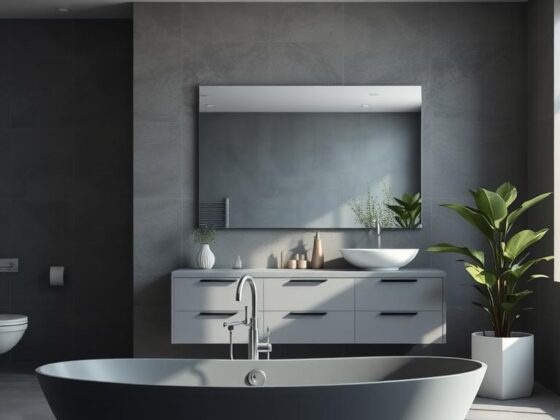
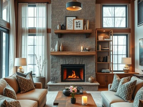
Interior Design for a Black Victorian Home
When I cross the threshold, I look for ways the past and present can shake hands. In the Athens project, original millwork remained the star while rooms adapted to new uses — offices on the main floor and four Airbnb suites upstairs.

Balancing history and life today: original charm meets modern ease
I aim for a handshake between old joinery and modern comforts. Warm neutrals, layered textiles, and clear traffic paths keep the architecture legible and the day-to-day easy.
Practical moves: conceal cords, corral supplies, and add storage that sits lightly against moldings. This keeps a working home tidy without erasing character.
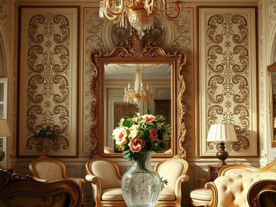
Walls, colors, and light: creating warm rooms with depth
A dark exterior needn’t mean dim rooms. I choose wall tones that bounce light and let woodwork read as the room’s jewelry. Task and mood lighting work together — picture lights for art, table lamps for glow, and a period-appropriate chandelier to anchor a space.
- Beds with slim, classic profiles keep sightlines open and calm the sleep zone.
- Parlors breathe when seating floats and windows get room to shine.
- Subtle facade cues—arched motifs or spindle patterns—echo indoors for cohesive style.
“Preserve the details, then make them comfortable to live with.”
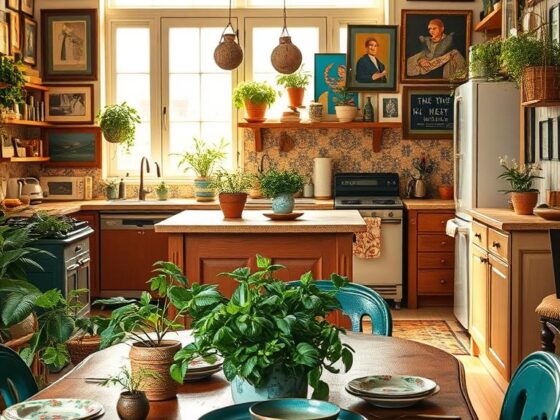
Room-by-Room: Dining Room, Kitchen, Bedrooms, and More
Each room should feel like a curated response to the exterior, not an afterthought. I design with purpose—so halls, parlors, and private spaces read as one welcoming story.

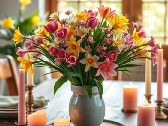
Dining drama and lighting
For the dining room I favor a moody wall tone and a gleaming table. Layer candlelight, a period-appropriate fixture, and dimmers so meals feel like events.
“A single lamp or a well-scaled pendant can make dinner feel intentional and memorable.”
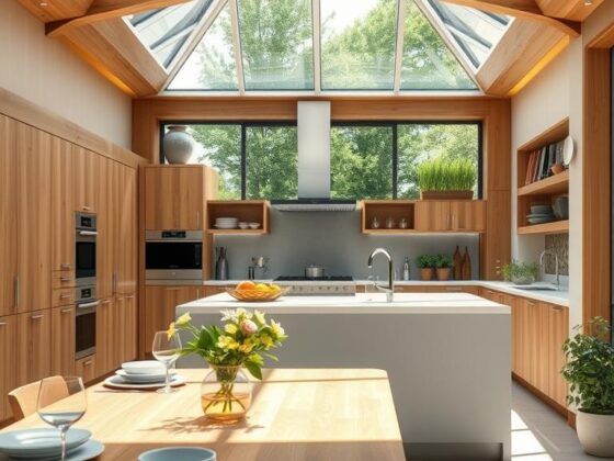
Kitchen choices that work
In the kitchen, echo original trim in cabinetry finishes. Pick durable floors and washable paint on high-touch areas. Satin trim and scrubbable eggshell on walls make daily life easier.
Bedrooms that restore
Bedrooms should calm. Choose a bed with timeless lines and soften it with linen and wool. Keep the palette quiet so the room helps you rest at day’s end.
| Room | Key move | Finish note |
|---|---|---|
| Dining room | Moody walls + bright table | Dimmers; period fixture |
| Kitchen | Cabinetry echoes trim | Durable floor; satin trim |
| Bedroom | Simple bed; layered textiles | Quiet palette; wall-mounted lights |
| Parlor/Library | Rug anchors; breathing space | Respect sightlines; soft lighting |
I design each room to carry the home’s larger story forward—so transitions feel natural and the interior answers the exterior’s confidence in a kind, useful way.
Landscape and Garden: Bringing Green to the Black Exterior
Good landscaping turns a bold façade into a living frame—greenery does the heavy lifting for curb appeal. I recommend a layered plan that reads well at a distance and up close.

Plant palettes that pop in every season
Glossy evergreens, chartreuse grasses, and white blooms snap into focus against a dark backdrop. I map a four‑season plan so the view stays lively: spring bulbs, summer hydrangeas, autumn foliage, winter structure.
Porch styling: planters, seating, and day-to-night ambiance
Treat the porch like an outdoor room. Layer seating, scaled planters, and lanterns so it invites conversation from morning coffee to twilight.
- For family gatherings, include wide paths and a small herb bed near the kitchen door—function is part of the landscape’s beauty.
- Scale planters to the façade: tall, slim forms echo verticals; low bowls soften steps and thresholds.
- Lighting should be gentle and layered—step lights for safety, warm sconces for mood—so the space glows without glare.
- If your lot allows, frame the property with native plantings to reduce maintenance and support local ecology.
“On the Texas project, the owners refreshed planting in spring and the side porch returned to being a true outdoor living area.”
Want ideas? See how planting choices pair with trim and tone at a comparable project in my notes on a sage‑green contrast here. Small, deliberate moves make the garden and porch worth using every day.
Light, Time, and Color: Seeing Black the Right Way
Light writes its own rules on a dark façade—watch closely and you’ll see shifts by the hour. I ask clients to treat samples like living experiments, not images on a screen.

Quick test: isolate swatches on boards and move them across the yard. Check each at three checkpoints: morning, midday, and evening. Note how undertones change with the light and what moments delight you.
Every time of day: morning blue-black to evening charcoal
Morning light can cool a tone toward navy; low sun warms it toward charcoal. Take short notes at set times so patterns replace guesswork. That steady view beats a single perfect photo.
How climate and elevation change the view of a black facade
High sun and dry dust favor satin finishes; shaded lots make some blacks drift icy. Map how the porch, trees, and neighboring brick reflect onto your walls and affect interior light in each room.
“Living with swatches for weekends showed me which shade felt right at every hour.”
- Read color in real light: outdoors and inside.
- Track the moment: choose the shade that consistently delights.
- Document times: quick photos at set times reveal useful patterns.
| Condition | Common shift | Practical tip |
|---|---|---|
| Morning | Cooler, bluer cast | Check before breakfast for true cool undertones |
| Midday | Neutral, highest contrast | Judge texture and true value |
| Evening | Warmer, softer charcoal | Assess curb appeal and porch glow |
Design choices feel safer when you test across times and trust a steady view. Do this today and your final pick will work for the life you live, not just a single beautiful moment.
Process and Steps: From Inspiration to Painted Perfection
The path from a saved photo to a finished façade is mostly about narrowing, not adding. I start by collecting images and then eliminating what feels wrong.
Research, elimination, and shortlisting shades
Shortlist 3–5 tones with distinct undertones. Isolate swatches on boards and move them around the yard.
Check each in sun and shade over several weekends. Avoid overreliance on virtual tools — they lie too often.
Contractors, timelines, and cost-aware sampling
Build a timeline with your people — painter, carpenter, and any masonry or metal pros. Sequence prep, repair, and painting so primers and finishes marry correctly.
- Start wide: collect images, then eliminate — knowing what you don’t want matters.
- Sample smart: brush-out movable boards, not checkerboards on the house.
- Bundle scope: pair porch repairs with paint to save time and money.
“Living with swatches for weekends showed me which shade felt right at every hour.”
| Action | Tip | Why |
|---|---|---|
| Shortlist | 3–5 tones | Limits choice fatigue |
| Sample | Move boards | Shows light shifts |
| Plan | Bundle repairs | Stretches budget |
Practical note: In hot climates expect roughly a 10-year repaint cycle and choose satin finishes to cut dust buildup. Keep a decision log of dates, light, and gut reactions — it’s the best way to defend your choice later.
Community, Stories, and Lifestyle in a Black Victorian Home
A confident finish can change how people use a porch, a path, and even a Saturday morning. Bold exteriors invite attention and create small local rituals—stops for photos, questions at the café, and impromptu tours from friends.
Photos, tours, and the social life of a distinctive exterior
In Athens, neighbors brought up the painted façade in restaurants and online. Passersby paused for pictures and strangers asked for a peek inside. Those moments become stories that stitch a home into the neighborhood fabric.
Owning your style: why strong opinions shouldn’t sway you
People will have takes. Let them. Your steadiness and care—good prep, quality materials, and thoughtful design—keep the conversation about craft, not gossip.
Family life often benefits. At night the façade recedes and glowing windows make the property feel like a lantern for gatherings. Host a small room‑to‑porch tour for friends; it demystifies the process and builds pride.
“She wears black majestically.”
Every time I coach a client, we talk about alignment: if the house, your values, and your lifestyle agree, the choice ages well. Share before-and-afters and the sample stories—that’s how design becomes a communal gift.
Conclusion
When a façade and family rhythms align, a property stops being a project and starts being a lived home.
I’ll leave you with a few simple truths I use with clients. Give the process time. Test samples in real light until a color delights you day after day.
Use history as a map, not a rule. Let period details sing while you make rooms comfortable for modern life — the dining room, the kitchen, the bedrooms, and the small corners where a table lamp matters.
Plan the garden as the soft frame for the house. Own your choice with love; every time someone asks “why?” you get to tell a story about craft, care, and inspiration.
For reference on period proportions and detailing, see this Victorian-style homes guide: Victorian-style homes guide.