Can a near-black actually calm a room instead of closing it in? I ask that because this soft black has a quiet confidence most folks don’t expect.
I’ve used this deep, dynamic shade on doors, trim, and cabinets—and it reads softer than true black thanks to an LRV of 8 and subtle neutral-to-blue undertones. It gives rooms a designer-level contrast without shouting.
In practice, cracked pepper ties together black stone, slate, and hardware while pairing beautifully with classic whites like White Dove or Whipped Cream. It works in coastal cottages and new builds alike.
Later, I’ll show where this paint is most forgiving, how it shifts in daylight, and why clients say darker walls feel both luxe and cozy. If you’ve hesitated to go dark, this post will make the choice feel easier—and more intentional.
Key Takeaways
- Soft black with depth: LRV 8 gives richness without harshness.
- Versatile uses: Ideal for doors, trim, cabinets, and accent walls.
- Complimentary pairings: Plays well with warm and cool whites.
- Design appeal: Dark tones often raise perceived value and comfort.
- Real-world proof: Works across styles—from coastal to modern.
My Verdict on This Soft Black Paint Color
In homes I’ve worked on, this soft black quickly became the safe bold choice people actually loved living with.
My take: it’s the most approachable deep neutral I’ve specified lately—statement-making yet soothing. Real-world rooms show it melts into white trim and reads less harsh than a true black.
I recommend it for doors, millwork, and a single accent wall when you want contrast without starkness. It photographs beautifully and feels velvety in person.
- Versatile: Great on walls or cabinets; clients say spaces feel more designed, not smaller.
- Forgiving: Easier than true black for first-time dark paint users.
- Timed well: This post explains why the color is popular right now for cozy, wellness-focused homes.
| Use | Effect | Best Pairing | Why I Choose It |
|---|---|---|---|
| Interior door | Calm contrast | White Dove / Whipped Cream | Instantly modern, low risk |
| Accent wall | Moody focus | Soft neutrals, warm wood | Adds depth without closing in |
| Cabinetry | Refined anchor | Stone counters, brass hardware | Photogenic and forgiving |
| Small step | Test drive | Single door or island | Easy to live with and change later |
Bottom line: cracked pepper earns a permanent spot on my shortlist when I want depth without drama. It’s a smart paint color choice that adds designer polish and calm to a room—time after time.
Behr Cracked Pepper: What It Is, Why It Works, and How It Reads in Real Homes
With an LRV of 8, this near-black sits in that sweet spot between drama and calm. I call it a soft black because it keeps depth while rounding off the hard edge most true blacks create.

Depth and light reflectance
The low light reflectance value means the color anchors a space without feeling flat. Under strong southern or western light, you may notice a subtle blue-violet wink. In typical rooms, the hue stays impressively neutral and velvety.
Color of the Year context
Consumer research backs the trend: many homeowners link darker paint colors to comfort and a designer finish. That shift explains why this shade rose in popularity and feels timely in modern interiors.
Undertone and specs
Technicals matter. RGB 76/77/79 and HEX #4C4D4F signal a cooler, controlled profile that resists brown or green shifts. That makes it easy to pair with warm whites like White Dove or Whipped Cream and with stone, slate, and dark hardware.
| Spec | Value | Best pairing |
|---|---|---|
| LRV | 8 | White Dove / Whipped Cream |
| RGB / HEX | 76/77/79 / #4C4D4F | Charcoal textiles, slate surfaces |
| Use | Interior walls, trim, cabinets | Feature wall or door for soft contrast |
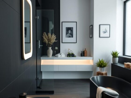
Where Cracked Pepper Shines: Doors, Cabinets, Accent Walls, and Exteriors
Think of this tone as a design anchor—strong enough to define a space but soft enough to welcome daily life. I use it where contrast should feel intentional, not theatrical.

Interior doors that “melt” into white walls
Painting a single door in this shade against crisp white walls instantly reads custom. It frames sightlines and calms a hallway without heavy contrast.
Kitchen cabinets and islands
On cabinets and islands, I check countertops closely. Graphite or cool-gray veining pairs best.
Metal knobs and pulls echo the finish, so the whole kitchen reads cohesive. Small changes—like coordinated hardware—make the result feel deliberate.
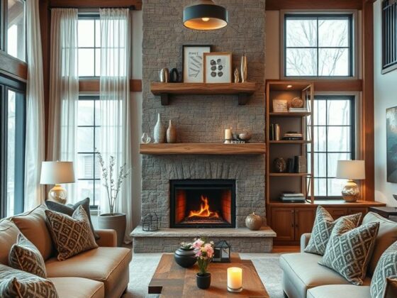
Accent walls and fireplaces
An accent wall behind a bed or a fireplace gets depth without turning a room into a cave. Stone texture and mantels pop when the tone is velvet-like rather than flat.
Exterior appeal
For a front exterior, this color softens massing and plays well with black windows. It’s kinder than jet-black in bright sun and still dramatic from the curb.
- Quick wins: stair rails, built-ins, mudroom cubbies—one gallon goes a long way.
- Sampling tip: test in morning and afternoon light to confirm the mood.
| Use | Why it works | Best pairing |
|---|---|---|
| Interior door | Quiet contrast | White walls, soft trim |
| Kitchen cabinets | Refined anchor | Charcoal counters, metal hardware |
| Fireplace wall | Shows texture, adds depth | Stone surround, light mantel |
Design Pairings: Whites, Coordinating Colors, and Lighting Considerations
Choosing companion whites and coordinating hues makes a bold shade feel calm and collected.
I lean on three go-to whites for trim and ceilings. Ultra Pure White gives a crisp, gallery-like edge. It’s my pick when you want the sharpest contrast.
Pure White from Sherwin-Williams offers a softer transition. Use it in family rooms where edges should feel relaxed. Polar Bear warms the trim slightly and pairs especially well with oak and woven textures.

Coordinating colors from the 2024 palette
Build a whole-home palette with the 2024 companions: Whipped Cream for airy rooms, Amber Brew or Rumors for confident accents. Earthy tones like Mountain Olive and warm taupes keep the scheme cozy without muddying the color. Blues such as Provence Blue act as refined secondary notes.
Light matters
In south or west-facing rooms, expect a slight violet/blue wink when bright sun hits the surface. North and east exposures read more neutral and charcoal.
- Sheen tip: eggshell on walls, satin or semi-gloss on trim and cabinets for durability.
- Fabric tip: heathered charcoal threads echo the paint and help the palette flow through your home.
- Test tip: view swatches by day and under evening lamps before you commit.
| Element | Why it works | Best use |
|---|---|---|
| Ultra Pure White | Sharp, clean contrast | Trim, ceilings in modern rooms |
| Pure White | Soft transition | Family spaces, open plans |
| Polar Bear | Warm, inviting edge | Trim paired with wood tones |
| Whipped Cream / Amber Brew | Airy to bold accents | Whole-home palette anchors |
For more on the exact shade and coordinating ideas, check this guide to the color here: cracked pepper color guide.
Compare Before You Commit: Cracked Pepper vs. Tricorn Black, Iron Ore, Wrought Iron, Peppercorn
A quick side-by-side test will show you why some near-blacks feel kinder than true black in daily life. I always sample on both a wall and a cabinet face to watch how light and veining play together.

Side-by-Side Depth and Undertones
Depth check: Tricorn Black (LRV 3) is inkier and sharper. Cracked Pepper (LRV 8) reads gentler and more forgiving.
Undertones matter: Iron Ore and Wrought Iron can nudge green or charcoal in certain light. Peppercorn trends more gray than black and can suit cool stone.
When to Choose Each Shade
- Walls: Pick cracked pepper when you want mood without harshness. Choose Wrought Iron for a classic charcoal look.
- Kitchen cabinets: Match cabinet color to countertop veining—smoky quartz pairs well with this soft black; busy granites may favor Iron Ore or Peppercorn.
- Exterior: For an all-dark facade that stays approachable, this shade softens massing and pairs beautifully with black windows.
| Shade | LRV / Read | Best Use |
|---|---|---|
| Cracked Pepper | 8 / soft, neutral with blue-violet wink | Walls, cabinets, exteriors that need depth without drama |
| Tricorn Black | 3 / ink-black, crisp edges | Feature doors or trim where absolute contrast is wanted |
| Iron Ore / Wrought Iron | Mid-LRV / charcoal with green or moody cast | Works with warm stone and traditional palettes |
| Peppercorn | Higher LRV than true black / dark gray | Good with cooler countertops and subtle contrast |
Quick tip: sample these paint colors side-by-side in your interior light. Undertones shift with exposure and finish—so test before you commit.
Conclusion
Conclusion
When you’re ready to make a quiet statement, this hue gives rooms weight and warmth at once.
I recommend sampling it on an entry, a living room wall, or a single door to watch how the light and fabric choices play together. Start small—an island or fireplace wall—and let that success guide the rest of the house.
Choose crisp white trim for sharp contrast or a warmer white for a softer wrap; both flatter the velvety profile. For high-traffic spots, I suggest BEHR DYNASTY or MARQUEE for smooth coverage and durability—available at major retailers.
Good design supports daily life. This color anchors a whole-home palette so wood, metal, and textiles feel intentional. For more context on the 2024 trend and how designers are using darker hues, see this short guide.