Have you ever wondered how a room can feel both abundant and calm at the same time?
I fell for this approach because it invites me to cook and to linger. Patterned stone next to lacquered cabinetry, vintage fixtures against saturated hues—it all makes the space sing.
Designer David Netto’s advice became my north star: go all in on metal, color, and especially tile. When I committed, the whole design started to hum with personality.
I sketched a mood that read like “Downton Abbey below-stairs meets Auntie Mame”—exotic marble, an ornate range, handmade tile, flowers, and stacks of well-loved cookbooks. Small accessories—a tactile knob, a rattan stool—made the story feel lived in.
My rule? Abundance with intention. I display the beautiful and useful up front and tuck the rest away—except for one honest junk drawer, as Chef Andy Baraghani insists. That messy drawer keeps you real and resourceful.
Key Takeaways
- Commit to bold choices in metal, color, and tile to unify a room.
- Balance ornate pieces with useful accessories for true warmth.
- Let vintage elements and exotic stone add depth and character.
- Design with intention: display beauty, hide clutter, keep one honest drawer.
- A well-crafted space invites cooking, lingering, and storytelling.
Set the Scene: Confidence, Contrast, and the Art of Abundance
Every time I plan a space, I start with one question: how should this room feel when I walk in?
That emotional cue—confidence—sets the rules. When you decide whether the room should energize or soothe, the rest of the design falls into place.
Abundance isn’t clutter. It’s a curated chorus: repeated color notes, intentional pattern hits, and a clear path so cooking stays effortless.
I anchor contrast with materials that love each other—patterned stone beside glossy cabinetry, a matte wall across gleaming hardware, a heritage piece paired with something playful.
- Map three zones: color on cabinetry, art or shelving on the wall, and a tactile counter moment.
- Introduce pattern in small doses—tea towels, a runner, a pottery trio—then scale up as your confidence grows.
- Name your style in a sentence to use as a filter. It makes choices easier and the look more cohesive.
The result is a maximalist kitchen that feels considered and joyful—where pattern has purpose, color feels deliberate, and abundance supports the way you live.
Color, Wallpaper, and Tiles: Big Moves for a Maximalist Kitchen
Color is the fastest way to rewrite how a room feels—start there. Bold-colored cabinets act as the keystone of a room. Pick a saturated hue you want to live with daily and echo it in textiles or pottery for a cohesive look.

Go bold with cabinetry color to anchor the design
Cabinetry color sets tone. Lacquer reflects light and amplifies drama; matte soothes and grounds. Choose a finish based on how much energy you want bouncing around the space.
Try patterned wallpaper or a feature wall for instant print and personality
Wallpaper can wrap a whole room or serve as a single feature wall. I’ve paired bold cabinets with Isidore Leroy’s Port‑Cros to add collected, refined prints that feel intentional, not busy.
Create pockets of pattern with statement tiles and splashbacks
Use tiles as accents behind the sink or hob for big visual payoff without a full remodel. Metro tiles in anthracite read timeless; geo alloy mosaics give a bolder print effect.
Hand‑glazed tiles shimmer like jewelry beneath layered light. Under dimmed pendants they glow and make everyday meals feel special.
Look up: painted or dark ceilings add drama and depth
Paint the ceiling a few shades deeper than the walls or go fully dark to lower the visual plane and create intimacy. It ties the palette together and frames the whole design.
- Rule of three: one hero (cabinetry), one supporting actor (wallpaper), one cameo (tiles).
- For renters, try tile-effect splashbacks in targeted areas for instant graphic punch.
- Consider finishes: lacquer for shine, matte to calm—both change how the room reads.
Light Like a Pro: Lamps, Pendants, and the Right Metals
Good light makes everything look and feel like it was chosen on purpose. I treat pendants as the jewelry of the room—drops that mark the island, sink, or dining table and give the whole space a focal point.

Statement pendants over the island or table
I hang pendants like earrings: scale them to counter length, center them, and space two to three fixtures about 24–30 inches apart over the island. Dimmable pendants change the mood from task to dinner in a heartbeat.
The Maxim Lighting Kismet Pendant is my go-to when clients want presence without a big spend. It casts shape, shadow, and a touch of glamour.
Layer table lamps and candles for soft, flattering interiors
For evening warmth I add table lamps and candles. Lamps such as Hwang Bishop’s Incense tripod, Pooky’s Karnak, or Visual Comfort’s Cap‑Ferrat read like small sculptures that also soften light.
“Flame temperature flatters skin and food—lighting isn’t only technical, it’s emotional.”
Commit to metal finishes
Pick a primary metal and stick with it. Brass or gold warms saturated palettes; deliberate mixed‑metal moments work when repeated across pulls, lights, and faucets.
Think of the faucet as jewelry too—a House of Rohl Acqui spout adds a gentle, Edwardian flourish that grounds exuberant design.
- Three layers: task, ambient, accent—let them play together.
- Over an island, aim for two to three pendants, dimmable and centered.
- Use lamps and candles to make evenings feel intimate and art-directed.
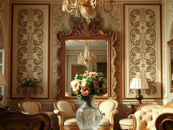
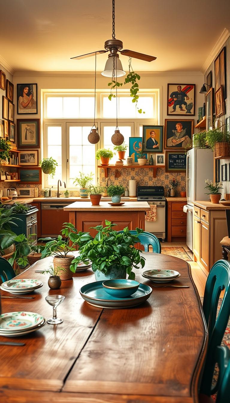
Curate the Story: Art, Accessories, and Vintage Finds
Good rooms feel like stories you can read with your hands. I arrange objects so the room reads as one warm chapter. That means bold prints, wearable ceramics, and hardware with personality.
Build a gallery wall with prints and personal art
I treat the wall as a scrapbook—framed recipes, travel sketches, family photos, and art that rotates. Vary frames but repeat one finish to keep the composition calm.
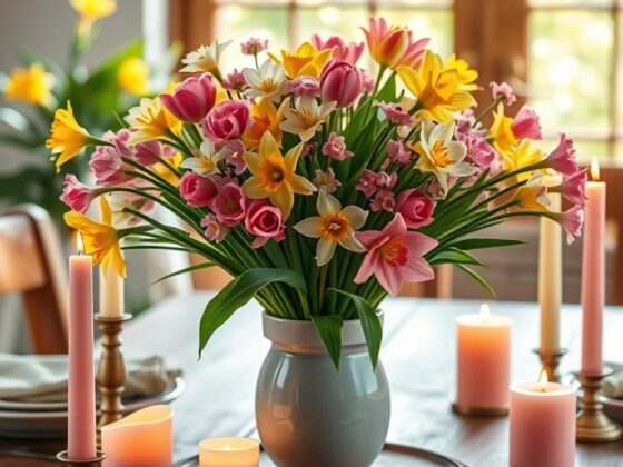
Style the table with bold textiles and ceramics
Start with a Marigold Living Iznik tablecloth, add a Hermès Soleil d’Hermès teapot as a jewel, and finish with hand‑painted glasses like Los Vasos De Agua Clara Tirol for sparkle. Small touches turn a meal into ritual.
Mix vintage fixtures and tactile hardware
Pair a retro pendant or a vintage faucet with fresh color. Tiny changes—like Corston’s Barlow knob—give cabinetry real character.
Display cookware and objects—beauty in plain sight
Leave beloved cookware visible: enameled Dutch ovens, copper pans, hand‑thrown bowls. They make daily tasks feel special.

| Method | Best For | Key Accessories | Designer Tip |
|---|---|---|---|
| Gallery wall | Personal storytelling | Prints, photos, mixed frames | Repeat one frame tone for cohesion |
| Open shelving | Everyday beauty | Bamboo trays, enamelware, bowls | Line shelf backs with wallpaper for whimsy |
| Styled table | Meals & rituals | Tablecloth, teapot, hand‑painted glasses | Layer pattern from base to centerpiece |
Editing is caring—I rotate collections so each accessory gets its moment. For more on how to bring this design to life, see my short guide on how to design a maximalist kitchen.
Bring Life In: Botanicals and Biophilic Layers
Bringing in living green is the quickest, most forgiving edit I make to any design. Plants add texture, scent, and a quiet rhythm that helps a bold room feel lived in. They refresh color palettes and soften heavy surfaces without fuss.

Use oversized plants for scale and texture
I love a Kentia palm for instant stature. It softens corners, filters light, and makes compact rooms feel generous.
For a hit of color, a bright‑pink Caladium reads like living art beside emerald cabinetry or moody paint.
Go vertical when floor space is tight
Wall gardens and ceiling‑hung pots let you use unused vertical real estate. They frame windows and add a green curtain without stealing walking room.
- Group by care: pair similar light needs and mix leaf shapes for contrast.
- Planters as accessories: repeat finishes—terracotta, matte black, aged brass—for cohesion.
- Practical herbs: basil and mint near the cooktop add scent and invite cooking.
- Light and water: rotate plants seasonally and use a grow bulb if needed; hide saucers with cachepots.
| Plant | Best Spot | Visual Effect | Planter Finish |
|---|---|---|---|
| Kentia palm | Corner or beside island | Scale, soft silhouette | Terracotta or aged brass |
| Caladium | Sunny shelf or tabletop | Bright color, graphic leaves | Matte black or glazed ceramic |
| Herb trio (basil, mint, thyme) | Near cooktop or windowsill | Fragrant, practical | Terracotta or matching cachepots |
Small idea: make your weekly watering tour a ritual—plants will reward the care, and the room will breathe better for it.
Make It Cohesive: Patterns, Palette, and Smart Space Planning
Cohesion is the quiet magic that makes bold choices feel intentional rather than chaotic. I rely on a small ruleset so the room reads as one thoughtful story.

Stick to a color scheme or recurring pattern to unify the look
My simplest rule: pick three to four colors and commit. Let one dominate, one support, and two accessorize so the eye knows where to rest.
Repeat a pattern—stripe, scallop, or check—across scales: a runner, a shade, even the inside of a cabinet. Same motif, different scale keeps the design coherent.
Balance open display with storage zones to avoid visual clutter
Open shelves show off colorful cookware and art. But plan zones for larder, prep, serve, and clean so daily flow stays easy.
The island doubles as workhorse and stage: prep on one side, curated display on the other. Function and theater coexist when you assign each task a home.
- Metals pull it together—if you choose brass, let a whisper of gold repeat on pulls, sconces, and faucet.
- Use statement tiles strategically—one strong backsplash plus a quiet floor keeps pattern purposeful.
- For the ceiling, a deeper tone from your palette caps the composition and hides clutter.
| Zone | Purpose | Tip |
|---|---|---|
| Display | Everyday beauty | Group by color and reset seasonally |
| Prep | Work surface | Keep tools nearby, hide bulk below |
| Storage | Bulk & backups | Label and zone for flow |
Before I buy big pieces I make a tray test: paint swatch, tile chip, metal pull, and fabric under the room’s light. If they harmonize there, they’ll sing in the kitchen.
Conclusion
Good design shows up most clearly at the table, during a long dinner. That moment tells you whether a room works for real life.
If there’s one takeaway from my journey, it’s this: a maximalist kitchen should reflect your rituals — what you cook, how you gather, what you collect. Start with one big move: bold cabinet color, wallpaper, or a statement tile. Then layer lighting, metals, and textiles until the look feels inevitable.
At night I light a few candles and click on a pair of lamps. Faces soften, conversation flows, and the meal tastes better for it. Keep a wink of imperfection — Andy Baraghani’s chaotic junk drawer is allowed. It keeps the room human.
Choose pieces you’ll love in ten years, let trends be seasoning, and set the table with a story. Do that, and your style will do the rest.