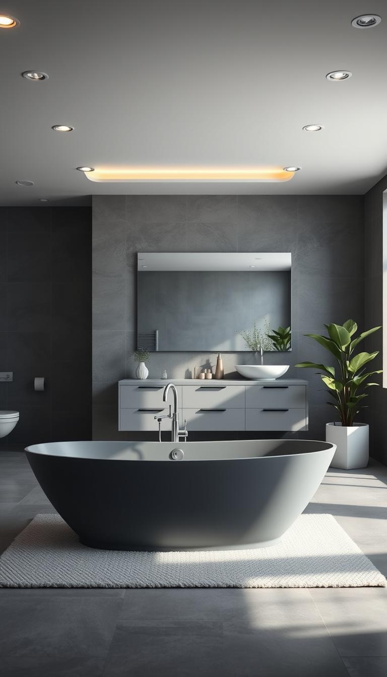
Can a neutral shade truly make your morning routine feel like a short retreat? I ask that because I lean on gray in small rooms—it sits perfectly between black and white and calms the mood without stealing personality.
I’ll show how a well-planned design can make that neutral read luminous, not moody. Think glazed subway tile that bounces light and large mirrors that double brightness.
For tight spaces, I favor large-format tile and floating vanities to cut grout clutter and open sightlines. These moves make the room feel larger and easier to maintain.
Pairing matters: wood, brass, or black fixtures add warmth and depth without fuss. I’ll also map low-lift swaps—hardware, mirror frames, accent tile—to refresh a room in a weekend.
Key Takeaways
- Neutral balance: the right neutral creates calm and stays flexible for future updates.
- Use glossy tile and mirrors to boost light and keep the room airy.
- Large-format tiles and floating elements expand perceived space and cut upkeep.
- Pair with warm materials—wood or brass—for sophistication without clutter.
- Choose consistent undertones across surfaces to avoid a disjointed look.
Gray Bathroom Ideas
A restrained palette gives you freedom: layer shades for depth or keep it seamless for a spa-like feel.
I outline practical gray bathroom ideas I use with clients — from weekend refreshes to full bathroom design plans. Start by mapping the spectrum: pale dove for walls, pewter for tile, and charcoal for a grounded vanity.
Layering versus monochrome: pair a darker vanity with soft walls to anchor the room while keeping it luminous. Or choose a single tonal envelope for a calm, continuous look that reads larger.
Warmth matters. Add wood shelves or soft metals like brushed brass to keep the palette from feeling cold. For small space wins, I favor floating storage, larger mirrors, and clear glass to keep sightlines open.
Savvy splurges and saves: spend on durable surfaces and targeted task lighting. Save on paint, mirrors, and hardware swaps that deliver big visual change for little cost.
- Prioritize undertones across tile, paint, and vanity.
- Use patterned backsplashes or floors sparingly for personality.
- Quick updates: linens, art, and greenery refresh mood fast.
Set the Tone with Gray Walls: From Pale Dove to Deep Charcoal
Start with the walls and the rest of the room will follow—light, depth, and texture hinge on that choice. I usually pick a primary route first: lift the room or add presence.

Light gray walls for a luminous, spacious feel
Light gray reflects light and makes small rooms read larger. For compact sinks and narrow layouts, I specify a soft dove shade with a satin sheen—LRV matters here.
Quick wins: match undertones across tile and vanity, use a large mirror, and keep trim crisp for a clean look.
Dark gray accent walls to add depth and drama
A single deep charcoal wall behind a vanity or tub adds instant depth without a full remodel. Swap towels and sconces to change mood seasonally.
Pro tip: test paint on three walls—light shifts can make the same color read completely different.
- Balance dark walls with lighter adjacent walls and warm metals.
- Painted paneling in a deep tone gives tactile texture for a farmhouse touch.
- Renters: color-blocking one wall delivers drama with minimal effort.
Choose based on light, ceiling height, and the feel you want—luminous or moody—and align your color undertones so the whole design reads cohesive.
Tile-Forward Designs: Subway, Hex, Herringbone, and Beyond
Tiles set the tone — they can make a small room feel taller, softer, or quietly bold. I like to start with a clear layout plan before ordering so the pattern reads intentional, not accidental.

Gray subway tiles: stacked vs. running bond vs. vertical
Glazed gray subway tiles protect splash zones and bounce light. Stacked rows give a modern, minimal look. Running bond (classic brick) adds rhythm and hides small grout shifts. Vertical stacks visually raise the ceiling — a neat trick in compact rooms.
Hex and mosaic patterns for organic texture and movement
Hex and mosaics bring subtle motion. Mixed tones mimic stone underfoot and work well as feature walls or niches. Use small mosaics sparingly so they read like accents, not wallpaper.
Herringbone and chevron floors that energize the room
Herringbone or chevron floors add energy without loud colors. Pair them with large-format wall tiles to cut grout lines and ease cleaning. Choose grout to match for a seamless look or contrast to highlight pattern—both can work.
Quick sourcing checklist
| Item | Reason | Order Qty |
|---|---|---|
| Primary field tiles | Cover main surfaces; cost-effective | +10% waste |
| Accent mosaics | Feature areas and niches | +20% for cuts |
| Large-format floor tiles | Fewer grout lines, easier cleaning | +8% waste |
| Matching grout | Seamless or contrast options | Buy extra for repairs |
Marble Moments: Veining, Elegance, and Low-Maintenance Alternatives
A marble accent can read like quiet luxury — a single slab lifts a small room into a spa-like space. I favor using stone where it counts: a shower surround, vanity top, or a bookmatched tub wall.

Gray marble and marble-look porcelain for spa-like sophistication
Real gray marble gives unmatched veining and cool tactility. It’s perfect for a floor-to-ceiling shower that feels minimalist and calm.
For busy homes, I specify marble-look porcelain. You get the veining and spa vibe without resealing or frequent worry about stains.
Pairing marble with brass, black fixtures, and wood
Warm metals and wood temper marble’s coolness. Brushed brass or matte black fixtures add contrast and keep the palette from reading flat. A wood stool or open shelf brings tactile balance.
- Reserve real stone for focal areas to control cost.
- Use porcelain elsewhere for durability and simpler upkeep.
- Choose slab thickness and edge profiles at the vanity to elevate the look subtly.
| Material | Pros | Cons |
|---|---|---|
| Natural marble (gray-veined) | Authentic veining, cool touch, high elegance | Needs resealing, can stain, higher cost |
| Marble-look porcelain | Low maintenance, durable, cost-effective | Less authentic feel, grout care still needed |
| Bookmatched slab feature | High-impact focal point, dramatic veining alignment | Expensive, requires careful installation |
“A quick care plan: use pH-neutral cleaners, squeegee after showers, and reseal natural stone on schedule.”
Lighting matters—side-lit mirrors or sconces grazing the veining bring out texture and movement. That gentle glow is the finishing touch that makes marble feel lived-in, not precious.
Concrete Calm: Industrial-Inspired Gray with Warmth
An industrial edge can feel surprisingly warm when you balance concrete with wood and soft textiles.
Concrete or concrete-look surfaces give a serene, matte texture and quiet strength to a small bathroom. I often specify porcelain with a cement look when clients want the aesthetic but not the maintenance of real cement.
Seal cement finishes with a breathable, bathroom-appropriate sealer so moisture stays out and cleaning is simple. Lighting matters—raking light highlights the grain and keeps the surface alive.
Warmth comes from contrast. Add walnut shelves, soft towels, and warm metals to keep the space inviting. Slim steel frames on mirrors or glass panels add that crisp industrial line without feeling harsh.
- Where concrete shines: walk-in shower surround, integral sink, or a feature wall.
- Not ready to commit? Try a vanity top or hex floor tile that echoes the look.
- Palette: charcoal, walnut, cream, plus a hint of black for focus.
“Keep lines decluttered so the material’s subtle movement has room to breathe.”
Smart Gray Vanities: Floating Forms, Storage, and Hardware Choices
A smart vanity anchors the room while freeing up sightlines and storage.
Floating vanities open floor area so the space reads larger and cleaning is easier. I often pair them with a mirrored cabinet to double storage and bounce light back into the room.
Plan storage with purpose: deep drawers for bottles, divided trays for cosmetics, and a pull-out for hair tools. That keeps the counter calm and your routine efficient.

Hardware sets the tone. Slim matte-black pulls feel modern; brass knobs add warmth; lucite gives a touch of glam. Choose one accent and let other fixtures coordinate without matching exactly.
- Sink choice: integrated sinks save counter space; vessel sinks offer sculptural presence.
- Reuse tips: repaint the box in a satin-lacquer gray and swap hardware for a big lift.
- Ergonomics: follow standard heights and clearances so the vanity feels comfortable and ADA-aware when needed.
Finish choices matter. A satin lacquer resists fingerprints and reads refined. I use these tweaks to deliver a calm, practical vanity design that lasts.
Showers that Shine: Glass Panels, Niches, and Statement Tile
A compact shower can feel luxurious with the right glass, niche, and tile choices.

Clear glass with soft framing to open sightlines
I favor clear glass panels with a slim, soft-framed edge to keep sightlines open. That choice makes the room read larger and keeps the finishes visible—no visual stop between wet and dry zones.
Subtle mosaic niches for function and contrast
Place a mosaic niche at elbow height to corral bottles and add a delicate counterpoint to large wall fields. Small tiles also stay grippy on shower floors, so they serve form and function.
Large-format shower tiles to minimize grout
Use large-format tiles on the walls to cut grout lines and simplify cleaning. Pair them with smaller floor mosaics for traction and a subtle pattern shift that feels intentional.
- Layout: map cuts to corners and align niches with grout joints.
- Entry: pick a door swing or walk-in based on ventilation and plan.
- Light: skylights or shower-rated fixtures lift the whole ritual.
“Seal natural stone and pick mold-resistant grout to keep maintenance low.”
Mirrors and Lighting: Amplifying Light in a Gray Palette
Bring brightness in with mirrors, glossy surfaces, and a simple lighting plan. I treat reflective elements as part of the design — not an afterthought.

Feature mirrors that anchor the vanity
I love a single feature mirror with a slate-gray frame to ground the vanity wall. It frames your face with flattering light and reads like built-in architecture.
Reflective surfaces and practical layers
Wall-to-wall mirrors double incoming light and expand perceived space in tight rooms. Glazed, glossy tiles on splash zones bounce daylight and keep the palette airy without adding color.
- Layer lighting: sconces at eye level + ambient overhead for balance.
- Linear vanity fixtures work well in tall rooms to cut shadows.
- Smart dimmers shift mood from energizing morning to soft evenings.
- Target bulb temps near 2700–3000K for warm, natural skin tones.
- Consider a mirrored cabinet for extra storage and added brightness.
“Coordinate mirror width with vanity and backsplash height so lines read clean and intentional.”
The payoff is simple: a brighter, bigger, calmer bathroom that fits everyday life—often with no remodel required.
Warm It Up with Wood: Vanities, Shelving, and Accents
Wood instantly warms a cool palette and makes the space feel lived-in and calm.
I rely on oak vanities, walnut shelves, or a small teak stool to soften tile and add life. Those pieces create an immediate homey layer that feels intentional.

Pair rustic grain with glossy tile for a luxe contrast in texture. That mix reads upscale without being fussy.
Open wood shelves keep everyday items at hand and add personality. Wood slat partitions can divide a vanity and shower while keeping light and flow.
- I pick sealed hardwoods or wood-look composites for humid zones.
- On a budget, swap drawer fronts to real wood and keep the cabinet box.
- Echo wood in mirror frames and accessories to tie the design together.
Care tip: use gentle cleaners and quick wipe-downs to protect finishes. Even a small wood accent can change the room’s emotional temperature and make the bathroom feel calmer and more modern.
Undertones Matter: Coordinating Warm and Cool Grays
A small shift in undertone can change a whole room’s mood from cozy to crisp. I start every scheme with an undertone check—lay tile, paint, and vanity samples side by side and watch them in daylight and at night.
How to keep undertones consistent across tile, paint, and vanity
Pick a dominant undertone and repeat it on major surfaces. If your gray tiles skew warm, pair them with wood and brass. If they run cool, choose polished nickel and crisp whites.
Avoid the “almost match” trap by testing samples together. Grout matters—its undertone can shift how a tile reads. When in doubt, match grout to the tile for a seamless look.

Blending gray with whites, blacks, and blues for balance
Black gives instant contrast and focus—use it in fixtures or frames to sharpen lines. White lifts the palette; pick a soft white if your tiles are warm so trim doesn’t clash.
Want a little color? Fold in navy towels or sky-blue art to complement cool tones without cluttering the palette. For a simple recipe: one gray undertone + one metal + one wood tone + one accent color. Fabrics and rugs soften any leftover mismatch and make the bathroom design feel cohesive and deliberate.
“Repeat the same undertone across tile, paint, and cabinetry—consistency is the quiet key to calm.”
Small Bathroom, Big Impact: Tricks for Space and Serenity
Think vertically and reflectively: that combo stretches sightlines and doubles the light in tight rooms.
I lean on pale light gray on walls to boost reflectivity and calm visual noise. A generously sized mirror above the vanity amplifies brightness and makes the whole bathroom read larger.
Floating fixtures free the floor so the space feels airy. Clear glass for the shower keeps sightlines open from door to back wall. Narrow vertical subway tiles draw the eye up and add perceived height.
Layer lighting—task, ambient, and a small uplight—so no corner sits dim. I hide storage behind drawers, medicine cabinets, and a shower niche to keep counters calm and functional.
- Large-format walls: fewer grout lines, calmer look.
- Compact sink & scaled hardware: keep proportions comfortable.
- Clear glass panels: uninterrupted sightlines and cohesion.

| Tactic | Benefit | Quick tip |
|---|---|---|
| Pale light gray walls | Boosts reflectivity, calms palette | Test in morning and evening light |
| Vertical tile layout | Adds perceived height | Use narrow subway profiles for lift |
| Floating vanity & hidden storage | Frees floor plane; reduces clutter | Choose deep drawers for bottles |
Result: small moves—scale, reflectivity, and clear sightlines—deliver serene function and smart design without expanding the footprint.
Pattern Play: Wallpaper, Printed Tiles, and Artistic Touches
Playful prints and quiet geometry lift a powder room into something memorable. I like a single patterned surface to add personality without heavy color or clutter.
I often start with a humidity-safe wallpaper for a powder room—moody clouds, subtle botanicals, or small-scale swans that read like art.
Practical note: confirm the paper can handle steam and pair it with a clear ventilation plan so the surface lasts.
- Use a printed tile behind the sink as an easy focal point.
- Tonal floor patterns—circles or geometrics—add motion while staying neutral.
- Balance pattern with calmer adjacent surfaces so the space stays restful.
I tie everything together with simple accents: a framed mirror, slim black sconces, and soft linens. If you’re hesitant, start with a feature wall and keep the rest painted a coordinating gray.
“Place patterns opposite the door or where the mirror reflects them—small gestures that feel thoughtful.”
For sourcing and care tips, see my wallpaper guide to pick materials and grout that keep patterns crisp and durable.
Contemporary Bathroom Style in Gray: Minimal, Sleek, and Cohesive
When I design a contemporary space, cohesion and restraint guide every decision. I favor clean profiles and a tight palette so nothing fights for attention.
Large gray tiles wrap floors and walls to create a continuous plane. That reduces grout and makes the room feel bigger at a glance.
I pair those tiles with slim black fixtures for crisp contrast. Floating vanities and mirrored storage keep sightlines clear and increase usable storage without bulk.
Glass partitions separate the shower but preserve openness—no heavy frames. I align edges, grout lines, and hardware so the room reads intentional from every angle.
- Lighting: linear sconces, recessed trims, and mirror-integrated fixtures for quiet, even light.
- Texture: mix matte and gloss within the same gray family for subtle depth.
- Edit: fewer accessories, better quality—let form and function sing.
“The goal: a calm, current bathroom that works day to day.”
For more on coordinating tile tones and finishes in a contemporary bathroom, see this resource: contemporary bathroom.
Farmhouse and Transitional Gray Bathrooms: Mixing Classic and Modern
Mixing farmhouse warmth with cleaner modern lines gives you a classic room that still feels fresh.
I often pair shaker-front vanities with gray tile and rustic wood shelving. The look reads intentional, not themed. Marble or marble-look counters add quiet luxury against crisp black and white fixtures.
A freestanding tub becomes the sculptural heart of the space. Add a small wood stool and soft linens for instant warmth. Subway tile and simple crown molding frame modern art or a statement rug with ease.
If your home is older, I pick a warmer muddy gray so new work sits comfortably with historic trim. Hardware can skew aged brass for a softer farmhouse feel or polished nickel for a more transitional finish.
Storage matters: an antique-look armoire or built-ins that match the vanity keep family life organized and calm. The restrained palette—gray, white, wood, and black—lets texture and shape do the talking.
“The goal is a collected room that feels comfortable every day — not a set-piece.”
- Shaker vanities + rustic wood = timeless warmth.
- Marble (or porcelain) + black fixtures = crisp definition.
- Freestanding tub + wood stool = sculptural, cozy focal point.
| Element | Farmhouse Read | Transitional Read |
|---|---|---|
| Vanity | Shaker-front, warm-stained wood | Shaker or slab, painted finish, polished nickel pulls |
| Countertop | Marble slab or marble-look porcelain | Engineered stone or marble-look with neat edge profile |
| Fixtures | Black or aged brass for warmth | Polished nickel or matte black for contrast |
| Accents | Wood stool, open shelving, vintage armoire | Clean-lined mirrors, modern art, subtle crown molding |
Backsplashes and Feature Walls: Create a Focal Point
Think of a backsplash as armor that also doubles as a tiny piece of art. I use tile backsplashes to protect a wall and to introduce pattern or sheen. They handle splash and humidity while lifting the sink moment into something deliberate.
Gray subway tiles make a timeless backdrop; you can stack them, run them horizontally, or take them vertical for a fresh read. Glazed tiles add light bounce at the sink and make daily routines feel brighter.
For bolder moves, I keep patterned tiles to a single feature wall. In small rooms, that patchwork approach zones the layout without cluttering other walls.
- Height: tile to mirror or floor-to-ceiling based on splash risk and drama.
- Edges: clean trim or mitered corners for a refined transition.
- Alignment: plan outlets and sconces within the tile grid for a crisp finish.
- Contrast: pair a dark feature wall with a pale vanity—or reverse—to focus the eye.
“A single well-planned wall becomes the room’s anchor—practical, protective, and beautiful.”
Finishing Touches: Fixtures, Texture, and Accents for Depth
A few deliberate accents bring depth and make daily routines feel easier. I dial in fixtures to fine-tune the vibe—matte black for graphic edge, brushed brass for warmth, polished nickel for refined cool.
Texture is the secret sauce. Ribbed towels, woven baskets, and a small rug soften sleek surfaces and add tactile interest. I pick a sink silhouette to match the mood—integrated for clean lines, vessel for sculptural interest, or apron-front for a classic nod.
- Mirror: a round mirror breaks tile lines and feels human at eye level.
- Plants—fern or pothos—bring a fresh green counterpoint to neutral tones.
- Coordinate accent colors sparingly—navy, charcoal, or creamy white—to keep the palette soothing.
- Layered lighting on dimmers lets mornings feel bright and evenings unwind softly.
| Finish | Effect | Use |
|---|---|---|
| Matte black | Graphic, modern | Taps, pulls |
| Brushed brass | Warmth, depth | Fixtures, sconces |
| Polished nickel | Cool, refined | Mirror frames, handles |
“Hooks, trays, and canisters keep essentials handy while keeping the room calm.”
These finishing details—small fixtures, deliberate accents, layered texture—add real personality and make the whole bathroom design feel complete and welcoming.
Conclusion
Finish with a few thoughtful moves and the room will feel like it’s always been this way. Choose one or two changes—paint, a new mirror, or swapped hardware—and you’ll see immediate impact.
Keep undertones consistent and lean on warm wood or brass for softness and black for crisp definition. Pick durable materials—large-format tile, sealed stone or porcelain, and clear glass—to cut upkeep and keep the look fresh.
We covered smart gray bathroom ideas and practical bathroom ideas you can use now. With a clear plan, your home gains a calm, functional space that will age gracefully. Start small. Phase in the rest. You’ll end up with designs that feel restful and intentional—an oasis you actually use.