Curious how a smart pairing of finishes can make your kitchen feel larger, calmer, and more purposeful? I ask that because done right, a split palette is more than a trend—it’s a tool for better living.
I love designing these schemes. They’re timeless and practical, and they use simple color psychology to calm, energize, or balance a room without visual chaos.
We’ll map a clear path from planning to palette so you can pick cabinet finishes that work with light, counters, and floors—and still look great years from now.
Along the way I’ll show where contrast brings clarity and where restraint soothes the eye. You’ll get real pairings—names like Vienna Gloss White with Gloss Gray or Valleywood White with Marine Blue—so combos are easy to source and install.
Key Takeaways
- Smart splits add depth without clutter.
- Choose finishes that match your light levels.
- Use contrast for zones and restraint for calm.
- Gloss lifts light; matte grounds the design.
- Pick brands that ship matched sets to simplify ordering.
Why Two Color Kitchen Cabinets Are a Smart, Stylish Choice Right Now
A smart mix of tones can instantly clarify function and flow in any cooking space. Contrast helps the brain organize, so a visually divided layout feels calmer and more intuitive to use.
I often place lighter finishes up high to make rooms feel taller and brighter. Darker runs across the bottom add visual weight, hide wear, and anchor the plan. Consistent hardware ties both parts together and keeps the look cohesive.
Use a bold island as your focal point while keeping surrounding runs neutral. That gives you drama without overwhelming the rest of the room. It’s also budget-smart: paint or order the statement piece where it counts and keep the rest simple.
- The split approach defines zones—prep, serve, and gather—so busy households move with ease.
- It adapts to many styles, from cozy farmhouse to sleek modern, because the idea is balance.
- And yes, it photographs well—useful for resale—yet still supports everyday cooking and hosting.
Planning Principles for a Harmonious Two-Tone Kitchen
Begin with a grounding choice and you’ll avoid surprises when samples meet real light. I pick a neutral—white, gray, or natural wood—first. That neutral keeps the rest of the palette calm and predictable.
Place color by room size and light. In small or dim rooms I lift brightness up high and use a deeper tone below to anchor the work plane. In sunny, open space you can introduce richer hues more confidently.
I always test swatches beside floors, the countertop, and the tile. Undertones change how pairs read. A cool white can clash with warm stone, so sampling matters.
Architectural cues and cohesion
Let architecture decide where the accent goes. A range niche, pantry run, or window wall makes a natural feature. Hardware ties both runs together—one finish keeps the scheme coherent.
“I tape vertical swatches to doors and observe them at morning and evening light—it’s the simplest way to avoid regrets.”
| Decision | Why it matters | Quick tip |
|---|---|---|
| Grounding neutral | Maintains balance across the room | Choose white, gray, or natural wood |
| Placement by light | Controls perceived height and depth | Lighter uppers in low light; darker lowers to anchor |
| Coordinate with fixed finishes | Prevents undertone clashes | Sample next to floor, countertop, and tile |
Try a small pilot run first. An island or a single run lets you live with the scheme before committing to the whole room. It saves money and stress—trust me, it works.
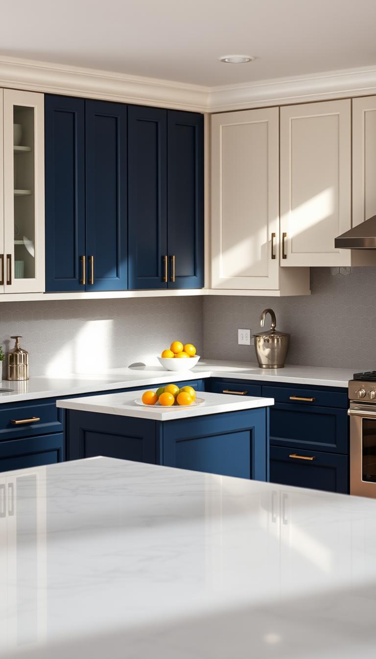
Horizontal Split: Light Uppers, Dark Lower Cabinets for Depth
A horizontal split gives rooms a clear base and a bright crown—it’s an easy way to add depth without fuss.
White or cream uppers bounce light and lift the ceiling. Glossy finishes amplify that effect and make the room feel airier. I often ask clients to test an upper swatch near a window before committing.
White or cream uppers with gray or navy bases
Gray or navy lower runs add gravitas and hide daily wear. Dark bases work well for active families where the lower cabinets take the most traffic. Pair them with a neutral countertop—white quartz or marble helps stitch the tones together.
Consistent hardware to unify the scheme
Use the same pulls and finishes across both tones. Brushed nickel, matte black, or brass will bind the design and make the split read as intentional.
- I start clients with this layout for instant balance and easy refinement.
- Match sheens: glossy uppers, matte or satin lowers.
- Add under-cabinet lighting to remove shadow bands and keep the plane cohesive.
“A careful horizontal split makes a space feel both taller and more grounded.”
| Feature | Upper run | Lower run |
|---|---|---|
| Finish | Glossy white or cream | Matte gray or navy |
| Function | Reflects light, feels open | Durable, conceals scuffs |
| Pairing | White quartz or marble countertop | Uniform hardware across both runs |
Vertical Divide: Zoning Open-Plan Kitchens with Two-Tone Cabinetry
In open-plan homes, a vertical split lets each side play a clear role—one for cooking, one for socializing. I often put warm wood by the range to feel rooted and durable. The dining side wears crisp white to read light and welcome guests.
It’s zoning without walls. That keeps circulation free and prevents visual clutter. A thoughtful backsplash or accent tile that borrows both tones ties the halves together so the divide reads intentional.
I repeat the wood tone in floating shelves on the white side, or add white appliance panels in the cook zone for a subtle handshake. Match door profiles across both runs to avoid a patchwork look.
Lighting confirms function: brighter task fixtures over the range, softer pendants near seating. Use a continuous floor—wide-plank oak or a porcelain with grain—to unify the space.
| Design Move | Why it Works | Quick Tip |
|---|---|---|
| Warm wood at cook zone | Adds durability and visual weight | Choose a medium grain for warmth |
| Crisp white at dining side | Feels open and social | Use matte or satin to reduce glare |
| Bridging tile or backsplash | Links both finishes and softens the split | Pick a tile with both undertones |
Statement Islands: Make the Island the Accent Color
Make the island your bold punctuation mark — it’s the easiest place to show personality. I often suggest clients start here when they want a pop without chaos.
A black island in a white kitchen reads classic and crisp. It draws the eye and then lets the rest of the room breathe.
Navy or teal islands give a lively, grown-up blue that still feels sophisticated. Keep the perimeter light so the island stays the focal point.
Details that seal the look
Waterfall countertop edges turn the island into sculpture. Pendants focus light and define the zone. Match hardware finish across island and perimeter for cohesion.
- Tuck power into an end panel for a clean face.
- Use durable satin finish on island cabinets for family life.
- Choose stools that echo the island tone or hardware to bridge textures.
“Start with the island — it’s easier to repaint one element than an entire room.”
| Move | Why it works | Quick tip |
|---|---|---|
| Black island | High contrast, timeless anchor | Pair with white perimeter and brass or black hardware |
| Navy or teal island | Rich, approachable blue accent | Use matte or satin for durability and depth |
| Waterfall countertop | Sculpts the island, highlights color | Match veining to tie into countertops elsewhere |
| Pendant lighting | Spotlights function and form | Hang low enough to define zone, keep sightlines clear |
Targeted Contrast: Pantry, Corners, and Feature Runs
Small edits—an accented corner or a lone tall run—often make the biggest visual payoff. I use a secondary tone on a pantry or a single run when clients want impact without excess.
You don’t have to repaint everything. A painted tall unit or a warm wood corner adds subtle variety and warms the room. This approach keeps sightlines calm in a small kitchen and reduces visual clutter.
I often echo the accent in nearby elements—bar stools, shelf brackets, or a trim on the hood—so the move reads intentional. Keep door profiles identical; the shared profile is the thread that ties the whole design together.
Test first: paint one tall cabinet or the appliance garage in the secondary tone. Live with it for a month. It’s the cheapest, least risky way to learn if the hue suits your routine.

“I asked a client to try a burnt orange pantry for two weeks — they kept saying it made mornings feel happier.”
| Move | Why it works | Quick tip |
|---|---|---|
| Single tall run | Adds punch without overwhelm | Match door profile to perimeter |
| Cornermill wood finish | Softens joins and adds warmth | Repeat wood on shelves |
| Accent tied to tile | Makes the whole look cohesive | Use a thin stripe of matching hue in backsplash |
Frame-and-Panel Contrast: Subtle Two-Tone Cabinet Door Ideas
A frame-and-panel approach lets detail do the talking, not bold blocks of paint. It’s a gentler riff on a split scheme that reads crafted and calm.
Black frames with white panels feel architectural—graphic but not loud. They give a refined look that works in modern and transitional layouts. Keep hardware minimal; slim pulls or integrated rails let the door design be the star.
Black frames with white panels for a refined twist
Use durable finishes on the frame—edges take the most wear. Match sheens so the finish reads intentional. A simple subway backsplash keeps the eye resting on the door detail.
Two shades of gray for transitional spaces
Layered gray tones soften contrast and add depth without high drama. This is a subtle way to update a small kitchen or a galley where details do the heavy lifting.
- If you love subtlety, try frame-and-panel contrast—the frame and center panel are different tones.
- Keep hardware minimal so the door design shines.
- Match sheens for a crafted, coherent finish.
“Small details often give the room a quiet, curated feel.”
Gradients and Layered Tones: From Pale to Charcoal
Shifting tones gently down a wall creates a layered look that feels calm and deliberate. A tonal gradient—from pale gray uppers to charcoal lowers—softens contrast and adds real depth without fuss.

I always match sheen. Use matte or satin across the whole run so the finish reads like one idea instead of separate paint jobs. That single-sheen trick keeps the eye moving and the scheme coherent.
Use matching sheens (matte or satin) for cohesion
Pair the gradient with a neutral countertop and a consistent backsplash tile. This stitches the layers together and avoids adding a competing third tone. Under-cabinet lighting helps the darker lowers show detail rather than vanish.
Balance with neutral countertops and backsplashes
This approach adapts well as light shifts through the day. Reverse the gradient on an island for rhythm—darker uppers, lighter island—to create movement without noise. For durability, choose satin or matte on lower runs and a single metal finish like brushed nickel to tie the whole kitchen and its cabinets together.
Finish and Texture Choices: Gloss, Matte, and Wood Grain
A finish can change how a room breathes—gloss brightens while grain invites touch. I treat finish and texture as tools, not afterthoughts. They set mood, manage wear, and shape perception of depth.
Glossy white uppers to bounce light
Glossy white uppers to bounce light
Gloss reflects daylight and lamp light. That makes ceilings feel higher and the room airier. Vienna Gloss and Impression Gloss are great stock options for this effect.
Matte dark lowers to ground the room
Matte dark lowers to ground the room
Matte bases hide scuffs and steady the plan. Use a darker matte to anchor the work plane and add visual depth where traffic is highest.
Wood textures to add warmth and dimension
Wood textures to add warmth and dimension
Walnut, oak, or textured laminates add tactile warmth. Lucca and Bella slab lines show how to pair grain with gloss for a curated look.
- Keep sheens consistent by band—all uppers gloss, all lowers matte.
- Consider maintenance: gloss shows smudges; matte shows dust; wood hides both.
- Repeat hardware finish to tie the look together.
“The right finish pairing can make a modest kitchen feel custom—without custom prices.”
Best Wood Pairings for Two-Tone Kitchens
Good wood pairings make a room feel crafted and calm. I look for one light species and one richer partner so the contrast highlights grain and movement. That approach keeps the plan from feeling busy and helps the eye land on workmanship.
White Oak + Walnut for classic contrast
White oak reads neutral and airy. Walnut brings depth with pronounced grain. Use oak on uppers and walnut on lowers or an island to anchor the space.
Maple + Cherry for warm, cozy tones
Maple’s smooth surface balances cherry’s soft red undertone. Together they create a warm wood feeling that suits family-focused kitchens and harvest-table moments.
Ash natural + dark-stained Ash for cohesive subtlety
Same species, different values. This is a refined play on tones—subtle, elegant, and easy to match across trim and shelving.

| Pairing | Character | Practical tip |
|---|---|---|
| White Oak + Walnut | Light neutral + rich grain contrast | Carry walnut into open shelves or island face |
| Maple + Cherry | Soft grain + warm undertone | Use on lowers with painted uppers to add warmth |
| Ash + Dark-stained Ash | Cohesive same-species contrast | Sample in your light—UV shifts hues over time |
| Finishing notes | Bridging materials | Let counters with warm veining unite both woods |
Keep door profiles simple—Shaker or slab lets grain speak. I also recommend matte black or burnished brass hardware to complement the woods and complete the style.
Classic Neutrals: Black and White, White and Gray
A crisp neutral pairing feels like design insurance — it always reads fresh and collected.
Matte black lowers with glossy white uppers give modern contrast and real visual depth. Glossy uppers catch light; a reflective backsplash amplifies that glow and keeps the room feeling open.
White countertops knit the palette together and make meal prep feel bright and clean. I often choose slim, modern hardware to underline the graphic look.
For a softer route, swap black for dark gray on lowers. Dark gray with white uppers creates a muscular, refined balance without harshness.
Add warmth with a wood floor or stools so the plan never feels sterile. Patterned tile—herringbone, small-scale Moroccan, or glazed subway—introduces movement and personality.
“Neutral foundations are forgiving — seasonally, you can change art, runners, or greenery and the whole room feels new.”
- Black-and-white is timeless and easy to refresh.
- Gray lowers read sophisticated and quiet the contrast.
- White cabinets and white countertops keep the composition clean.
Blue-Based Ideas: Navy, Powder Blue, and Blue-Gray Combinations
Navy anchors a room with a calm confidence that still reads modern and collected. Use it as an island or a deep base and keep the perimeters pale for balance.
Powder blue uppers bring a soft, sky-like feeling. Pair them with blue-gray lowers to add depth without drama.
I like a navy island against light surrounds—it becomes a focal point that feels fresh, not fussy. Waterfall countertops and sculptural pendants elevate that moment into a real feature.
Bring in whitewashed oak or matte wood panels to soften the cool tones. Brass or matte black hardware adds polish and two different flavors of warmth.
Sample any hue under your lamps and daylight. Blues shift with warm and cool bulbs more than many other colors, so test before you commit.

“A navy island felt like jewelry in one project—simple, but it changed how the whole room reads.”
| Move | Why it works | Quick tip |
|---|---|---|
| Navy island | Strong focal anchor | Pair with pale perimeters and brass pendants |
| Powder blue uppers | Soft, airy feel | Anchor with deeper blue-gray lowers |
| Blue-gray palette | Mood without saturation | Echo veining in backsplash or countertop |
Nature-Inspired Palettes: Sage, Olive, and White or Warm Wood
Muted greens bring a soft, restorative mood that feels rooted and modern at once.
I use sage and olive to make busy rooms breathe. Dark green on the lowers anchors the plan while white or light wood uppers keep the ceiling feeling open.
Warm wood accents—open shelves, an island face, or trim—add texture and a tactile, biophilic note to the palette.
Stone counters with gentle veining echo nature’s randomness and soothe the eye. In low light, keep greens muted so the room never feels heavy.
- Sage and olive breathe calm into busy kitchens.
- Black or brass hardware gives an earthy-modern finish.
- Small plants and wood accessories reinforce the natural link without clutter.
If you have warm oak or terracotta floors, sage is forgiving—it harmonizes undertones and ties the whole palette together.
“Clients often tell me these rooms finally let them slow down—the space just seems to exhale.”
Warm and Moody: Mustard, Deep Browns, and Earthy Woods
I reach for mustard, deep brown, and warm wood when a client wants cozy without drama. These colors sit next to each other on the wheel, so they read calm and harmonious.
Use mustard in a glossy or semi-gloss finish to catch precious light in darker rooms. A glossy surface helps the hue act like a soft reflector rather than a shout.
Put deep brown on lower runs and choose a warm wood island to create a fireside gathering spot. Keep counters quiet—cream or soft beige stone lets the palette glow.

“Layer textures — linen shades, ceramic pendants, and woven rugs add depth beyond paint.”
- Hardware: blackened bronze or antique brass to underline the cozy vibe.
- Walls neutral so the cabinetry carries the warmth without feeling heavy.
- In open plans, echo mustard in art or upholstery to unify adjacent rooms.
| Element | Why it works | Quick tip |
|---|---|---|
| Mustard glossy finish | Reflects light, warms space | Use on a feature run or island face |
| Deep brown lowers | Anchors the plan, hides wear | Pair with warm wood island |
| Quiet countertops | Prevents visual competition | Choose cream or soft beige stone |
Playful and Retro: Teal, Peach, Lilac, and Color-Blocking
Retro palettes invite a wink—bold pastels and saturated accents can make chores feel joyful. Use color-blocking to assign personality by zone: a teal base run, a peach pantry, a lilac island. I like this for homes that want a playful look without chaos.
Keep countertops and backsplash neutral. That gives saturated tones room to breathe and protects the work surface from visual competition. A simple cream zellige or small-scale mosaic tile works especially well.
Pair one saturated hue with a pastel partner to avoid a shouting match. Finish choices steer the era: glossy lilac reads modern; matte peach leans vintage. Repeat an accent in stools or a pendant stripe to tie the plan together.
I often suggest starting small—an island or open shelves you can swap out. This makes bold kitchen cabinet ideas less risky and more fun to live with.
“A tight palette—two hues plus a neutral—keeps the composition intentional and joyful.”
- Feeling playful? Assign personality by zone for instant variety.
- Use clean-lined cabinetry so color becomes the star of the style.
- Retro palettes sing with checkerboard or scaled tile; keep counters quiet.
Two Color Kitchen Cabinets
Layered lighting and smart hardware make a two-tone plan feel like a single, polished idea. I start by testing swatches under the bulbs you’ll actually use. Warm and cool light nudges hues differently, so try both before you commit.
Under-shelf and under-cabinet LEDs are non-negotiable. They remove dark bands, show off the finish contrast, and spotlight your color story.

Use open shelving to soften strong contrasts
Open shelves in a complementary wood calm bold splits. They break up large fields of paint and give your daily wares a warm backdrop.
Make hardware and tile do the heavy lifting
Keep hardware finish consistent to tie diverse runs together. Swap pull styles sparingly if you want subtle variety.
- Choose a backsplash tile that borrows both tones—patterned or glazed—to bridge runs.
- Pick grout to either outline the tile or disappear for a calmer wall plane.
- Consider a slim rail for tools; functional accents can echo the palette.
“Lighting, hardware, and tile are the threads that stitch a split scheme into one coherent look.”
| Element | Why it matters | Quick tip |
|---|---|---|
| Under-shelf LEDs | Add depth and reduce shadow bands | Mount warm white for cozy rooms, neutral white for clarity |
| Open shelving | Softens contrast and displays wares | Use contiguous wood to repeat the tone |
| Tile backsplash | Bridges colors and adds texture | Pick a tile with both undertones; test grout |
Product and Style Inspiration from Stock RTA Lines
I turn to stock collections when a client wants a reliable palette and faster delivery. They remove a lot of guesswork—profiles, matched sheens, and consistent hardware finishes arrive ready to install.
Shaker staples
Valleywood Shaker anchors in White or Cream and pops with Marine Blue, Shaker Gray, or Dusky Gray. It’s an easy base for an island in Rustic Hickory for texture.
Kingston often ships White as the main with Charcoal Black accents for crisp contrast. Supreme Shaker spans Navy, White, Gray, and Oak—great for classic-meets-modern plans.
Elegant and Coastal Shaker lines let you mix Black, Ivory, blue, or green across runs for a friendly, lived-in style.
Modern gloss and slab
Vienna Gloss pairs Gloss White with Gloss Gray or Walnut and dark-wood slabs for sheen plus warmth. Impression Gloss adds plywood boxes and dovetailed drawers for a refined, durable build.
Lucca and Bella slab doors pair well with white cabinets and textured white finishes when you want a clean, modern aesthetic.
Warm wood accents
Havana and the Impression Wood Series bring Blanco or Plata with Walnut or Ash accents. Use them as open shelves or island faces to add tactile warmth and tie natural grain into the plan.
Bold anchors and accents
Madison Slim Shaker reads sharp in Black with White. Cali frameless offers Navy + White at approachable prices. Pacific and similar lines add premium accessories if you want higher-end pulls and soft-close boxes.
- Stock lines make two-tone attainable—coordinated profiles and finishes reduce lead times and layout guesswork.
- Looking for sample ideas? See curated pairings from a popular RTA source for practical inspiration: stock RTA lines.
“Start with a stocked series and you’ll spend your energy on layout and lighting—not chasing perfect matches.”
Small vs. Large Kitchens: Color Strategies by Space
Small footprints ask for bright strategies; they read larger when light is prioritized. In a compact room I lift brightness up high—gloss uppers or pale paint—and keep darker tones low and limited to one feature. That single accent does the heavy visual work without crowding the plan.
Maximize light. Use under-cabinet LEDs and a reflective backsplash to amplify daylight and task lamps. Slim pulls keep sightlines calm in tight spaces.
Large spaces welcome deeper, layered tones. You can run gradients, repeat accents across elevations, and use vertical zoning—warm wood at the cook end, crisp white where you dine—so function reads clear at a glance.
Islands behave differently by scale. In small layouts the island is best as a lone accent. In big kitchens you can color-block perimeter runs too and still feel balanced.
“Design should follow life—let movement, not trend, decide where color lives.”

| Size | Strategy | Quick tip |
|---|---|---|
| Small room | Light uppers, one dark feature | Slim hardware, reflective backsplash |
| Large kitchen | Layered tones, vertical zoning | Repeat tones across elevations |
| Ceiling | Lift or ground the volume | Light paint for height; beams to anchor |
- Choose hardware scale to suit space—smaller rooms, slimmer pulls.
Lighting and Hardware: Tying the Two-Tone Scheme Together
Good lighting makes a split scheme read intentional, not accidental. Pendants over an island spotlight accents and become a visual anchor. Under-shelf LEDs erase shadow bands so tone differences read crisp and clear.
I keep one hardware finish across the room whenever possible. Cohesion calms the eye even when runs contrast. Minimal pulls let framed doors breathe; bolder knobs act as jewelry on slab faces.
- Lighting is your editor—pendants, under-cabinet LEDs, and correct bulb temp shape perception of color and material.
- Use dimmers to shift mood—prep-bright to dinner-glow.
- Bridge wood and paint with metal: antique brass warms blue and timber; matte black sharpens white and gray.
Don’t forget touch points. Soft-close hinges, solid pulls, and repeat metals in adjacent fixtures make the cabinetry feel quietly luxe. If you mix metals, pick one dominant and one accent—treat them like your palette so the whole look feels orchestrated, not piecemeal.
“Lighting and hardware are the small elements that finish a design and shape how you live in the room.”
Durability and Maintenance: Choosing Cabinet Finishes That Last
What your cabinet faces feel like tomorrow matters as much as how they look today. Pick finishes that survive daily life. That means thinking beyond the paint swatch and into wear, cleaning, and repair.
I favor lines like Impression Gloss for their durability—plywood boxes and dovetailed drawers really hold up. These build decisions matter where you open and store most often.
Practical finish notes: gloss shows smudges but reflects light and brightens a room. Darker matte lowers hide scuffs and stay calm under traffic. Wood grain disguises dings and makes a lived-in patina feel intentional.

- Match sheens across runs so touch-ups read consistent and the overall design feels unified.
- Use quality primers and hard-wearing topcoats on high-touch doors for longevity.
- For families I specify satin on lowers—cleanable, resilient, not overly shiny.
- Inside, melamine or easy-wipe interiors cut cleaning time and reduce stains.
Consider integrated appliance panels to reduce finish transitions and keep the look seamless. Simple profiles—Shaker over ornate—clean faster and age more gracefully. In short: choose what you can live with, and the beauty will endure.
“Longevity beats trendiness—pick materials and builds that save time and repairs.”
Budget and Build: RTA vs. Assembled, Framed vs. Frameless
Choosing between RTA and assembled is one of the clearest ways to control cost and timeline. I often start clients with stock RTA lines when budgets are tight—pairing items from the same warehouse keeps shipping fees down for a typical 10’x10’ benchmark.
Assembled boxes cut install time and reduce DIY risk. They’re smart when schedules are short or you want fewer surprises on site.
Frameless lines—Lucca, Bella, Vienna, Impression Gloss, Cali—give full-access storage and a sleeker look. Framed options—Valleywood, Kingston, Supreme, Elegant, Coastal—offer classic door tolerance and Shaker flexibility.
- Match build to style and use: slab fronts work best on frameless; Shaker pairs well with framed frames.
- Premium details—dovetailed drawers, plywood boxes—pay off in longevity.
- Mix a budget perimeter with a splurge island for big visual impact without big cost.
“Plan finishes and color early—lead times vary and they’ll hold your schedule.”
| Choice | Benefit | Tip |
|---|---|---|
| RTA | Lower price, flexible warehousing | Pair lines from one warehouse |
| Assembled | Faster install, fewer site adjustments | Good for tight timelines |
| Frameless | Full access, modern look | Use for slab or glossy styles |
| Framed | Classic profile, easier door alignment | Best for Shaker and textured finishes |
Bringing It All Together: Sample Schemes and Material Pairings
Think of this as a recipe box—tested combos that make a room feel resolved and livable. I list clear pairings so you can pick a palette and order samples with confidence.
Quick, reliable pairings I use:
- Timeless: white uppers + gray lowers, white quartz counters, brushed-nickel pulls — quiet depth and long-term appeal.
- Statement: light perimeter + navy island with a waterfall top and a trio of pendants — focus and function in one.
- Nature-led: sage lowers, white uppers, brass hardware, zellige tile — calm, tactile, bright.
- Modern warm: Vienna Gloss White wall with Walnut Slab bases — sheen meets grain for rich contrast.

More ways to mix materials: Valleywood White paired with a Marine Blue island for classic Shaker charm. Cali White + Navy gives a sleek, frameless coastal look. Havana Blanco with walnut accents adds minimal, lived-in warmth.
| Move | Why it works | Quick tip |
|---|---|---|
| Subtle gradient | Pale upper to charcoal lower | Keep satin sheen across the run |
| Vertical zone | Warm wood cook wall, crisp white dining run | Use a backsplash that pulls both tones |
| Mixed wood | White perimeter with walnut accents | Repeat wood on shelves or island face |
“These kitchen cabinet ideas prove there’s more than one way to harmonize color, material, and light—pick the palette that matches your daily rhythm.”
Conclusion
Design that lasts blends function with feeling; that’s where the best schemes live.
I still see the same truth in every project: planning around light, room size, and fixed finishes saves regret. Start with a grounded neutral, add a confident partner, and test swatches at home under your real bulbs.
Match sheens, keep hardware consistent, and light the planes—those small choices make the whole scheme sing. Stock RTA lines are a great way to get coordinated profiles and durable builds without long waits.
When in doubt, edit. Fewer, better moves beat a busy mix. If you want help mapping your palette or translating inspiration into a livable interior, I’m here to guide the way.