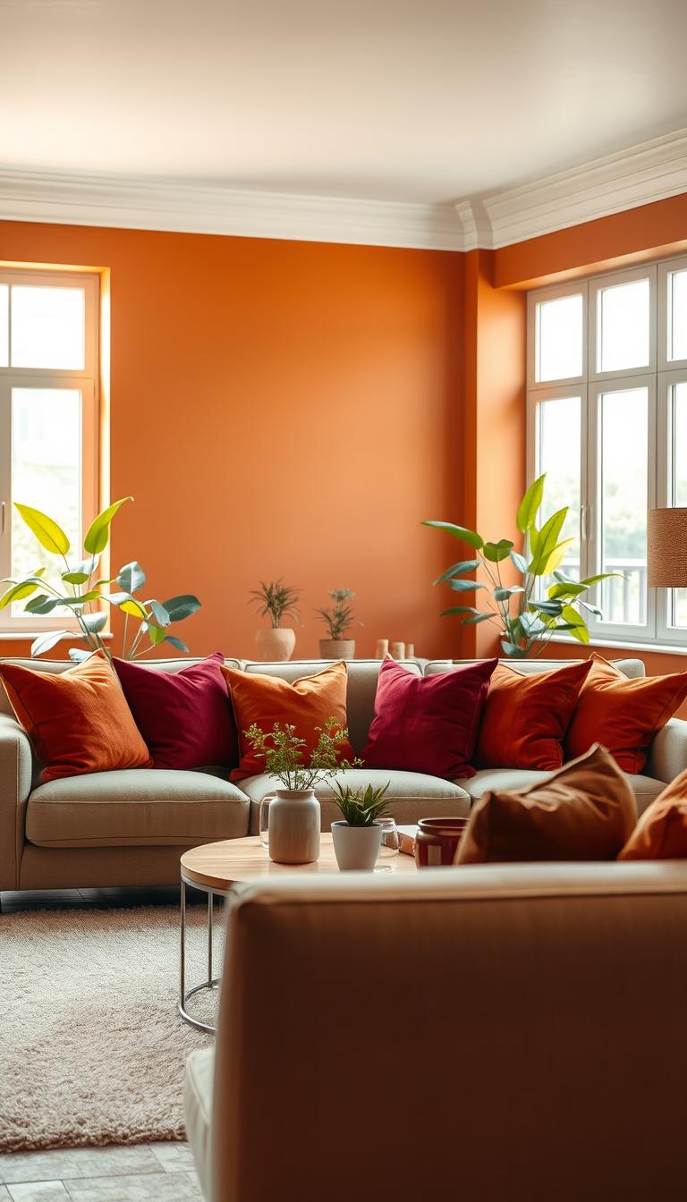
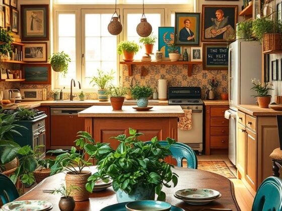
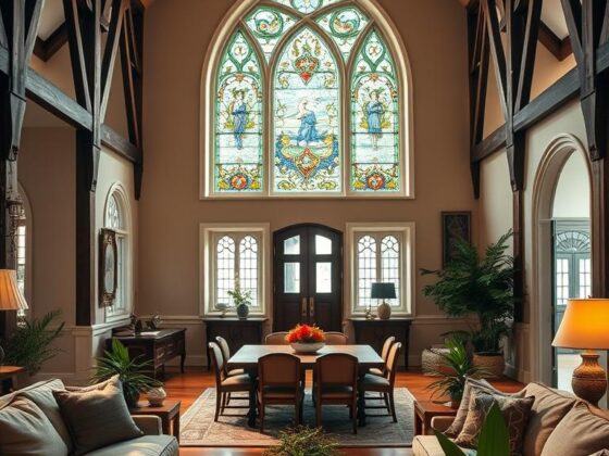
Ever wondered why a simple color change can make a room feel like a hug?
I ask that question because I often reach for a cozy palette when a client wants instant comfort. I’ll explain the science behind how certain hues activate a social vibe and why they work in living and dining rooms.
I guide homeowners to read undertones, test swatches on actual walls, and observe light at different times of day. That way you avoid surprises and get the look you imagined.
In this piece I share practical steps and quick wins—use warm backdrops to unify open spaces, layer with textiles and wood, and balance with cooler notes where needed. Expect clear advice that helps you make a confident choice for your home.
Key Takeaways
- Try swatches on walls and view them in all lighting conditions.
- Use warmer hues in living areas to invite social energy.
- Read undertones to pair paint with furniture and finishes.
- Balance warmth with cool accents for visual calm.
- Layer materials—textiles, wood, and soft metals—to boost cozy style.
Start Here: What Makes a Color Feel Warm and Welcoming
Ask yourself: why does this room feel instantly cozy the moment you walk in? I tell clients it’s rarely a mystery—it’s about families of hues and how they read in real life.
Yellows, reds, and earthy blends cue our brains to sunlight and togetherness. That quiet glow is the real measure of warmth, not just saturation.
Neutrals like white or gray hide subtle undertones. The fastest trick: compare two samples side-by-side. Differences pop when you see them together.
Your dominant color — the leading tone in a room — sets personality. You can mix cool and cozy, but the main note decides if a space feels hug-like or spa-like.
- Watch a sample across morning and evening light to judge its true character.
- If you squint and it reads like candlelight, you’ve probably landed in warm territory.
- Match intent to hue: connection around a table, calm focus in a nook.
How to Choose Warm Paint Colors with Confidence
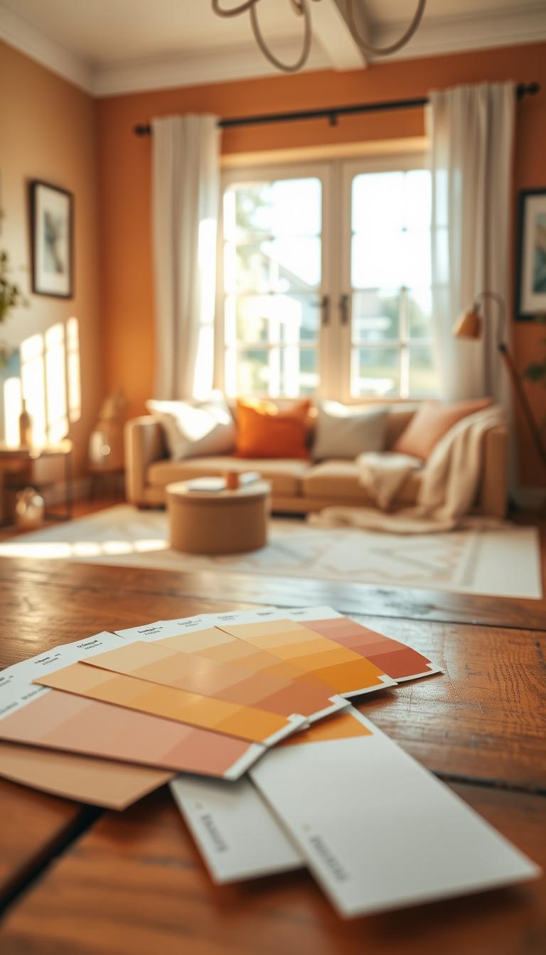
Picking the right hue starts with spotting tiny undertone cues you can miss at first glance. I begin by placing samples side-by-side so yellow, pink, or blue shifts jump out—this is especially true in white and gray families.
Understand undertones
Compare two neutrals on the same wall. The warmer one will read creamier or earthier next to a cooler chip. That quick test saves bad surprises.
Lighting basics
Note natural light direction: north light cools, south warms, east is crisp mornings, west gives late-day gold. Artificial bulbs matter too—anything 3500K and up looks cooler on the surface.
Test before you commit
- Brush two coats on poster board or the wall.
- View with blinds open, closed, and with lamps on.
- Check how countertops or steel shift a borderline neutral.
My tip: Keep photos in a notes app at different times. It’s the fastest way to make a confident choice and avoid second-guessing the final look.
Best Warm Neutral Shades to Try Now
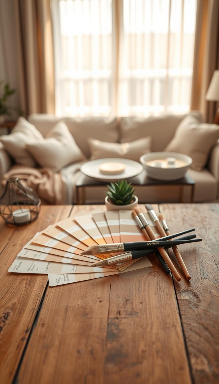
When I need to dial in instant coziness, I reach straight for a tried-and-true neutral from the Dunn-Edwards warm neutrals lineup. These hues work across open plans and small rooms, and they make finishes look better without competing for attention.
Golden and earthy warmth
Flickering Gold (DE6166) and Melted Wax (DE6163) bring soft gold depth. They wrap a living area in gentle glow without feeling heavy. Use them in open concepts where wood tones need a friendly partner.
Balanced and soft
Soft Ivory (DE6155) bounces light in hallways and compact spaces. Desert Mauve (DE6016) reads airy and calm—great for bedrooms that need subtle, cozy character.
Grounded depth and comforting beiges
Badlands Sunset (DE6083) and Thick Fog (DE6058) add grounded personality. My go-to beige trio—Warm Blanket, Summer Suede, Happy Trails—layers well with linen and pale woods for everyday living.
- Accent picks: Cocoa Delight, Cuppa Coffee, El Capitan for feature walls.
- Light-boosters: Mocha Frappe and Seashell keep smaller spaces bright.
- Pro move: sample two similar beiges on the same wall—the one with a whisper of gold will feel cozier next to oak or brass.
Design Tips: Pairing Warm Neutrals, Trim, and Finishes
A successful room relies on smart pairings—trim, finishes, and textiles working together. I use the color wheel to set confident contrast, then soften it with texture so a space feels lived-in, not loud.
Complementary schemes that work
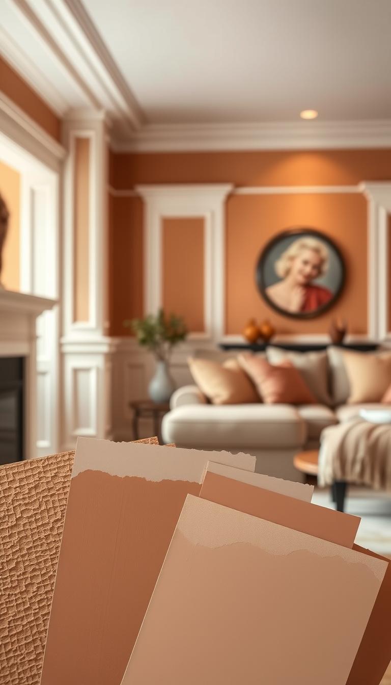
Complementary colours sit opposite on the wheel: red/green, blue/orange, purple/yellow. For warm-painted walls, that means muted greens or a deep navy will pop in a balanced way.
Trim and white choices
For cohesive trim, I favor White Dove OC-17—it keeps edges soft. If you mix warm and cool notes, Chantilly Lace OC-65 reads crisper without feeling icy.
Materials and accents
- Lean on linen, rattan, reclaimed wood, and honed stone to make hues sing.
- Add accents: deep greens, navy, terracotta, and a dash of gold for polish.
- If you have gray sofas or stone, introduce a creamy rug and wood tones to warm the room.
Quick test: paint a stripe of trim next to your wall color. If it looks chalky, you’ve likely found the right match. That small choice changes the whole way a room reads.
Room-by-Room Guide to Warm Paint Colors
I walk into a living room and immediately look for the color thread that ties the whole plan together. A single neutral base can unify zones and keep an open plan feeling calm and intentional.
Living rooms and open spaces
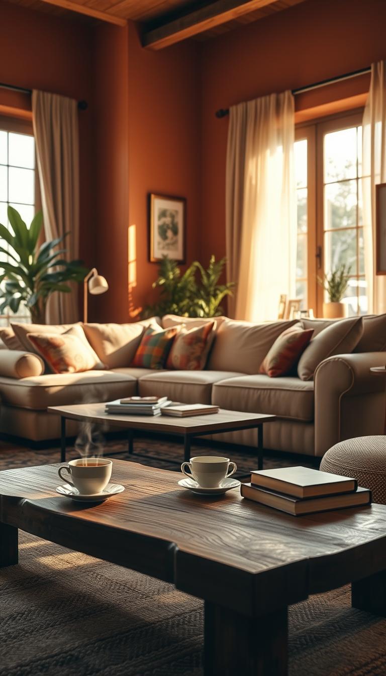
Living rooms and large open spaces benefit from a unifying tone like Melted Wax (DE6163). It adds inviting depth without closing the area in.
Use one neutral paint across the plan, then change accent colour by zone for subtle definition.
Kitchens and dining areas
In kitchens and dining zones, a warm backdrop encourages togetherness. Try Soft Ivory (DE6155) with wood stools and brass pulls for easy elegance.
That combo keeps the space lively while letting cabinetry and fixtures stand out.
Bedrooms and bathrooms
For bedrooms, pick enveloping shades like Cocoa Delight on a feature wall, then soften with layered linens and a creamy ceiling.
Bathrooms can handle neutral paint too—Thick Fog (DE6058) reads spa-calm next to a wood vanity. Lighter shades work in compact rooms; richer shades suit high ceilings.
- If your interior leans gray, add a warm rug or oak console to bridge the palette.
- Tape samples in each zone of an open plan and view them together—this quick test reveals the best through-line.
- Adjust shade depth by room size: lighter for small rooms, deeper for large spaces.
Want a quick refresher on how warm and cool interact? Check this warm and cool guide for a visual primer that helps with undertone decisions.
Warm Paint Colors: Sampling, Store Visits, and Next Steps
Before you buy a gallon, try samples where they’ll live — that’s where true character shows.
I ask clients to order large sample pots and paint two coats on boards or directly on the wall. That reveals undertones far better than tiny chips.

How to compare and test
- Place two large samples side-by-side to spot subtle shifts in colour and undertone.
- Evaluate each sample in morning, afternoon, and evening light — natural light and lamps change everything.
- Label the wall you tested and take clear photos so you can review choices later.
Visiting stores and asking smart questions
Bring photos of flooring, counters, and fabrics to the store. Specialists at an expert store can suggest a closer match fast.
Ask about bulb temperature in your fixtures. Swapping to warmer or cooler bulbs often saves a near-perfect pick.
| Step | Action | Why it helps homeowners |
|---|---|---|
| Order large samples | Paint two coats on boards or wall | Shows true undertone and real-life depth |
| Compare side-by-side | Place samples next to each other in the test spot | Makes subtle colour differences obvious |
| Visit an expert store | Bring photos and ask for in-store lighting checks | Retailers offer tailored advice and better lighting setups |
| Finalize choice | Check sheen and primer at the counter | Prevents finish or adhesion surprises after application |
If you’re stuck between two, pick the one that sings in your least forgiving corner — that spot exposes issues others hide.
For guidance on ordering samples and testing methods, see this short guide on choosing paint samples. Visiting an independent retailer often speeds the process; I’ve watched homeowners find their color in minutes once samples are viewed under proper lighting.
Conclusion
The most reliable way to pick a shade is to see it in the spot where you live.
I recommend sampling two or three large swatches and watching them in morning and evening light. Test on the actual wall or on boards you can move. That simple step reveals undertones and shows how a neutral paint will behave across a day.
Keep one hero shade and build accents from it—beige textiles, a dash of gold, or a deep sofa to add contrast. For trim, White Dove OC‑17 keeps edges soft; Chantilly Lace works when you mix cool and warm notes.
If there’s one takeaway: warm neutrals are the easiest path to everyday comfort—choose, test, and trust how your home feels at different hours.
Ready to begin? Pick two to three paint colours from this guide, paint larger swatches, and let the right neutral rise to the top with confidence.

