Can one bold choice change how a space makes you feel? I ask that because I’ve seen a single palette turn a plain corner into an intentional, calming haven.
I’ll show you how to plan, pick, and apply a full paint strategy so your home feels immersive without feeling faddish. This post pulls practical moves from client work and expert guides—what to paint, when to wrap the ceiling, and how to handle trim for a refined look.
Color drenching works best in smaller, enclosed spaces like powder areas or libraries, while open-plan layouts often call for tone-on-tone layering instead. I’ll help you decide which approach fits your life and style.
Expect tools you can use now: mood boards, light checks, and finish choices that balance beauty with durability. I’ll also flag common pitfalls so you don’t repaint a week later.
Key Takeaways
- Color drenching creates an immersive, cocooned feel when used in the right space.
- Small, enclosed rooms often showcase the effect best.
- Trim and ceiling choices make the result feel intentional.
- Use mood boards and light tests before you commit.
- I’ll outline common mistakes and how to avoid them.
What Is Color Drenching and Why It Works in Today’s Homes
Think of a painted shell that makes architecture read as sculpture. When I say color drenching, I mean committing one hue across walls, trim, doors, and even the ceiling so edges soften and the whole space feels intentional.
“Maria Killam defines color drenching as painting walls, trim, and doors the same color, noting it creates a cohesive, sophisticated backdrop that highlights architectural details like picture molding.”
How the effect works
The low-contrast envelope reduces visual “cut lines.” Your eye stops ping-ponging between shifts, and the mood feels calm. Depth reads richer because textures and shapes step forward.
Why it’s not about size tricks
Don’t chase bigger-or-smaller illusions. A well-edited drenched space invites you to notice form, textiles, and the quality of light instead.
- I reach for medium or moody hues — softened green or charcoal — for livable depth.
- Wrap the ceiling for full immersion, or keep it lighter to lift height.
- Use a powder or a dining room as a confident example of the approach.
Plan First: How to Assess Your Room, Layout, and Light
Start by studying how your space flows and where sightlines pull you—this shapes every paint decision. I walk clients through a quick checklist so choices feel intentional and last over time.
Open-concept caution: In wide, connected spaces it’s hard to know where to stop and start color. When trim and sightlines link areas, zoning with related tones works better than full color drenching.
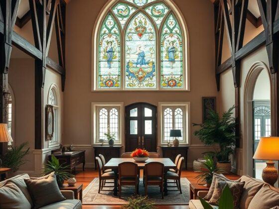
Architectural details and trim: Picture molding or skinny, mismatched trim are ideal candidates for a single-hue treatment. Painting those elements the same shade quiets fuss and makes the architecture read as one calm field.
Mood boards before paint: Build a board from your rug, sofa fabric, art, and metal finishes. Let those pieces pick your shade. Then place large swatches on multiple walls and the ceiling and watch them at different times of day.
Natural and artificial light: North-facing windows cool a hue; south exposure warms and intensifies it. Add lamps and dimmers so the feel you create by day survives into evening.

- Check adjacent spaces and circulation—plan a soft transition if a drenched zone meets a white hall.
- Paint vents, pipes, and built-ins in the same hue to simplify the visual field.
- Quick example: keep living/dining tone-on-tone and give a nearby powder a full wrap for drama.
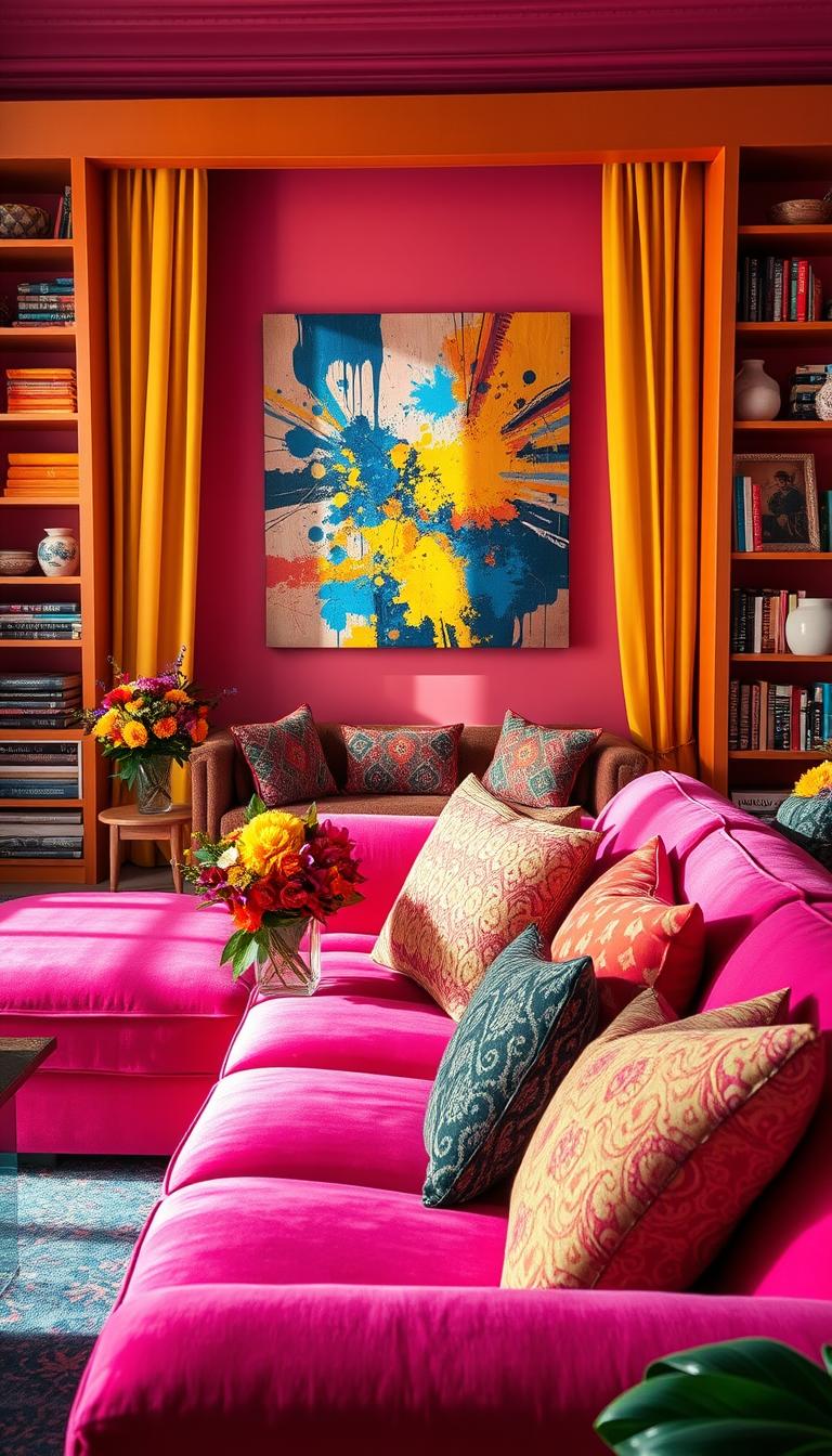
Color Strategy: Tones, Undertones, and Finishes for Depth
A smart hue plan starts with choosing mid-tones that give warmth and depth without shouting for attention.
I reach for medium-toned hues with complex undertones—muted green, deep teal, and soft charcoal—to add livable richness. These tones create subtle depth and let textures read clearly.
Tone-on-tone vs. gentle contrast: If your spaces have ornate millwork, a tone-on-tone approach keeps profiles elegant. In plainer areas, a slight contrast on trim gives crisp definition and visual interest.

Finish choices that matter
Matte or flat sheens calm walls and hide imperfections. For a dining room, satin or a soft gloss lifts candlelight and feels luxurious. Semi-gloss is my pick for doors and cabinetry where wear matters.
| Surface | Recommended Finish | Benefit | When to use |
|---|---|---|---|
| Walls | Matte/Flat | Hides texture, reads soft | Large fields, living areas |
| Dining room | Satin/Soft gloss | Reflects light, adds luxury | Formal dinners, focal spaces |
| Trim, doors | Semi-gloss | Durable, easy to clean | High-touch zones |
| Ceiling | Matched or slightly lighter | Maintains drenching or lifts height | Low ceilings or jewel-box spaces |
- Read undertones like a recipe—greener hues with yellow warmth, teals with gray for calm, charcoals with blue for cool mood.
- Build a tone ladder—same base in 2–3 strengths—to shape depth across walls and trim the right way.
Application Basics: Walls, Ceiling, Trim, and Doors That Sing
Decide your commitment up front—full wrap or a lifted lid—and the rest follows easily. That single call shapes how you prep, the sequence you follow, and the final look of the space.
Ceiling choices
In compact spaces, a full wrap across walls and ceiling creates that jewel-box magic. It feels immersive and intentional.
If height is an issue, I usually go one shade lighter overhead in the same undertone family. The lid breathes while the whole drenching effect stays cohesive.
Doors and built-ins
Paint doors, vents, and built-ins in the same hue to make them recede. Want a feature? Choose a deeper sibling tone to spotlight a built-in as an anchor.
Durable sheens on high-touch surfaces keep the finish practical without breaking the monochrome design. Semi-gloss for doors, matte for walls—one palette, several finishes.

- Roll color slightly onto the ceiling line to avoid a hard stripe, then finish the lid cleanly for a tailored edge.
- Use an angled brush for trim profiles and a fine-nap roller for walls; sand between coats on doors for a furniture-like finish.
- Work in sequence: ceiling first, then walls, then trim and doors—keeps drips manageable and the final result professional.
Room-by-Room Guide to a Color Drenched Room
Here’s a compact guide to match finish, light, and function for every room in your home.

Powder and baths
Powder and bath spaces love a full wrap. Use bathroom-rated satin or semi-gloss paint for moisture resistance and easy cleaning.
Mirror placement matters—oversized mirrors bounce light and stop a small powder from feeling closed in.
Dining rooms
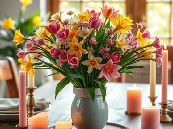
In the dining room, go dramatic. Satin or soft gloss throws back candle and pendant light beautifully.
Layer metallics, glass, and rich textiles for a luxe but family-friendly feel that still welcomes dinner and conversation.
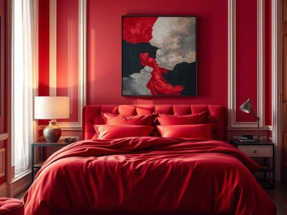
Bedrooms
For bedrooms pick muted palettes. Soft sage, dusty mauve, or deep teal soothe the mood and improve rest.
Paint the ceiling a shade in the same family to make the space feel cohesive rather than chopped up.
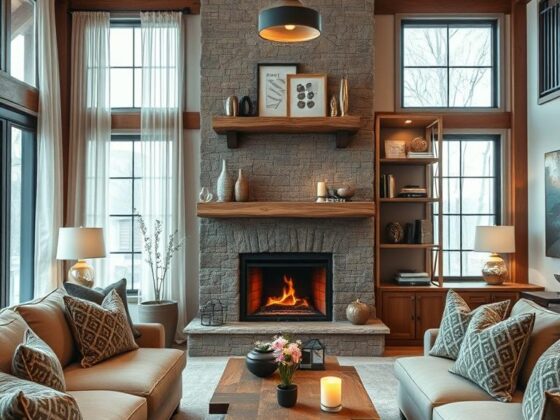
Living rooms
Small, light-filled living rooms can handle a full drench and feel intimate. In large or open-plan living spaces, lean tone-on-tone to keep zones clear.
Home offices
Match saturation to your work style. Earthy greens or charcoals aid focus; layered lamps give flexible light for long calls.
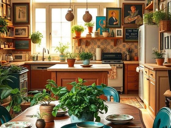
Kitchens
Prioritize cabinetry-forward drenching. High-gloss doors reflect light and wipe clean. Balance with lighter counters or a neutral backsplash so the kitchen stays lively, not heavy.
Entryways and hallways
Use a statement hue to set the tone. Tie it to adjacent spaces for flow, and add strong sconces or a pendant to avoid a boxed-in feel.
| Space | Finish | Key tip |
|---|---|---|
| Powder/powder room | Satin/Semi-gloss | Full wrap + oversized mirror to amplify light |
| Dining room | Satin/Soft gloss | Use metallic accents and layered textiles for warmth |
| Bedroom | Matte/Satin on ceiling | Muted hues and layered fabrics for restful feel |
| Kitchen | High-gloss on cabinetry | Balance with lighter counters or backsplash for contrast |
Style Moves: Texture, Pattern, and Neutrals That Elevate the Look
Textures, patterns, and a few smart neutrals transform a strong paint choice into a lived-in space. I use fabrics and finishes to add warmth and depth without bringing more colors into play.
Velvet, linen, and wool for depth without extra color
Velvet cushions, linen drapes, and a wool rug give tactile richness. They read as neutrals even when the walls are saturated.
That mix adds depth and keeps the scene cozy. It’s a simple way to make rooms feel layered, not flat.

Wallpaper as a partner: where pattern breaks up saturation
Wallpaper can be a gentle pause. A neutral botanical in a hall or a patterned ceiling gives the eye a rest.
Use it on a connecting wall or in a vestibule to highlight the paint story without splitting the flow.
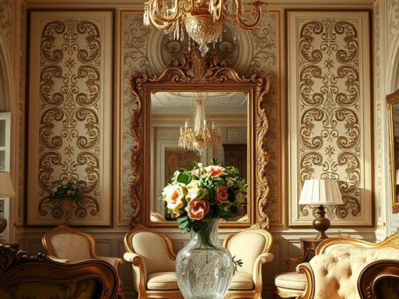
Neutrals and metallics: balancing saturated rooms with glass, brass, and wood
Metals, glass, and wood are grounding elements. Brass warms cool greens. Smoked glass lifts dark corners. Walnut frames a vivid field beautifully.
Keep the palette tight and vary finishes. That’s the way to make color feel rich, not loud.
- I layer velvet, linen, and wool to build depth and softness.
- Wallpaper in a light neutral can break saturation and tie spaces together.
- Use sculptural lamps, textured rugs, and mixed metals to anchor decor and style.
Avoid These Mistakes and Use These Pro Tips
Think about stops and starts: a well-considered transition keeps a bold palette from feeling chaotic. I see clients rush into a full drench and then wonder why the plan feels disjointed in an open plan. Take a beat and map where the hue will meet other surfaces.
Don’t force it in open layouts. Maria Killam warns that stopping and starting along connected trim is tricky. Instead, zone with related tones and soft transitions so the design reads cohesive, not clipped.
“Maria Killam advises against forcing color drenching in open layouts due to the difficulty of stopping and starting colors along connected trim.”
Skip high-contrast trim. A white stripe on a saturated wall often reads like a racing stripe. That contrast fights the calm you want. Keep trim close in value or use it sparingly for hardware and art accents.
Beware intense hues in bedrooms and low-light offices. Super-saturated shades can feel restless or sleepy at the wrong time of day. Pick muted tones and add layered lamps so the drenching still reads dimensional after sunset.
- Choose paint last—anchor the palette to your rug, sofa, and major elements first.
- Swatch at scale and live with samples through morning and evening light.
- If unsure, start small: test a powder or entry to learn how drenching affects your home.

Conclusion
When paint becomes backdrop instead of spectacle, your furnishings and light get to tell the story. I’ve found that the smartest way to use color drenching is to start small and learn the effects of light, finish, and tone.
Begin with easy wins — a powder, dining, or bedroom. Test swatches in morning and evening. Let one successful space guide bolder moves across the house.
Keep the palette focused. Choose medium-toned hues for livability and finishes that stand up to daily life. In large, open plans, layer tones instead of going all-in; this keeps energy and clarity.
Want more on handling open layouts? See my open-concept drenching tips for practical ways to tie zones together.
Done well, this trend becomes timeless design — an enveloping, collected way to make your home feel calm and uniquely yours.