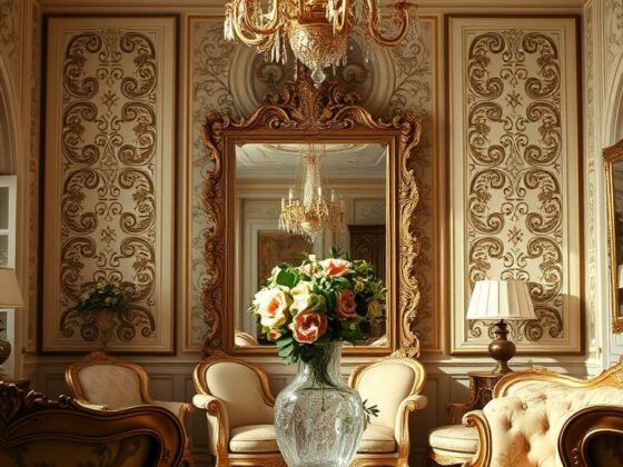
What if one careful color choice could make your whole space feel calmer and more personal? I ask that because I’ve seen it happen again and again. A single change—switching to a pink tile—can lift a room from flat to spa-like in a weekend.
I work with homeowners across the U.S., and I’ll walk you through the collection features you need: the range of hues, finish options, and where to place wall tile versus floor pieces for the best impact. Expect practical tips and small design moves that add real beauty without breaking the bank.
Handcrafted ceramic lines bring subtle variation and personality, while porcelain and glass offer sleek, easy-care finishes. I’ll help you choose a color and style that complements cabinets, countertops, and fixtures so your bathroom feels intentional—not accidental.
Key Takeaways
- One well-chosen tile can transform mood and light in a small space.
- Compare finishes—matte for grip, gloss for easy cleaning in splash zones.
- Sample packs and trusted sellers make decision-making easier and faster.
- Use wall and floor placements to define zones for a cohesive look.
- Handcrafted pieces add charm and a curated, personal feel.
Discover the Beauty of Pink Tiles for a Relaxing Bathroom Oasis
A subtle blush tone changes how light, skin, and fixtures all look together. I often begin with a soft pink or blush pink to set a calm, spa-like vibe that still feels modern.
Keep grout light—white or soft gray keeps surfaces seamless and lets the color sing without busy lines. For a clean, contemporary look, a stacked subway tile layout with light grout reads crisp and warm at once.
If you want elegance, mix matte and satin sheens on different wall tile zones. That little contrast creates depth and a refined shimmer without shouting for attention.
- I pick softer tones to enlarge tight spaces; deeper shades create a cozy cocoon.
- On floors, choose slip-aware finishes; on walls, use gentle reflectivity to bounce light.
- Handcrafted ceramic lines add tiny tonal shifts that feel bespoke and quietly elegant.
Whether you’re aiming for airy or intimate, tuning your colors and shades makes the space work. Small choices—grout, finish, layout—deliver big calm.
Pink Bathroom Tiles: From Soft Blush to Bold Rose—Design a Space You Love
Choose one focal wall and you get big impact with modest effort. I often start by framing a vanity or tub surround with a soft pink 3×6 or 3×8 subway tile. That stacked or running-bond layout reads clean and calm.
For showers, try 4×4 squares or fish scales to add movement. A light grout keeps the look airy and lets the pattern whisper rather than shout. Want a retro floor? Lighter pink floor pieces feel nostalgic. Brighter hues make a modern statement when balanced with warm woods.

“A small backsplash change can feel luxurious — try penny or hex accents in a powder room.”
Mixing tones is where personality happens. Pair blush with deep rose in a simple band. Add a chevron niche or a satin trim for a boutique touch.
| Application | Shape/Size | Effect |
|---|---|---|
| Vanity / Tub | 3″x6″, 3″x8″ subway | Clean rhythm; timeless look |
| Shower | 4″x4″, fish scale, herringbone | Movement and texture |
| Floor / Powder Room | Hex, penny, Geo patterns | Retro charm or modern pop |
- Use sample packs to preview shades and finishes at home.
- Repeat one shape in nearby kitchens to tie rooms together.
Materials and Finishes That Elevate Your Bathroom
Material choice changes how a room feels long after the install—choose wisely. I’ll walk through what works and why, so you get both longevity and style.

Pink Ceramic Tile: Handcrafted Beauty and Durability
Handcrafted ceramic tile brings organic variation in glaze and texture. Those small shifts in hue give real depth and lasting charm.
I recommend pink ceramic when you want a personal, tactile wall finish. It wears well and reads like a custom surface.
Porcelain and Glass Options: Practical, Elegant, and Water-Ready
Porcelain is dense and ideal for wet zones and the floor. It resists stains and keeps maintenance simple.
Glass adds sparkle on a feature wall or niche—great for reflecting light and adding a touch of elegance.
Matte vs. Gloss: Choosing the Right Finish for Your Space
Finish matters. Matte reads calm and soft; gloss bounces light and wipes clean with ease.
- I often pair matte on most walls with a glossy liner for a subtle accent.
- Choose softer shades to enlarge a small space; richer tones create intimate warmth.
- Order sample packs and view them under your real lighting before you commit.
Bottom line: pick materials for where they’ll live—ceramic for wall tile beauty, porcelain for the floor tile that must work hard. Small choices in color and finish yield big returns.
Shapes, Sizes, and Patterns That Define the Look
Shapes set the rhythm of a room. I start by choosing scale—then the pattern and color follow. Small formats read busy in tiny spaces; large formats can calm a busy plan.
Subway Classics and Clean Lines
I reach for 3″x6″ and 3″x8″ subway tile when I want crisp sightlines. They create a clean, timeless look on a vanity wall or backsplash.
Use 4″x4″ squares for a charming shower wall that feels classic without fuss.
Hex, Penny, and Geo for Depth
Hexagon and penny patterns add subtle movement underfoot. They give the floor tactile charm and visual depth.
A single Geo-Star or Geo-Hex band acts like jewelry—boutique personality with a restrained overall look.
Fish Scales, Herringbone, and Mosaics
Fish scales and herringbone deliver artistic flair. I place them as a feature wall or niche so they shine without overwhelming the space.
Sheeted Patterns for Faster Installs
Prefer precision? Sheeted herringbone and small mosaics speed installation and keep spacing consistent—especially helpful with ceramic tile and complex shapes.

- Balance: one hero pattern, one supporting plain floor.
- Scale: match pattern size to room size and tones.
- Align: center patterns on mirrors, vanities, or niches for a polished finish.
Color, Tone, and Grout: Perfecting Your Pink Palette
Start by laying out swatches in sunlight and warm lamp light. See how the color and tones shift through the day. I ask clients to view samples on a vanity panel and near the floor to judge true mood.

Soft Pink, Blush, and Coral Hues to Set the Vibe
Soft pink, blush, and coral each read differently with warm lighting. I pick a hero hue and let supporting shades play background roles. For a calm spa vibe, favor softer shades with satin finishes.
Grout Choices: White, Light Gray, or Beige for Seamless Beauty
Light grout keeps the focus on the tile’s hue. White brightens; soft gray adds subtle contrast; beige warms the field.
Pairing Colors: Neutrals, Navy, and Greens for Balanced Design
Pair blush with neutrals for serenity. Add navy or deep green for drama and balance. Mint or powder blue accessories offer a fresh lift without commitment.
“Lay samples in morning and evening light—colors change by hour.”
| Choice | Effect | Where to Use |
|---|---|---|
| White grout | Crisp, airy | Wall tile, small rooms |
| Soft gray grout | Soft contrast, hides dirt | Shower walls, high-use areas |
| Beige grout | Warm, cohesive | Floors and warm wood pairings |
Shop the Collection with Confidence
Good shopping begins with a clear use-case: are you tiling a floor, a wall, or a backsplash? Start there and the rest falls into place.
Explore by application so you only see relevant options. Filter for floor tile, wall tile, or backsplash to avoid sifting through mismatched sizes or finishes.
Filter by Material, Finish, Size, and Shape
I always narrow by material first. Choose ceramic tile for handcrafted charm or porcelain for heavy-use floors.
Then pick finish and size. Use subway tile for clean lines, hex or penny for texture, and fish scale for a feature wall.
Order Sample Packs to See Shades and Finishes at Home

Order sample packs and view them at different times of day next to your fixtures. That quick test beats a guess every time.
Fast, Nationwide Shipping and Easy Returns
Prefer momentum? Look for sellers with strong ratings and fast shipping. Free or expedited options keep your timeline on track.
- Filter by floor, wall, or backsplash to start smart.
- Narrow by material and finish to match performance and look.
- Dial in sizes and shapes—3×6 and 3×8 subways for structure.
- Order sample packs and compare colors in real light.
- Save favorites and build a short list before you shop.
“Whether you’re updating a guest bath or doing a full primary suite refresh, filters help you go from inspiration to add-to-cart in minutes.”
Final choice: shop with a plan—application first, then filters and samples—and you’ll limit surprise costs and speed the install. It’s a small step that protects your design and your timeline.
Installation and Care Made Simple
Think of your layout like a map—anchor it to one focal point and let it flow.
Selecting the Right Pattern and Layout for Your Project
Start with a plan: define the main pattern—subway, herringbone, or hex—and decide if it’s the hero or backdrop. I center patterns on mirrors, niches, or tub spouts so the layout reads intentional from end to end.
Sheeted mosaics speed installs and keep spacing consistent—especially useful in tight spaces. Dry-fit a few rows first when you’re tackling a DIY powder room or verifying flow before pro installation.
Choose finish by function: matte for grip and low glare; gloss for easy wipe-downs near vanities and splashes. For a pink floor or a subtle blush wall tile, confirm sheen with sample packs under your actual lights.

Everyday Maintenance for Lasting Elegance
Everyday care is simple. Use a mild cleaner and a soft cloth; wipe spills promptly so surfaces keep a silky touch. Seal grout per manufacturer guidance and re-seal on schedule—it’s the small habit that preserves elegance.
Whether you’re refreshing a small powder room or finishing a full primary suite, quality ceramic tile and porcelain are built for daily use. If you want continuity to outdoor spaces, verify product suitability—some lines are rated for patios and entries.
“A quick dry-fit and regular grout care keep design intentions intact for years.”
- I center patterns on focal points for balance and polish.
- Use sheeted mosaics to simplify a tricky install.
- Seal grout and clean with gentle products to maintain long-term beauty.
Conclusion
Small choices in layout and finish add up to a big change in how a space feels. I’ve seen a single pink tile selection lift a room from ordinary to calm and considered.
Choose ceramic tile for personality and durability. Keep grout light and limit your palette to two or three complementary colors. Center patterns on a vanity or niche so the look reads intentional.
Ready to move? Order samples, compare them in real light, then browse the collection to shop with confidence. Start small, plan clearly, and enjoy a space that reflects your style and personality.