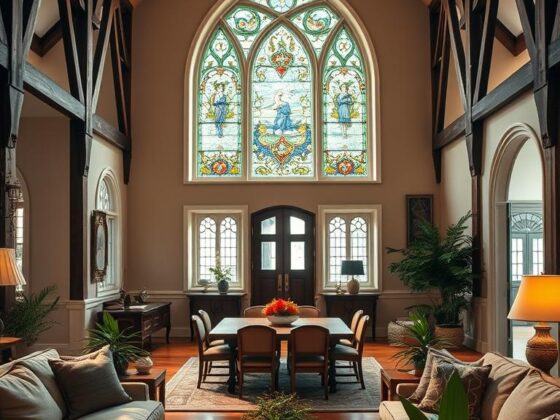
Ever wondered why a soft wash of hue can make a room feel like a calm retreat? I ask clients that all the time. A gentle blush—think low-chroma pastels—changes how surfaces read and how light behaves.
I use these tones to warm rooms without shouting. They act like dawn on walls and textiles, reducing visual noise in small apartments and making every corner breathe.
As a designer, I pick specific hexes—near #FFB5C0 or #FFD1DF—because their high luminance keeps things airy. They bridge cool whites and warm woods and help transition between neutrals and stronger accents.
In practice: a pillow, a vase, or a single wall can shift mood. Culturally, this hue signals care and calm. Start small, watch the effect through the day, and let the room tell you the way forward.
Key Takeaways
- Soft pastels can calm a room and reduce visual clutter.
- High-luminance, low-chroma choices enhance natural light.
- Small accents often deliver big emotional shifts.
- These tones bridge materials—wood, white, and bold accents.
- Try samples and observe changes during the day.
What Is Light Pink? A Clear Definition for a Design Dictionary
I call this hue the gentle mediator in any palette—soft, low-key, and surprisingly strategic.
In digital color spaces, the color sits near hex codes #FFB5C0 (RGB 255,181,192; HSL 351.1°,100%,85.5%) and #FFD1DF (RGB 255,209,223; HSL 342°,100%,91%).
Both are pastel, high-lightness, low-saturation entries in the red-magenta family. They read as pink soft to our eyes, so designers use them to calm a room or brand without losing warmth.
- Finder color picks: #FFB5C0 and #FFD1DF are common and behave similarly in real spaces.
- The HTML/CSS named color lightpink is #FFB6C1 — a close cousin worth listing separately in a dictionary color entry.
- Functionally, it bridges cool whites and warm woods, smoothing mood and adding cohesion.
“A small sample on trim taught me more about shift and scale than a swatchbook ever did.”
| Identifier | Hex | RGB | HSL |
|---|---|---|---|
| Common Finder | #FFB5C0 | 255,181,192 | 351.1°, 100%, 85.5% |
| Alternate Finder | #FFD1DF | 255,209,223 | 342°, 100%, 91% |
| Named Web Color | #FFB6C1 | 255,182,193 | 350°, 100%, 85.9% |
For practical use, sample the hue on trim or a small accent wall. Watch it in morning and evening light to learn the best way it serves your space.
Light Pink Color Codes and Values at a Glance
Consistent results start with exact numbers. Below I boil the essentials down so designers and developers can match a hue across screens and print.

Hex, web-safe, and binary
#FFB5C0 — web-safe neighbor: #FFCCCC. Binary: 11111111,10110101,11000000.
RGB and percentage values
#FFB5C0 = rgb(255,181,192) — rgb% 100%, 71%, 75.3%.
#FFD1DF = rgb(255,209,223) — rgb% 100%, 82%, 87% (note the 87% blue lift).
HSL and HSV details
HSL places these in the magenta-leaning band: 351.1°/100%/85.5% (#FFB5C0) and 342°/100%/91% (#FFD1DF).
HSV shows high value with low saturation — think bright, soft colors rather than saturated tones.
CMYK for print workflows
Start proofs with these CMYK conversions: #FFB5C0 → 0,29,25,0; #FFD1DF → 0,18,13,0. Paper and ink will shift perception, so always proof.
Platform snippets: CSS, iOS, and Android
- CSS: color: #FFB5C0;
- SwiftUI: Color(red: 1, green: 0.71, blue: 0.753)
- UIKit: UIColor(red: 1, green: 0.71, blue: 0.753, alpha: 1)
- Android Compose: Color(0xFFFFB5C0)
“Log both hex and HSL values — designers read relationships, developers read codes.”
Light Pink Contrast and Accessibility Guidelines
Contrast decisions make or break whether a hue reads as friendly or unusable in an interface.
I test early and often. For #FFD1DF the relative luminance sits near 72%, so it glows on screens. That brightness helps mood but challenges foreground choices.

Contrast Against Black vs. White
#FFD1DF vs. black scores about 15.4:1 — well within AAA. Use that pairing for readable text and strong CTAs.
#FFD1DF vs. white is roughly 1.4:1 — decorative only. Don’t use this for body text or essential labels.
Luminance and Readability Considerations
That ~72% luminance makes the hue feel soft and airy. But value contrast matters as much as hue.
“On light panels I always choose near-black text and bold weights — it keeps hierarchy clear.”
- I recommend dark, near-black text on pale panels for UI and signage.
- For hover/focus states, darken the foreground or lower the panel’s lightness slightly to meet contrast rules.
- Avoid pale text on white buttons; instead use blue or charcoal for icons and labels.
| Context | Foreground | Contrast Ratio |
|---|---|---|
| Panel/background | Black (near #000) | 15.4:1 (AAA) |
| Panel/background | White (#FFF) | 1.4:1 (Insufficient) |
| UI recommendation | Near-black text / bold weights | Passes AA/AAA when adjusted |
Good practice: pair the hue with decisive darks, test on the web, and treat accessibility as essential design. I do this in every project — it keeps spaces calm and usable.
Light Pink Shades, Tints, and Tones
When clients ask for “a bit richer,” I point to a measured progression of darker and desaturated hues. It helps to see how each step behaves in a room. I guide choices by purpose — field color, anchor, or highlight.

Shades
Shades add depth. Move from #FFD1DF toward #E2B9C6 and #C6A2AD for warmth without losing softness. Darker steps like #8D747B or #382E31 create sophisticated accents for cabinetry or frames.
Tints
Tints float. Options such as #FFE5ED and #FFEFF4 bounce light and keep rooms airy. Ultra-light tints like #FFF4F7 read as pale pink that feels like daylight, not stark white.
Tones
Tones mute saturation. Samples like #F4DBE2 and #EFE0E4 feel grounded and modern. They balance pale fields and deeper punctuation, preventing a scheme from becoming saccharine.
“I map these colors as a gradient — clients choose the right step when they can see the whole range.”
| Category | Sample | Use |
|---|---|---|
| Shade | #C6A2AD | Hardware, frames, accents |
| Tint | #FFEFF4 | Ceilings, wide walls, nurseries |
| Tone | #EFE0E4 | Structure, trim, grounded fields |
Light Pink
These near-identical swatches reveal how a slight hue shift completely changes mood. I walk clients through this all the time—one chip nudges toward warm, another hints at cool. The differences matter in textiles, paint, and branding.

Similar Colors and How They Behave
Pastel Pink (#FFD1DC) skews a touch more red and gives a rosier warmth. Pig Pink (#FDD7E4) leans magenta and reads feather-light on walls. Vanilla Ice (#F3D9DF) and Pale Pink (#FADADD) are paler, ideal when you want barely-there warmth.
Named Web Colors
The HTML/CSS named lightpink is #FFB6C1 and the web pink is #FFC0CB. They sit in the same family but differ from common picks like #FFB5C0 or #FFD1DF.
Where It Sits in the Family
From pastel to vivid, these tones live on the calming end. I pair rose-adjacent hues with camel or ink for quiet luxury. Culture and fashion shape choices—some clients want nostalgia, others a modern hush.
- Lavender Pinocchio (#EBDDE2) brings a soft lavender whisper for bedrooms.
- Use these shades to link warm neutrals and cool accents in a palette.
See more related tones at shades of pink.
Color Mixing and Paint Recipes for Light Pink
Mixing the right wash for walls starts with exact percentages, not guesswork. I share two reliable recipes I use in the studio and on job sites.
Eight-primary approach:
Eight-Primary Method: Percentages and Balance
For a near-#FFD1DF wall, try 15% red, 3% magenta, and 82% white. Mix, make a swatch, and view it in morning and evening light.
Five-Primary Method: Simplified Mix
Prefer fewer tints? Use 11% magenta, 7% yellow, and 82% white. The yellow keeps the tone warm and livable without oversaturating the field.
- Finish matters: satin bounces light; matte calms the surface.
- For trim or cabinetry, add a touch of grey to deepen without losing cohesion.
- Bring a printed swatch for a spectro read at the counter when matching brand color.
- CMYK reference: #FFD1DF ≈ 0,18,13,0 — always proof on your substrate.

“Paint a 24×24-inch swatch on foam board and move it through the room — it’s the fastest truth-teller.”
| Method | Primary Mix | Best Use |
|---|---|---|
| Eight-primary | 15% Red, 3% Magenta, 82% White | Near-#FFD1DF wall swatches |
| Five-primary | 11% Magenta, 7% Yellow, 82% White | Simpler mixes; warm fields |
| Trim/Cabinet | Add 1–2% Grey to base mix | Refined contrast without losing palette |
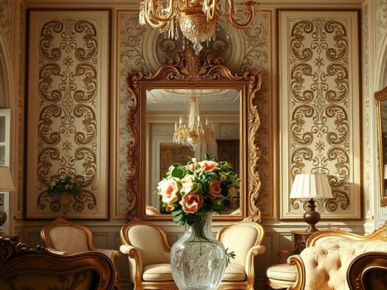
Design Palettes and Combinations Featuring Light Pink
Good palettes start with one confident choice and then gather supporting colors around it. I pick a main hue, then test how furniture, textiles, and metal finish it.

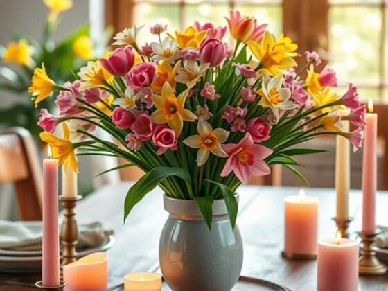
Summer Pairings
I pair #FFD1DF with grounded brown #60302D and olive #85822E. Add #ECCAD5 for a layered, linen-friendly look that reads warm and lived-in.
Winter Pairings
For refined winter schemes I use plum #703260 and amethyst #B551A1. A cool neutral like #EEE8EE keeps the field calm and gallery-like.
Spring Pairings
Spring calls for leafy #626B48 and dusty mauve #BEA3AB. Finish with breathable #F3EEE8 for airy backgrounds that feel fresh.
Analogous Combinations
For quiet tonal flow, move from #A75C6D to #C5A5AF and #D7B9BA, anchoring with deep #3D3235 for contrast.
Quick uses:
- Introduce a blue accent (indigo upholstery) to anchor pale fields.
- Use a darker tone on rugs or hems to add depth.
| Season | Key Hexes | Accent Use | When to Use |
|---|---|---|---|
| Summer | #60302D, #85822E, #ECCAD5, #FFD1DF | Linens, clay, pillows | Casual, sunlit rooms |
| Winter | #703260, #B551A1, #CCB2BA, #FFD1DF | Curtains, art, throws | Structured, elegant spaces |
| Spring | #504147, #626B48, #BEA3AB, #FFD1DF | Cushions, trim, vases | Fresh, botanical interiors |
| Analogous | #3D3235, #A75C6D, #C5A5AF, #D7B9BA | Bedrooms, tonal walls | Calm, layered schemes |
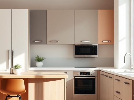
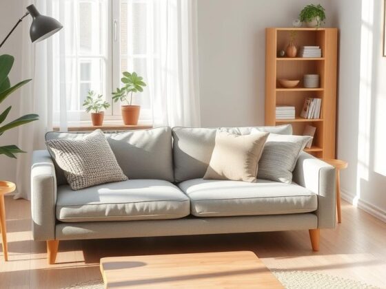
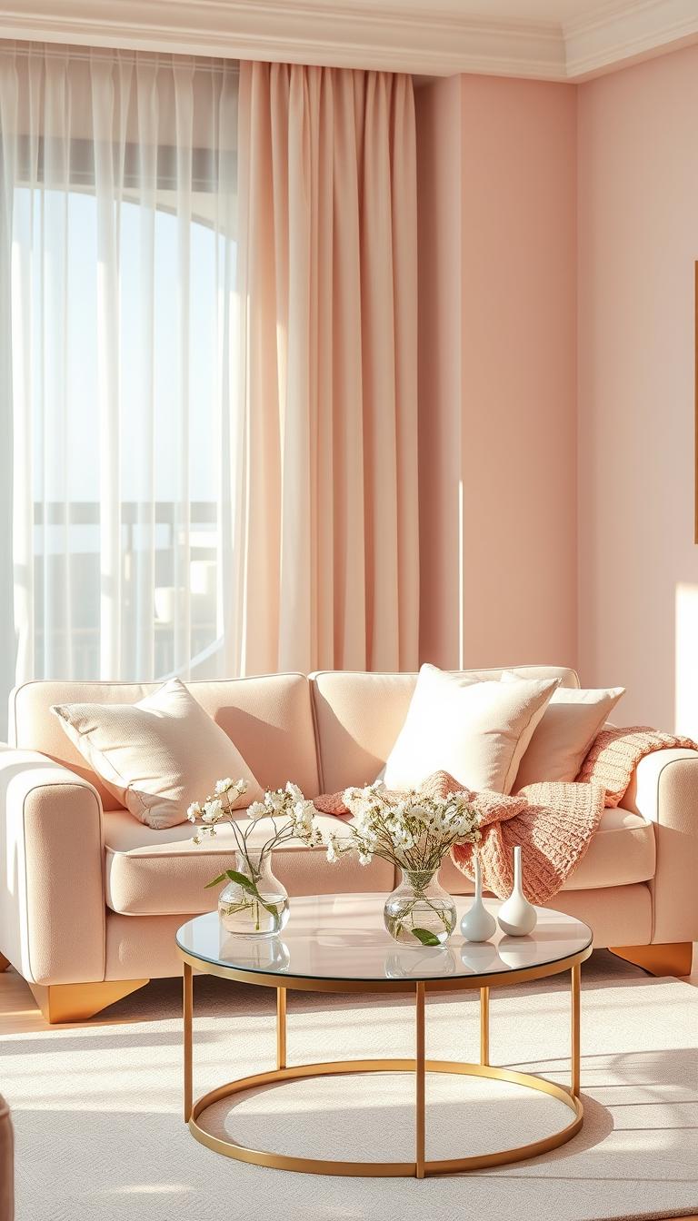
Using Light Pink in Interior and Digital Design Today
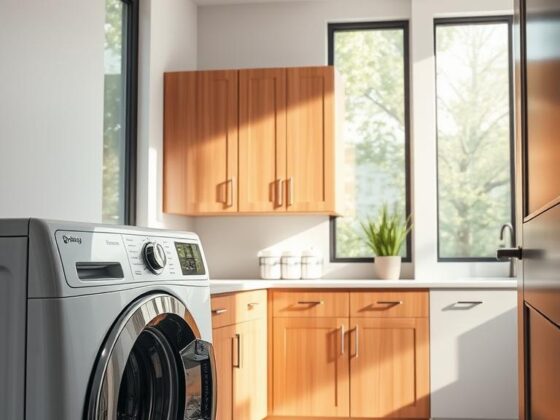
A soft wash across walls or textiles changes how daylight reads in a space. I use pale washes to make rooms feel larger and calmer without losing warmth.
Calming Spaces: Walls, Textiles, and Accents
At home, a wall in #FFD1DF brightens a room without the glare of pure white. Textiles in #FFB5C0 add a tender, touchable layer that invites presence.
Try linen bedding with a grounded headboard. The space feels cocooned, open, and easy to unwind in the evening.
For a subtle statement, a single console or runner signals welcome at the door.

Digital/UI Applications: Hex Choices, Contrast, and States
On screen, pick a primary hex and publish it in your kit. Use CSS: #FFB5C0; SwiftUI and UIKit initializers keep cross-platform color consistent. Document hsv targets so developers know how to nudge states.
“Pair pale panels with near-black text; that contrast reads clean and humane.”
| Context | Recommendation | Why |
|---|---|---|
| Background | #FFD1DF | High luminance (~72%) keeps fields airy |
| UI states | Lower lightness / small saturation + hover | Provides perceptible feedback |
| Contrast | Text near-black | 15.4:1 on black; 1.4:1 on white |
Pro tip: that 87% blue lift in #FFD1DF gives a fresh effect—great for wellness apps or calm living rooms. Keep a developer block with hex, hex code, and platform code in your design system for faster handoffs. For more shade guidance, see shades of light pink.
Conclusion
Treat this color like a neutral with feeling—use it to steady a palette and warm materials. I find its high value in hsv and HSL keeps fields airy and forgiving.
Note the common hex targets—#FFB5C0 and #FFD1DF—in your dictionary color so teams align. Record rgb and hsv notes in your design system for reliable handoffs.
For paint, start near 82% white with small magenta or magenta+yellow adjustments, then test on the wall. Contrast is essential: #FFD1DF scores ~15.4:1 on black and ~1.4:1 on white, so plan foregrounds accordingly.
I pair this hue with lavender and a disciplined blue accent. It reads modern, humane, and quietly lasting—just the kind of color I reach for when a space needs to feel kinder.